Vodo
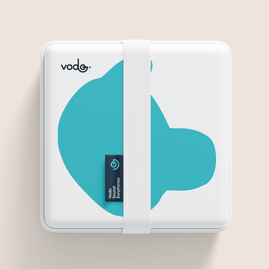
Vodo is a tech company focused on improving and simplifying consumers’ connectivity through innovative and high-quality products. Vodo offers mobile chargers, cables and cords, covers among others.
Location: Brazil
Role: Branding
Date: 2018
Challenge
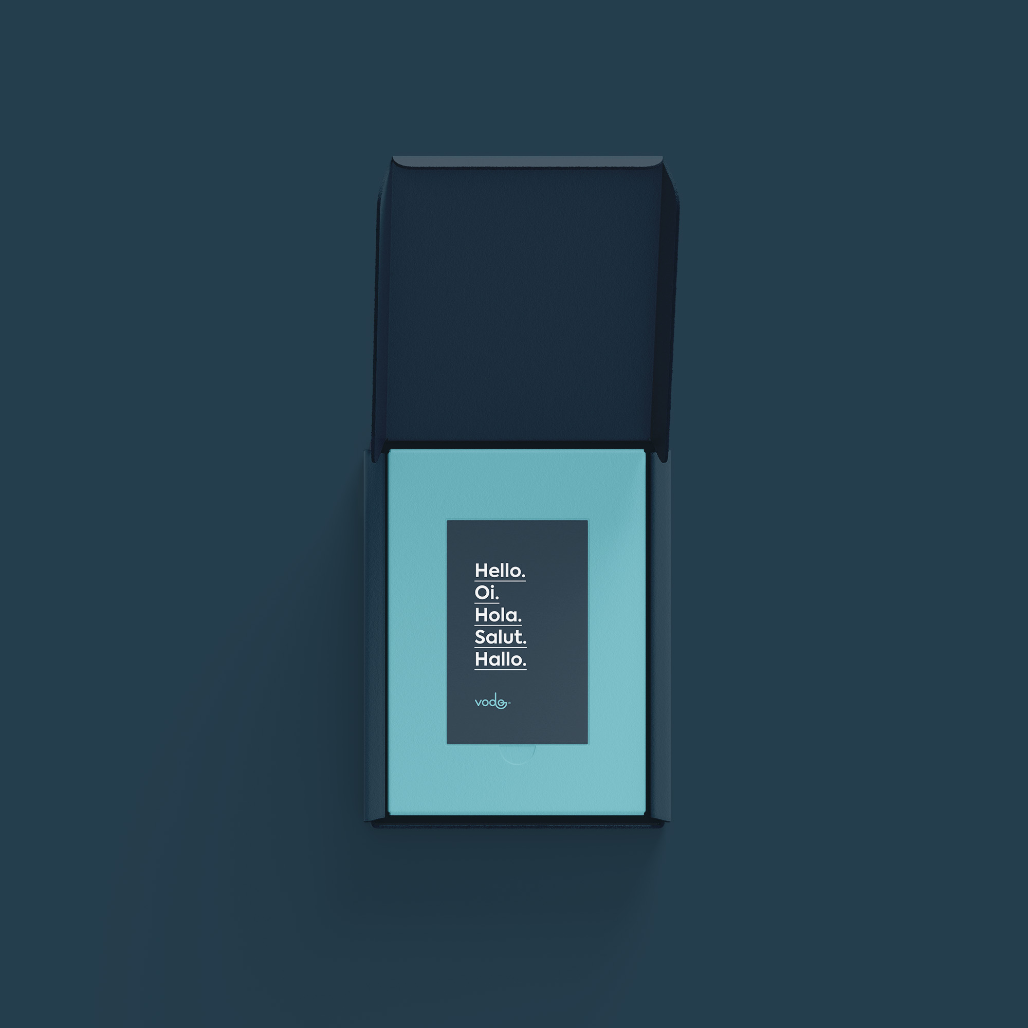
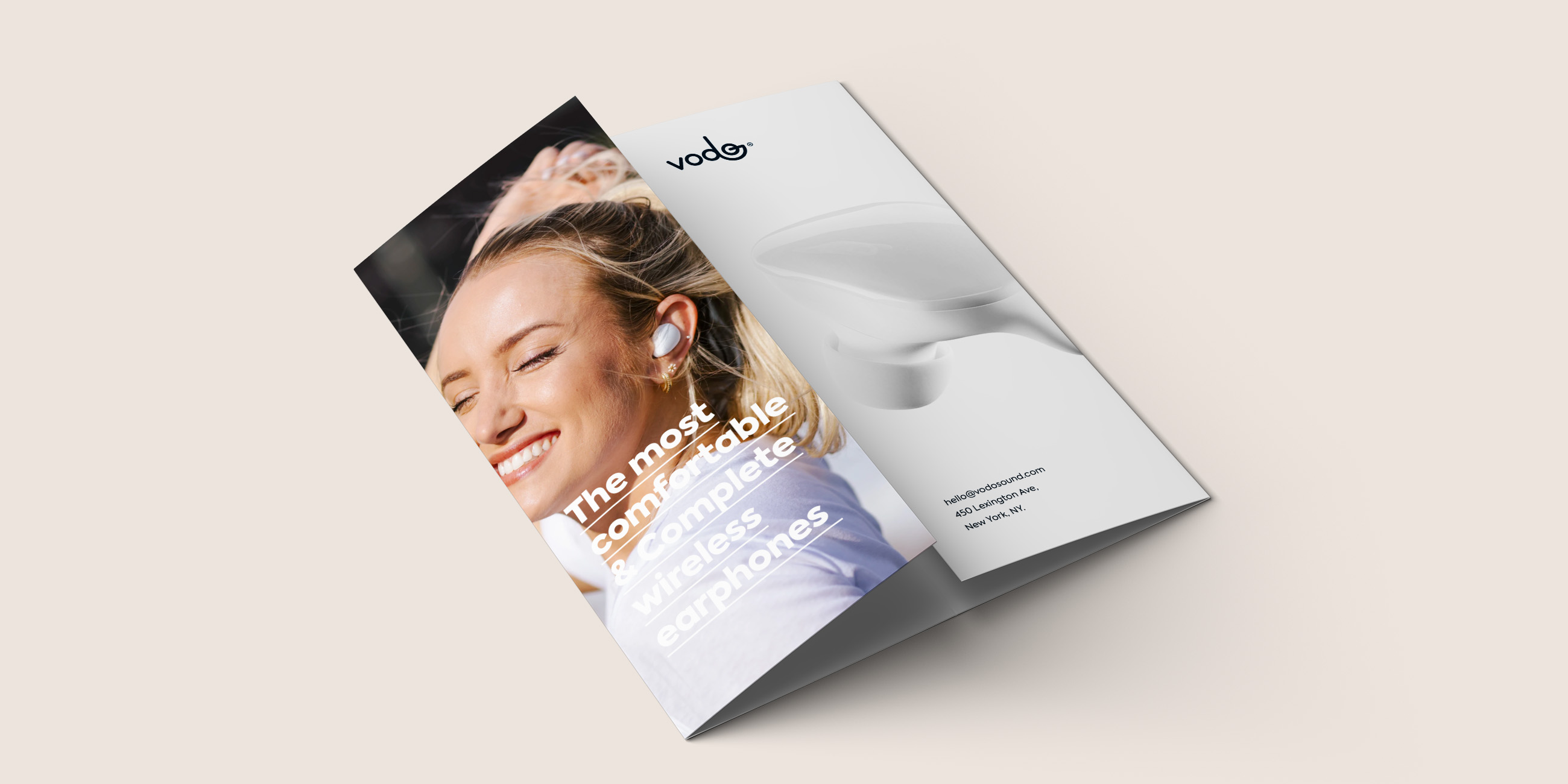
Vodo is a brand with strong technological appeal, but at the same time, it should address proximity and transparency to its consumers. It should communicate with the tech-savvy customer – but above all, the female.
Solution
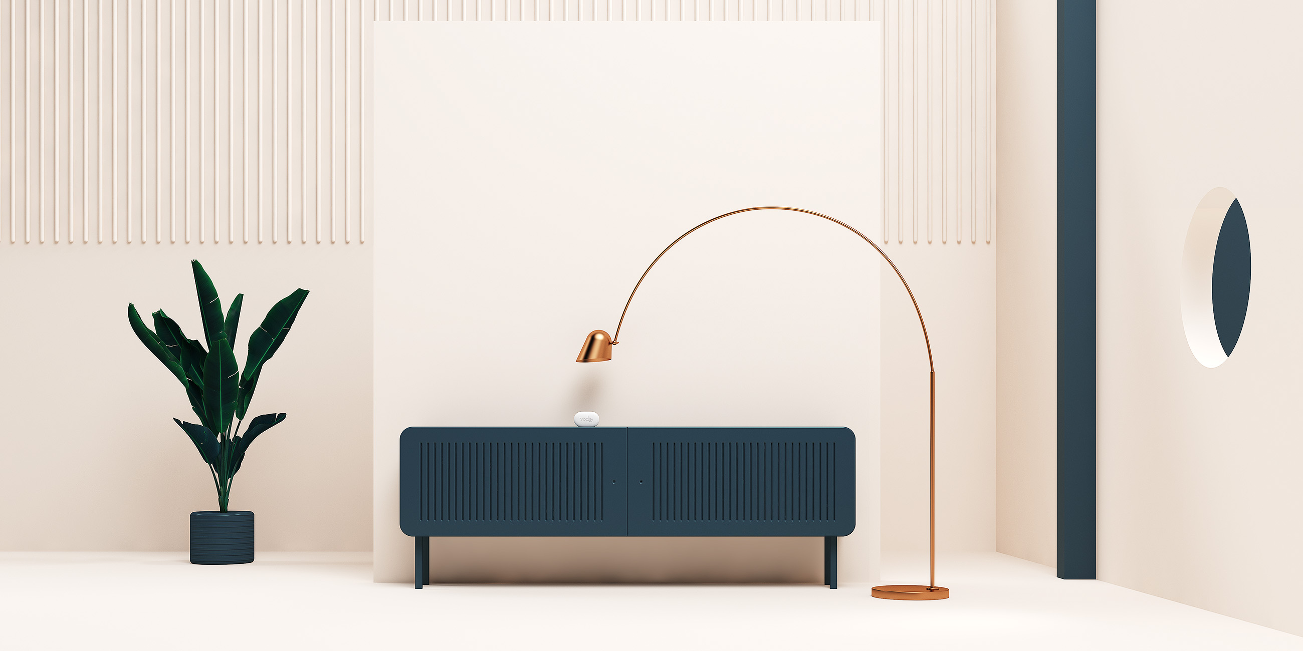
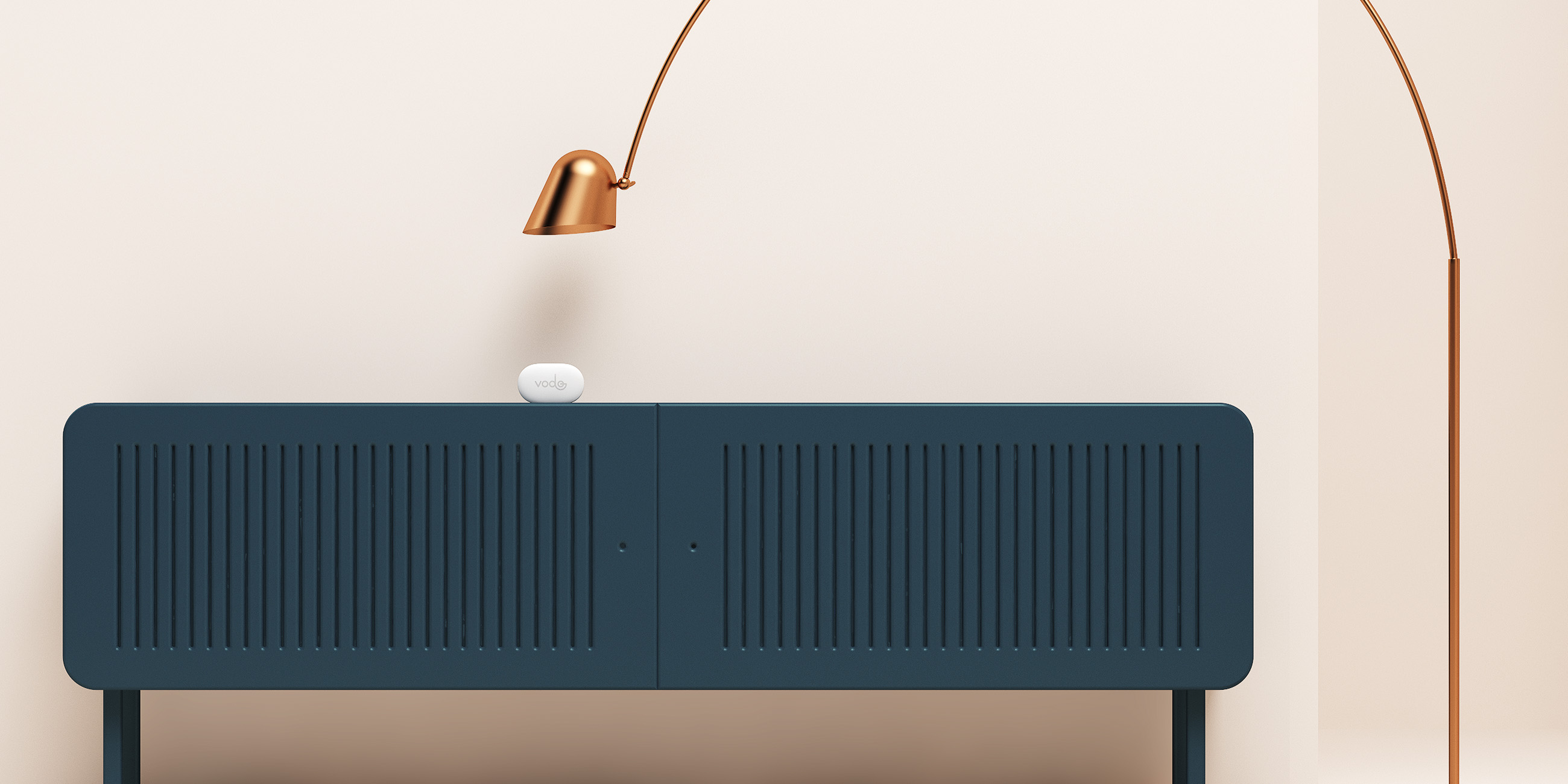
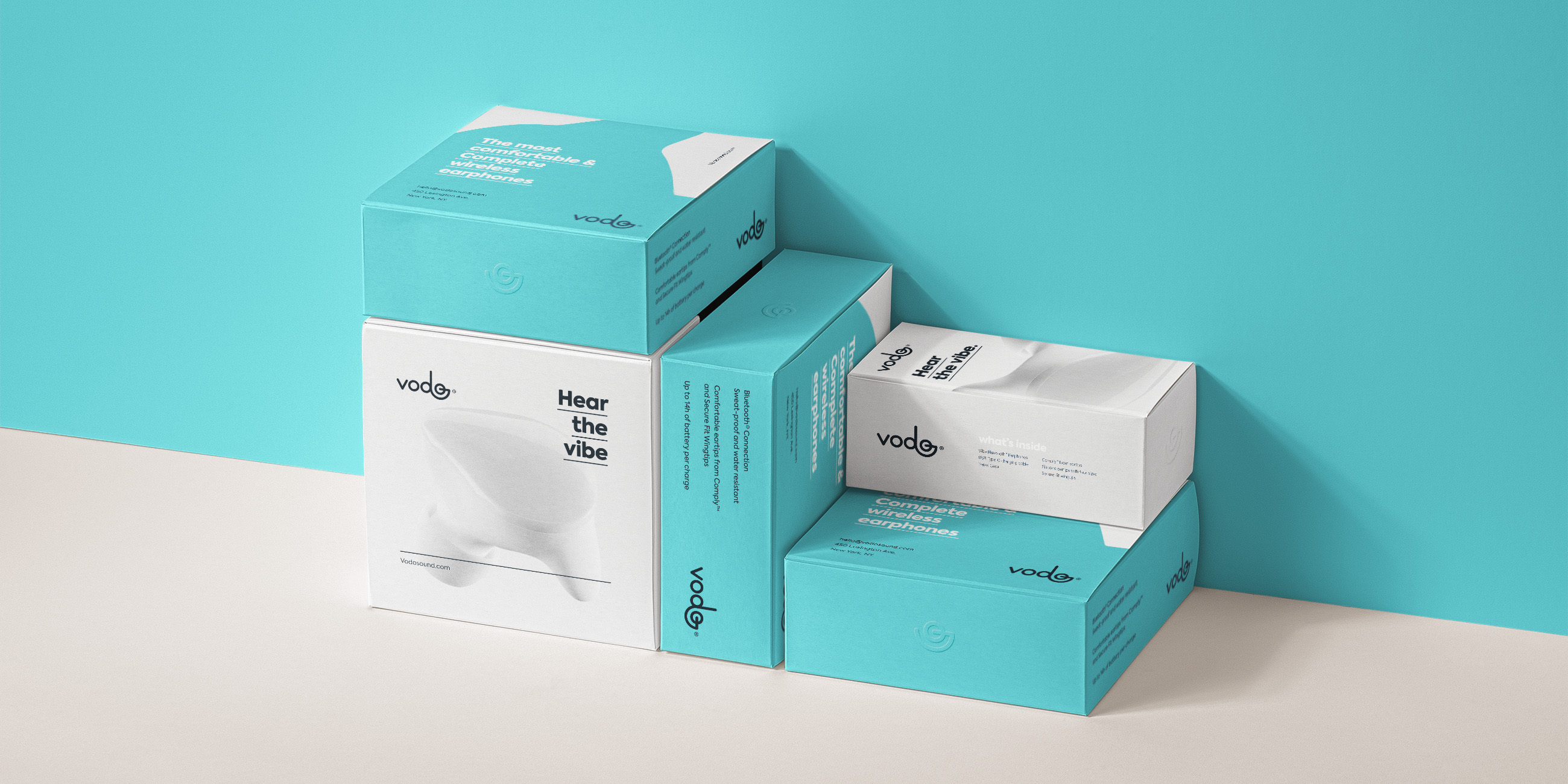
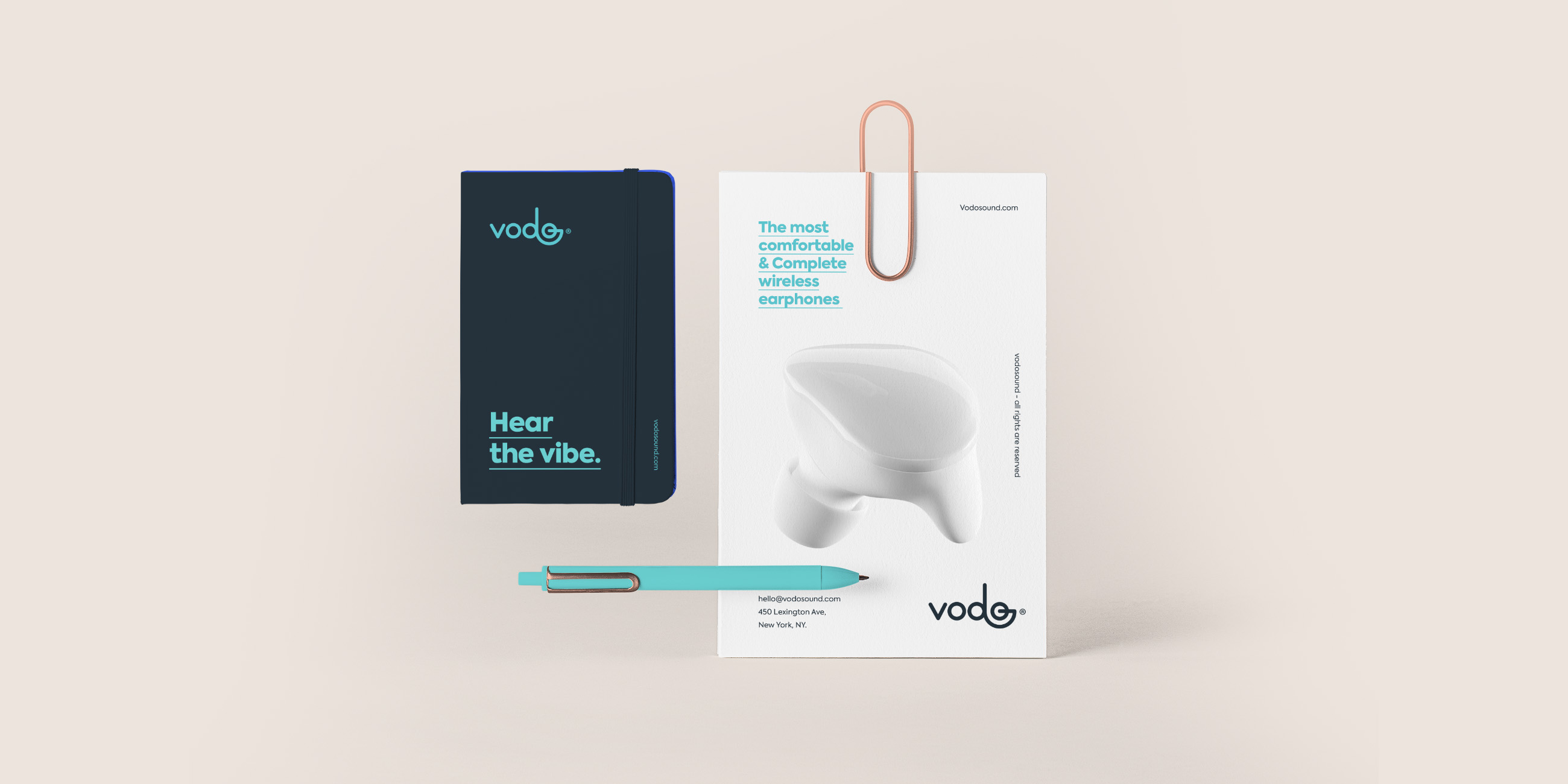
We devised a brand that has in its lettering the power as main perception, and it’s from it that everything starts. Rounded shapes translate proximity to consumers without losing the essence of trust and technology.

Need a project?