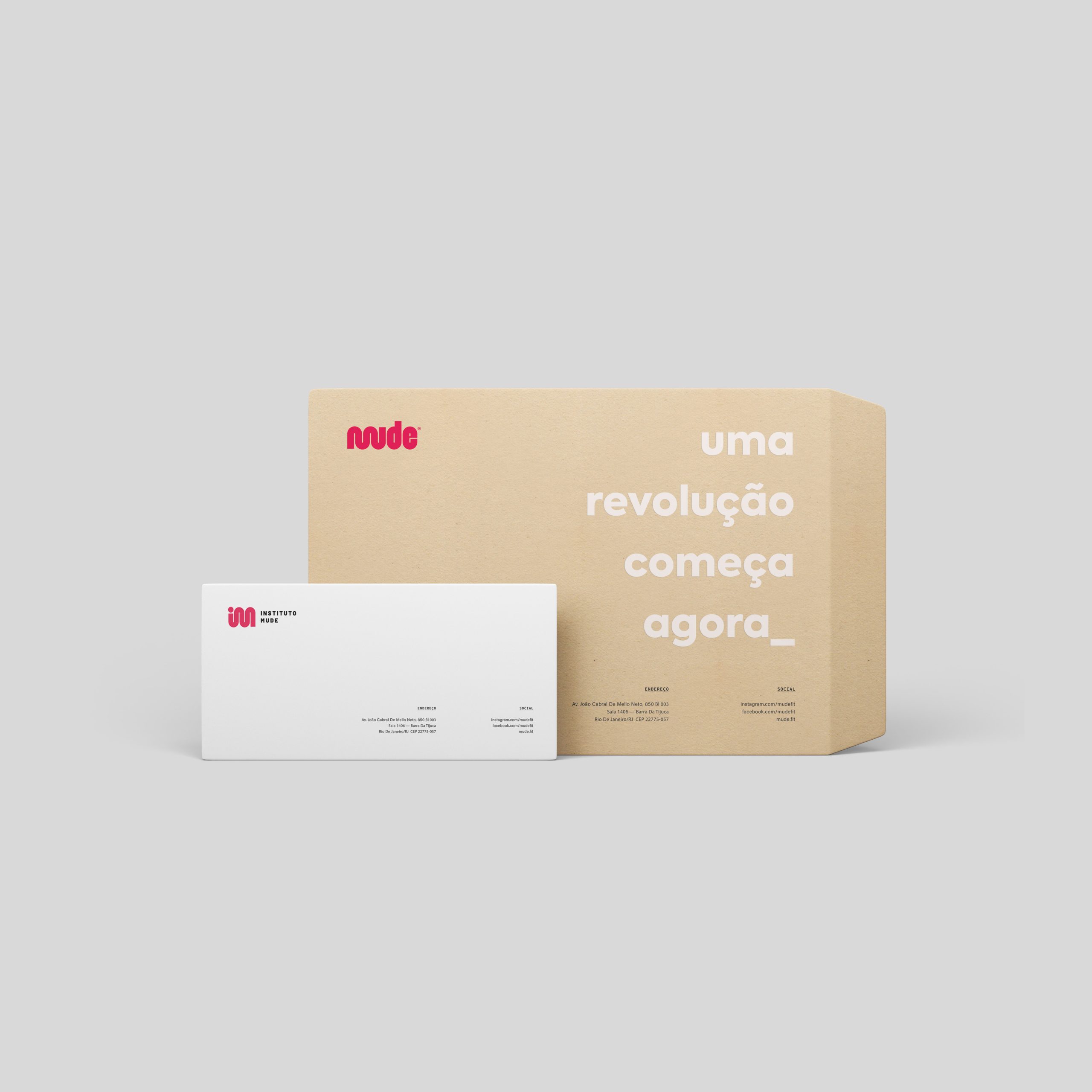
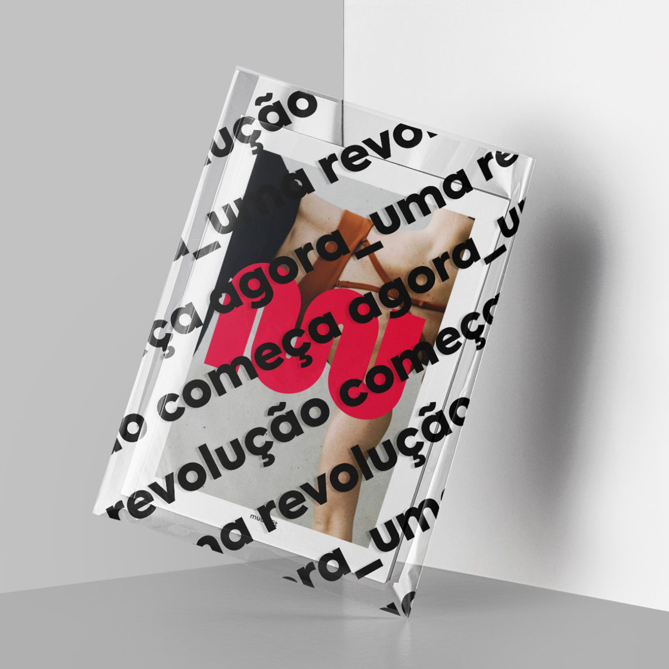
Mude
Mude is a wellness brand that aims to create a sense of community and value to public spaces through outdoor sports. Mude is current, inspiring and inquisitive whilst it creates new perspectives on healthy and positive attitudes through the use of urban spaces for well-being and collective development.
Location: Brazil
Role: Branding
Date: 2019
Challenge
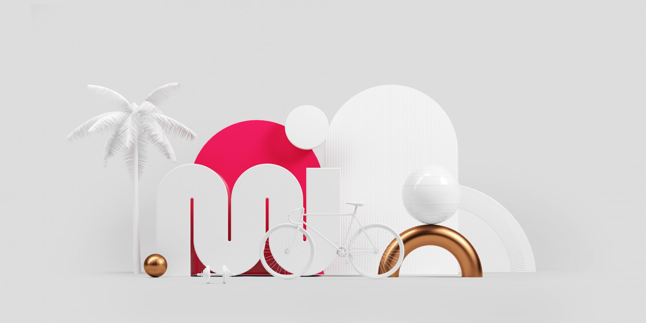
To create a dynamic brand, just like sportspeople, with a visual punch that converses with MUDE’s place of origin: Rio de Janeiro. It was also important to create a brand that had a strong symbol that could be further unfolded into diverse situations.

Solution
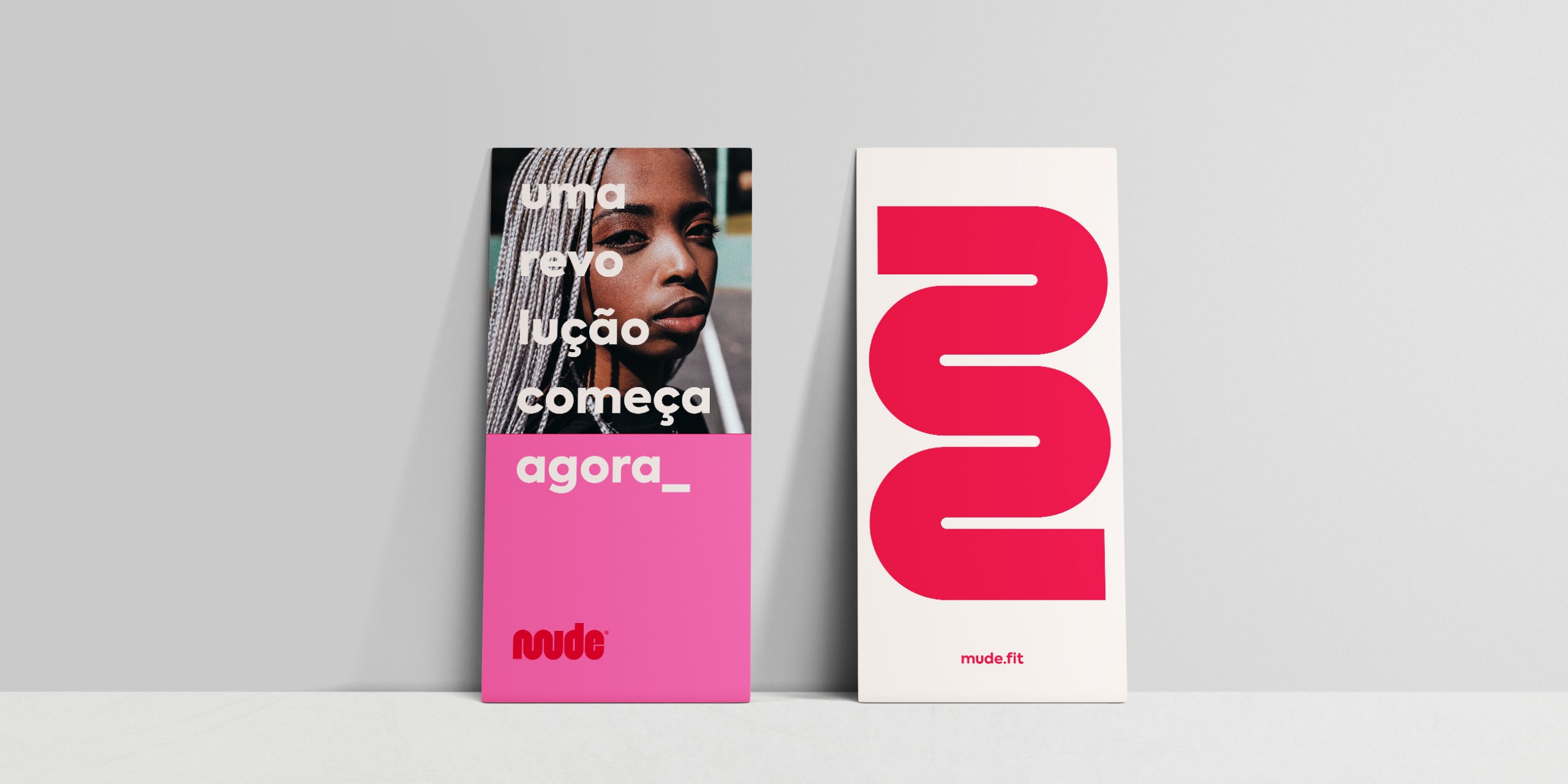
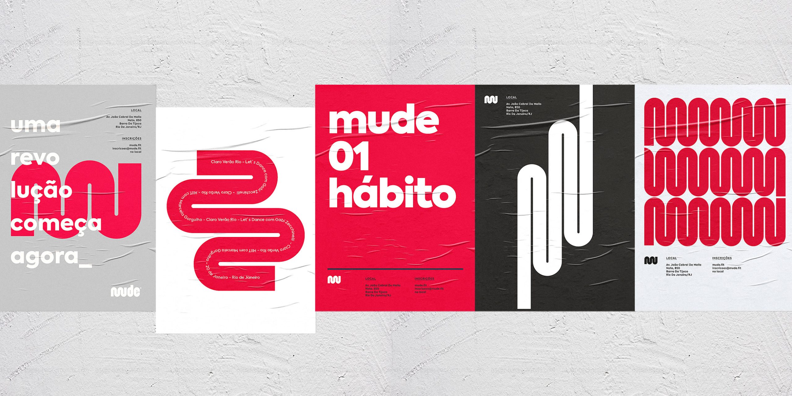
Because MUDE has many class options, from yoga to cardio, we came up with an energetic brand that, per se, illustrates different heart beats to different workouts. We also embodied Rio’s silhouette into the M symbol, creating a parallel with its world famous geography.
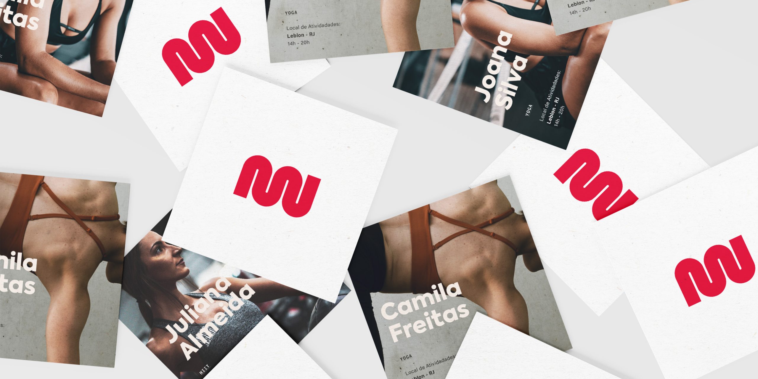
Symbol
Heartbeats are represented in the various brand variations and are applied according to the movement of each class. For cardio, the symbol with bigger movements is used, as opposed to the yoga class.

Need a project?