Tutti Giorni
For Tutti Giorni's debut on the disputed Zaffari shelves, the new line of food products marketed by the supermarket needed a distinct visual identity and a strong and cohesive visual system for its extensive product portfolio.
Location: Brazil
Role: Branding & Packaging
Date: 2021
Challenge
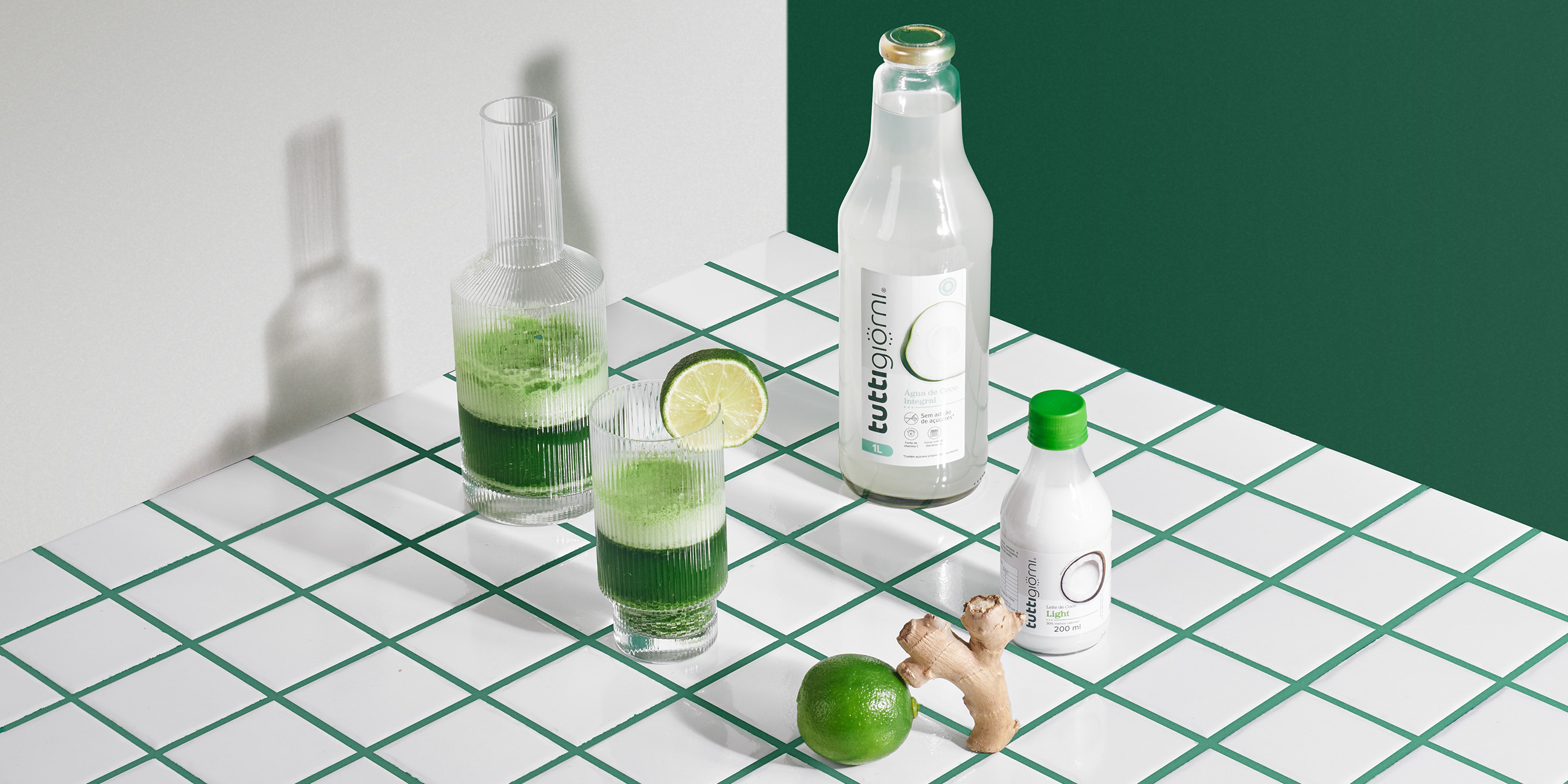
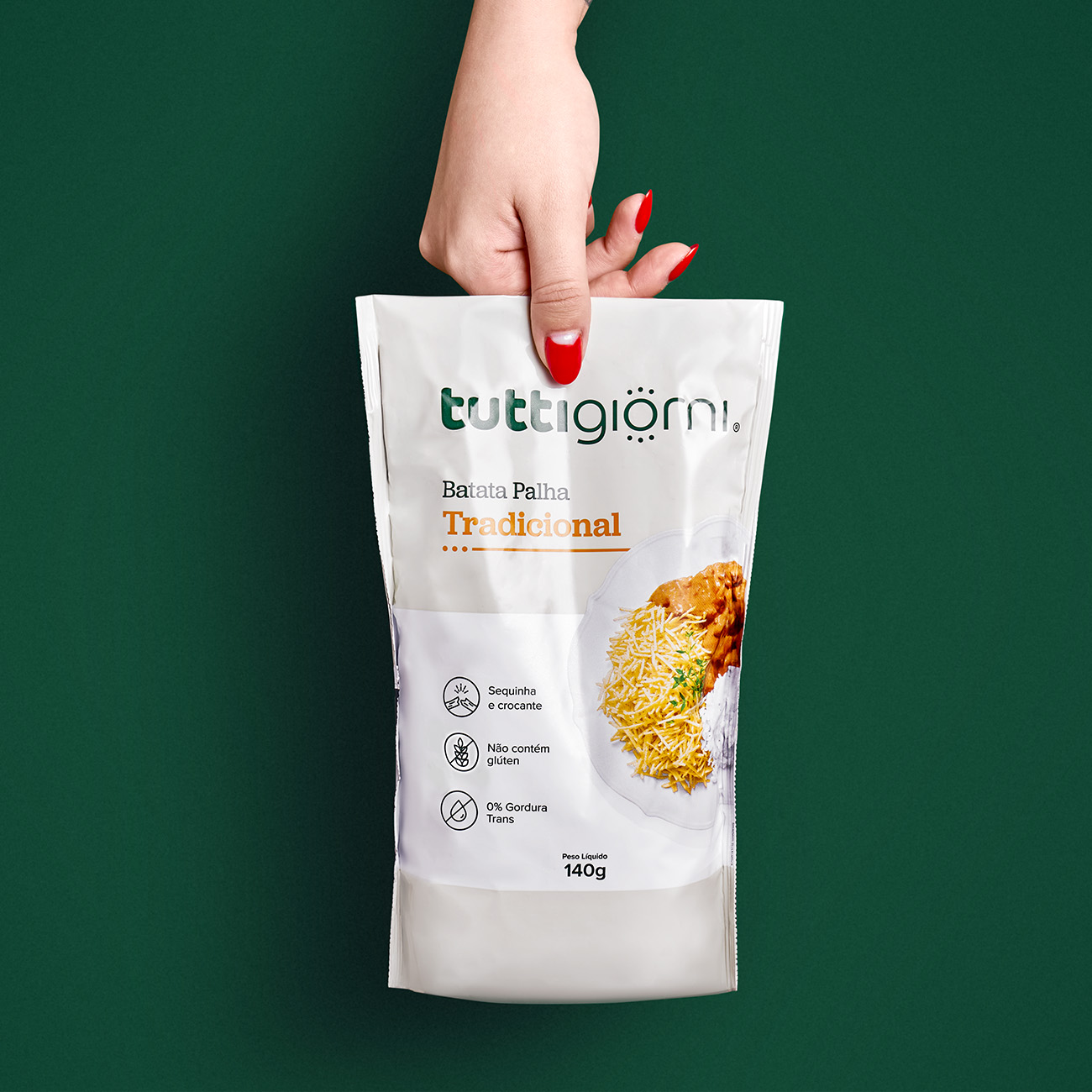
From spaghetti to coconut water, Tutti Giorni's visual identity and packaging system needed to talk to different meals, snacks, food cultures and category codes. All of this, while reinforcing the brand's proposal to sell everyday products with high quality at fair prices.
Solution
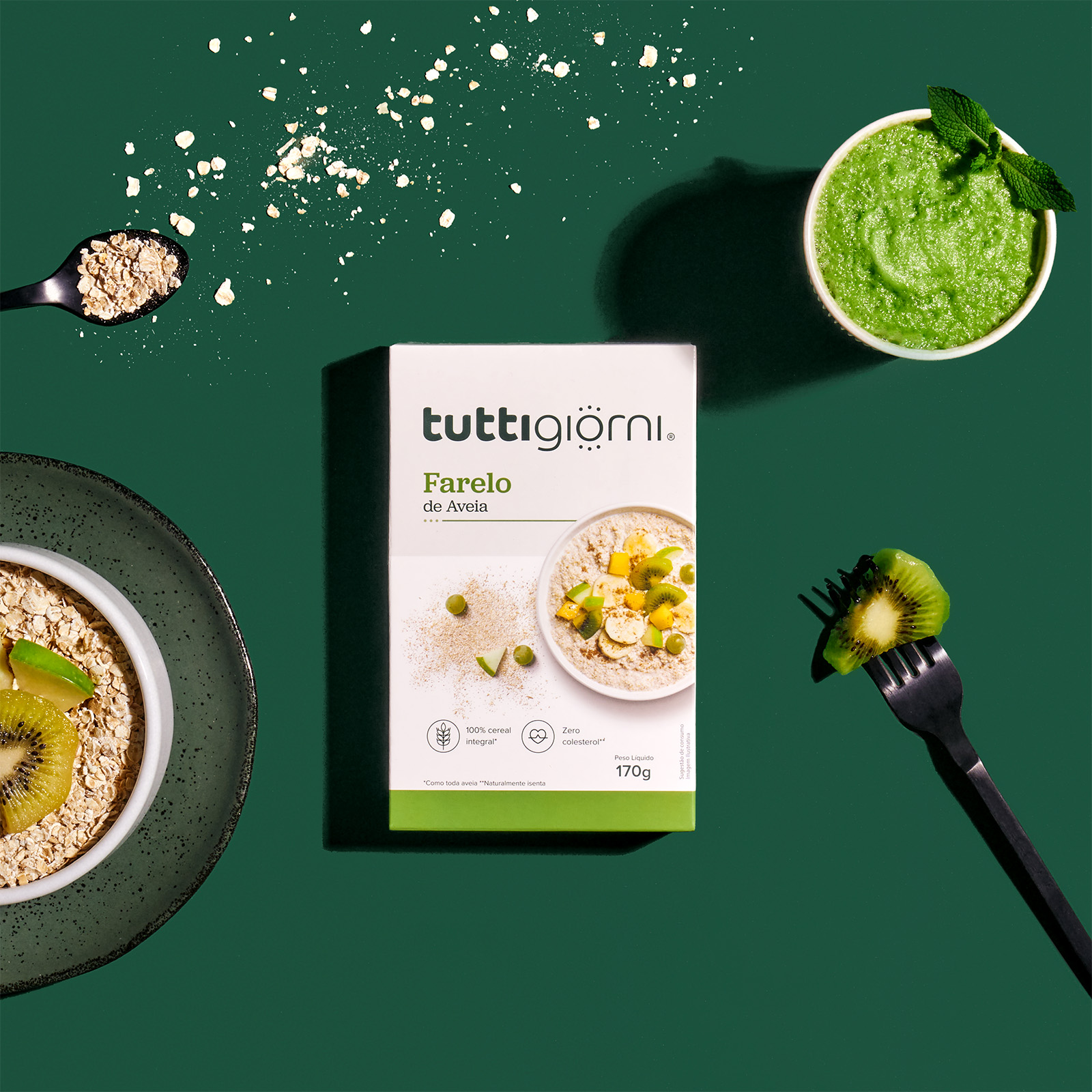
Starting from the meaning of Tutti Giorni - "every day" in Italian -, we looked for universal elements that represented the characteristic of the line of being "for every day, at any time". This concept is materialized in the letter "O" of the logo, which incorporates graphic
elements that refer to both sun rays and clock markings.

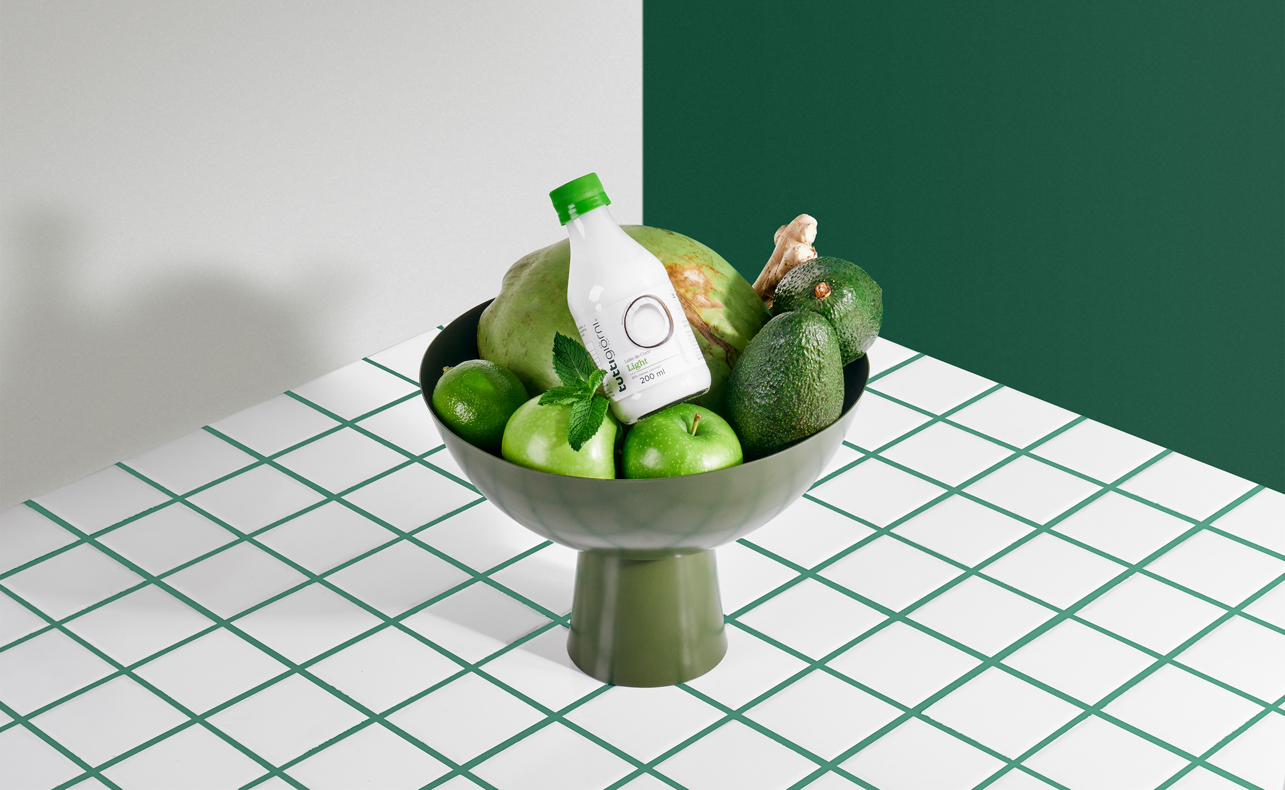
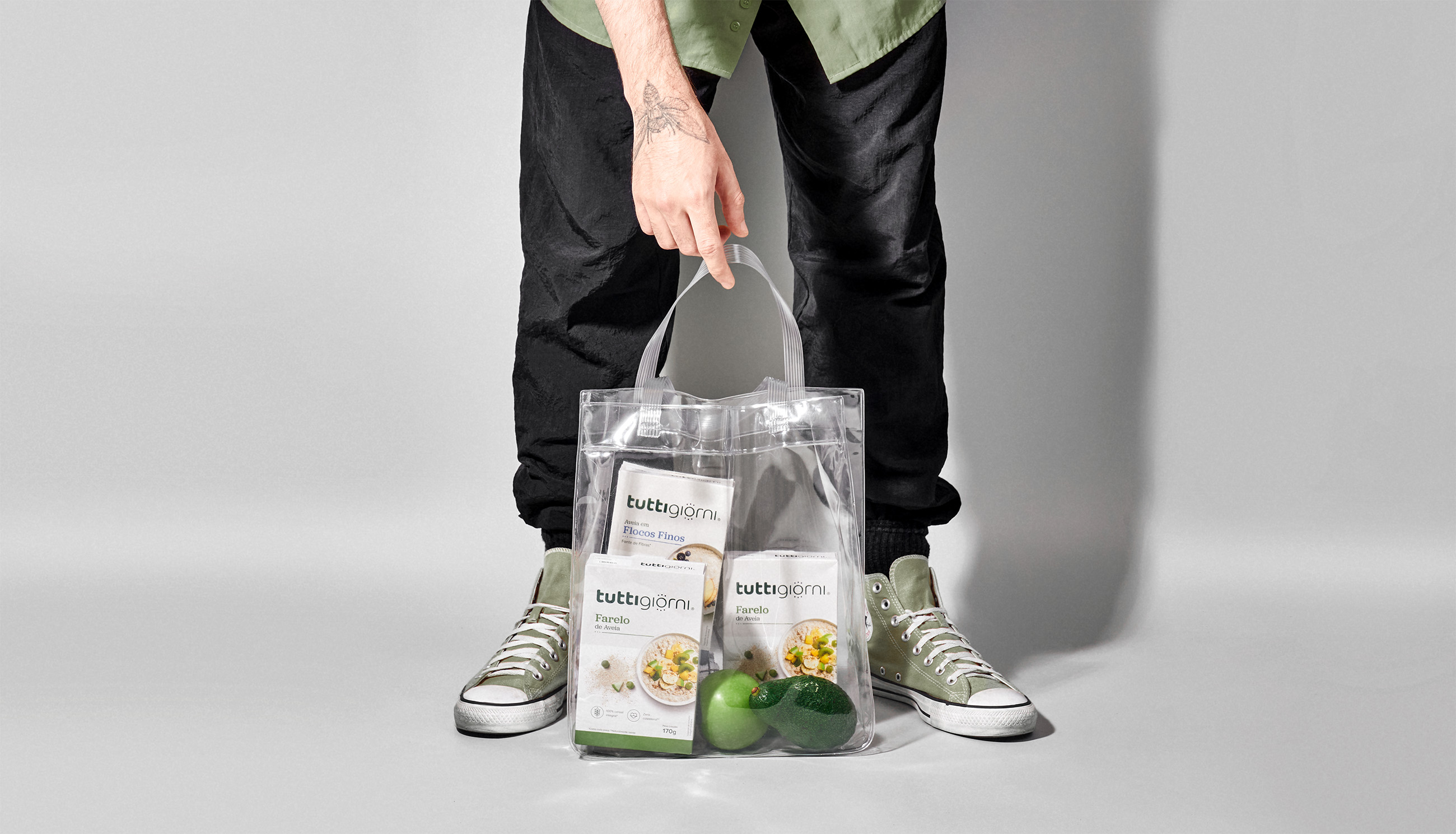
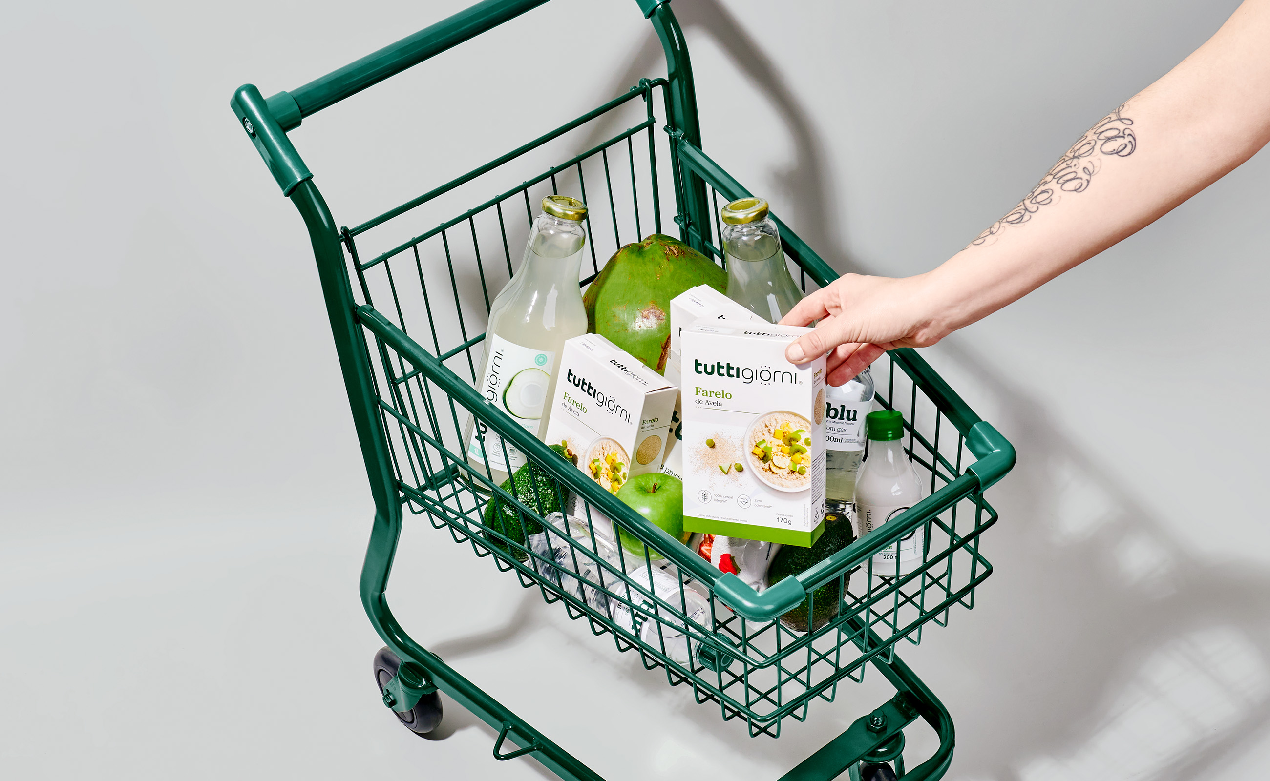
But we don't stop there. The concept is also materialized in the choice and circular application of top view photos that prioritize rounded formats. Strategy that promotes a quick identification of the brand and also of the products by the consumer.
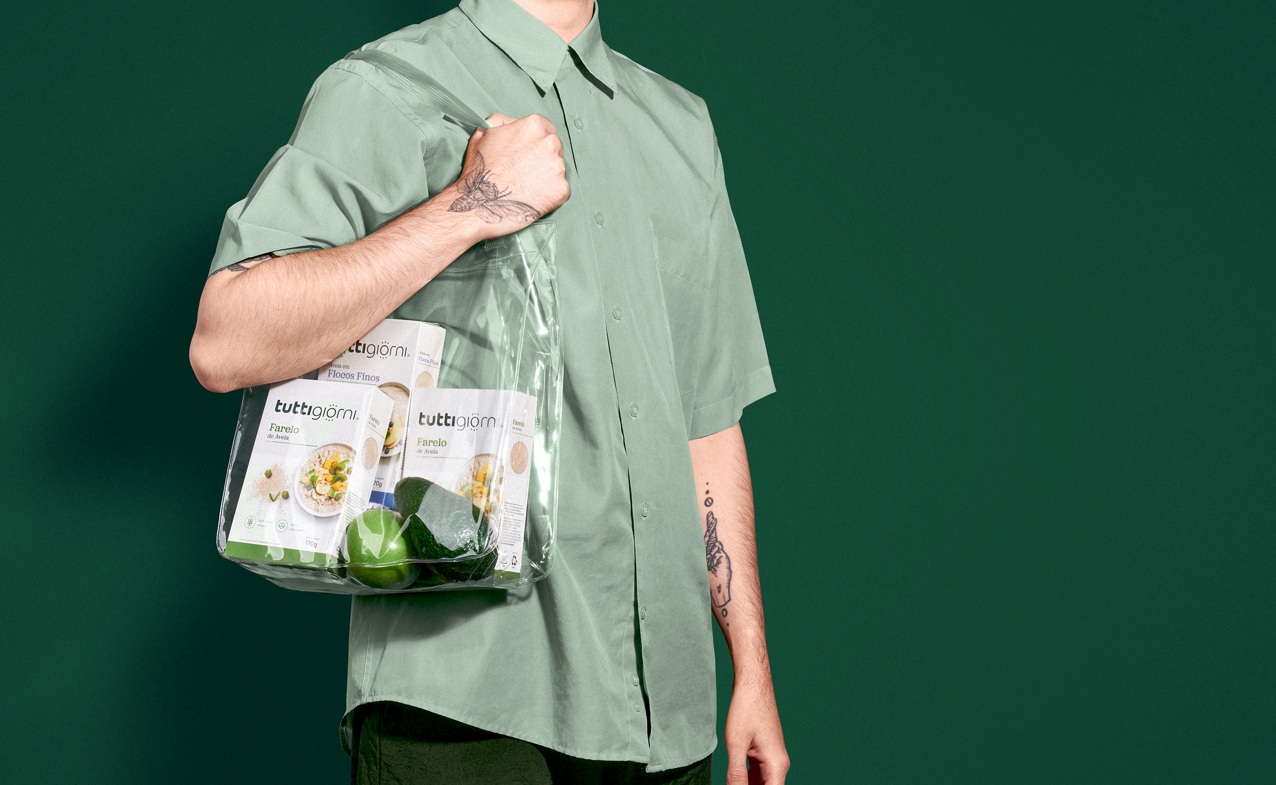
The visual freshness and the association with Italy come from the palette composed of dark green with shades of blue and a cream tone that brings warmth and coziness, in addition to serving as a basis for information and graphics along with white.
TuttiGiorni
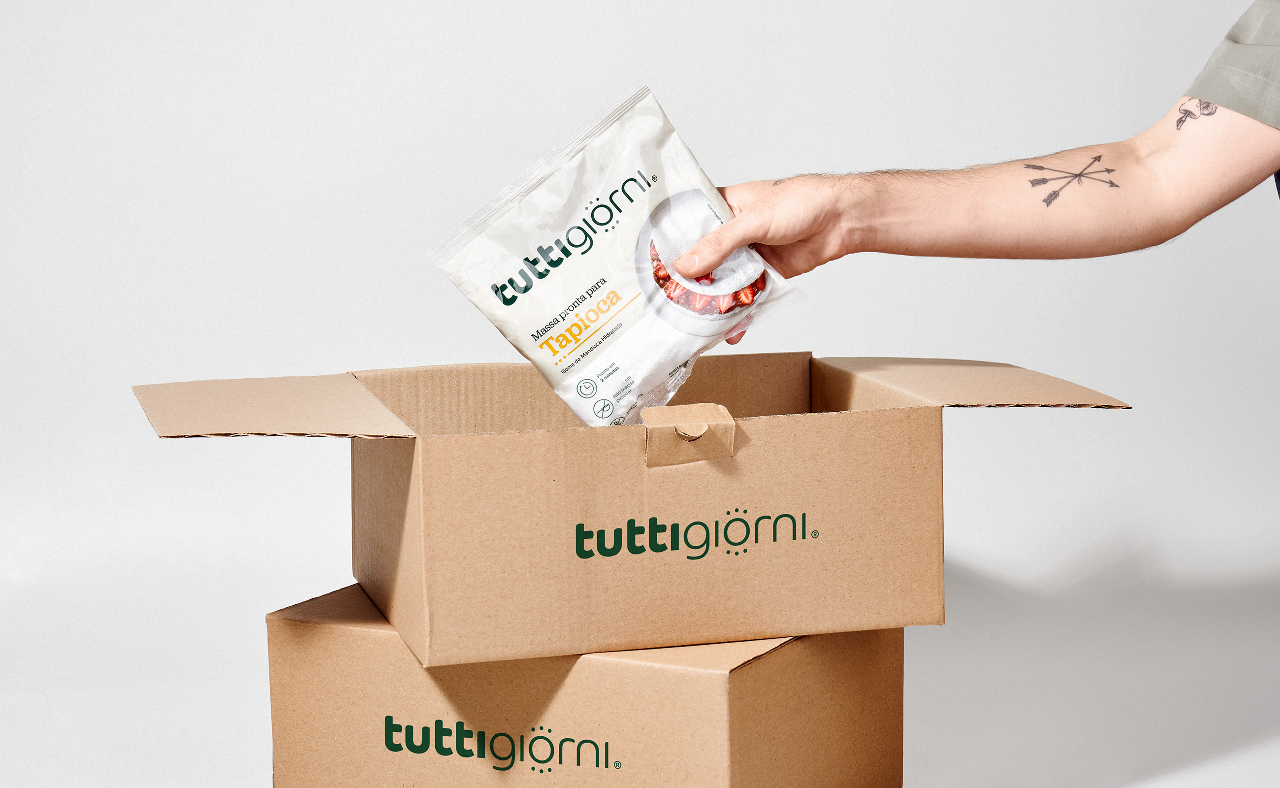
In this way, a highly functional and meaningful brand and packaging system is created.

Need a project?