Gin Brasil
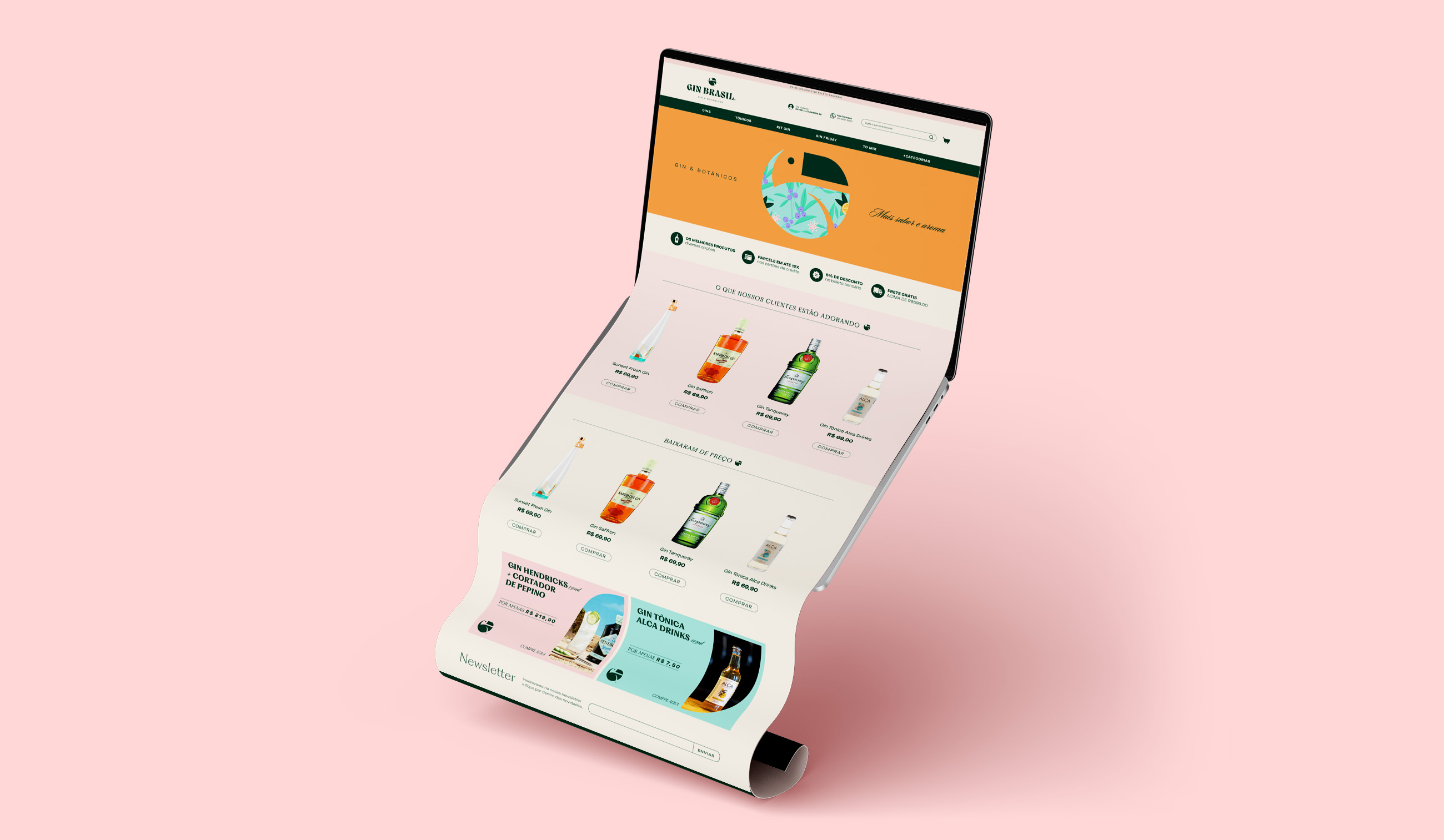
Gin Brasil is an e-commerce company formed by lovers of gin drinks and their botanicals. For the mission of making the world taste the best that this drink can offer, one last harmonization was missing: between the visual identity and the target audience.
Location: Brazil
Role: Branding & Packaging
Date: 2022
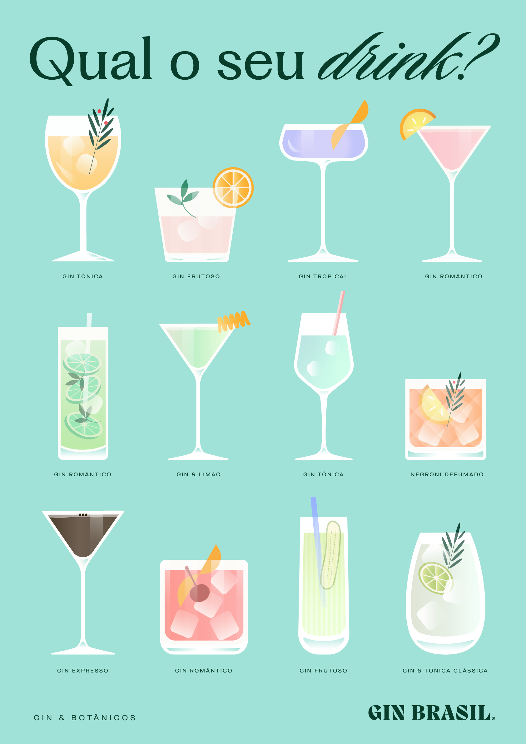
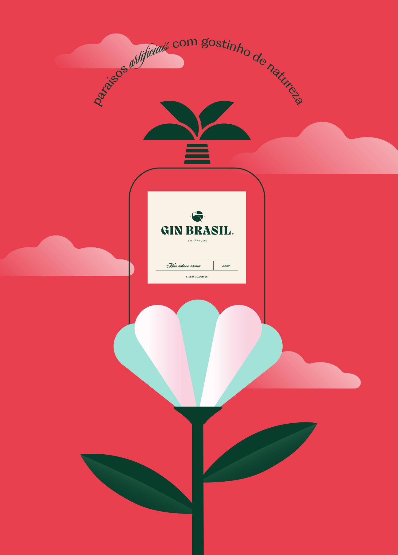
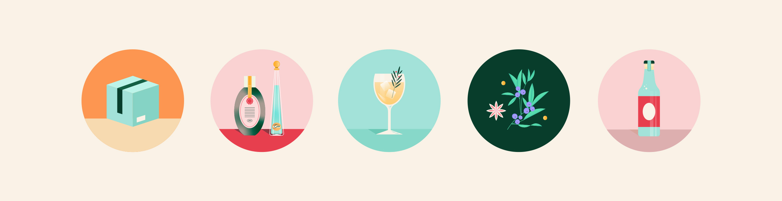
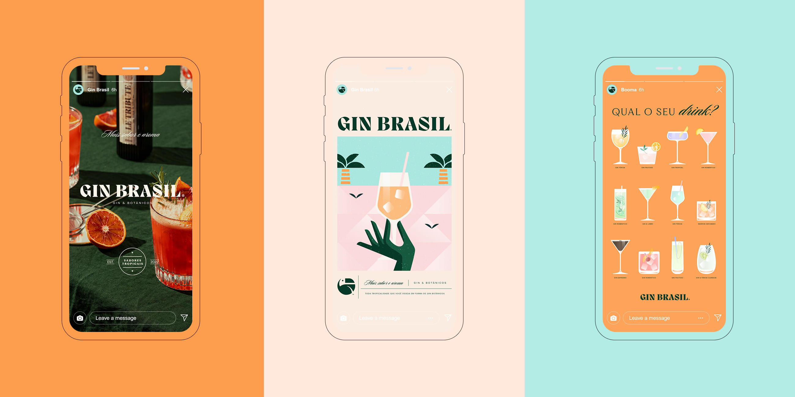
Illustrations
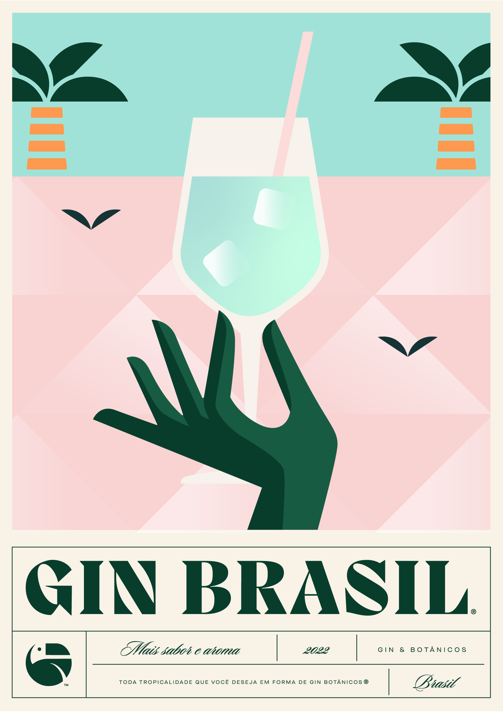
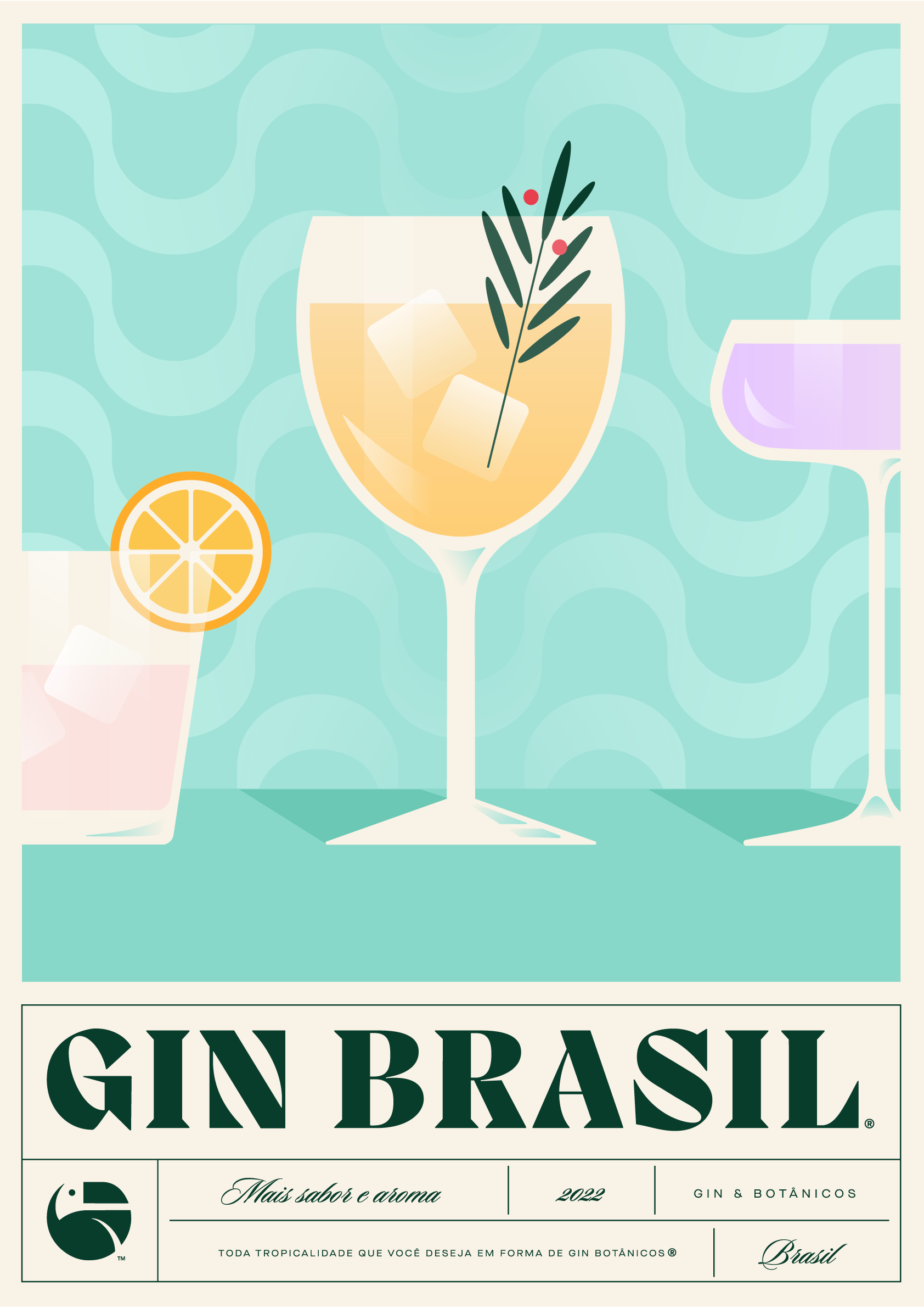
A blend of vivid colors, illustrations, and images, because the only thing gin is not is sober.
Challenge
The main challenge here was to refresh its visual identity so that the brand became more attractive and closer to its 80% female audience between 25-44 years old. By understanding the visual standardization among others beverage e-commerces in sober tones and rustic aesthetics, we knew that stepping out of this zone was our first move.
Solution
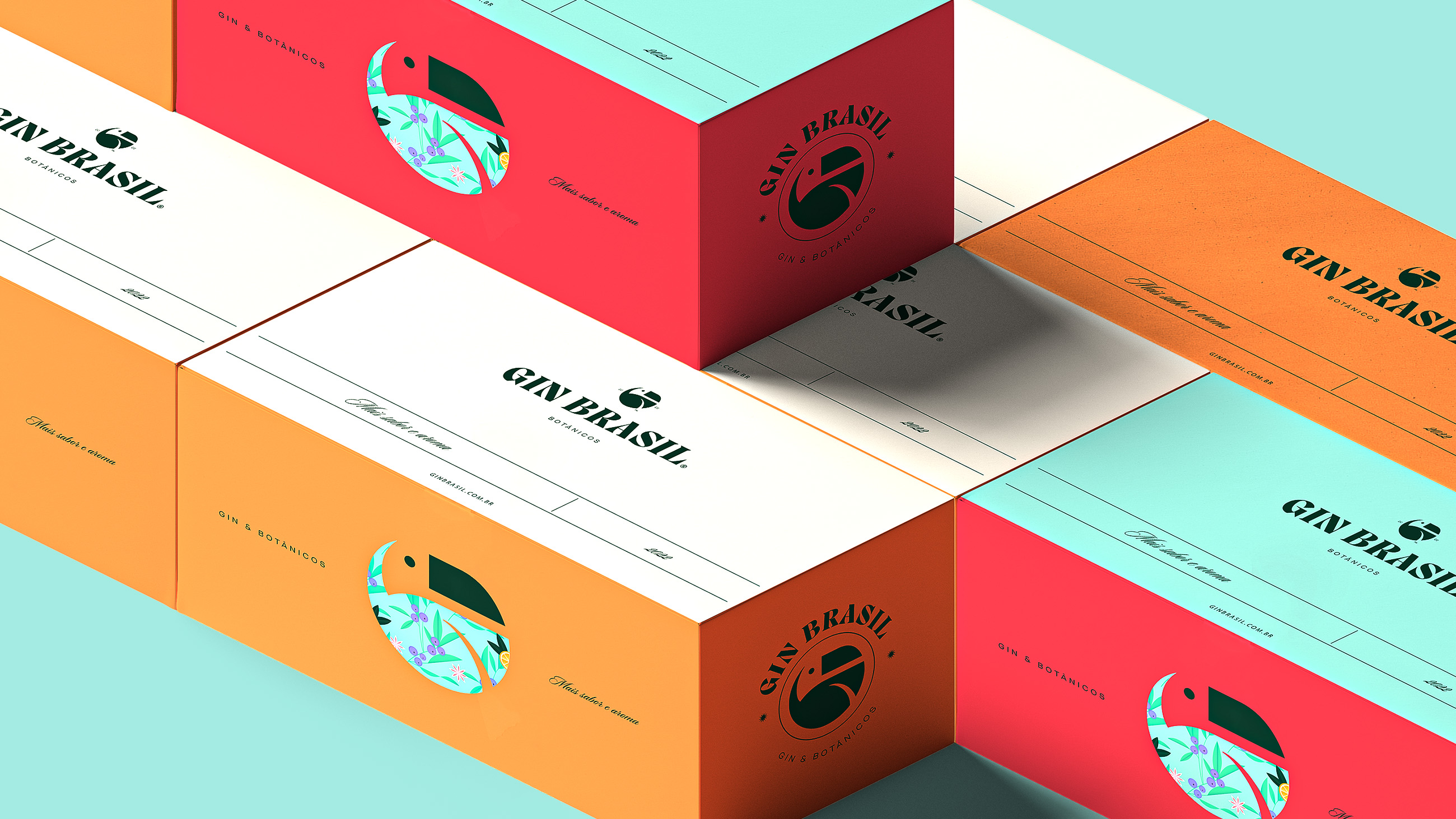
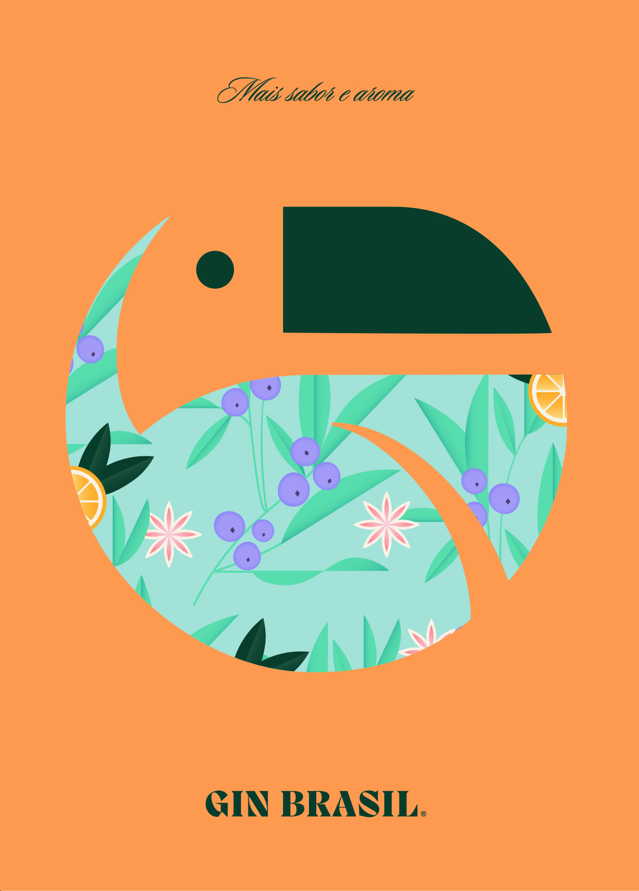
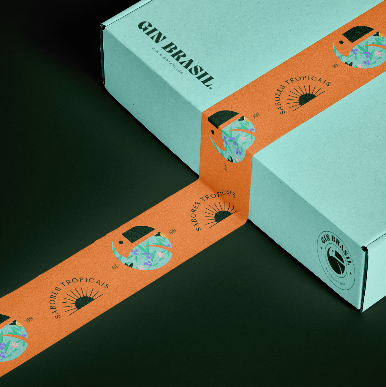
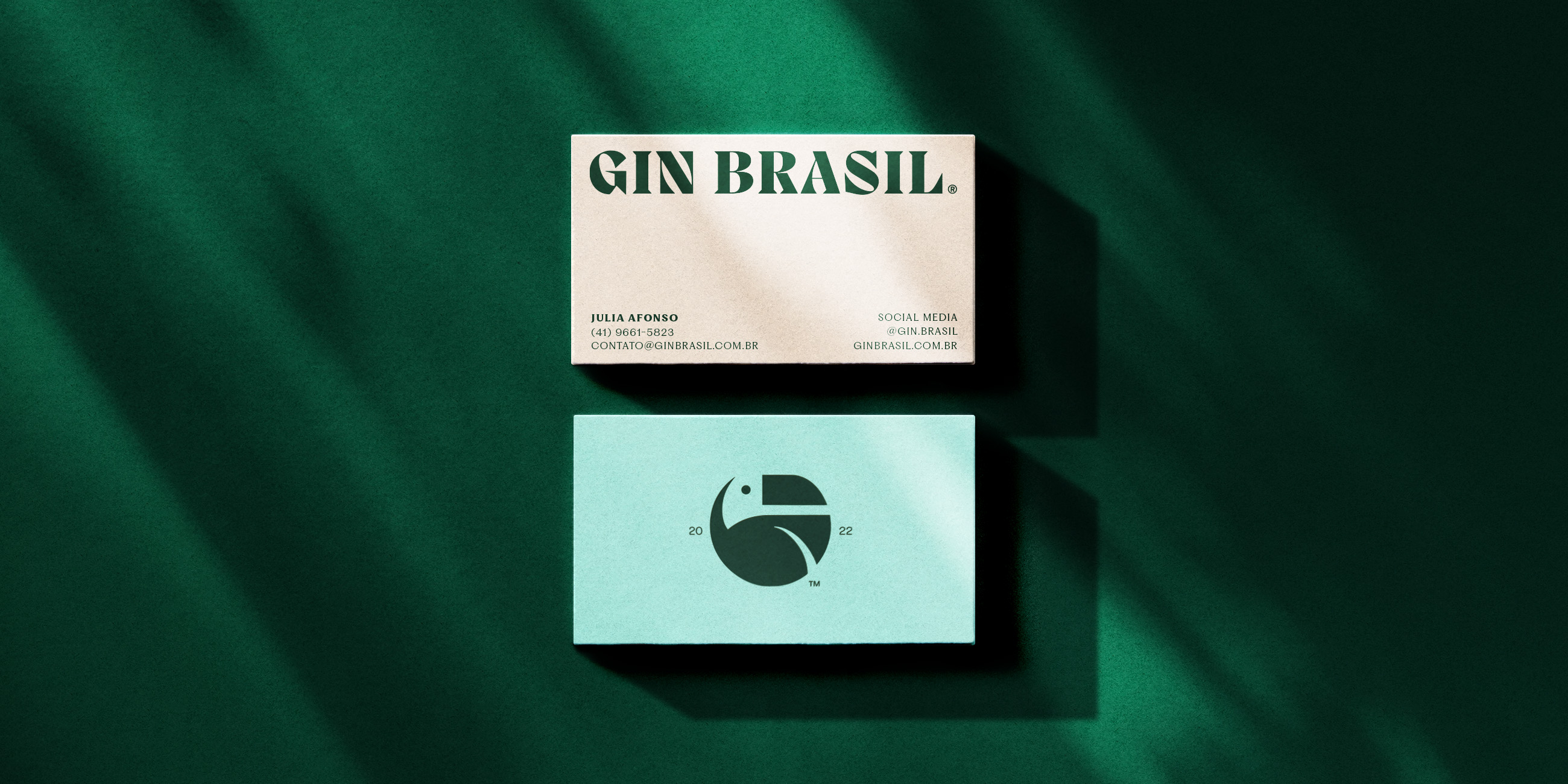
For Gin Brasil's new identity, we brought the tropicality of the name to the brand's visual universe as well. We transformed the famous and elegant tropical bird into a G, uniting in the gin universe with the tropical and botanical spirit that the toucan evokes.
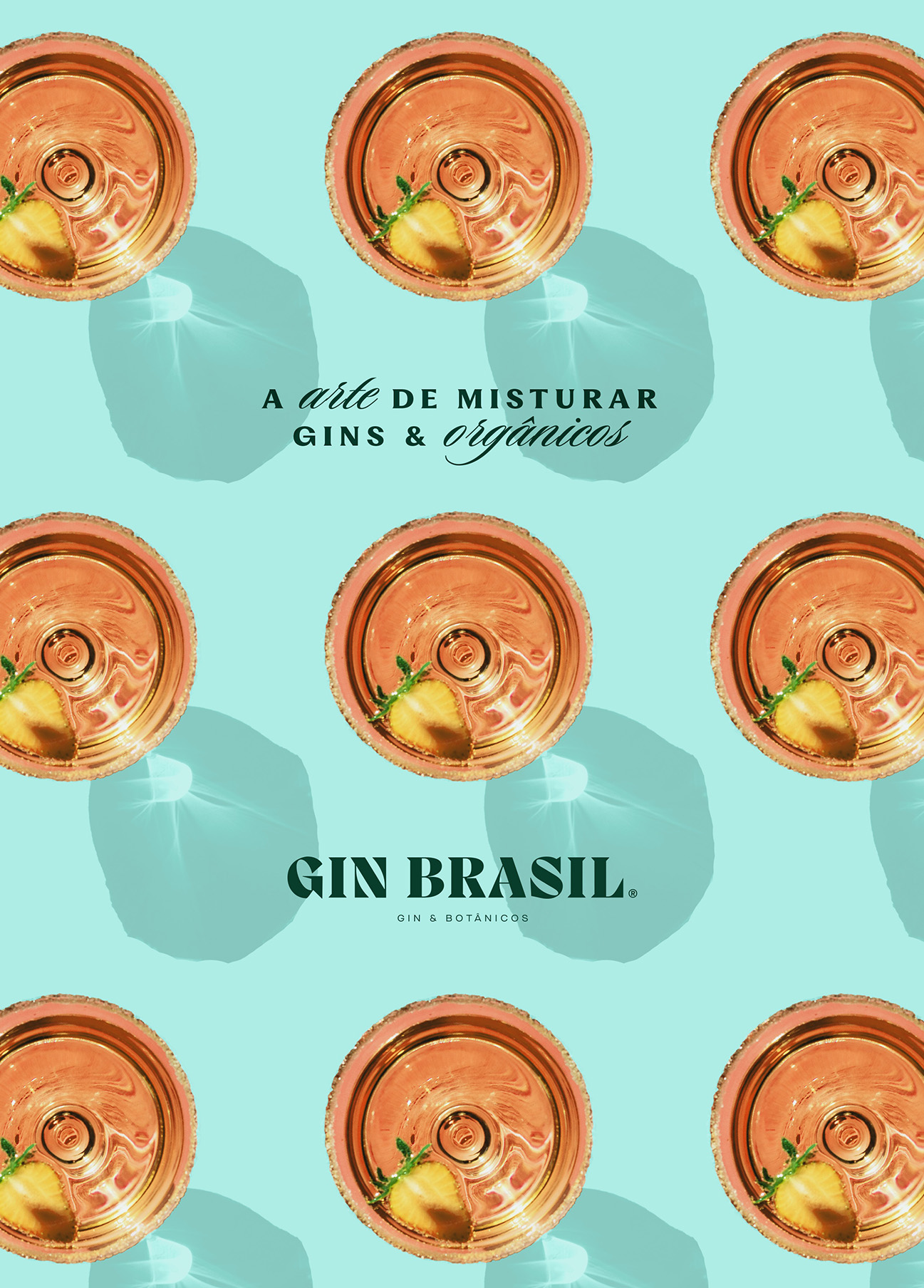
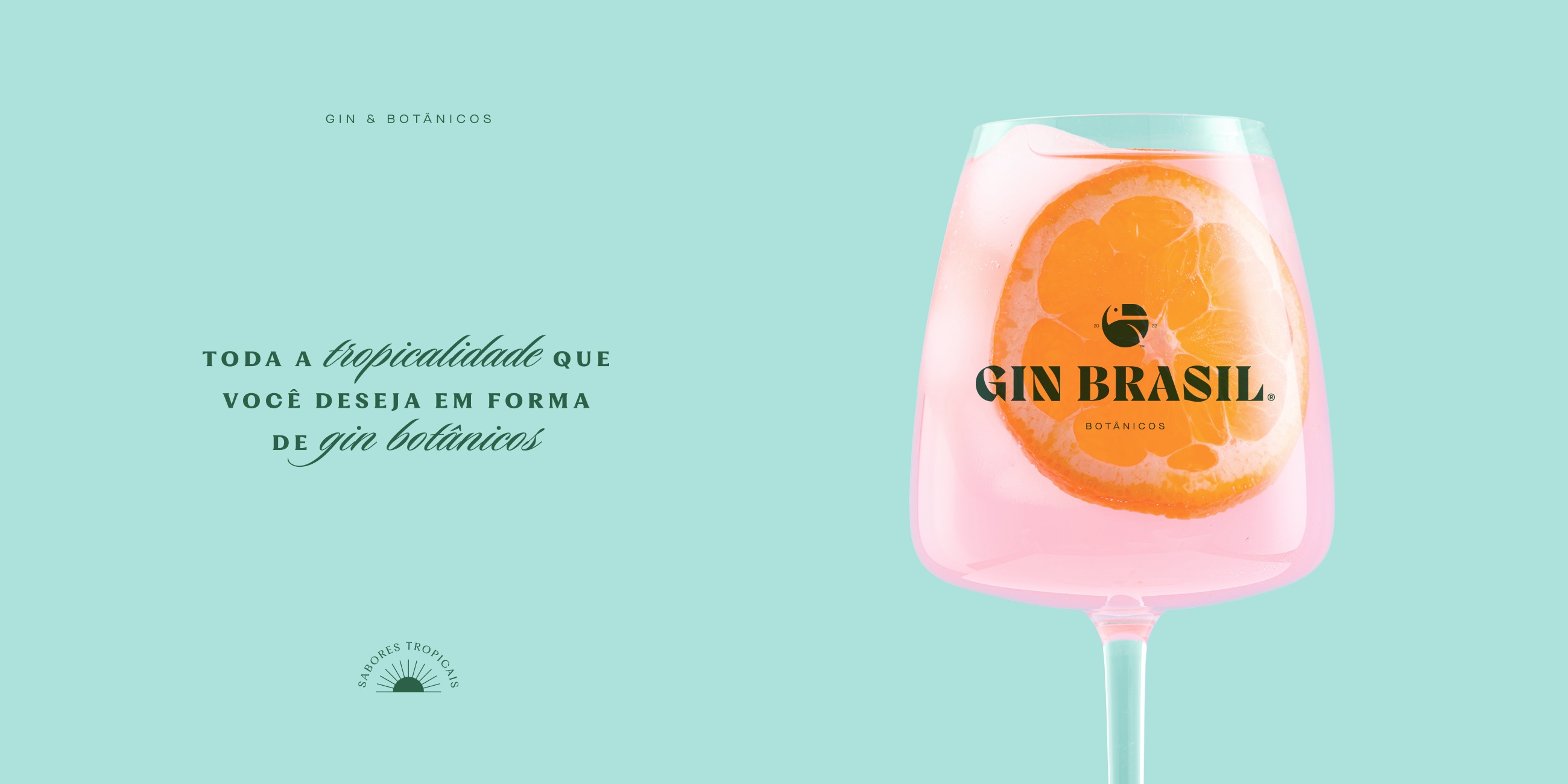
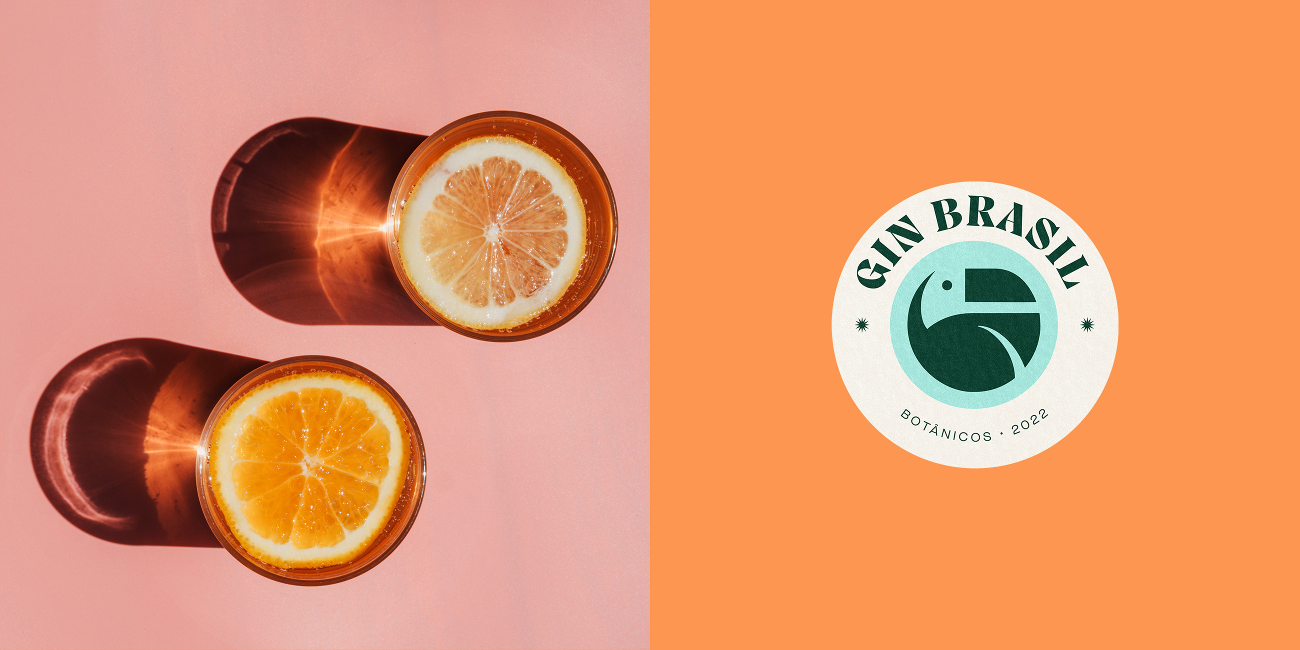
The color palette was chosen to bring freshness and sophistication in a unique and robust composition of blue, orange, pink, red, off-white and dark green.
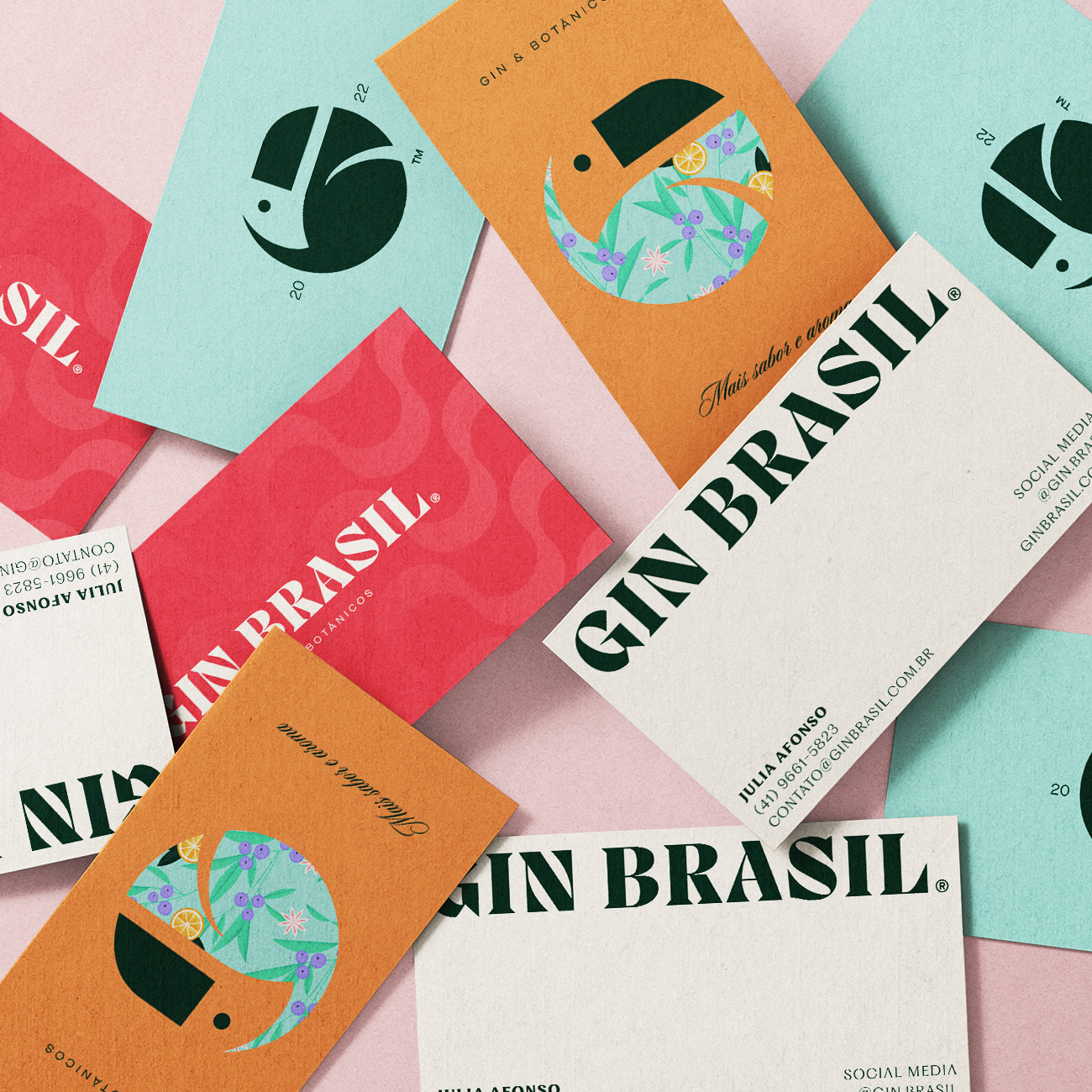
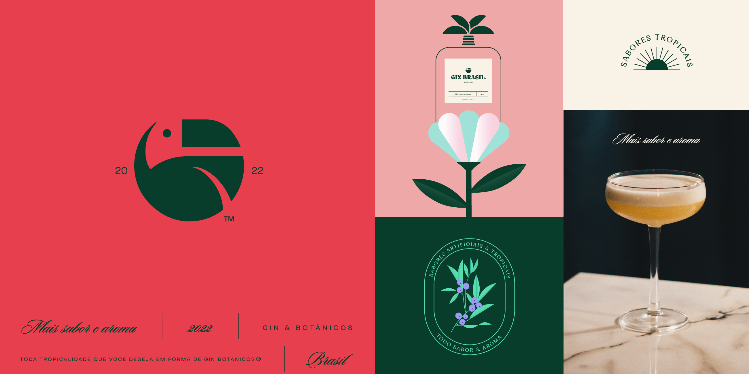
Blue is reminiscent of the sky and the ocean, orange and pink are reminiscent of sunset colors and red is connected with flowers and different fruits that nature presents us with. Off-white and dark green, on the other hand, bring contrast and intensity, as we find in the toucan.

Need a project?