Polarwise
Polarwise is a company specializing in anti-sweating solutions that truly work. To better connect with the 18 to 35-year-old audience, the rebranding of its visual identity and packaging needed to convey an authentic and bold narrative.
Location: Netherlands
Role: Branding & Packaging
Date: 2024
Context
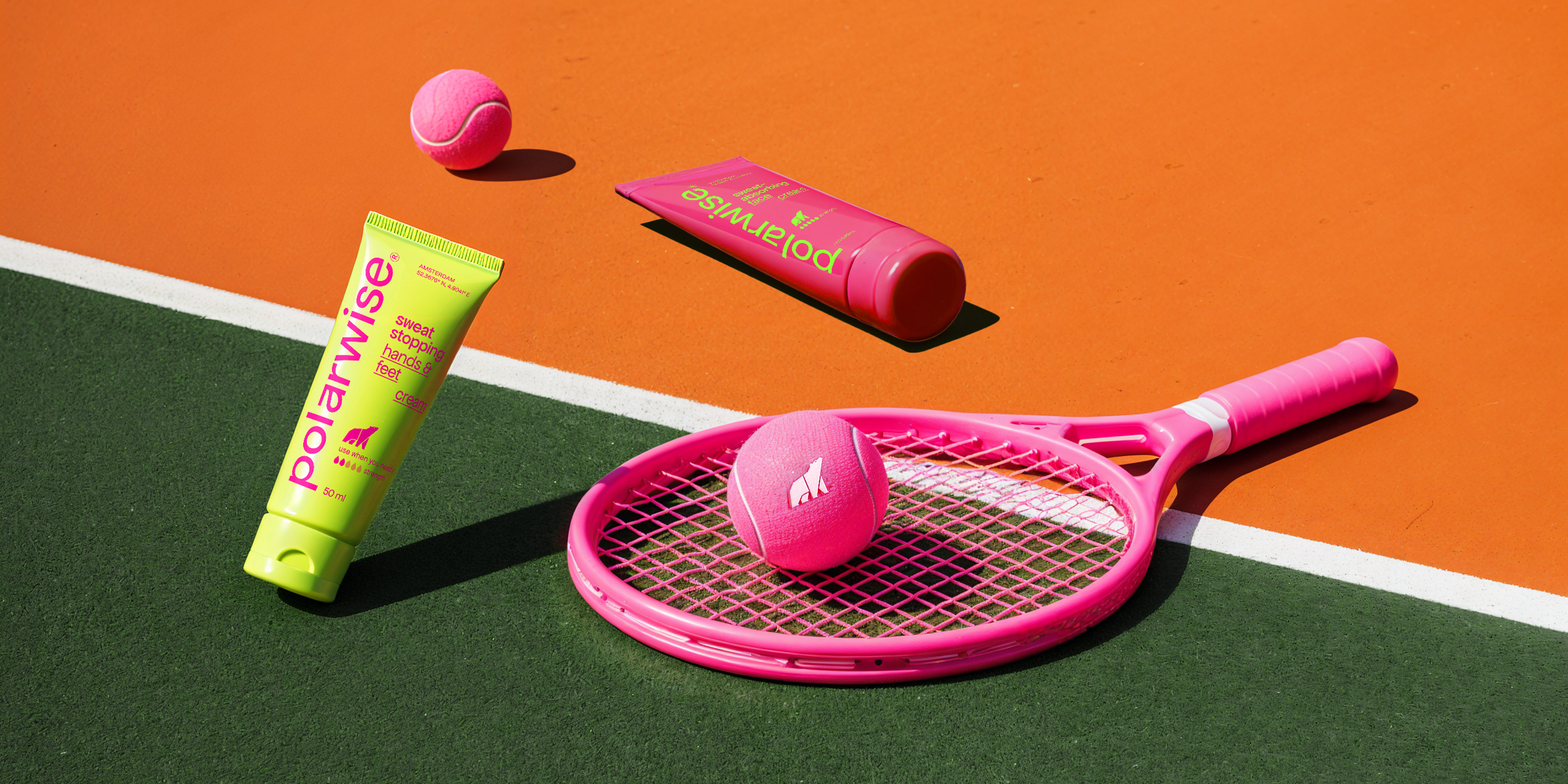
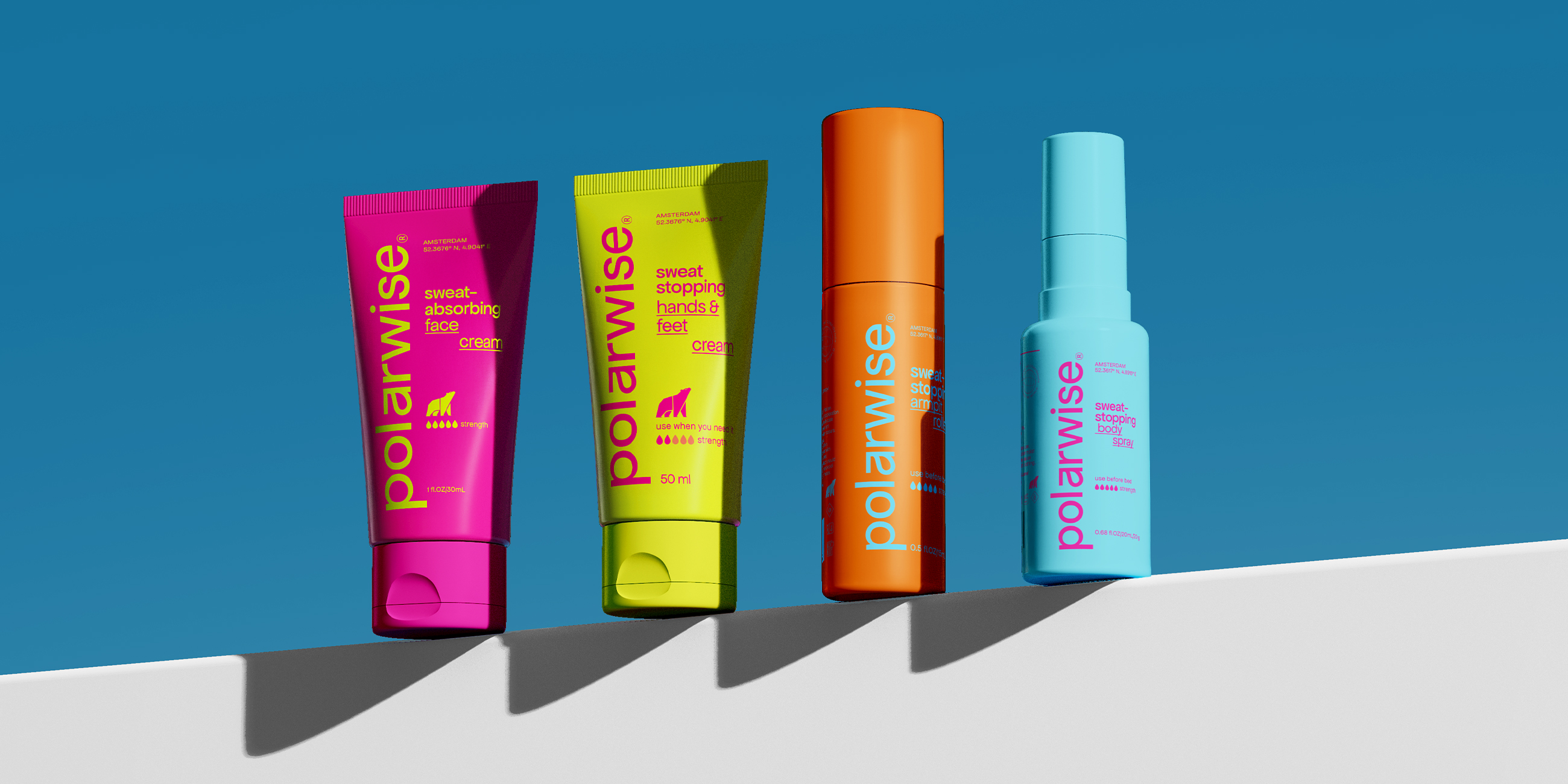
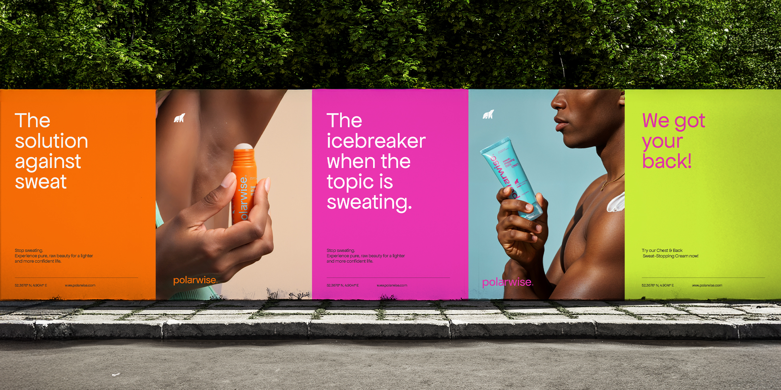
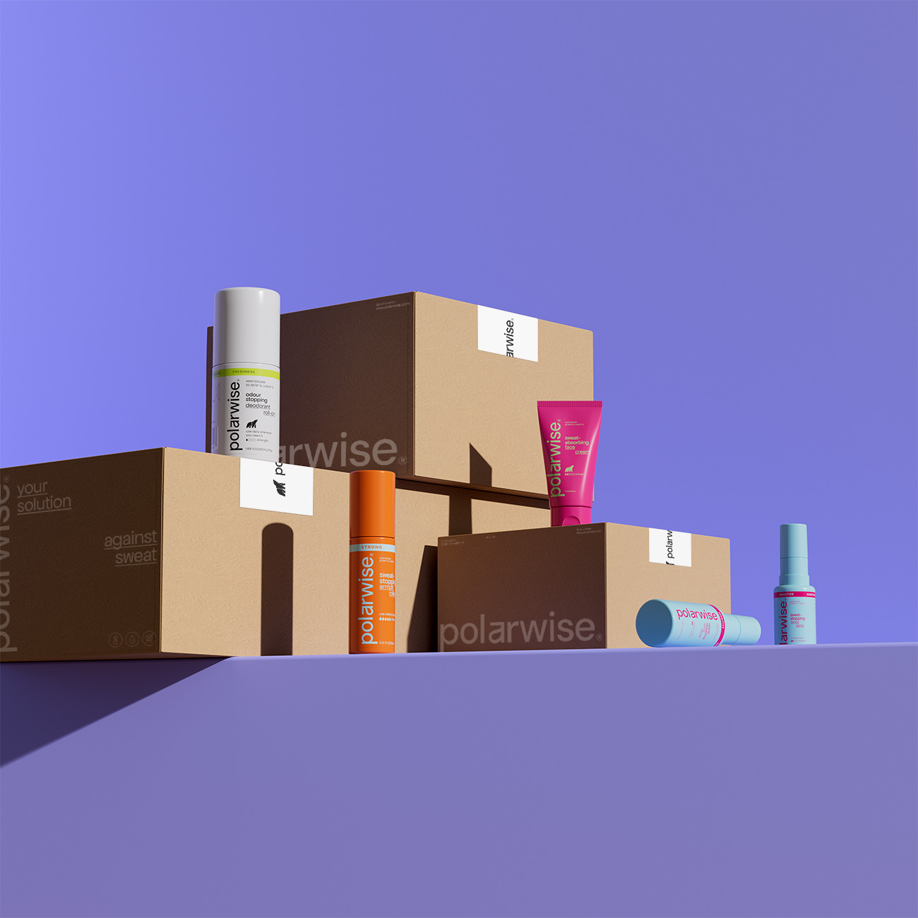
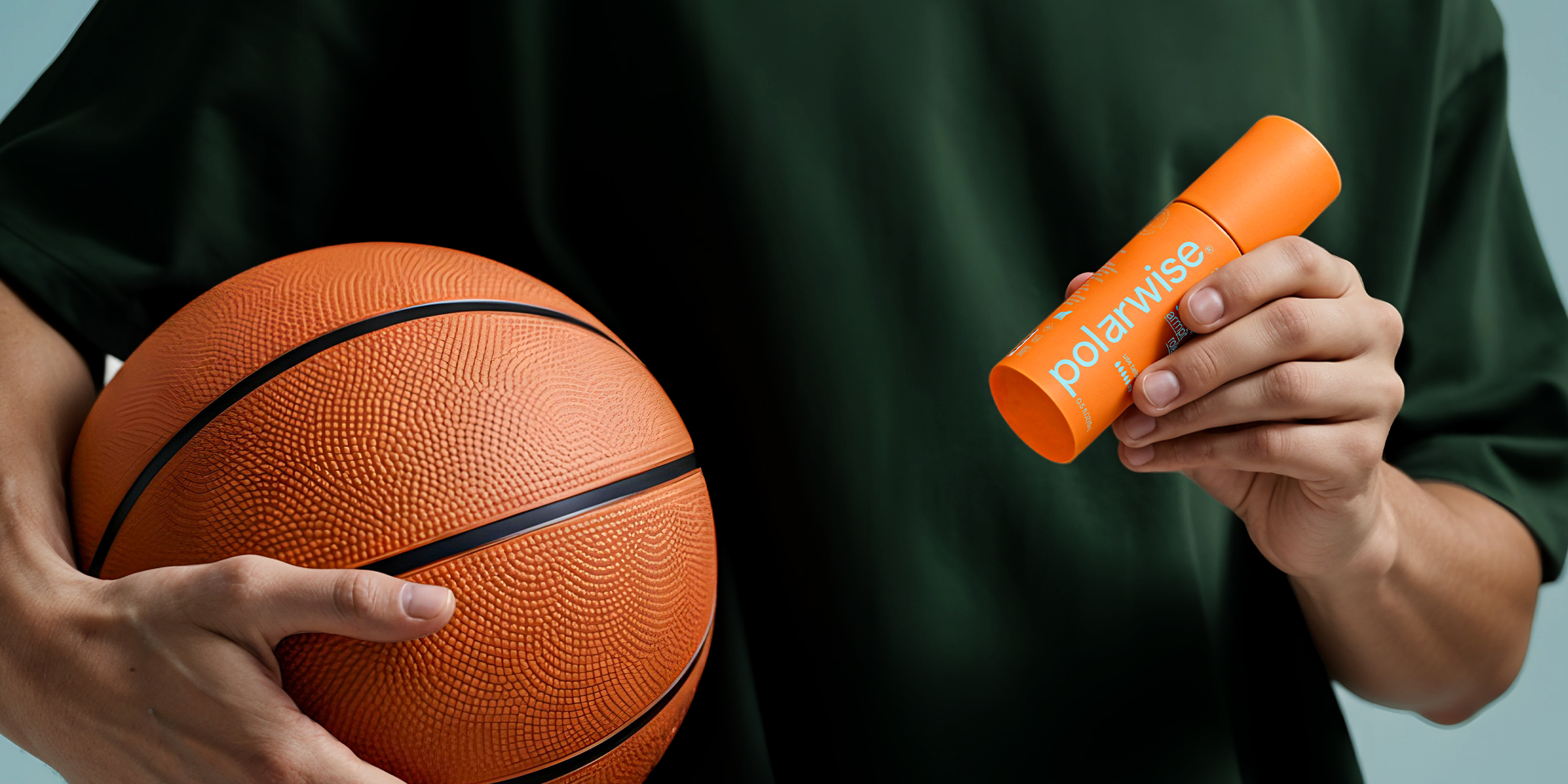
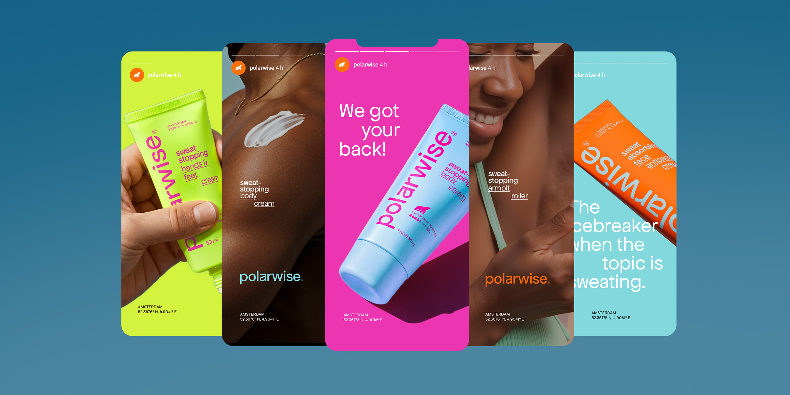
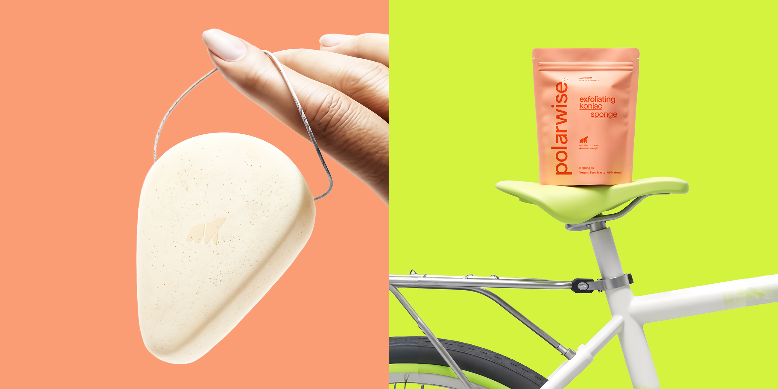
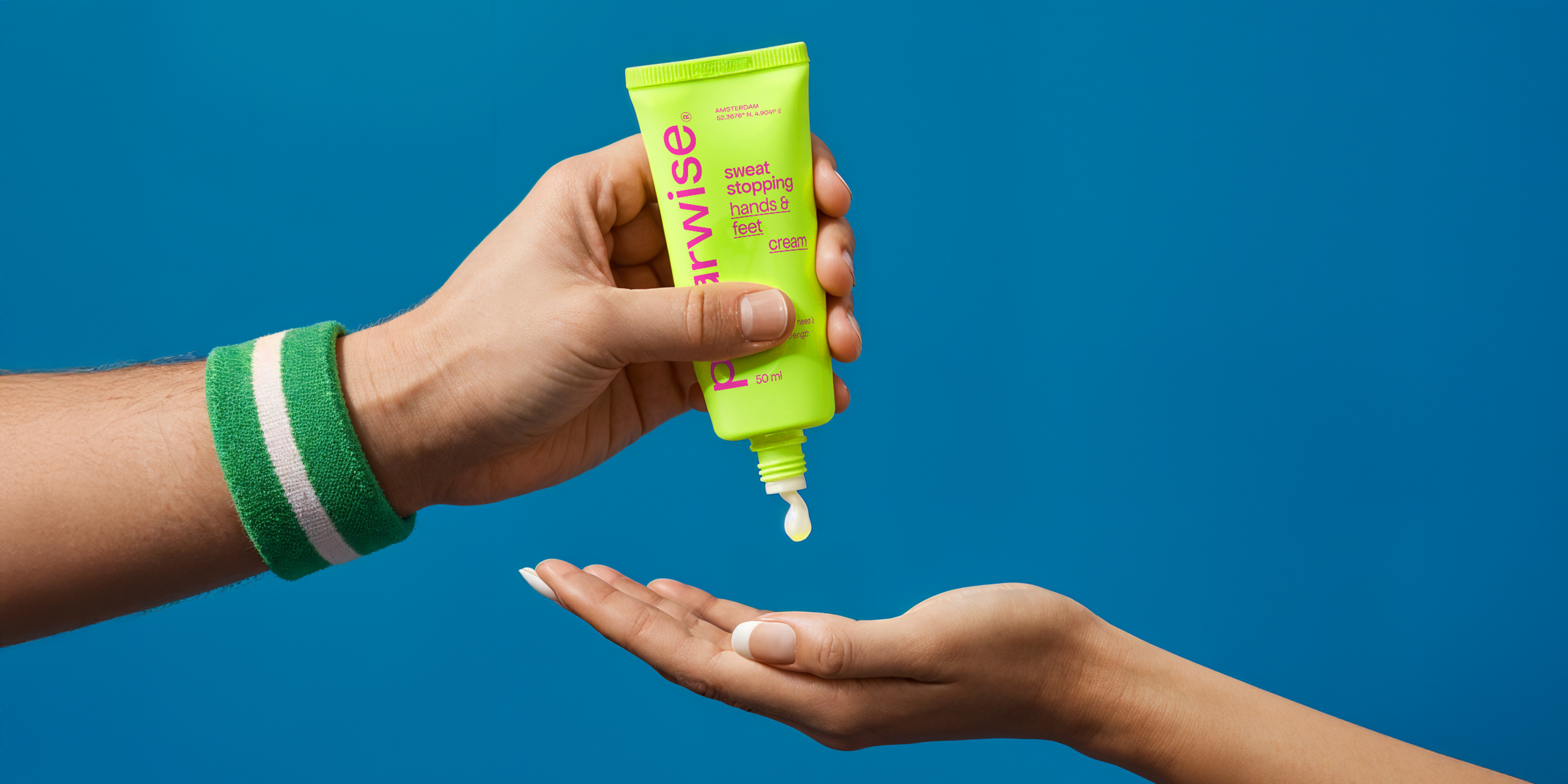
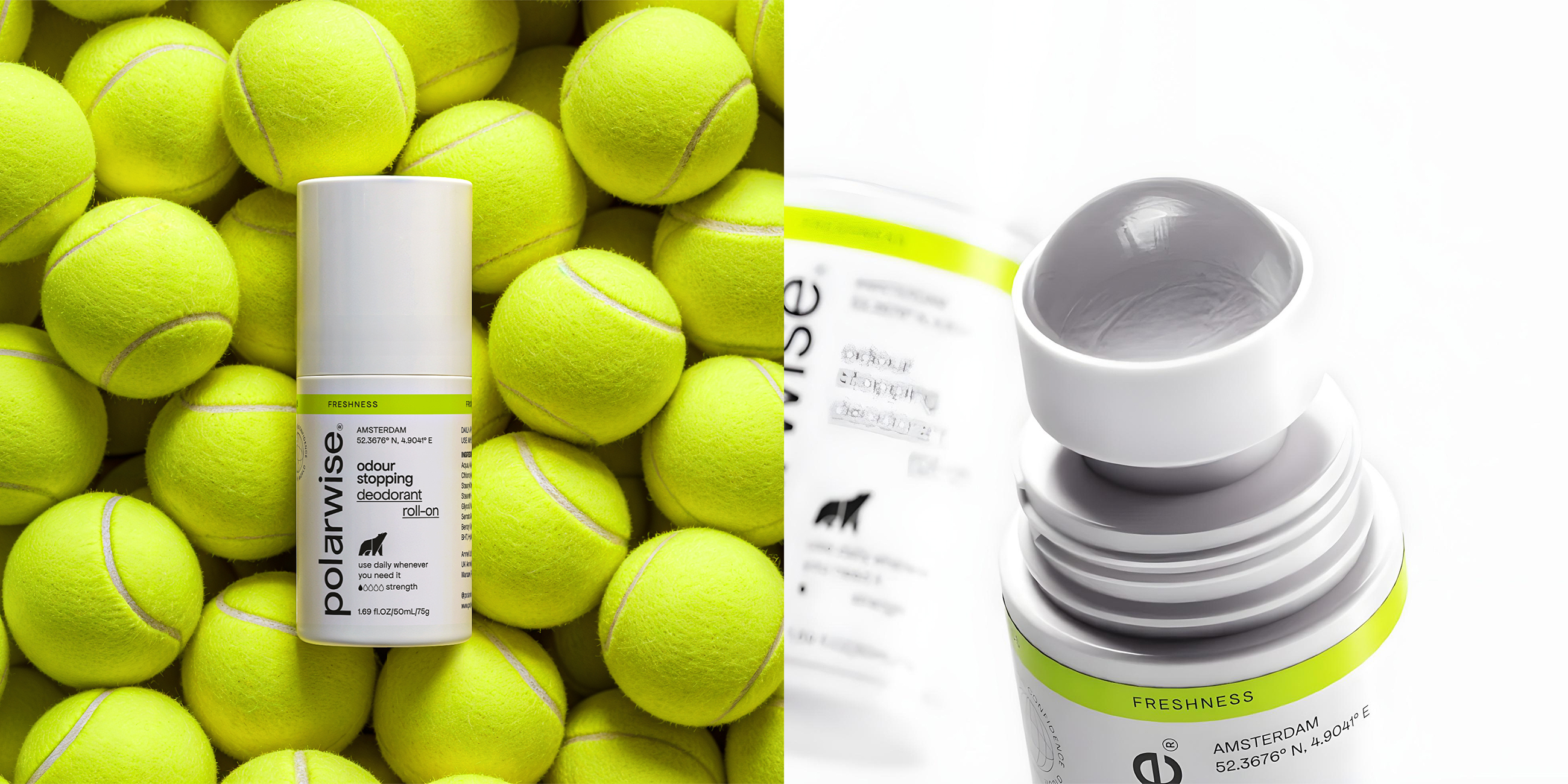
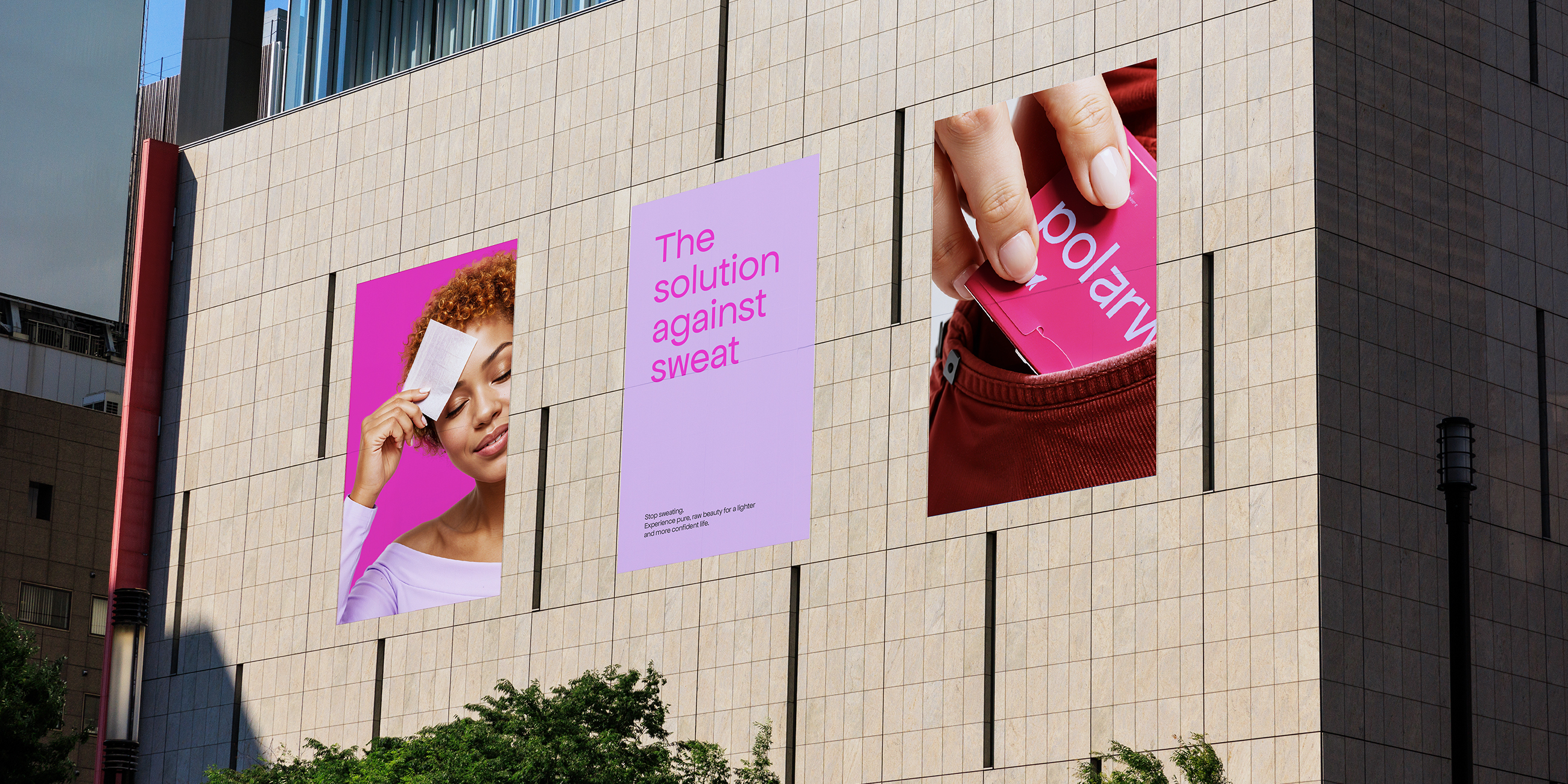
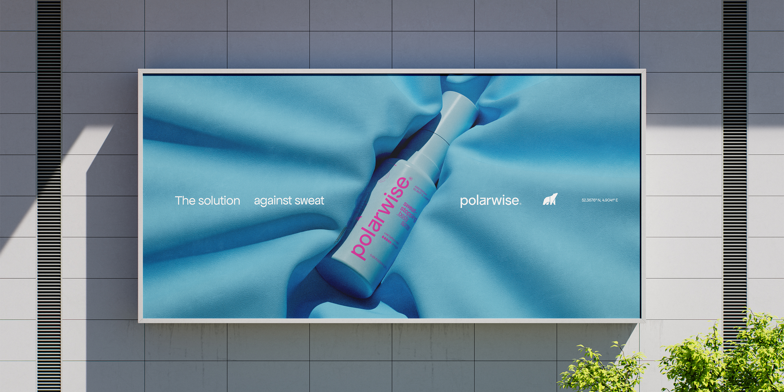
The approach focused on materializing the product’s power and the confidence it instills in customers. As a result, the rebranding features a daring combination of contrasting colors, a proprietary logotype with a hidden drop inside, and a contemporary typography composition on the packaging. This way, the packaging stands out - from social media feeds to store shelves - with a visual that boldly contrasts the clinical look of competitors.
Solution
With the mission to instill confidence through design, the rebranding set out to color boldly the old black & white aesthetic and rewrite the brand name with a unique character. After all, it’s a brand for those who hold their heads high - just as the project transformed the polar bear mascot, once bowed, now standing tall and confident.
.
The new logotype, defined by a strong yet simple style, is enriched by a unique personalization that features an “easter egg”: a subtle drop integrated into the letter A.
Color Coding
The contemporary typographic design is combined with vibrant and contrasting colors, creating a unique and proprietary personality for the brand. In this way, the packaging manages to stand out - from social media feeds to store shelves - with a visual that contrasts with the clinical look of competitors, connecting the brand with a young and discerning audience hungry for authentic narratives.
.

Need a project?