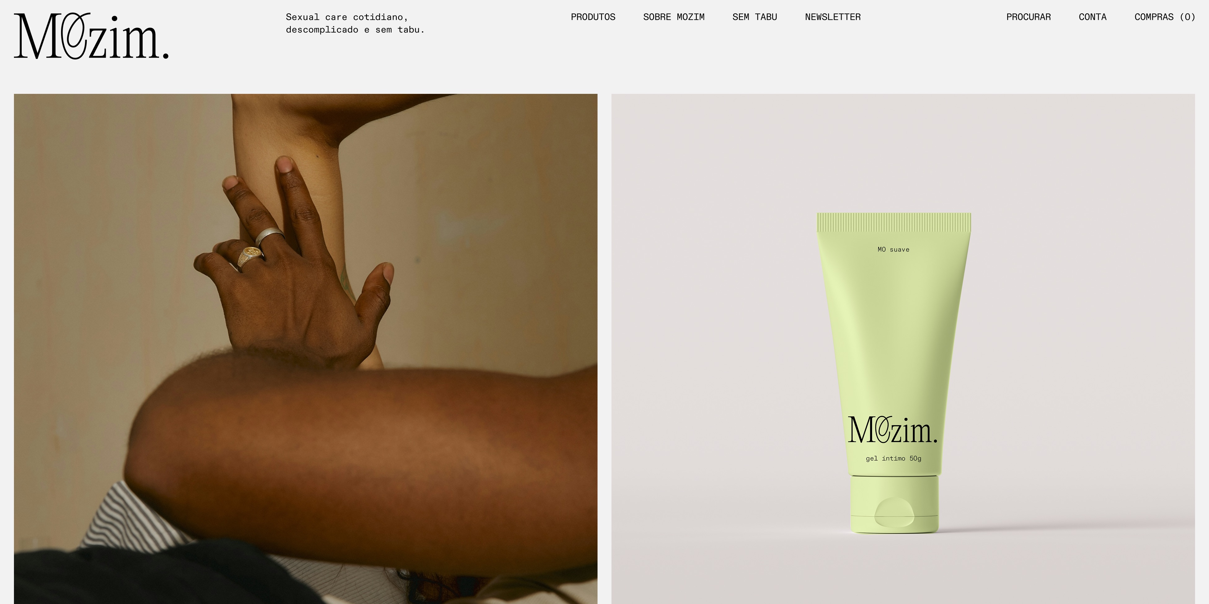
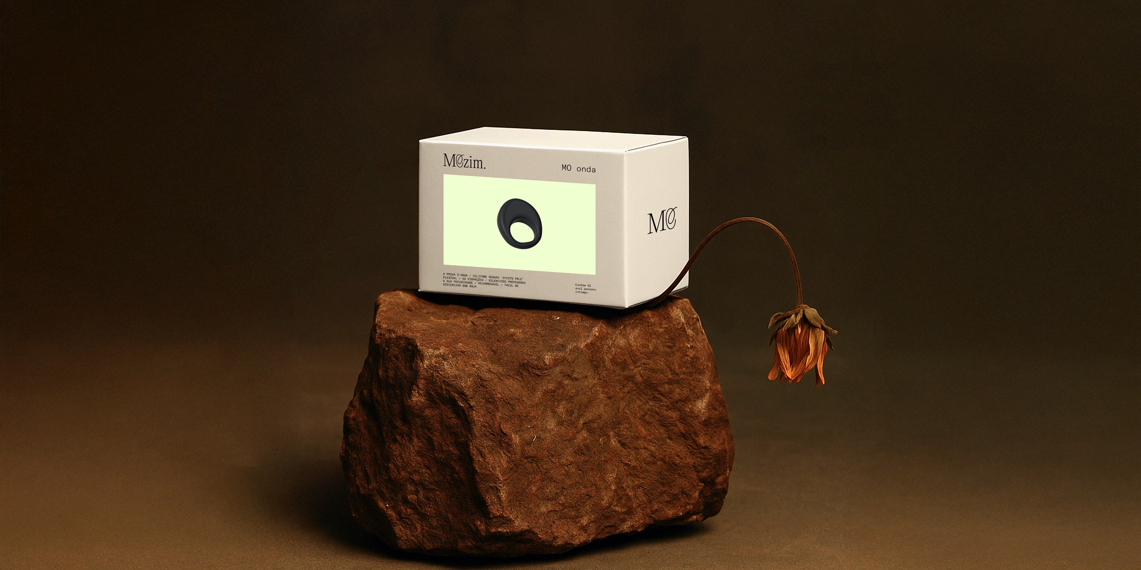
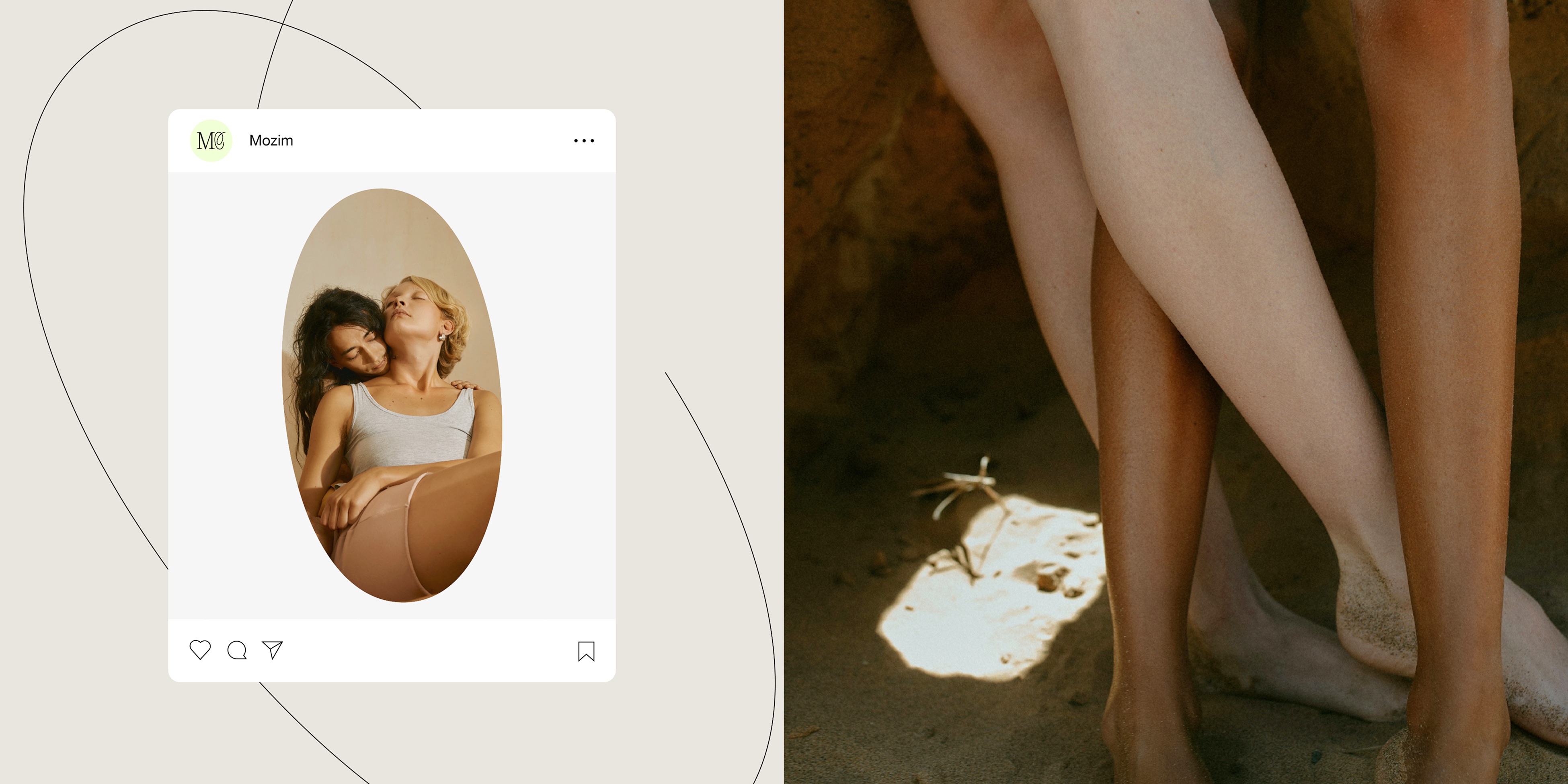
Mozim
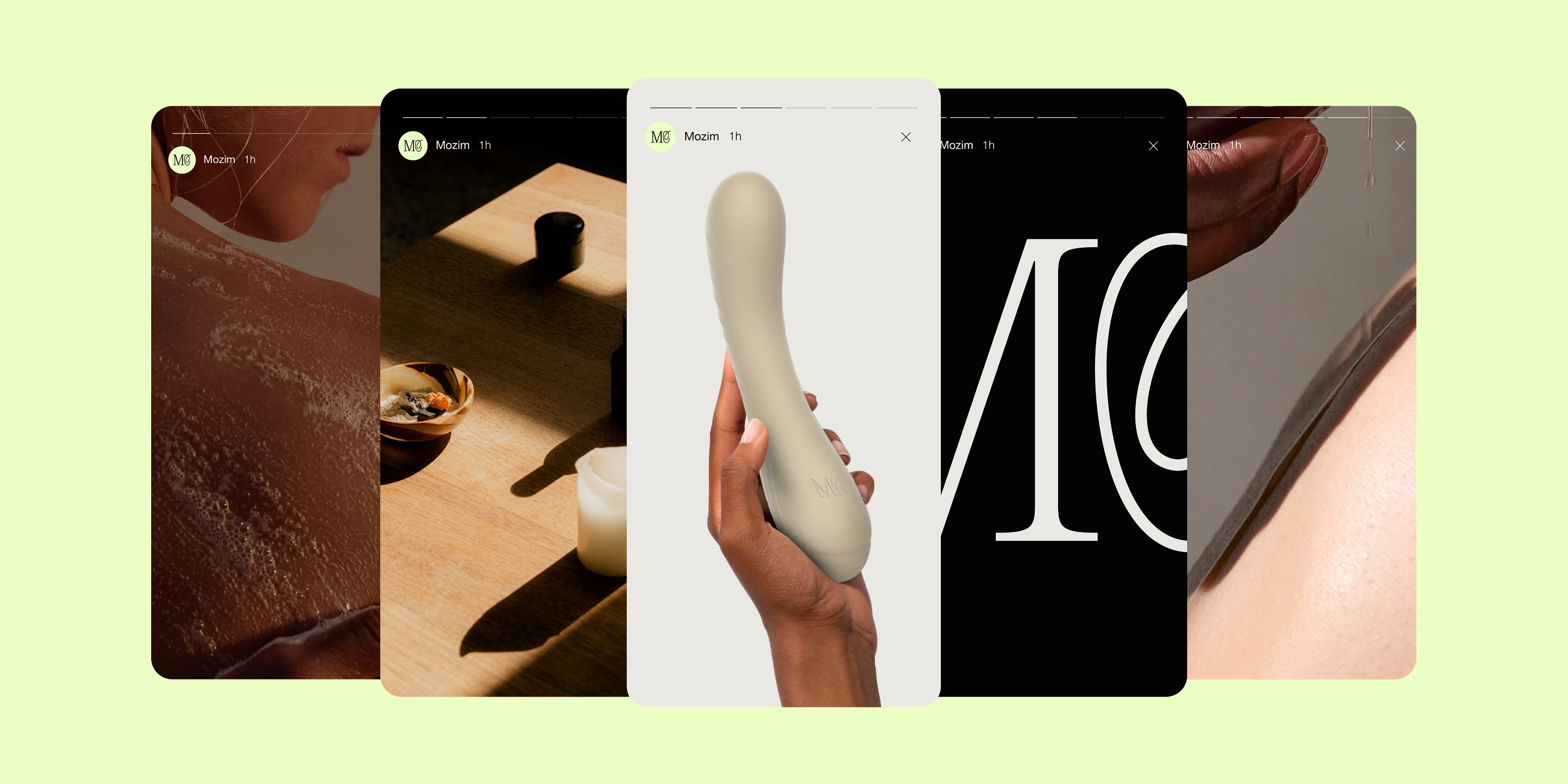
Mozim is a sexual care brand that’s uncomplicated and free of taboos. With high-design, minimalist toys and intimate cosmetics, it promotes confidence and well-being in a light, practical, and everyday way.
Location: Brazil
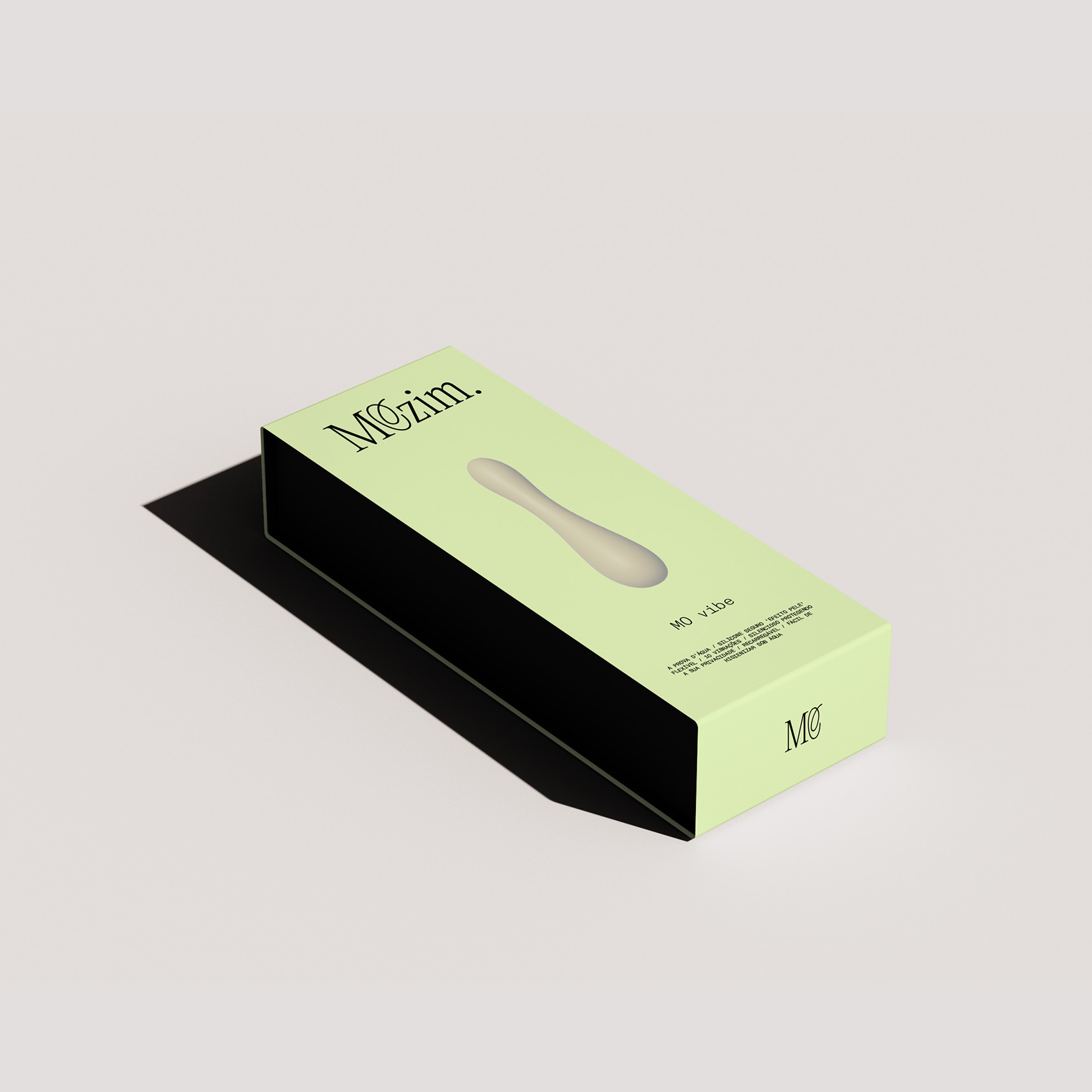
Role: Branding & Packaging
Date: 2025
Context
The challenge was to translate the brand's essence into a visual identity that balances elegance and modernity, communicating connection, expression, and sexuality in a light, accessible, and taboo-free way. The concept speaks to consumers who see design as an extension of their lifestyle — practical, sophisticated, and with a subtle touch of luxury.
Solution
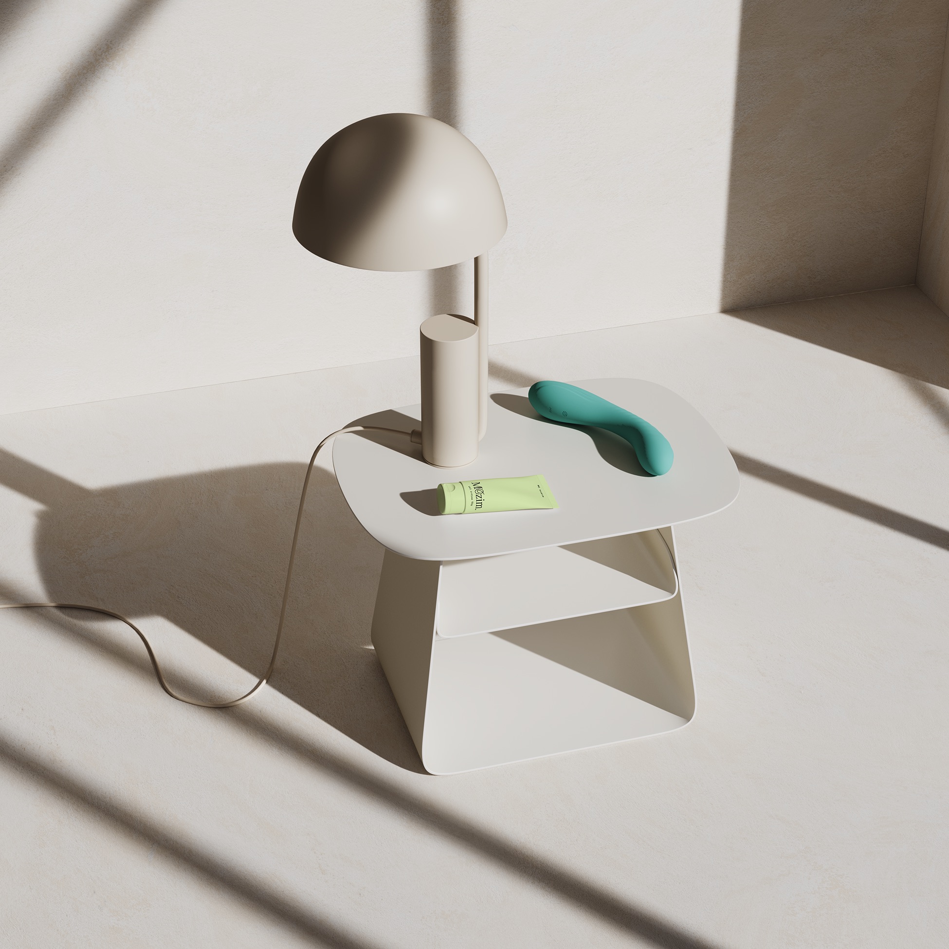
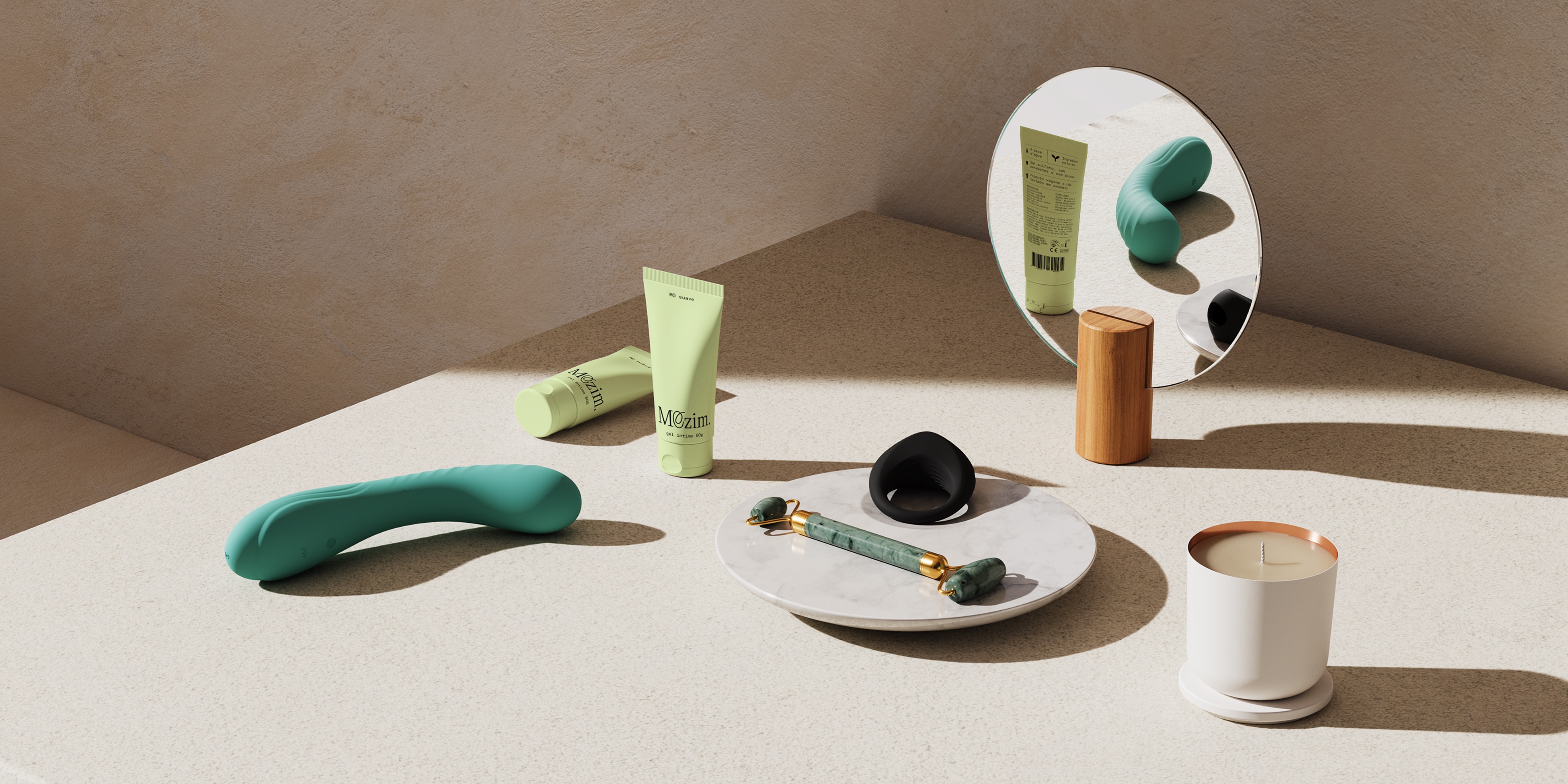
The solution stemmed from the idea of normalizing pleasure as part of a daily ritual. The visual identity combines sophistication and softness to break stigmas in the sector and reposition the products as objects of desire.
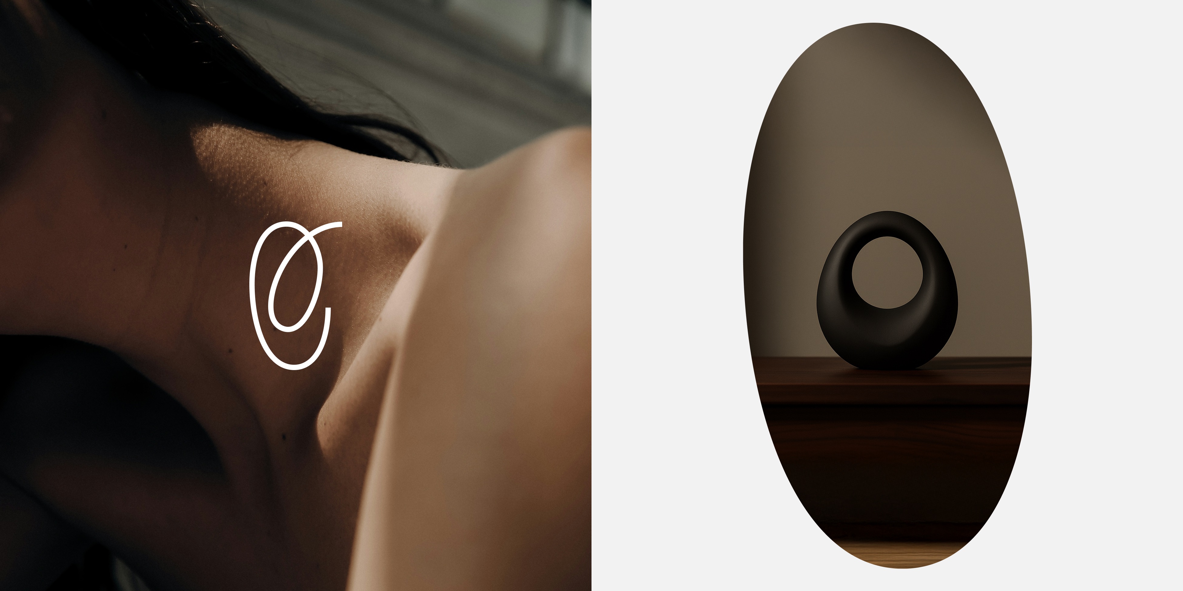
The symbol conveys connection, freedom, and intimacy through a continuous, fluid, and original line.
.
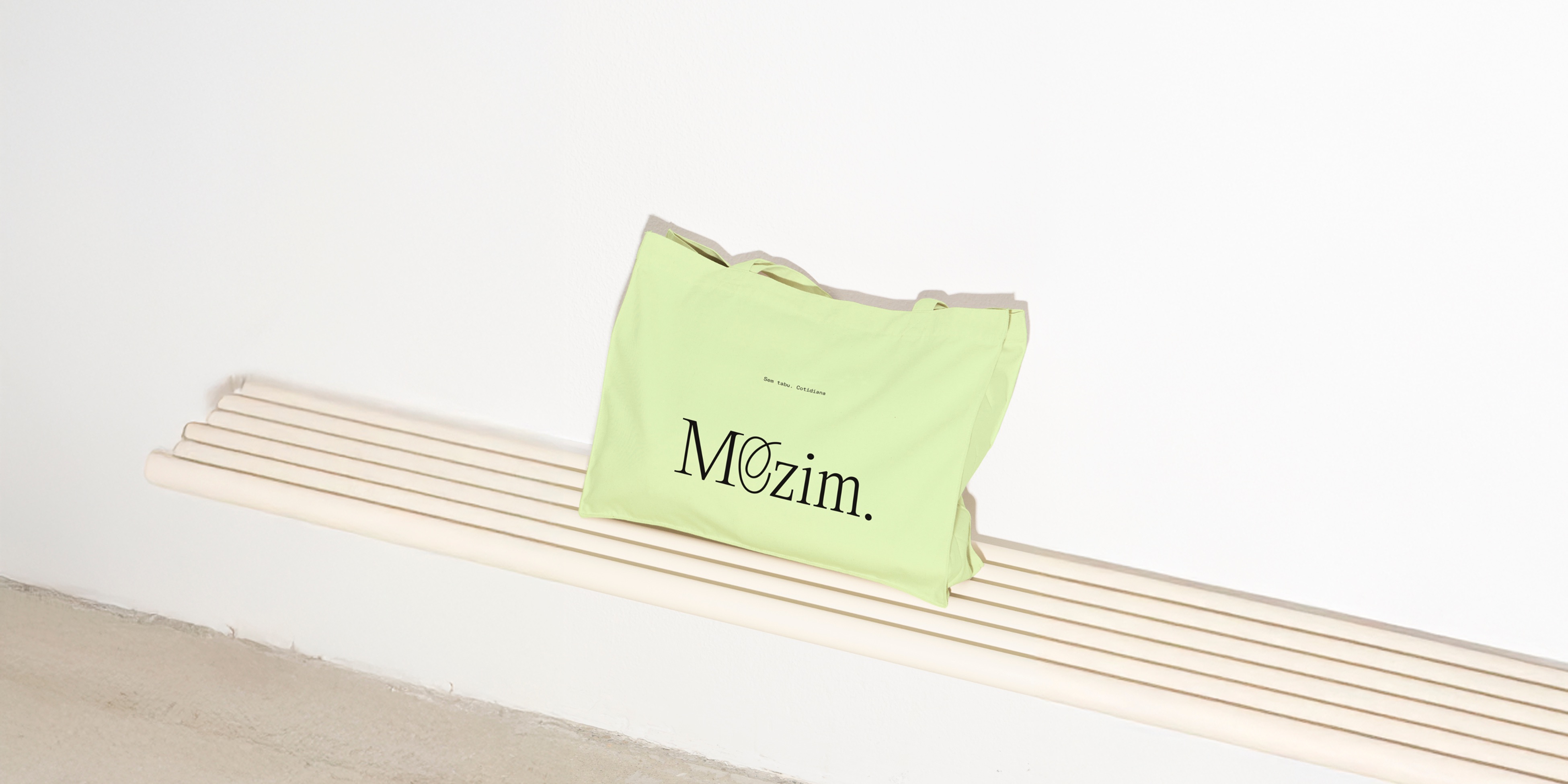
The serif typography adds elegance and a touch of luxury, while the period in the logo represents a modern, practical, and uncomplicated life. The result is a confident brand, with products meant to be displayed with pride and seamlessly integrated into one’s routine with purpose and ease.
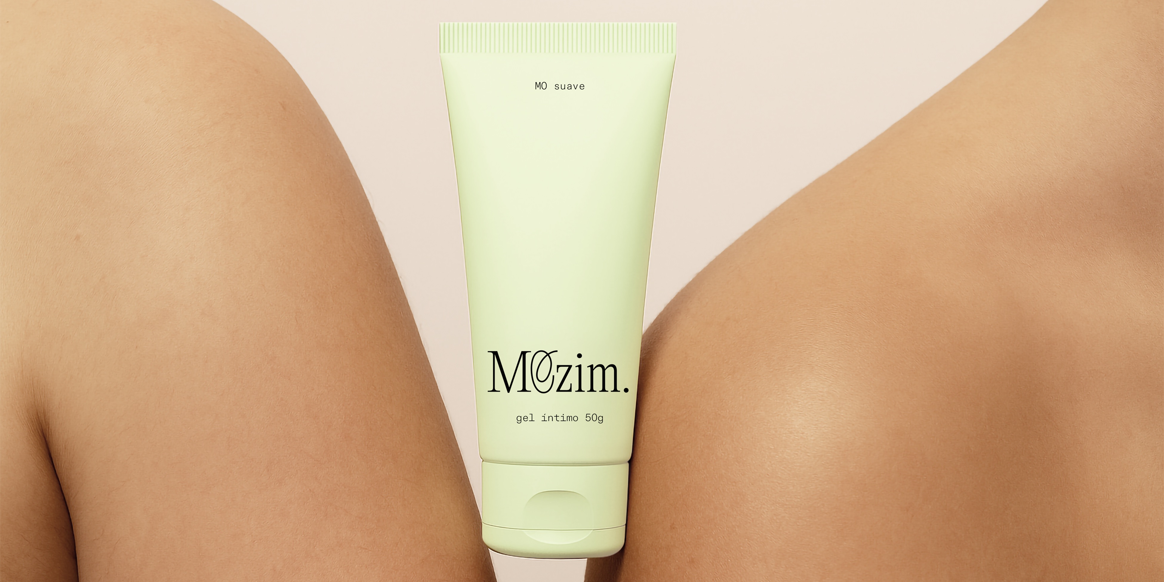
Color Coding
Mozim’s palette embraces soft tones that evoke calm, freshness, and modernity. A gentle green provides a breath of calm — light, relaxing, and distinctive. Neutral tones in contrasting temperatures bring balance and sophistication, while basic colors are used with precision. The result is a calm yet unexpected color code for the self-care market, breaking conventions without losing personality.
.


Need a project?