Piwi
PIWI transforms health benefits management into a clear, digital, and human-centered experience.
Location: Brazil
Role: Branding & Art Direction
Date: 2025
Context
Health benefits management is traditionally associated with bureaucracy, technical language, and low transparency. For small and mid-sized companies, this complexity often turns critical decisions into slow and uncertain processes. PIWI operates in this space with a different mindset. As the brand evolved, there was an opportunity to clearly express its role as a modern, reliable partner in a sensitive and highly regulated category.
Strategic Vision
PIWI occupies a place that was earned. The brand is built on the idea that trust is not imposed, but constructed over time. PIWI positions itself as a guide, offering clarity and support rather than authority or intimidation. This concept is translated visually through the brand symbol.

Visual Language
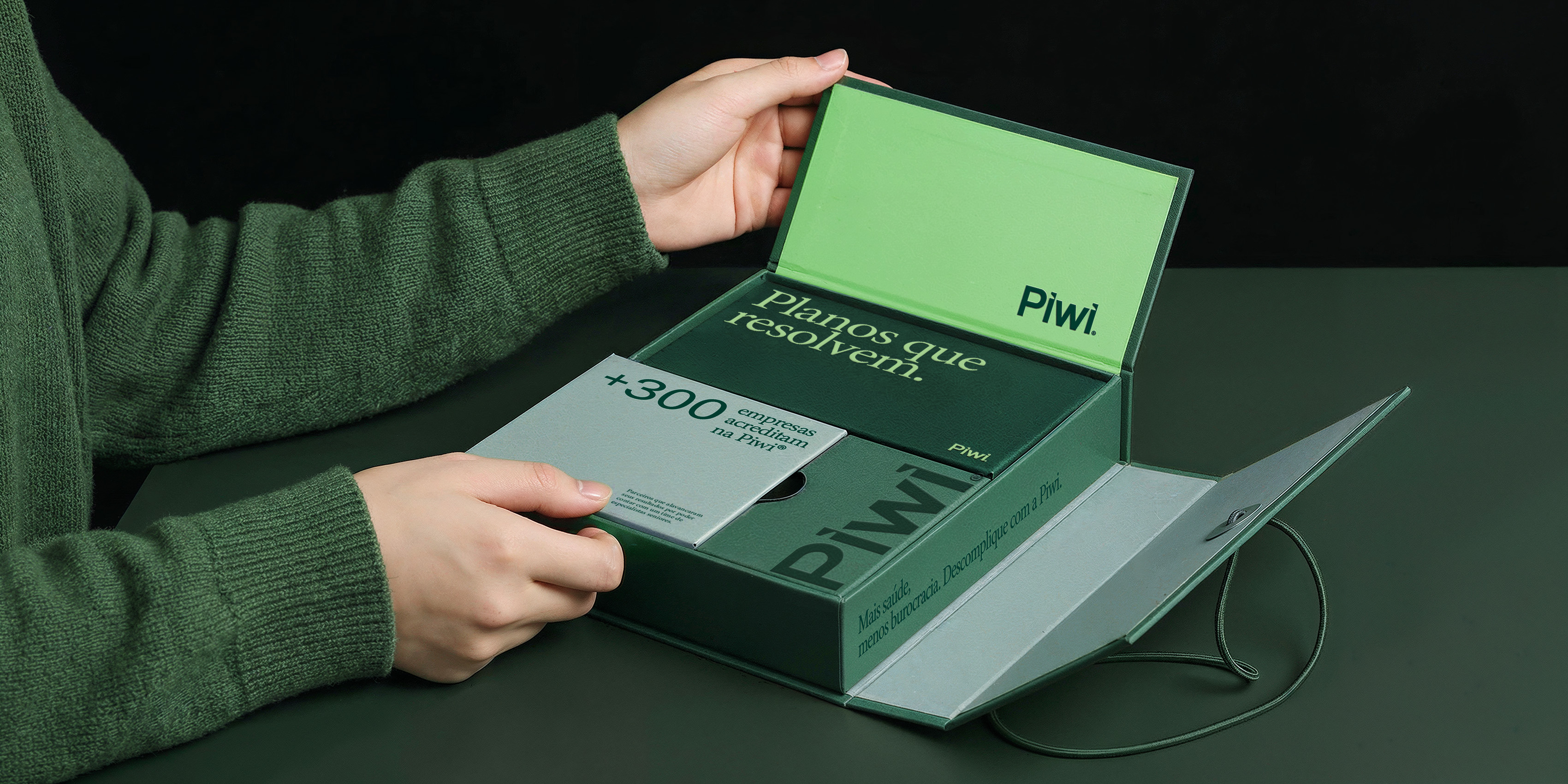
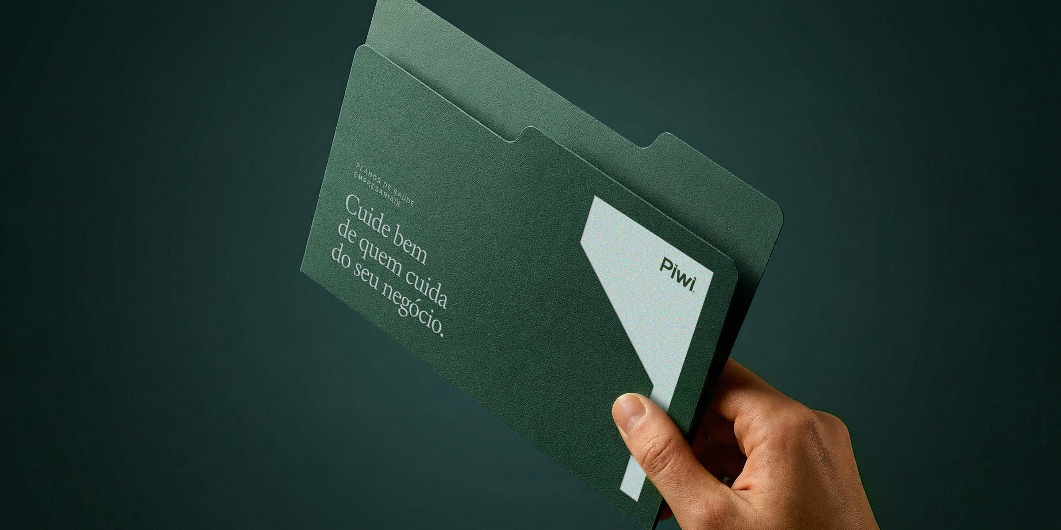
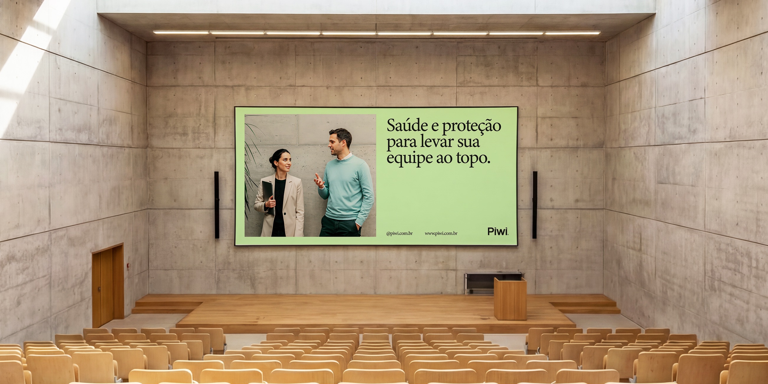
The visual system prioritizes clarity, hierarchy, and real-life context. Instead of relying on traditional corporate aesthetics, the brand language brings warmth, proximity, and human presence into a category usually defined by cold and technical visuals. This approach reinforces Moeda’s role as a supportive presence, not just a service.
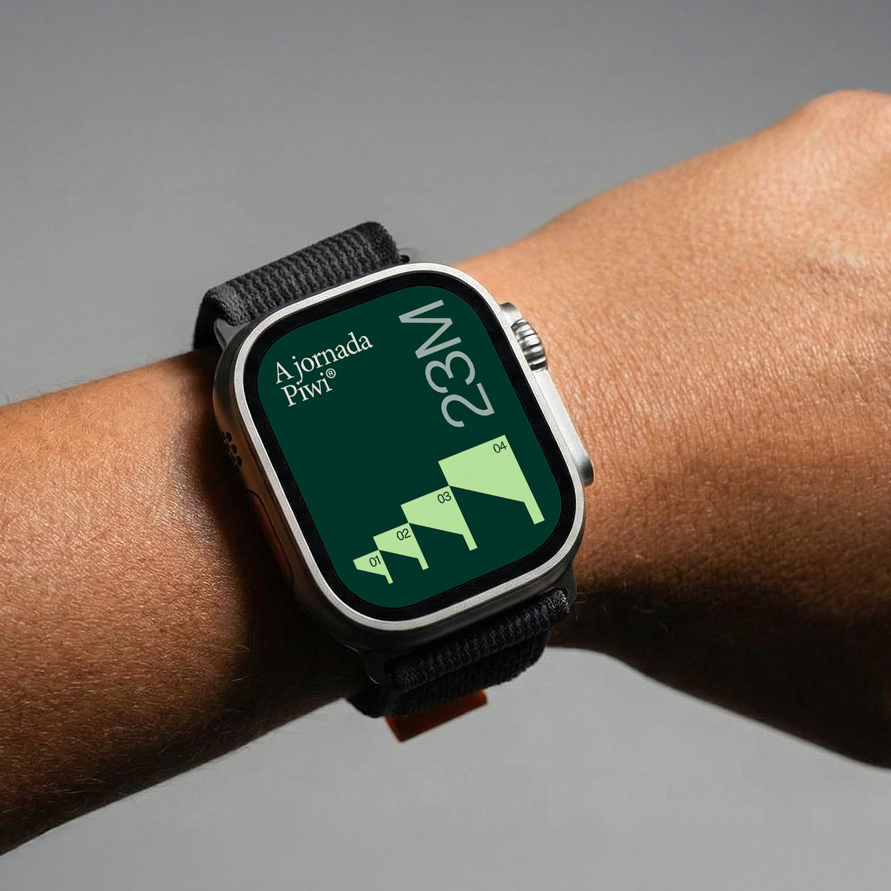
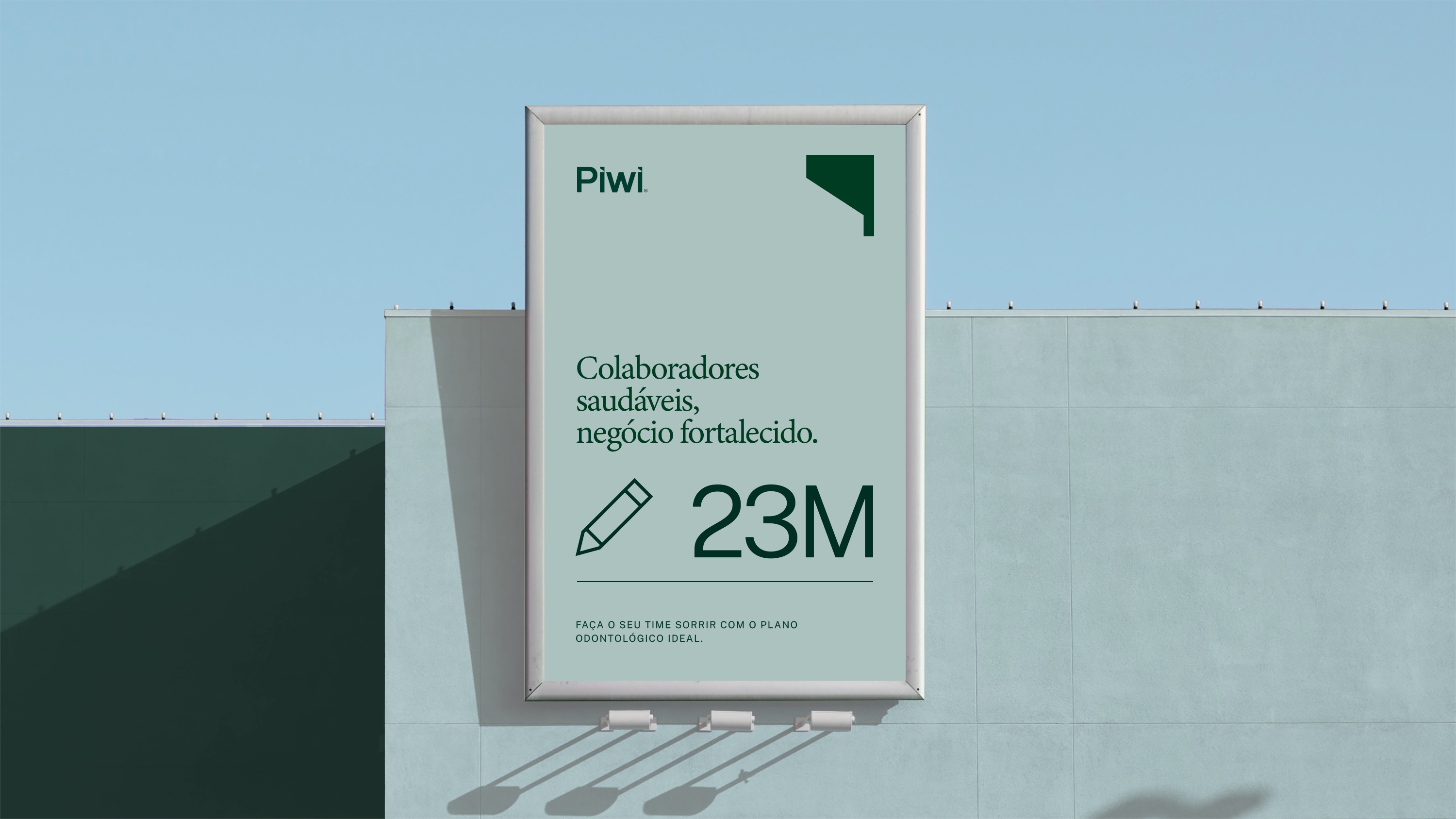
Symbol
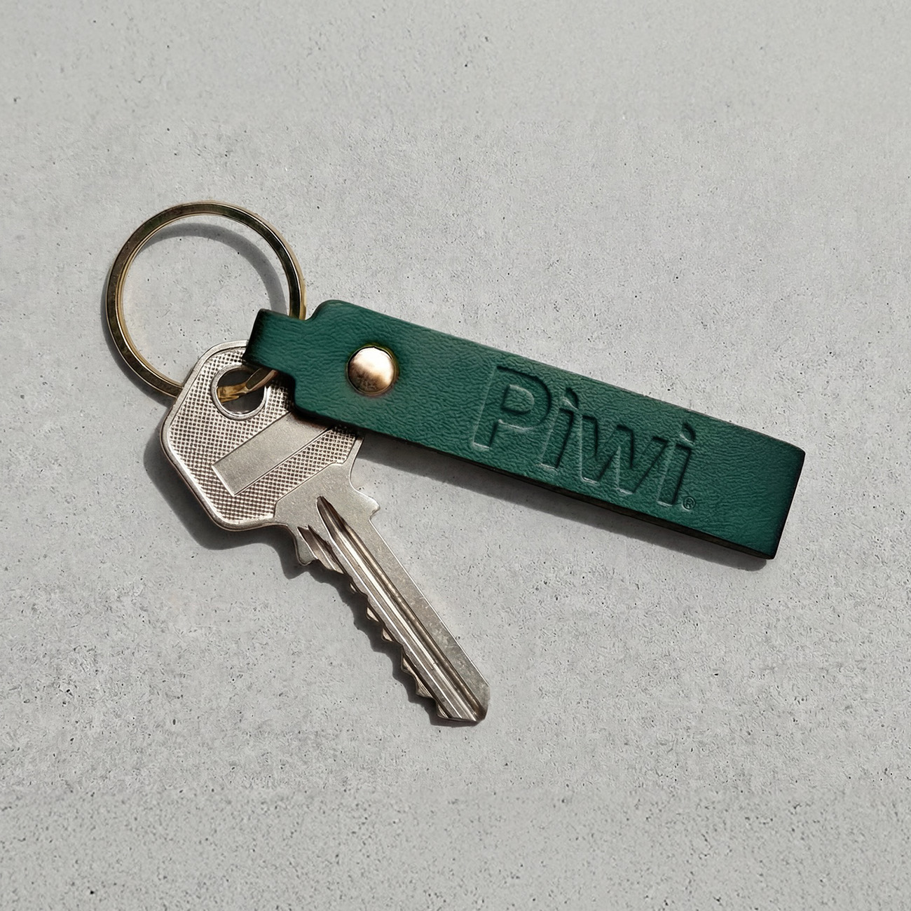
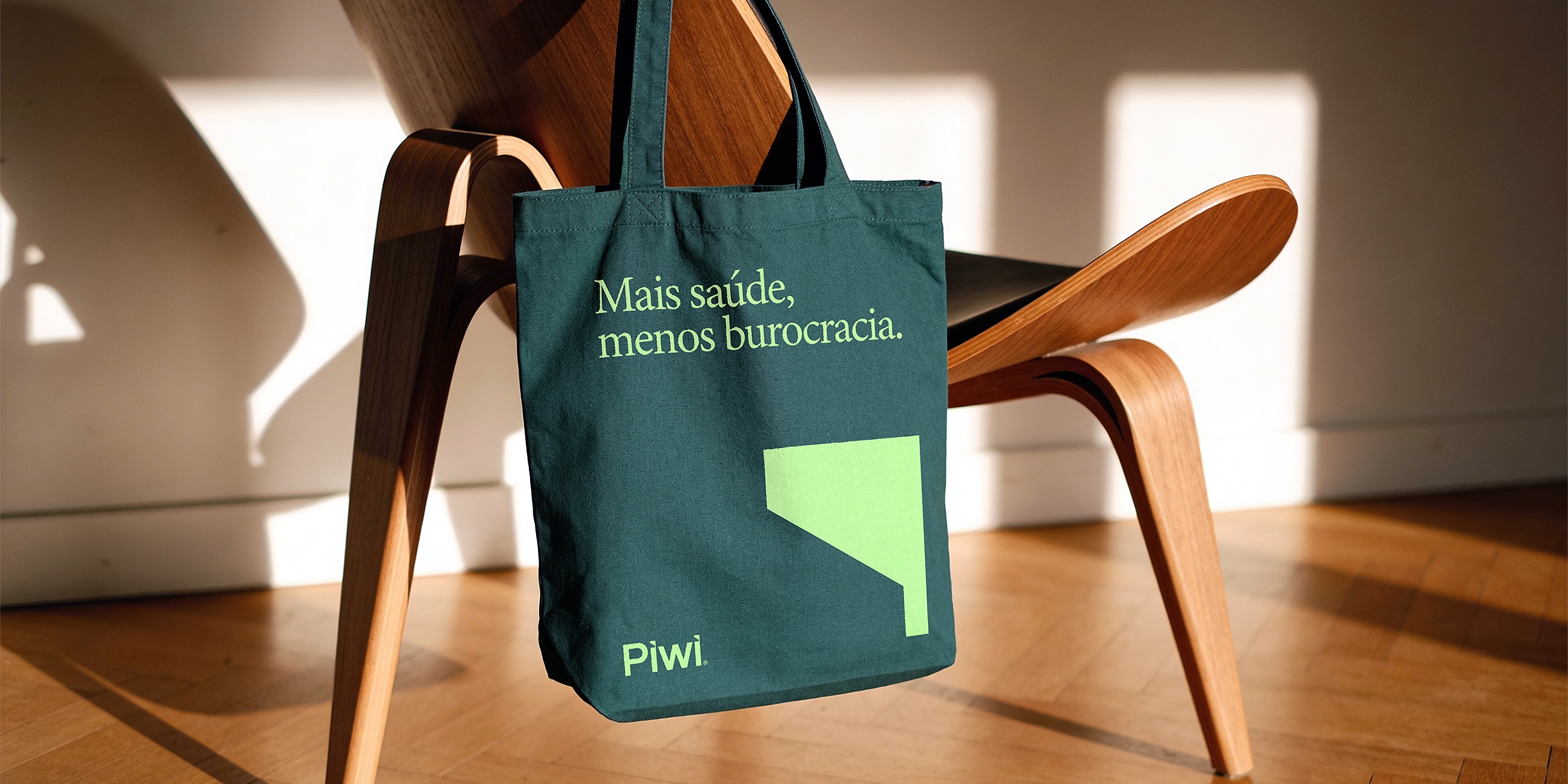
PIWI’s symbol represents a flag planted in the ground. It originates from the dot of the “i” in the logotype, transforming a typographic detail into a strong symbolic gesture. The flag expresses presence, achievement, and positioning. It marks a territory that was reached through consistency, clarity, and real value. More than a graphic element, the symbol acts as a statement. PIWI has arrived at a place that was built, not claimed.
Positioning
PIWI is positioned at the intersection of three core attributes: Simplicity Problem-solving capability Premium service This balance defines the brand as a strategic partner that combines technology, operational rigor, and human support in decisions related to health and well-being.

Visual System
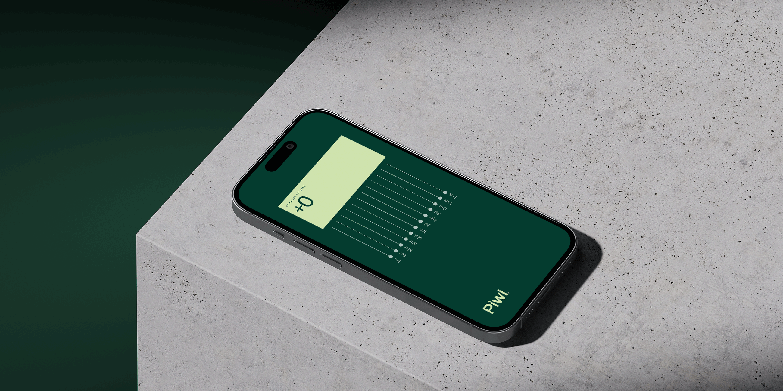
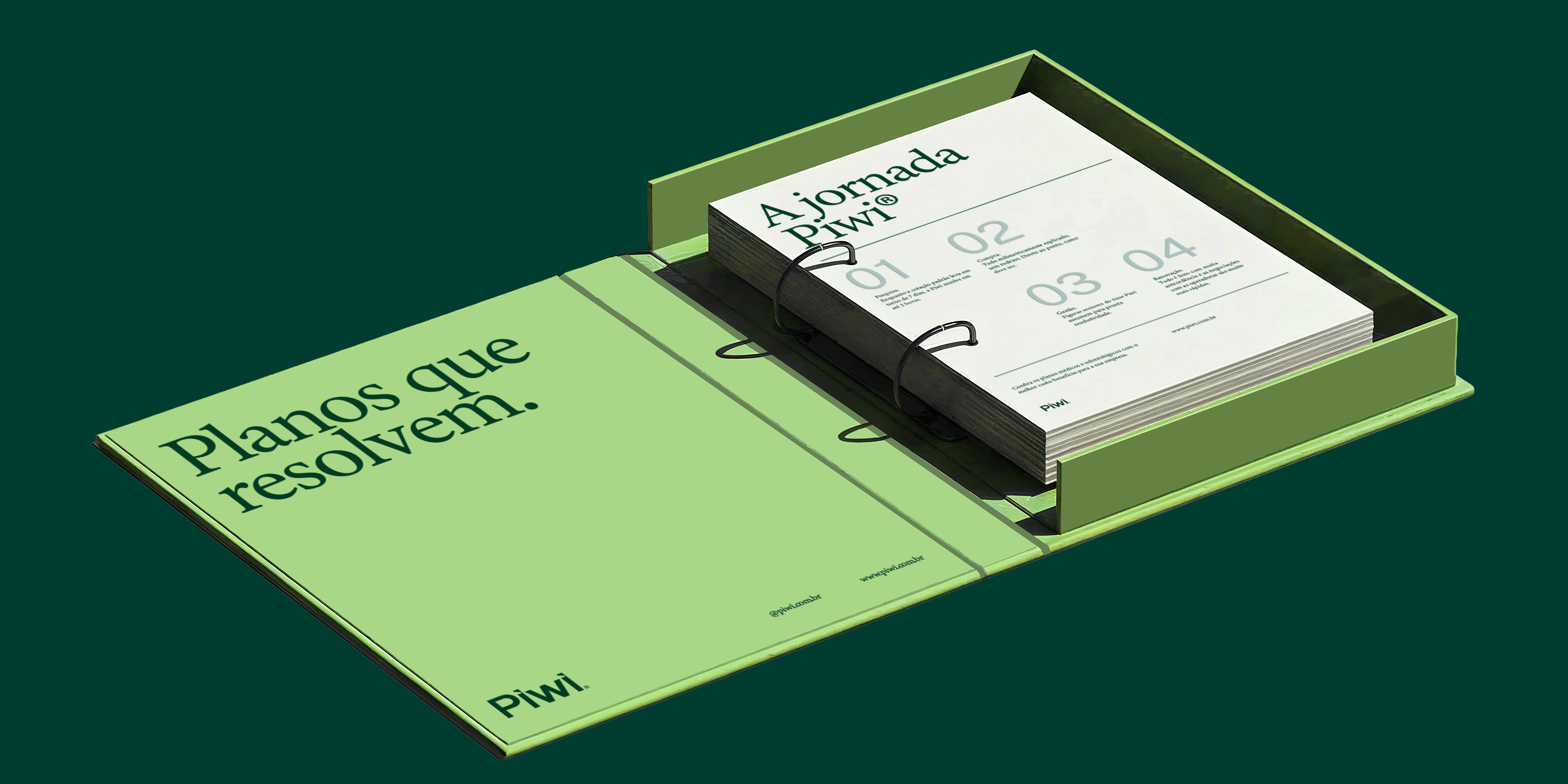
The visual identity was designed as a cohesive system. Structured grids, high-contrast typography, and a controlled color palette reinforce clarity and legibility. The flag symbol works as a visual anchor throughout the system, guiding attention and reinforcing the brand’s presence without excess. Every element serves a purpose.
Color Palette
The palette is rooted in tones associated with health, stability, and balance. Greens and neutral colors create a calm and trustworthy visual environment, while contrast is used strategically to support hierarchy and navigation. Color functions as a usability tool.

Need a project?