MO€DA
MO€DA redefines how the creative economy experiences accounting, transforming complexity into clarity, confidence, and control.
Location: Brazil
Role: Branding & Art Direction
Date: 2025
Context
The creative economy moves fast, but accounting rarely keeps up. For freelancers, creators, and service-based businesses, financial management is often associated with friction, fear, and a language that feels distant from their reality. Moeda was created to challenge this paradigm. The opportunity was to reposition accounting not as a bureaucratic obligation, but as an empowering tool that supports growth, decision-making, and peace of mind for professionals who build their businesses through creativity.

Strategic Vision
The brand was conceived to bridge financial rigor and a human-centered experience. MO€DA translates complex financial processes into something approachable, intuitive, and emotionally safe. The objective was not to simplify the business itself, but to simplify the way people experience it.
Naming
MO€DA is one of the most universal symbols of value, exchange, and trust. Direct and familiar, the name reinforces the brand’s core belief that money management should feel tangible, transparent, and understandable. By choosing a name rooted in everyday language, the brand positions itself as close, accessible, and part of the user’s real life, not as a distant financial institution.
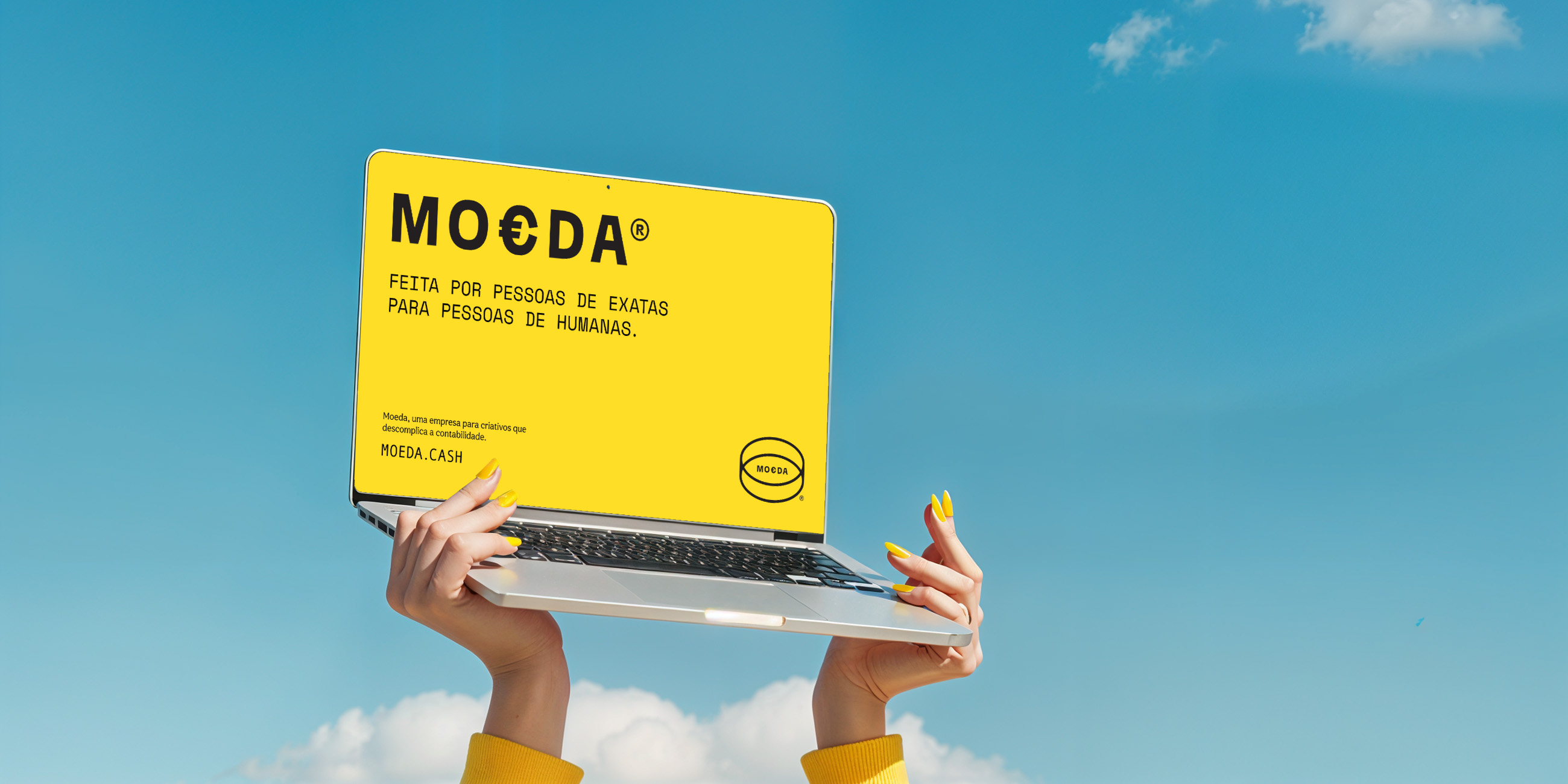
Logotype
The logotype was designed to communicate solidity without stiffness. Its construction balances strength and approachability, reflecting MO€DA’s positioning as a modern financial partner that feels reliable, contemporary, and aligned with the rhythm of the creative economy. The result is a mark that feels stable, but never corporate.
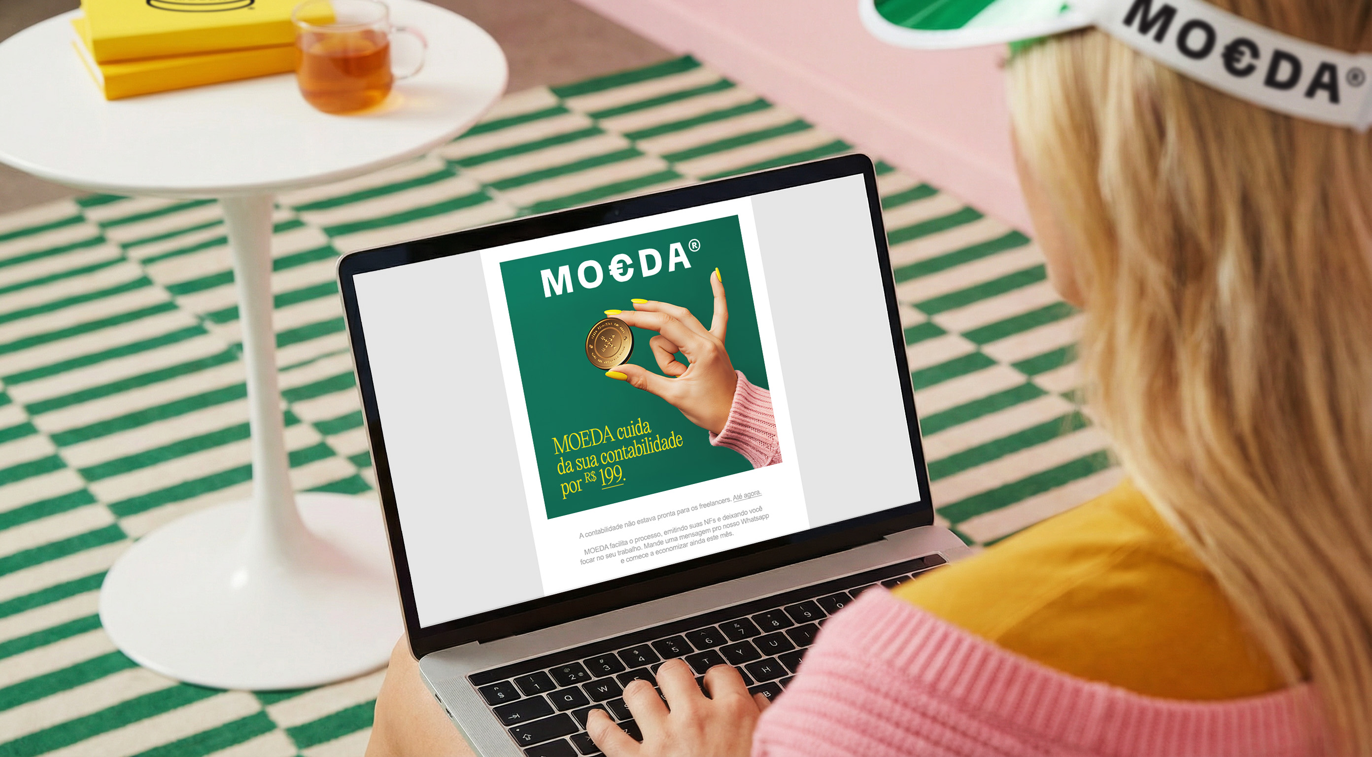
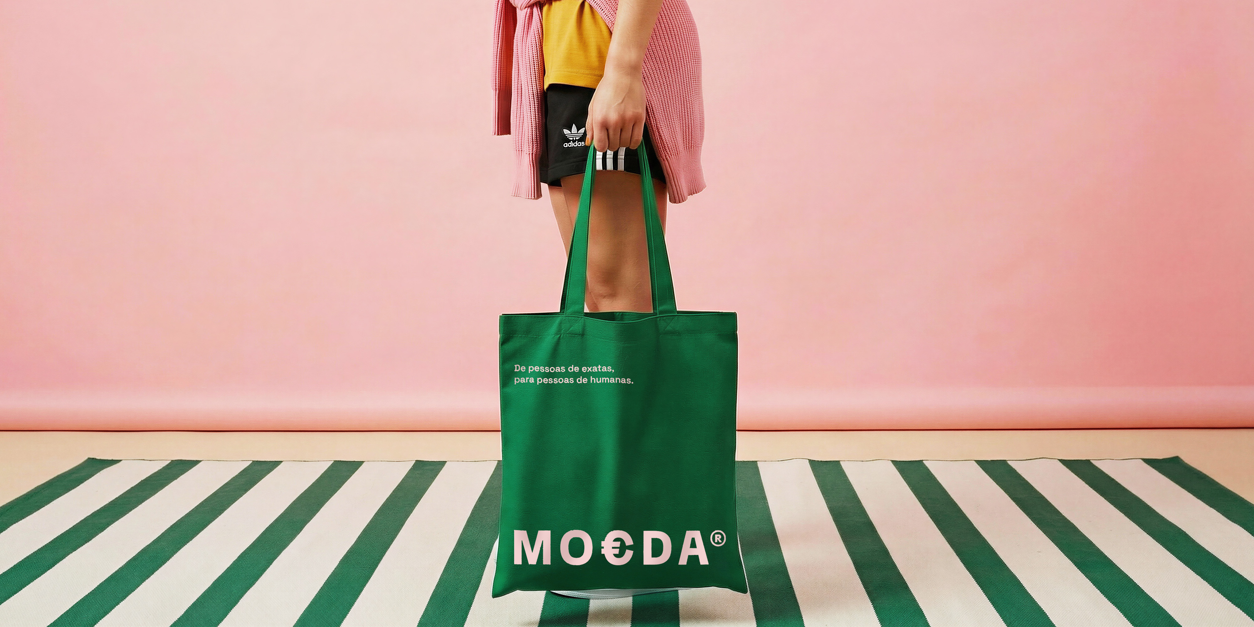
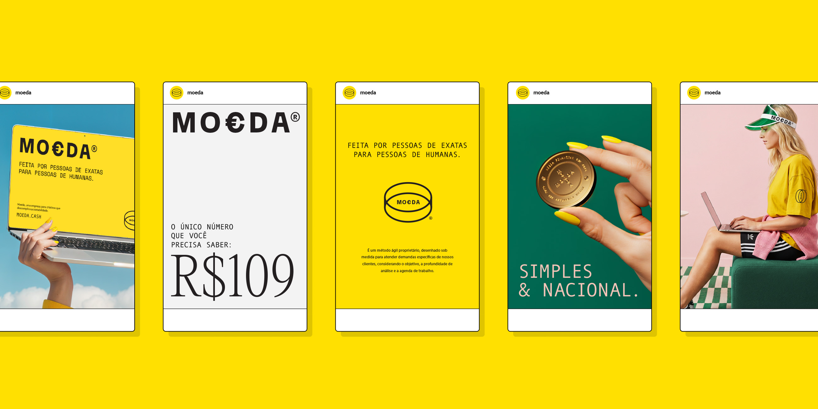
Visual Language
The visual system prioritizes clarity, hierarchy, and real-life context. Instead of relying on traditional corporate aesthetics, the brand language brings warmth, proximity, and human presence into a category usually defined by cold and technical visuals. This approach reinforces Moeda’s role as a supportive presence, not just a service.
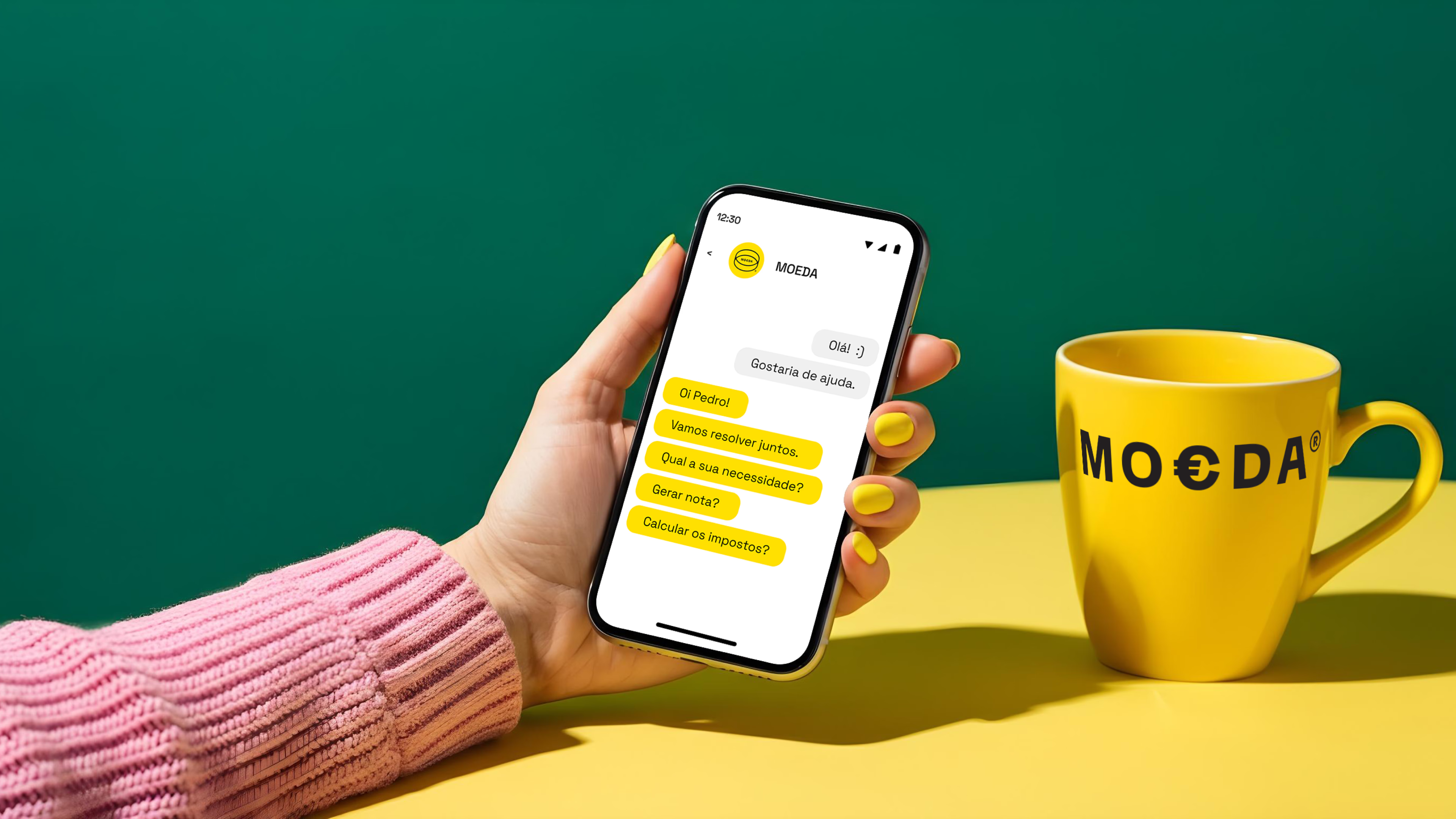
Digital Experience
From website to interface, every interaction was designed to reduce friction and cognitive overload. The experience transforms traditionally complex tasks such as company setup, invoicing, and tax routines into guided, easy-to-understand flows. The result is a financial platform that feels less like software and more like a partner that is present, clear, and supportive.

Need a project?