Nativa Spa
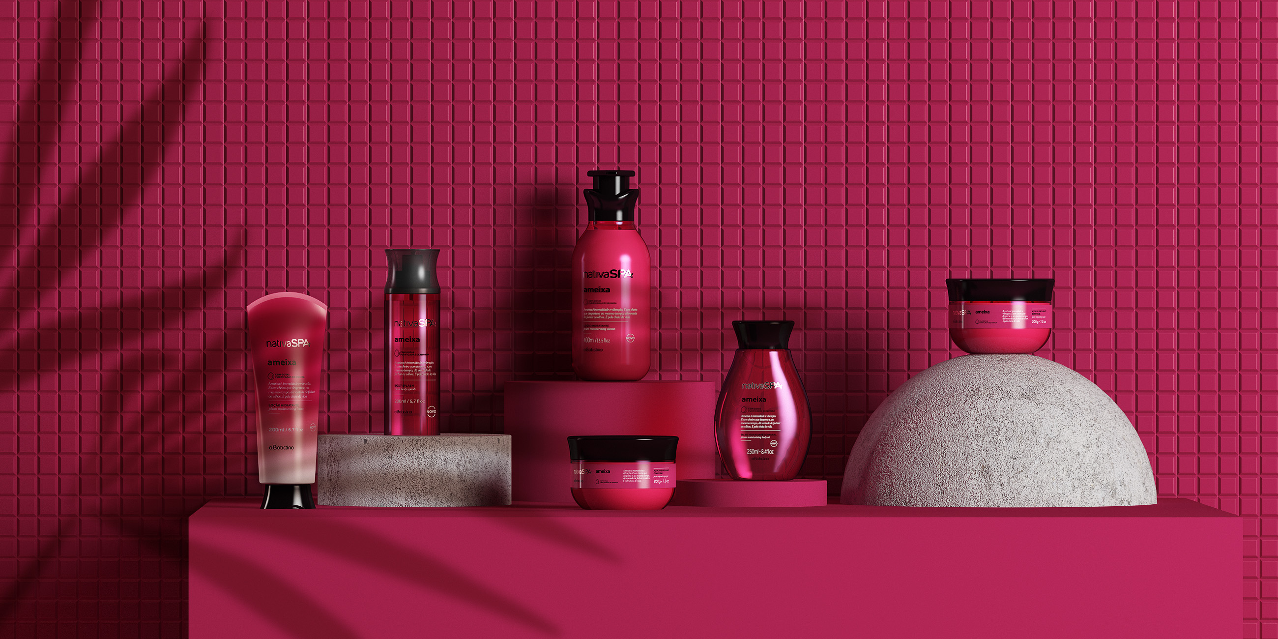
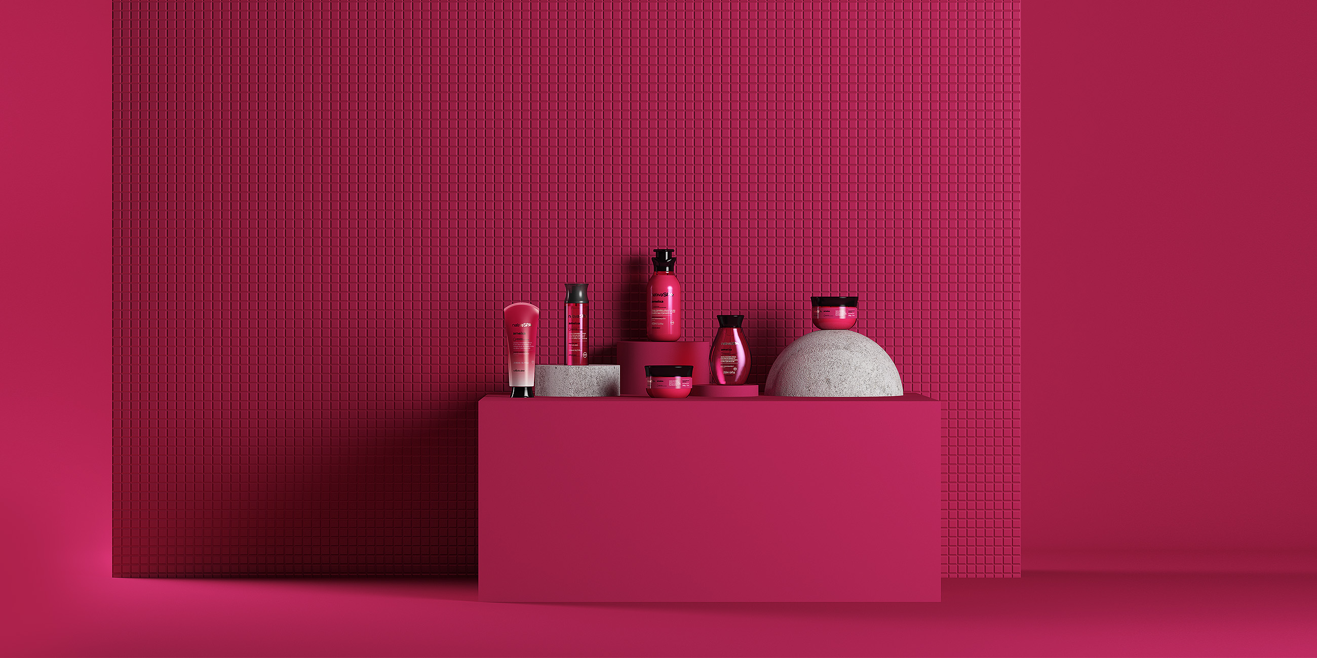
Nativa SPA is one of the most important personal care brands from O Boticário. The product line is composed by several scents that differentiate mainly by colors.
Location: Brazil
Role: Branding & Packaging
Date: 2019
Challenge
Throughout the expansion of Nativa SPA product lines, the package design architecture became confusing for customers, besides being dull and old-fashioned. Considering this scenario, we have been invited to recreate both product and graphic design for the line, enhancing the colors which are the main element to differentiate the fragrances.
Solution
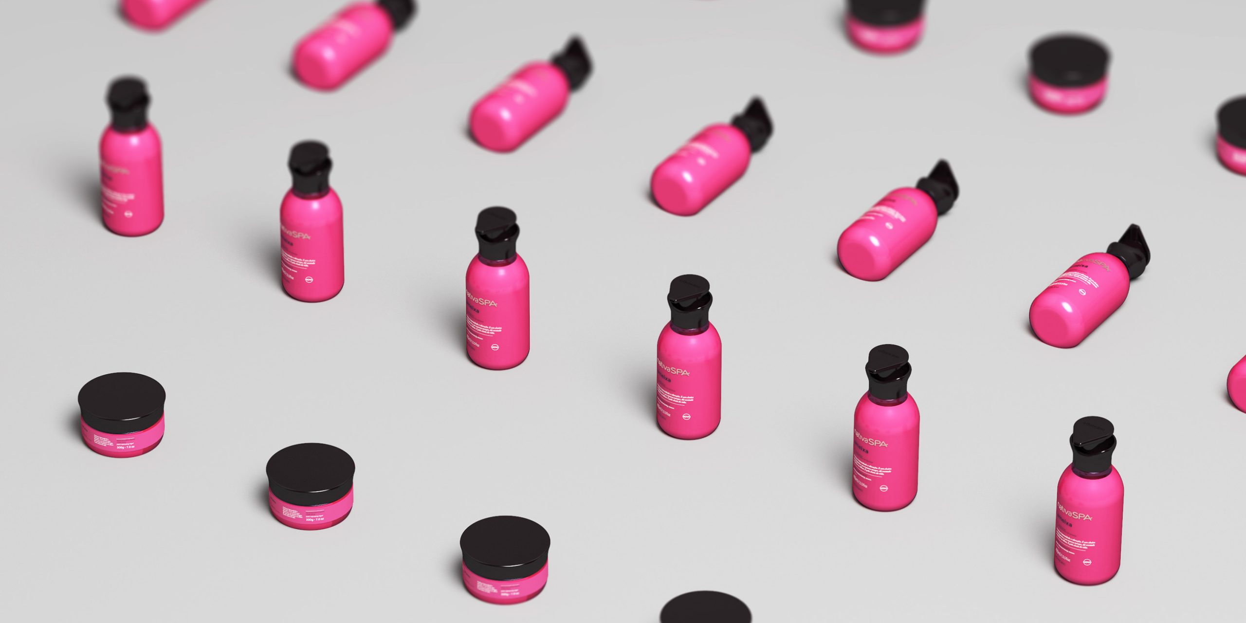
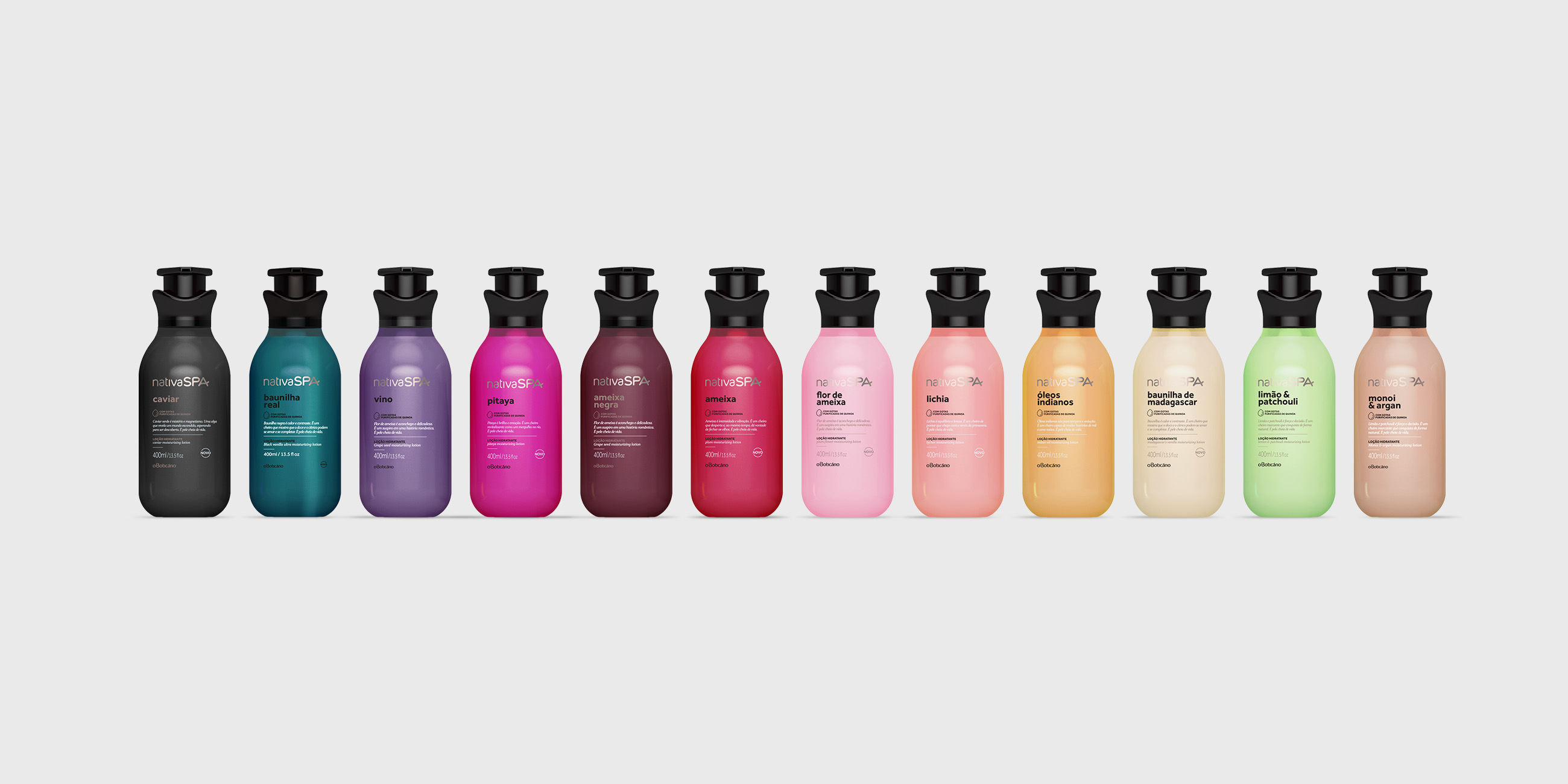
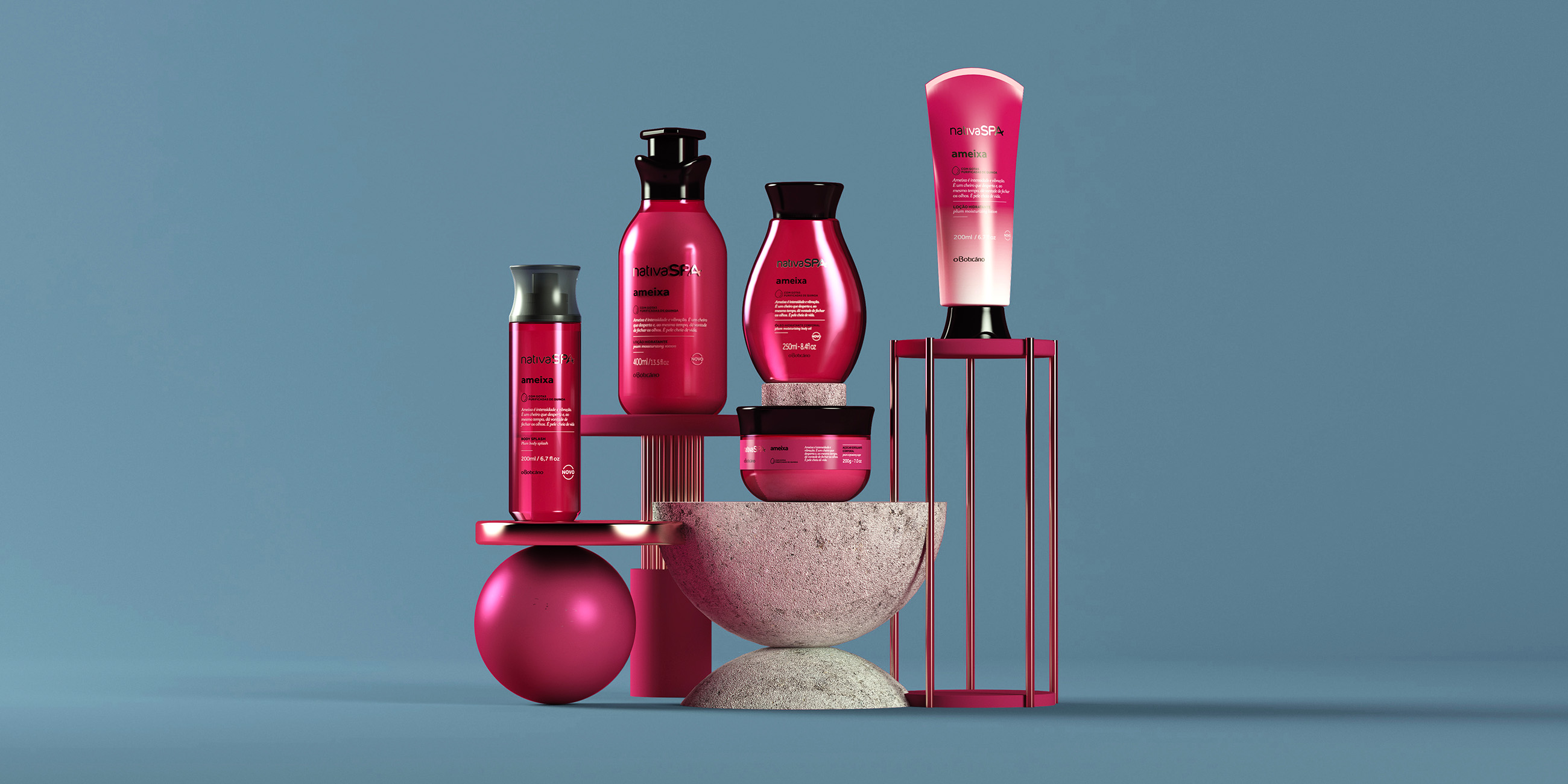
We focused on a minimalist and fancy typographic design so the color would be the protagonist on the layout. Using a broad and vivant color palette, we were able to reinforce the “rainbow effect”on the shelves, enhancing Nativa SPA variety of exotic ingredients and unique sensations.
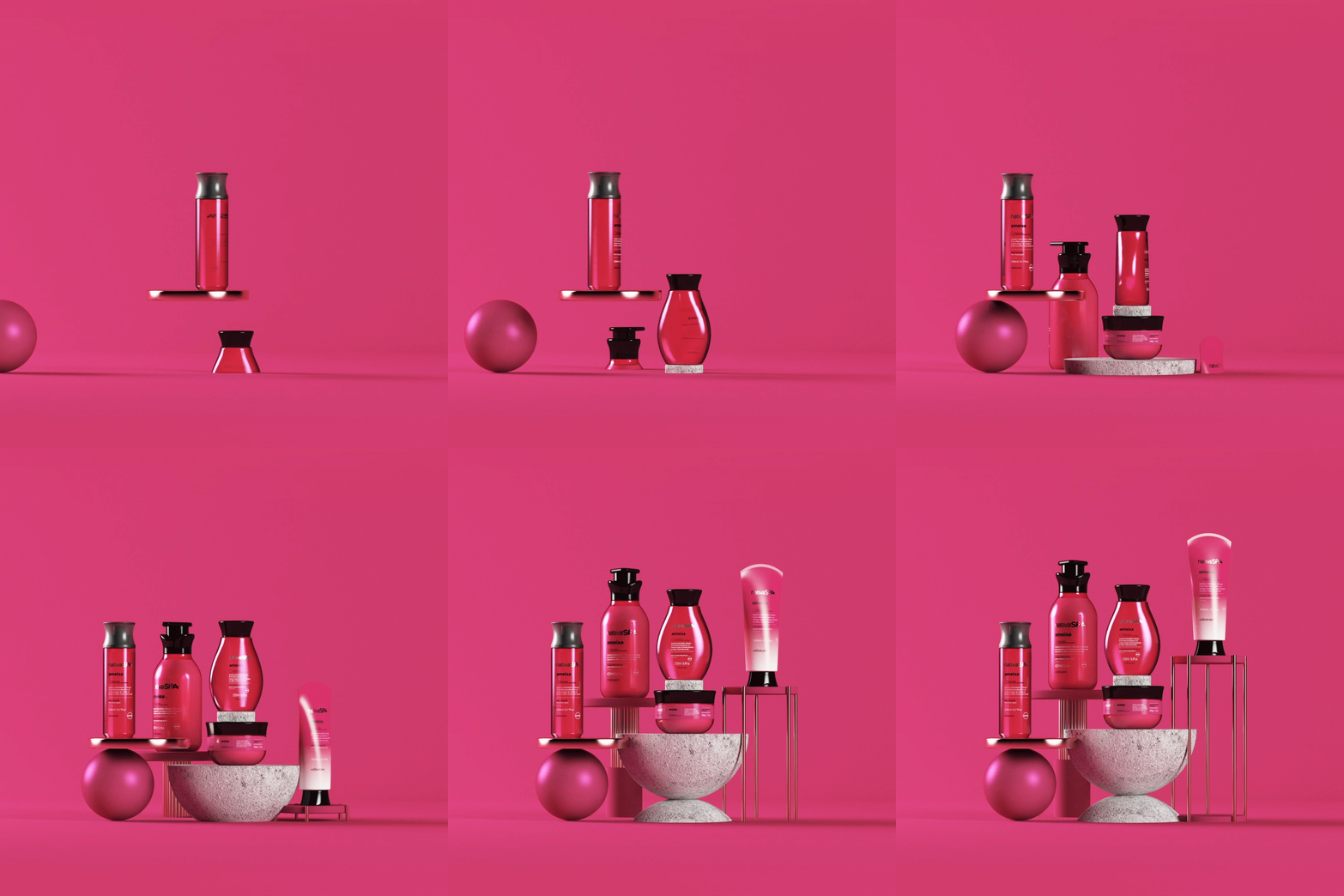
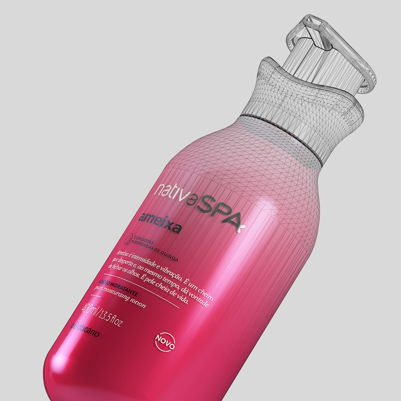
Work in progress
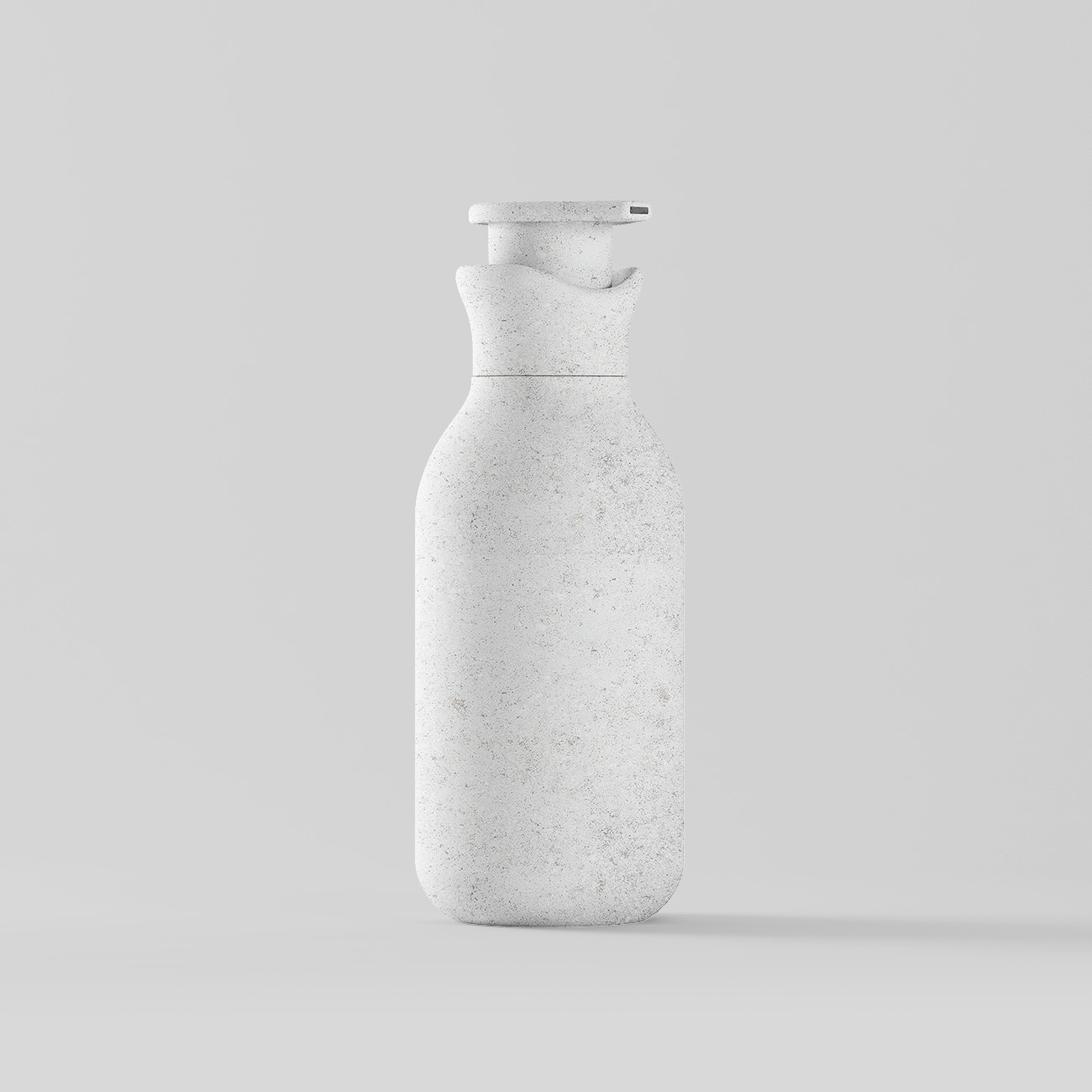
The shapes are ergonomic, elevating the quality of the user experience. Also, they relate to natural elements by their rounded aspect, creating a link between the products and the freshness of their composition.

Need a project?