Agibank
Agibank is a fully digital bank created for the current world, with no bureaucracy in an easy and agile way.
Location: Brazil
Role: Branding & Packaging
Date: 2017
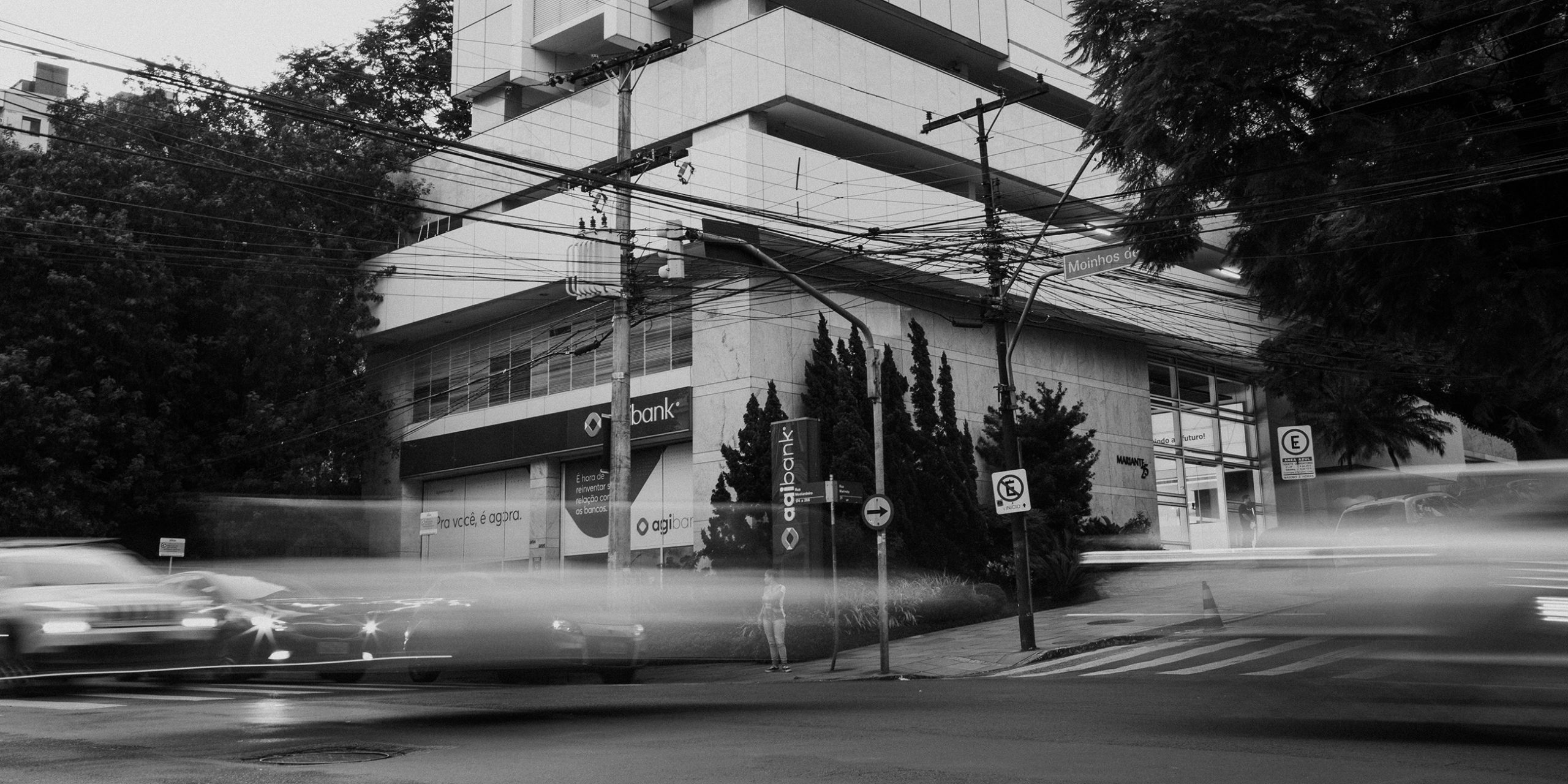

Challenge
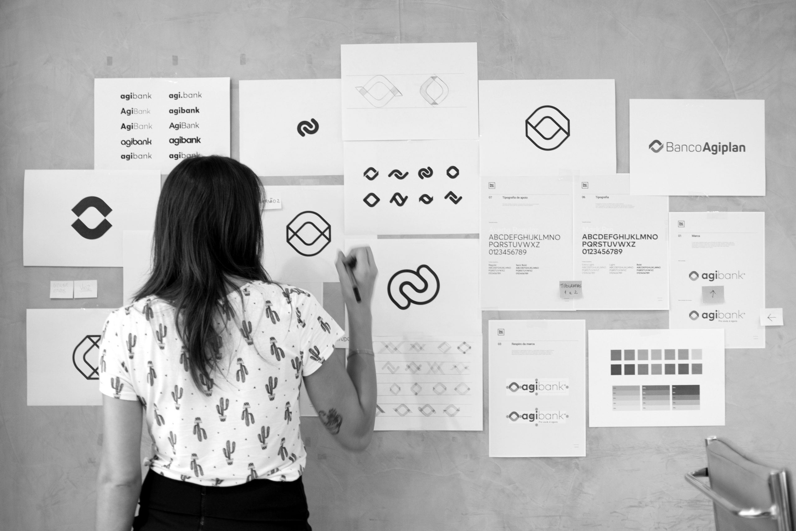
Our mission with Agibank – which was called Agiplan before – was to bring the brand into the present world, connecting people and giving a more humanized and cool voice tone for the institution. The symbol of the previous brand could not be majorly altered so it wouldn’t create a rupture with what already existed.
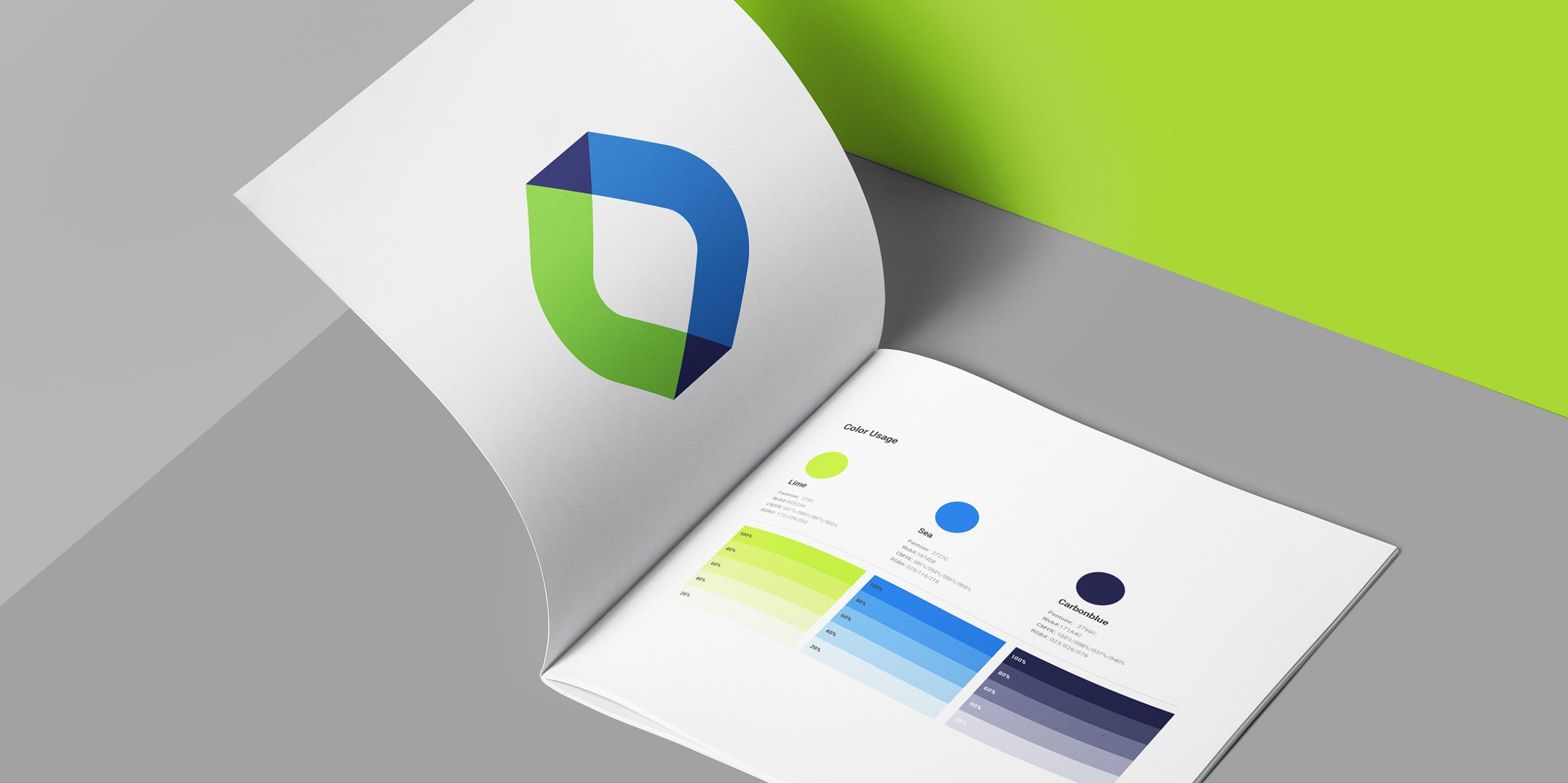
Solution
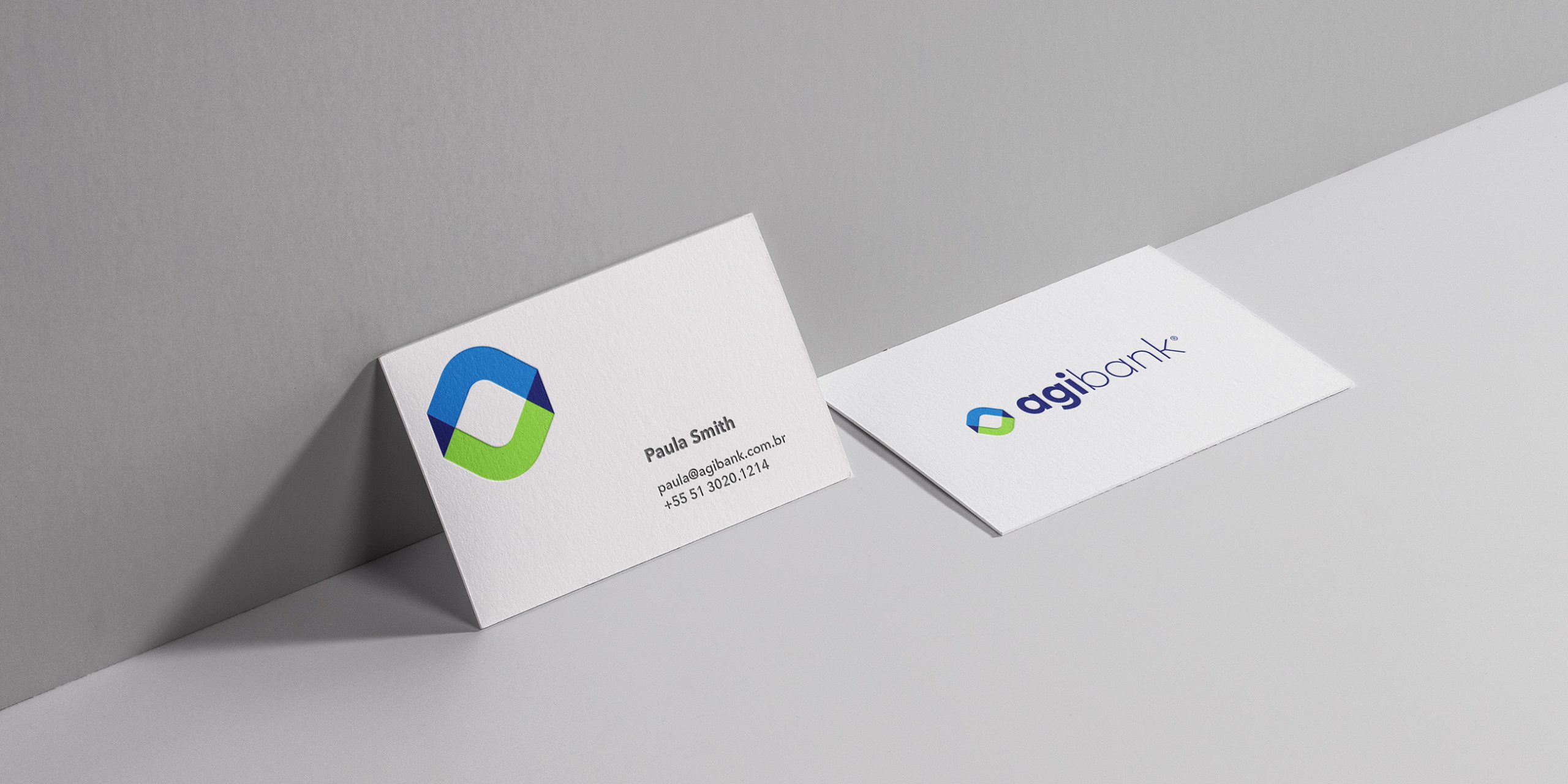
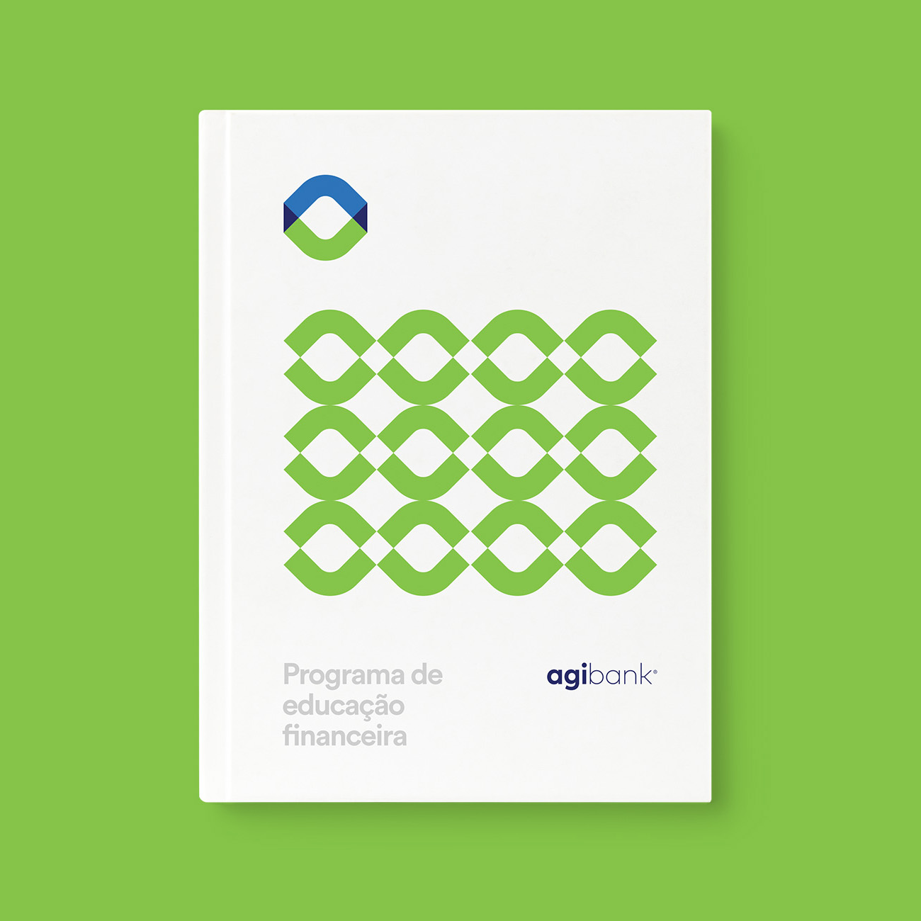
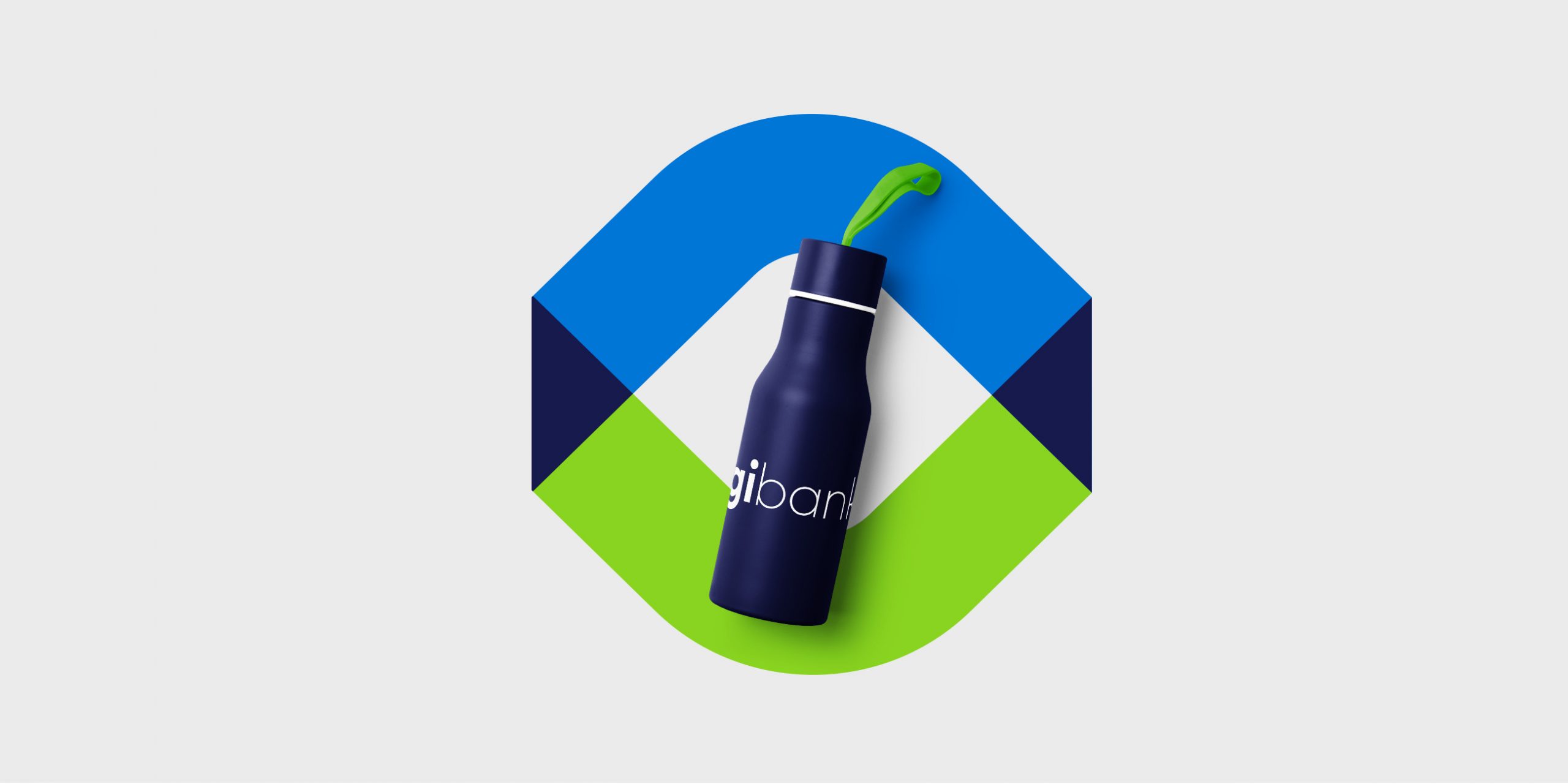
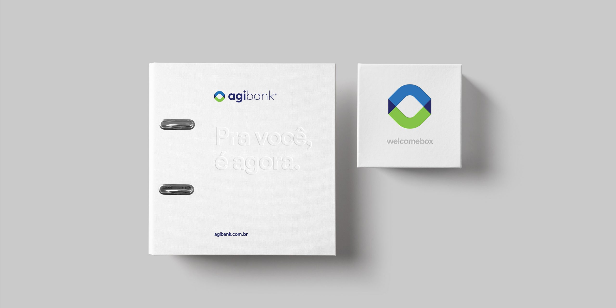
Union. This is the word that sums up Agibank’s branding. With a simple and direct concept – connecting people -, we brought the symbol closer, making its parts overlap in harmony. By using vivid and saturated colors, we’ve reinforced the contemporary and cool speech. The result is a strong, modern brand that carries timelessness in its DNA.

Need a project?