Kokeshi

Context
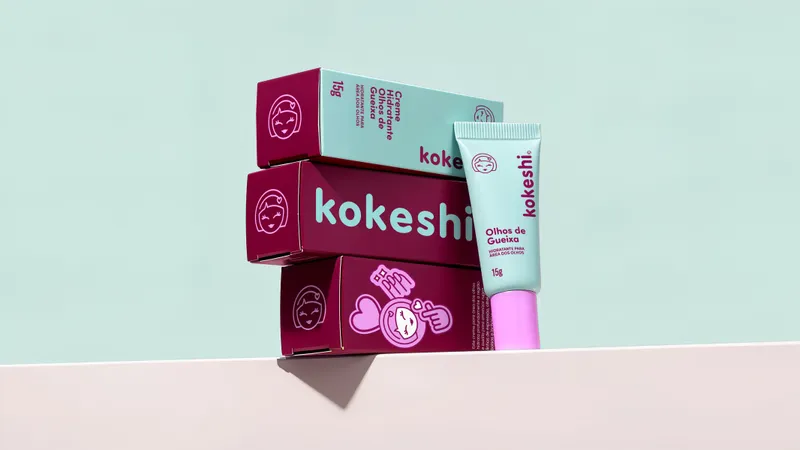
Kokeshi is a skincare brand inspired by J-Beauty that made affection its greatest asset. The rebranding started from a challenge: how do you mature a brand loved for being sweet without erasing its personality? The answer is a replicable design system that combines minimalism with Asian codes. Logotype, symbol, typography and composition follow a shared structure, making it easier to expand the portfolio. The new identity redraws the logotype and updates the doll consumers already recognize, keeping its distinctive features in a refreshed version. Stickers complete the system and extend the brand's personality. The result preserves the bond with consumers, without caricature, and is ready to speak to new generations. Kokeshi grows up without having to get serious.


Concept
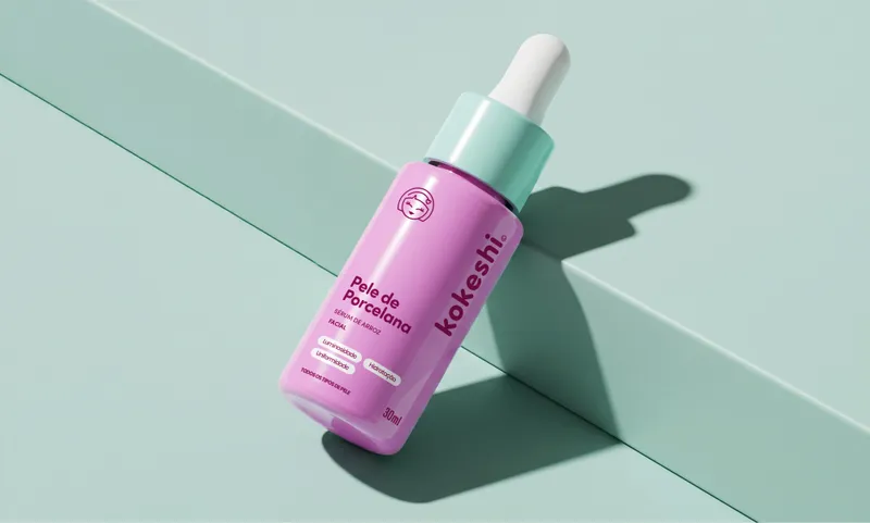
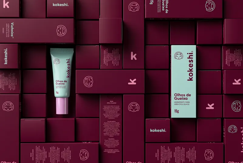
The project is built on resolving a central tension: the playfulness of the kawaii aesthetic versus the authority of dermocosmetics. To avoid infantilization or ethnic caricature, the conceptual starting point drew on Japanese graphic minimalism and the subtlety of Asian pharmaceutical and botanical labels. The doll was redrawn with rounder, more expressive lines, preserving its recognition as the brand's icon. The lowercase logotype reinforces this closeness with soft forms and a friendly rhythm. On the packaging, a rational structure organizes information, while a cherry tone connects the portfolio and complementary colors distinguish families and benefits. The stickers add a more spontaneous layer, balancing clarity, personality and youthful appeal.


Objective
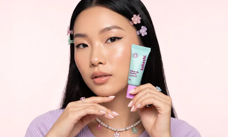
In the Brazilian market, entry-level skincare (mass market, e-commerce platforms such as Shopee and drugstore channels) operated under a restrictive polarization: either generic communication or childish visual appeals. Kokeshi's strategic goal was to occupy a neglected gap: offering a premium dermocosmetic experience at an accessible price, welcoming both mature women (40+) new to beauty routines and Millennials and Gen Z, guided by aesthetics and the visual curation of social media. By transforming the packaging with a minimalist layout that breaks with the current one, Kokeshi lowers the barriers to trying the category and turns design into a commercial asset with direct leverage.

Solution
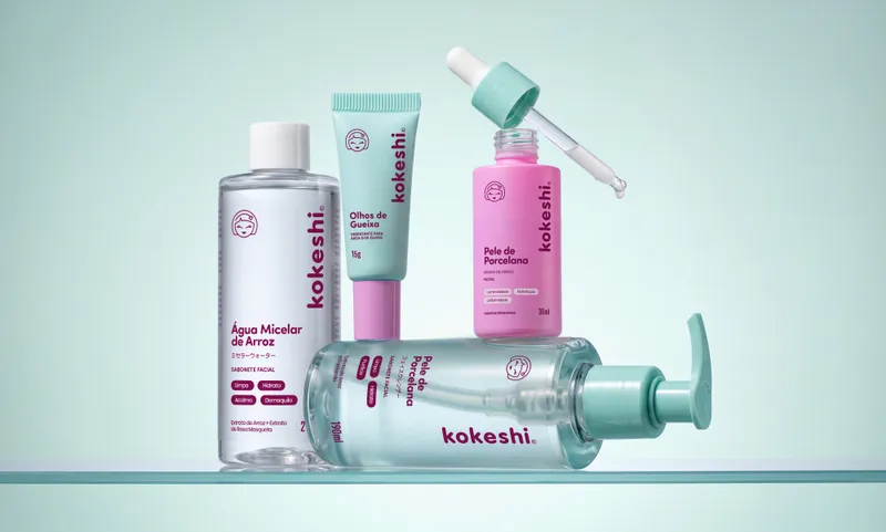
The project's strength lies in consistency: a system that works across many formats and stays recognizable. Dozens of products, bottles, tubes and boxes share the same architecture of a new Kokeshi, an efficient design system that does not give up affection. The identity keeps the delicate visual universe that already brings the brand close to its consumers, now with more clarity to compete in the category. The redrawn codes reinforce the pillars of recognition and capture the attention of new generations, who are more demanding about the language of packaging. The result proves that an accessible skincare brand can have plenty of personality and mature in order to grow, without losing the cuteness that made it beloved.