Joy of Matcha
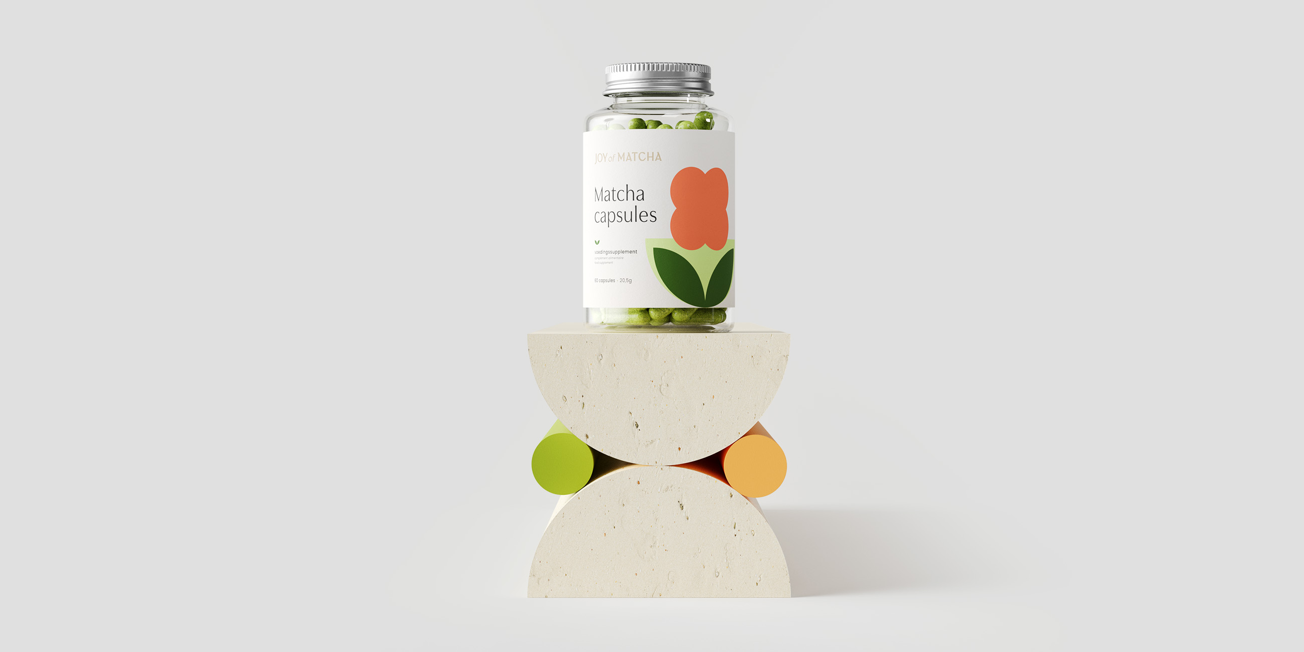
Joy of Matcha works with local, family-owned organic farms in Japan to enable consumers to experience the best of matcha, its flavor, and health properties.
Location: Belgium
Role: Branding & Packaging
Date: 2021

Challenge
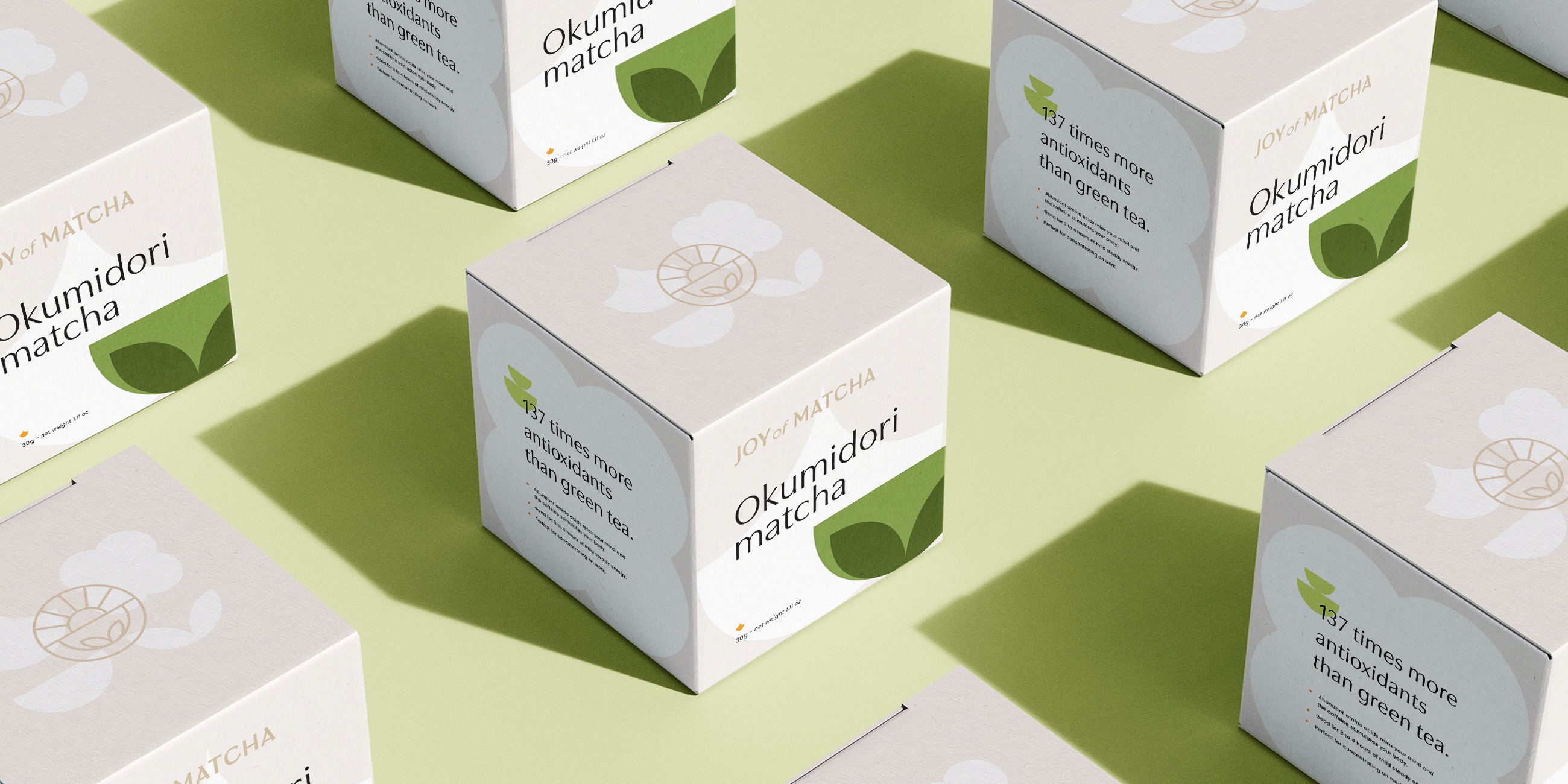
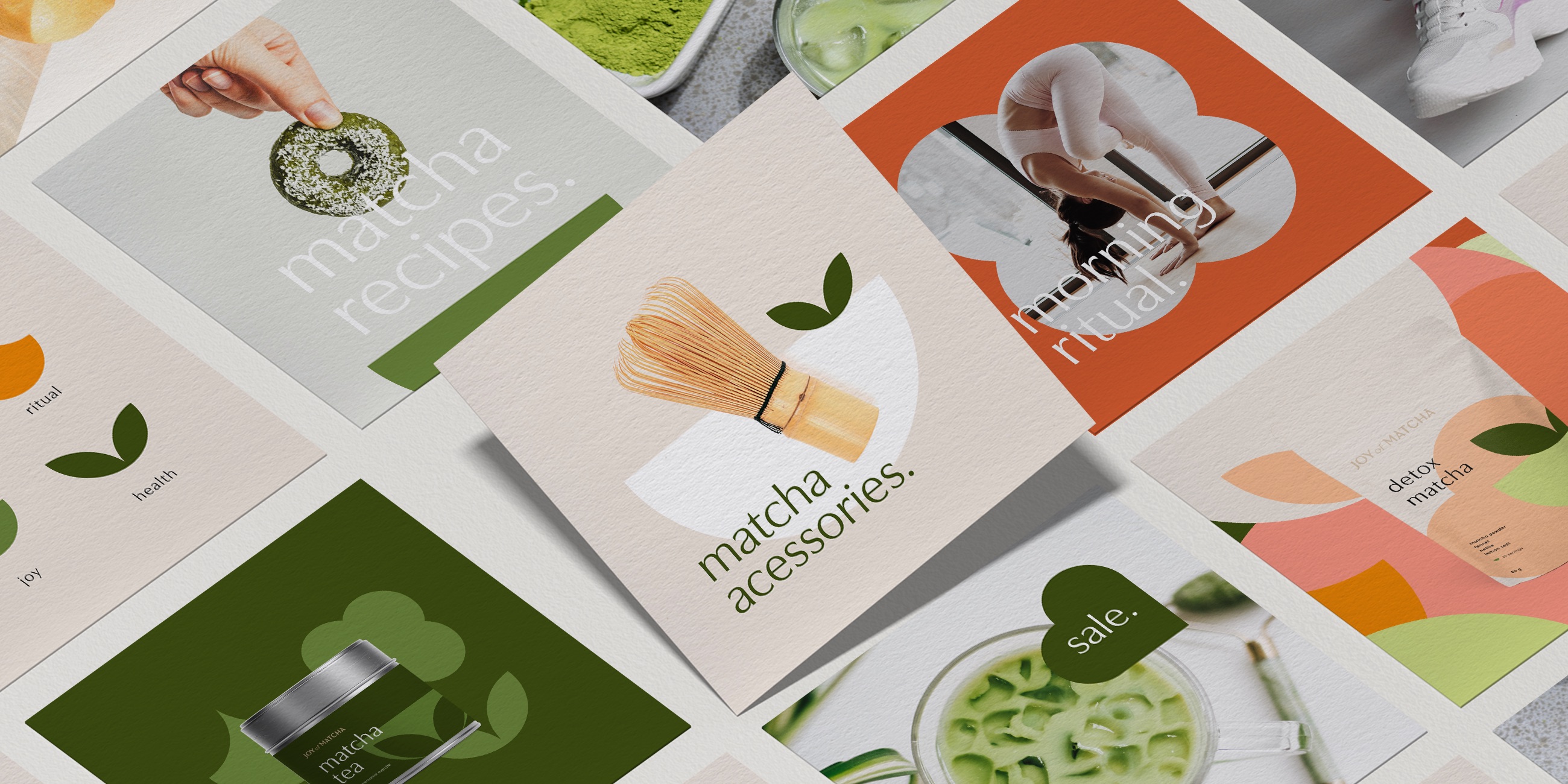
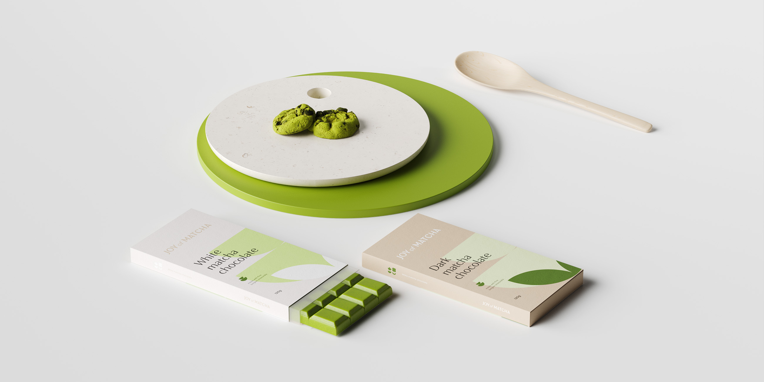
Passionate by the power of their matcha, our goal was to transmit all the ancestral culture of the tea in a modern, relatable, and, well as the brand name says for itself, joyful, throughout the brand’s wide range of products.
Solution
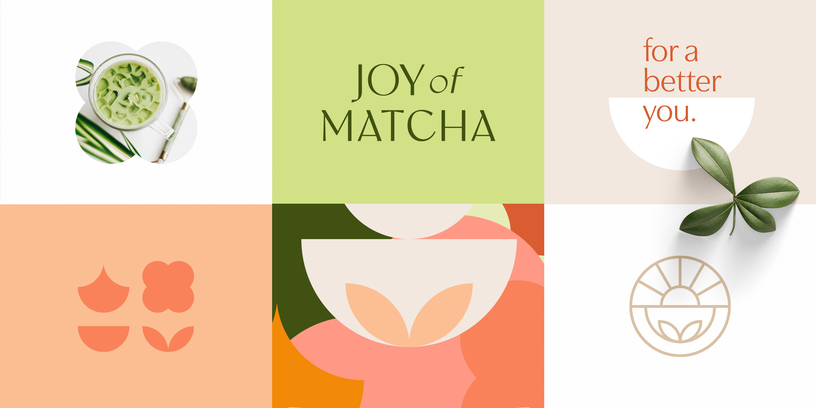
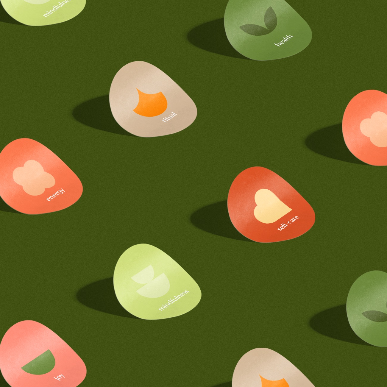
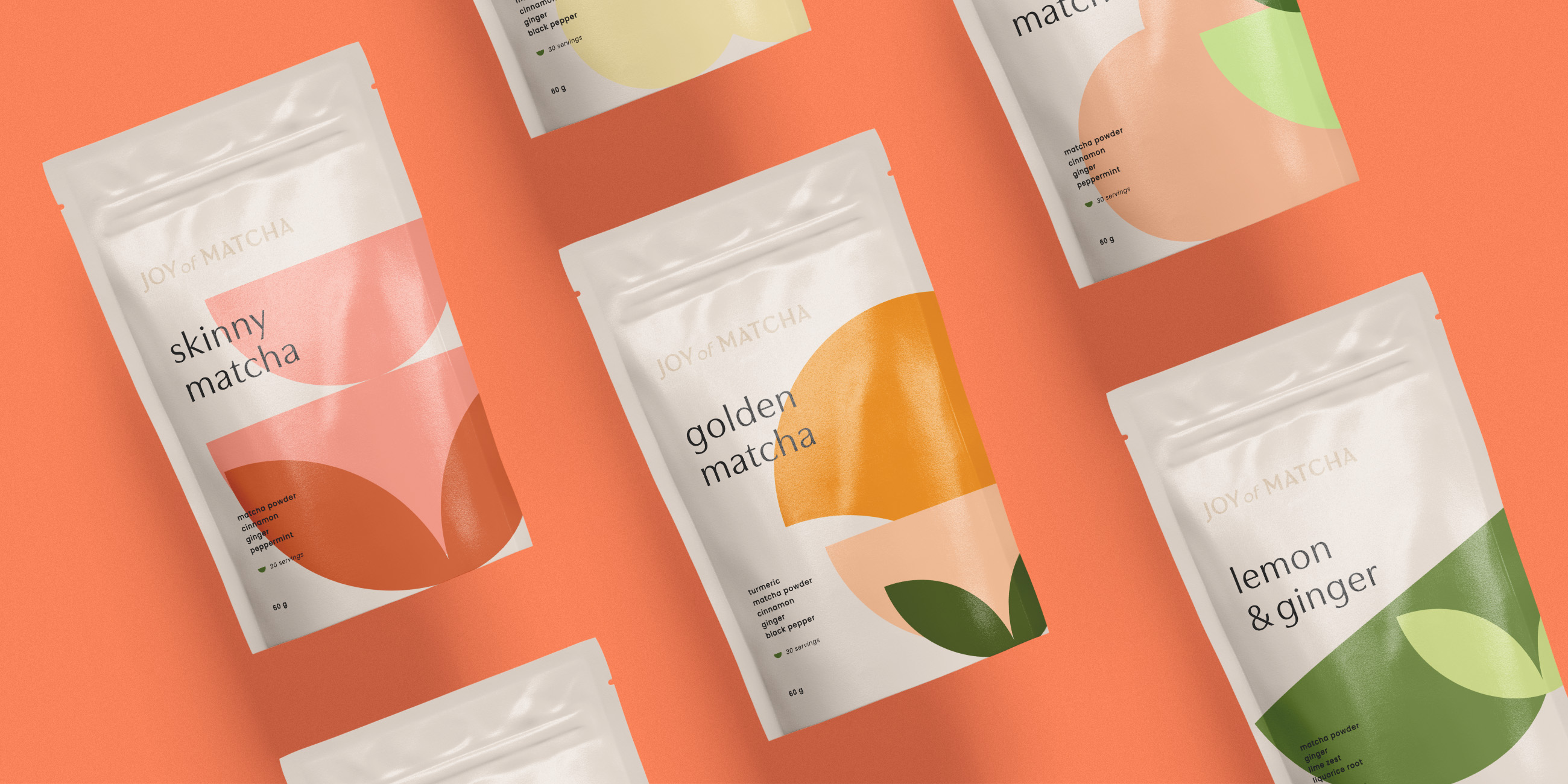
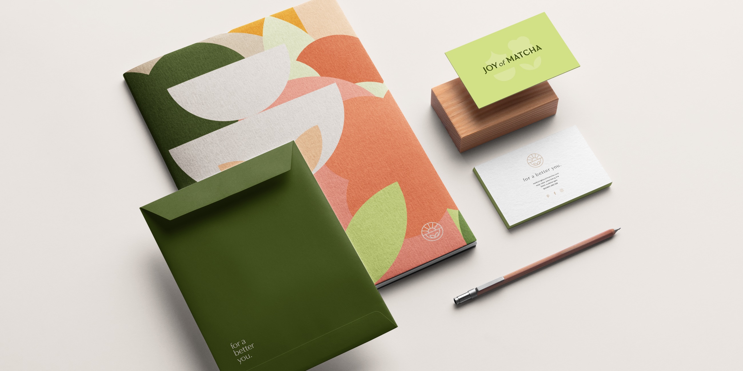
The brand blends Japanese culture-inspired font and symbols with colors and elements associated with the wellness benefits and playful personality of the brand. Have some fun too, try to find the smile that each icon brings in its own way.

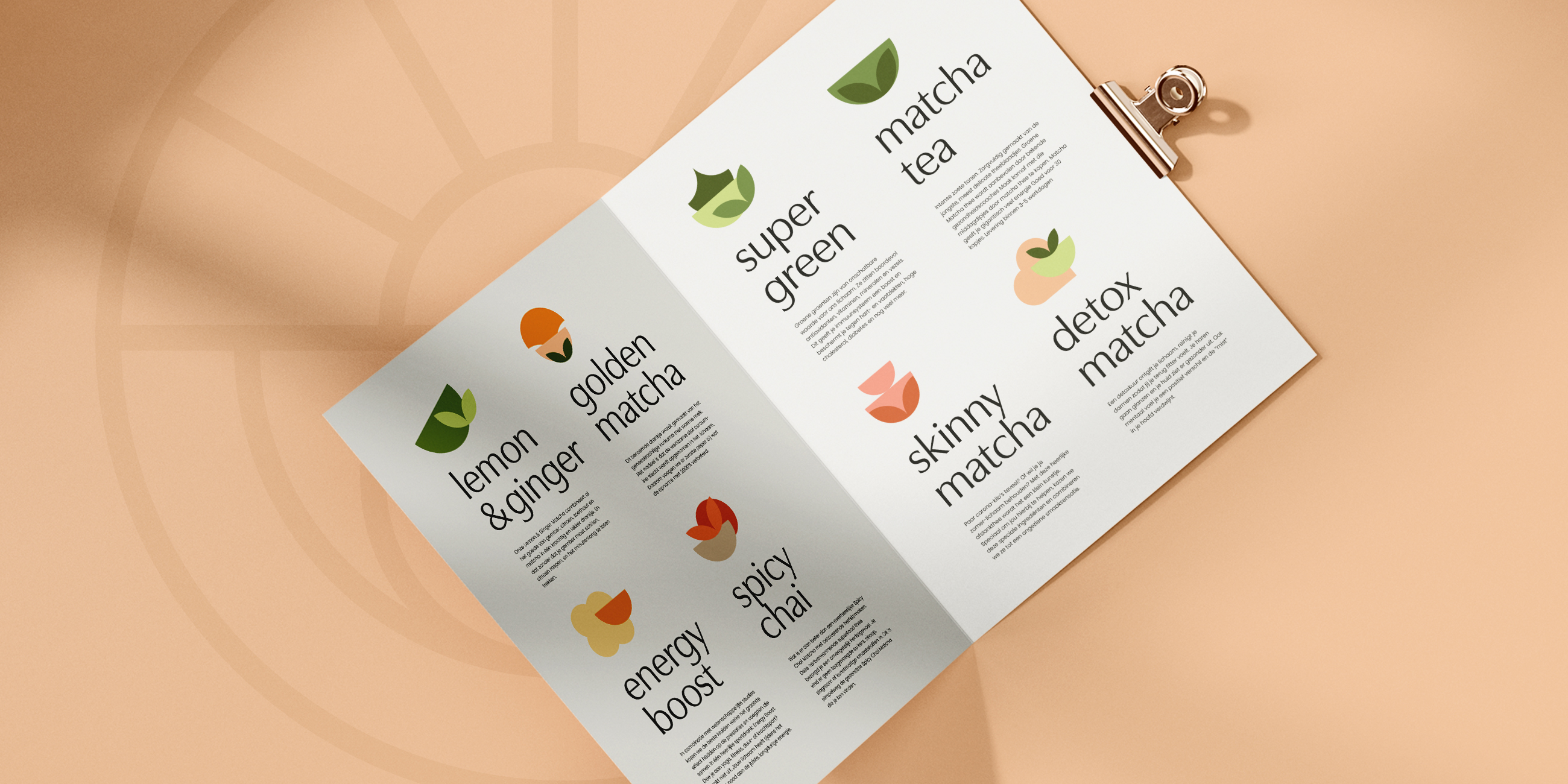
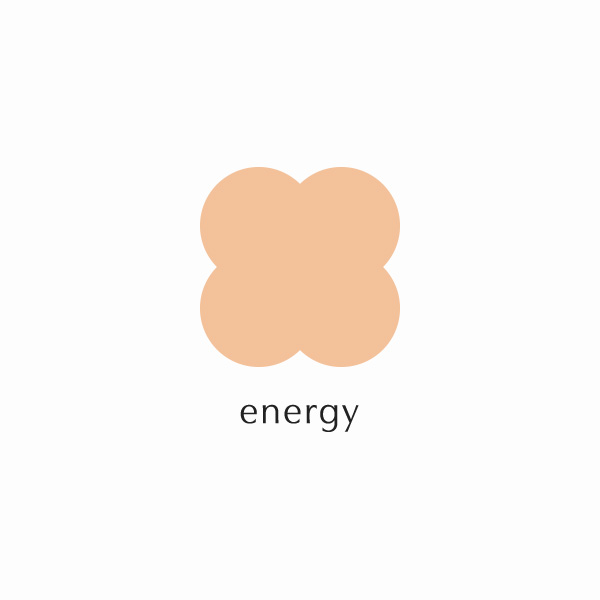
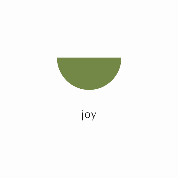
Symbols
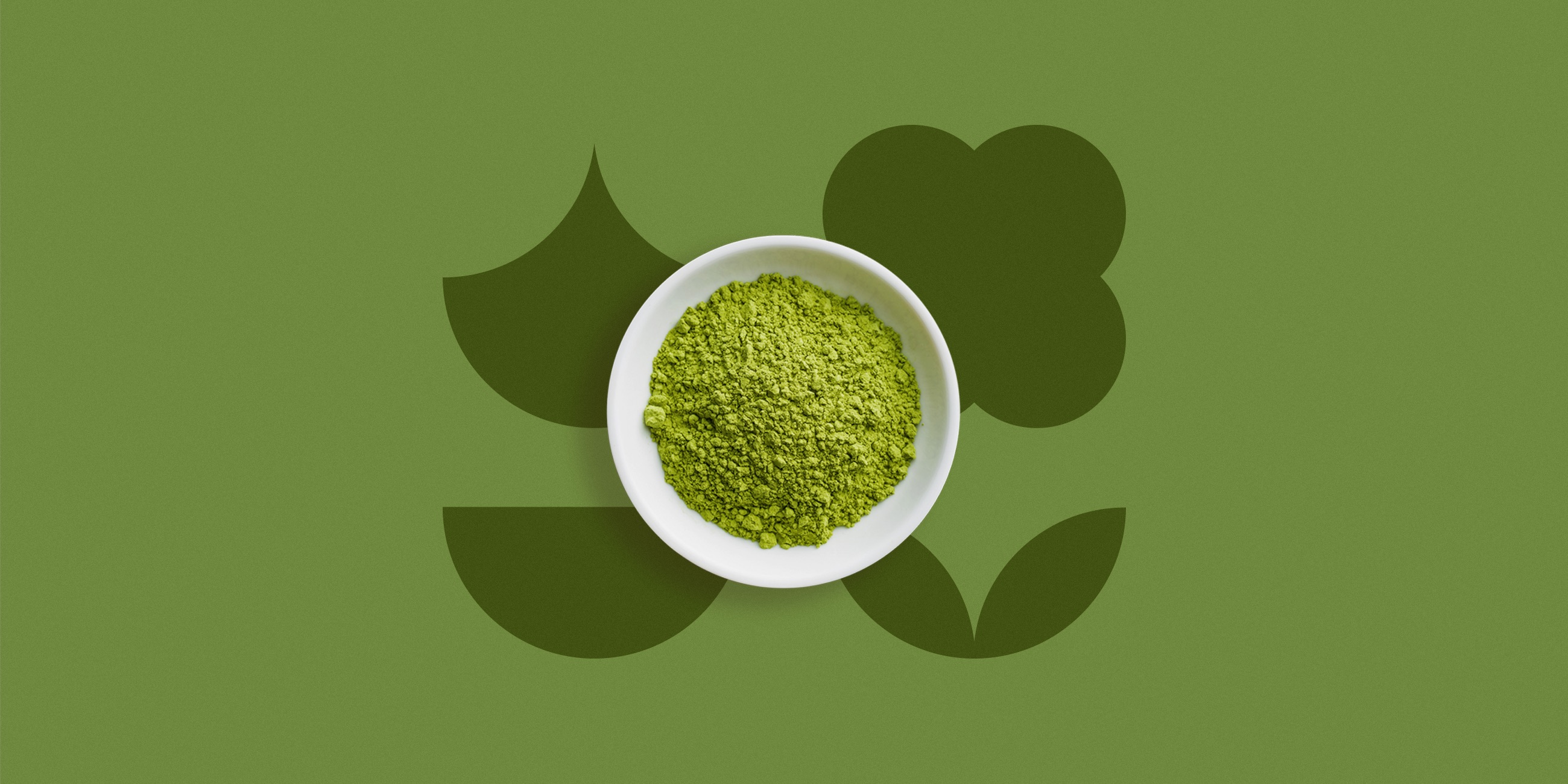
Separately, the icons carry different meanings, however when mixed together they create illustrations that are used as flavours’s identifiers.







Need a project?