Elofy
Elofy is an HR tech platform that allows companies to track and increase their team motivation and results. As its clients' results, Elofy grew a lot since its foundation, and so the need to rebrand to a more mature posture.
Location: Brazil
Role: Branding
Date: 2023
Challenge
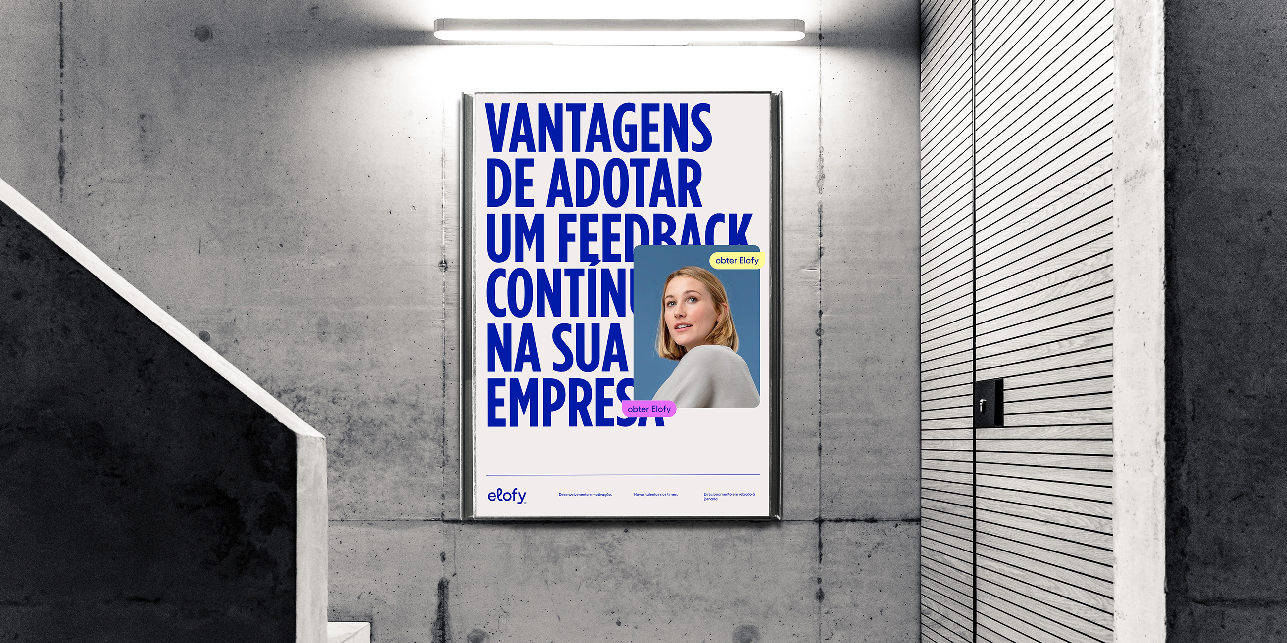
After going from five to more than 60 collaborators and serving over 300,000 users of well-known companies, Elofy needed to show a more mature look, without losing its human and friendly side.
Solution
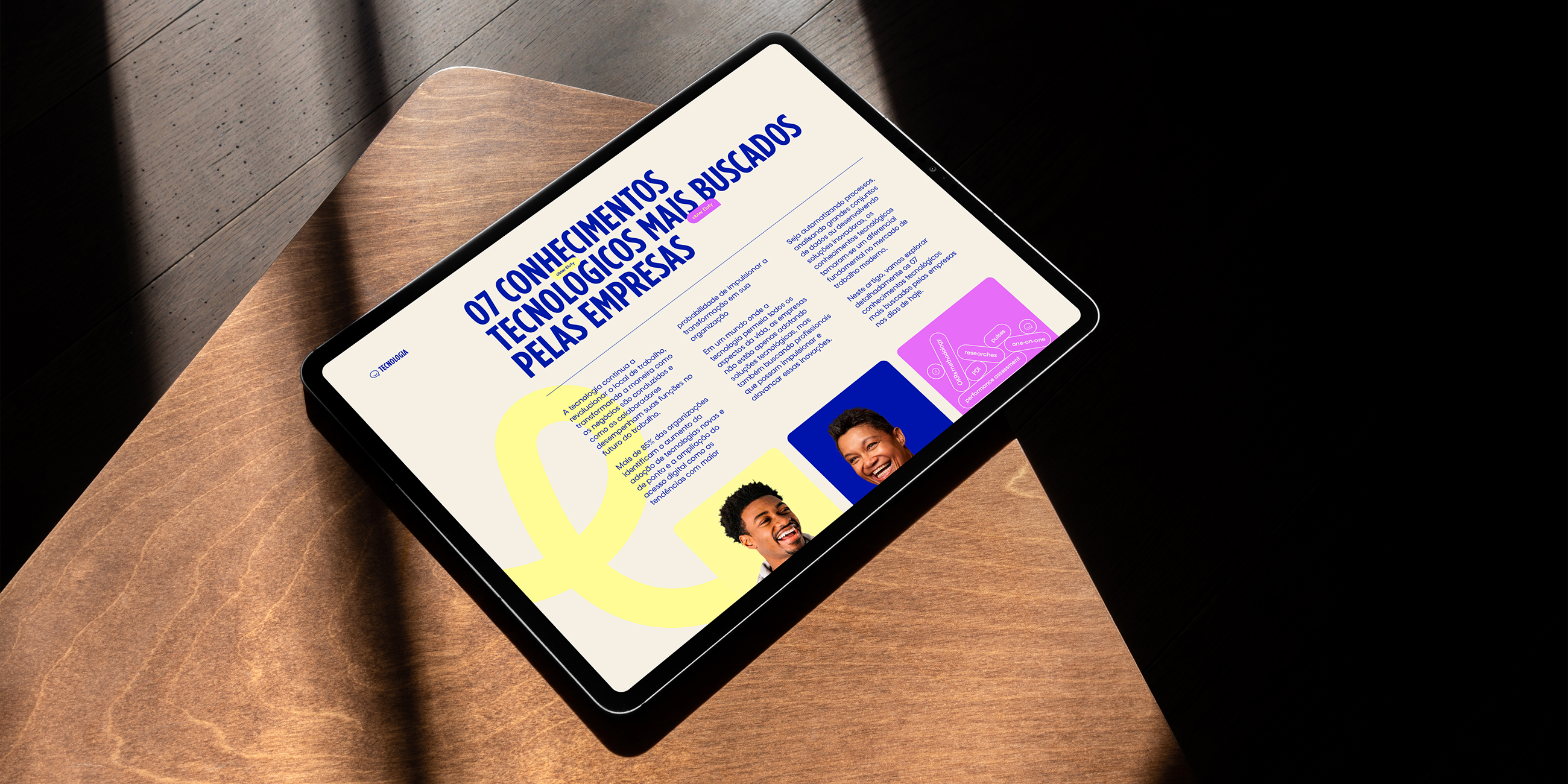
Elofy is doing great so we didn't want to mischaracterize the brand, just elevate its professional aspect. Transitioning from a fun and cool startup to a contemporary and elegant company that's part of an international group.
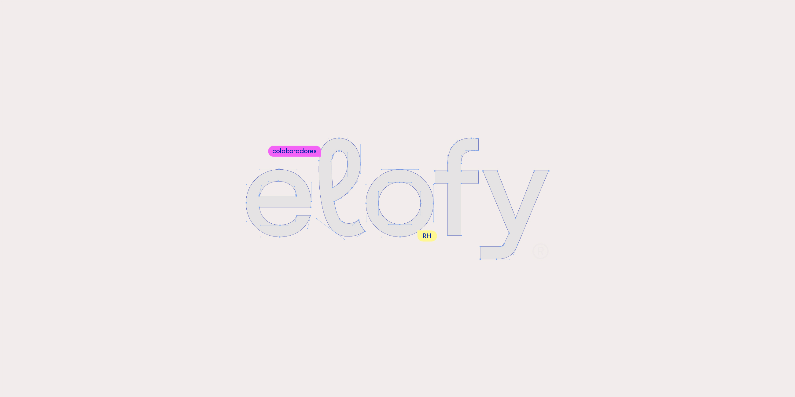
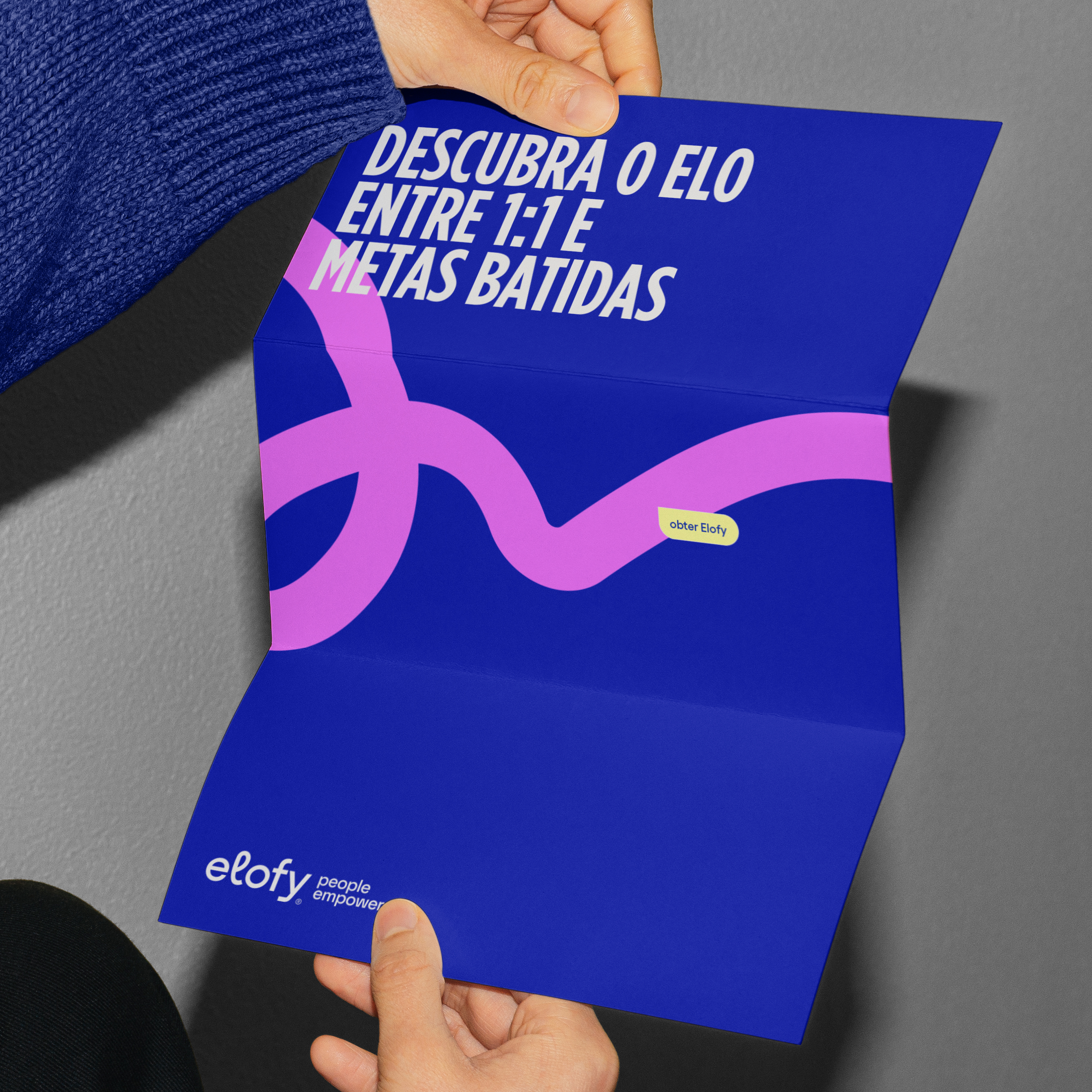
Once very suitable for the startup vibe, the playful logo now needed to be a little bit more serious. Therefore, we bet on a clean and contemporary typo with a tiny stylization to resonate with Elofy's innovative personality and its emphasis on creating connections.
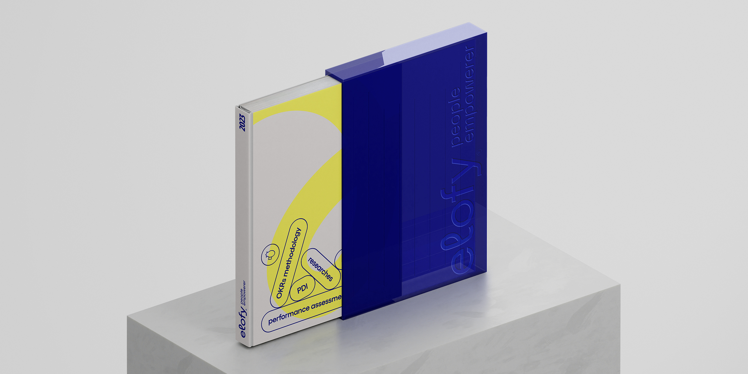
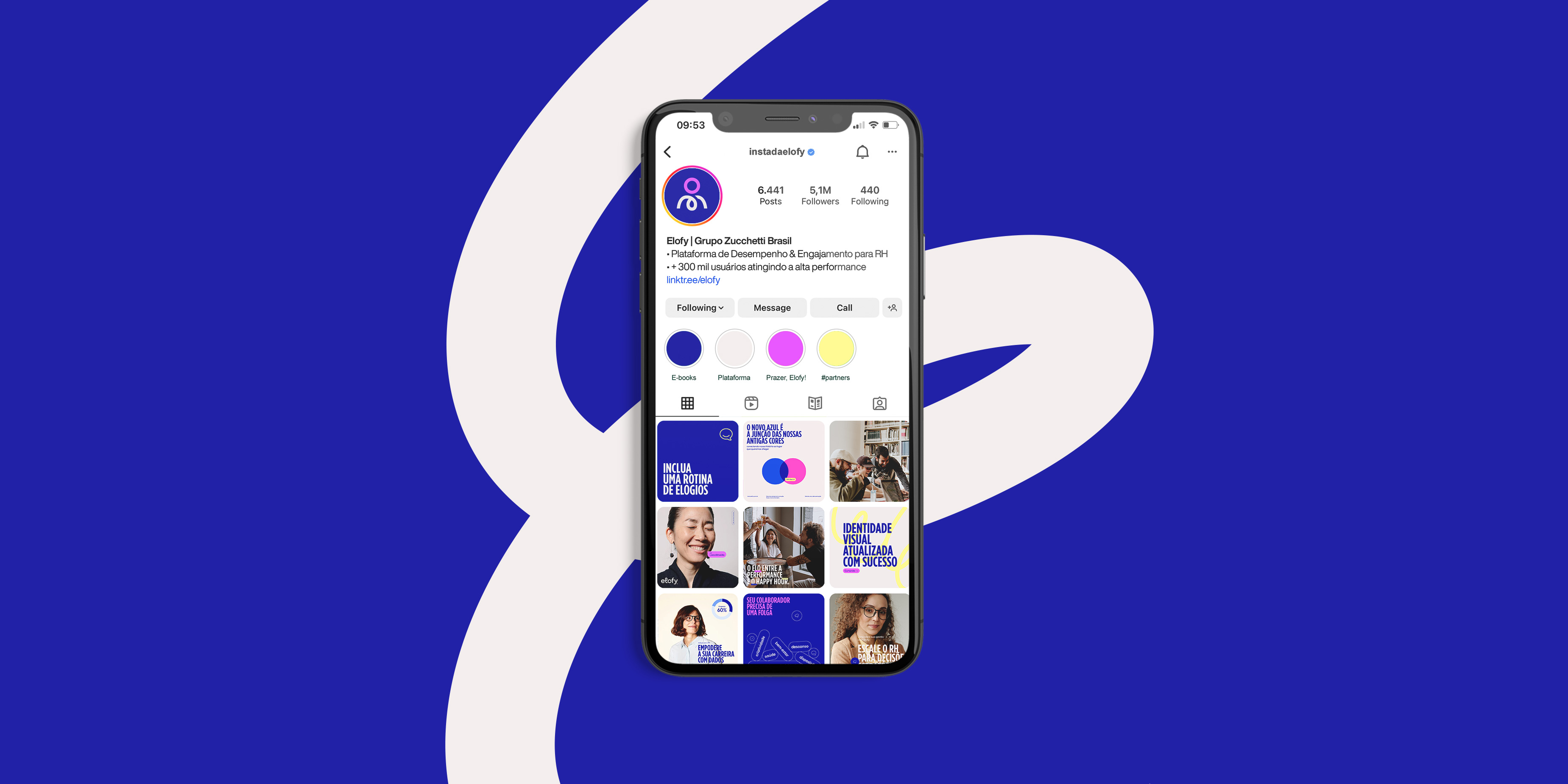

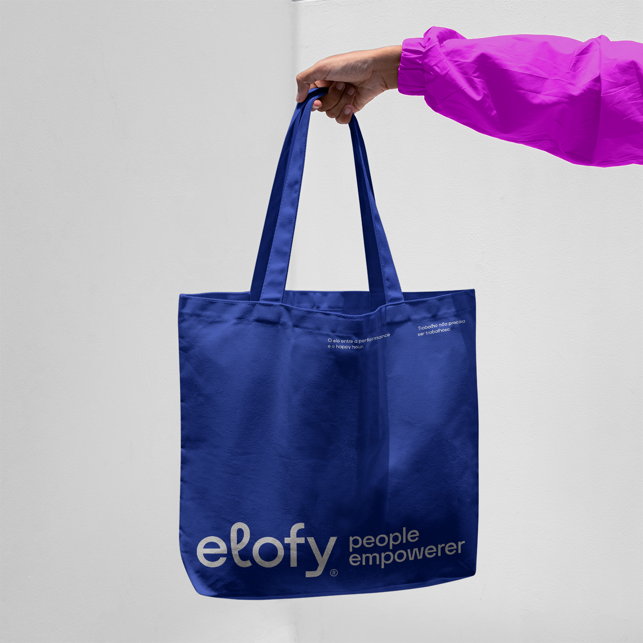
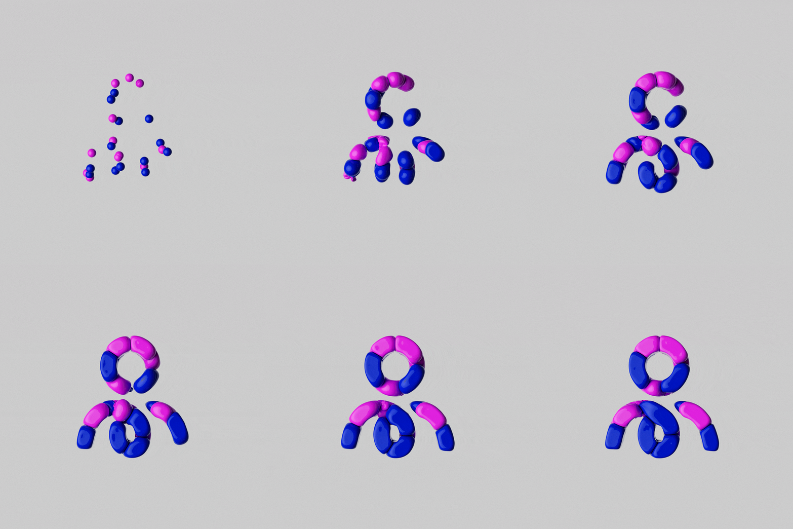
Based on this stylization, we worked on the brand's proposal to connect and create ties between the different parts of the company in dynamic assets to accompany the brand's communications.
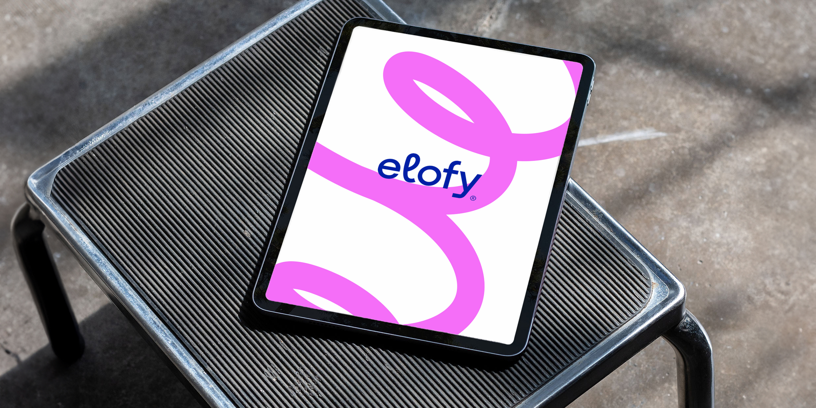
The new palette represents an evolution as well; the darker blue emerged from a blend of the previous blue and pink.

Need a project?