Booma
Booma is a brand of vegan, organic, and extremely high-quality hygiene and care products for babies. With shampoo, anti-diaper rash ointment, and moisturizer, Booma debuts on the market focusing on preserving the health of babies, as well as that of the Earth.
Location: Brazil
Role: Branding & Packaging
Date: 2022
Awards: The Dieline 2023, LAD 2023, BDA 2023
Challenge
Our main challenge was to develop a fun, cute, and friendly visual identity and packaging that would directly connect with the playful atmosphere of childhood, but at the same time elegant and reliable in order to convey all its excellence to parents.
Solution
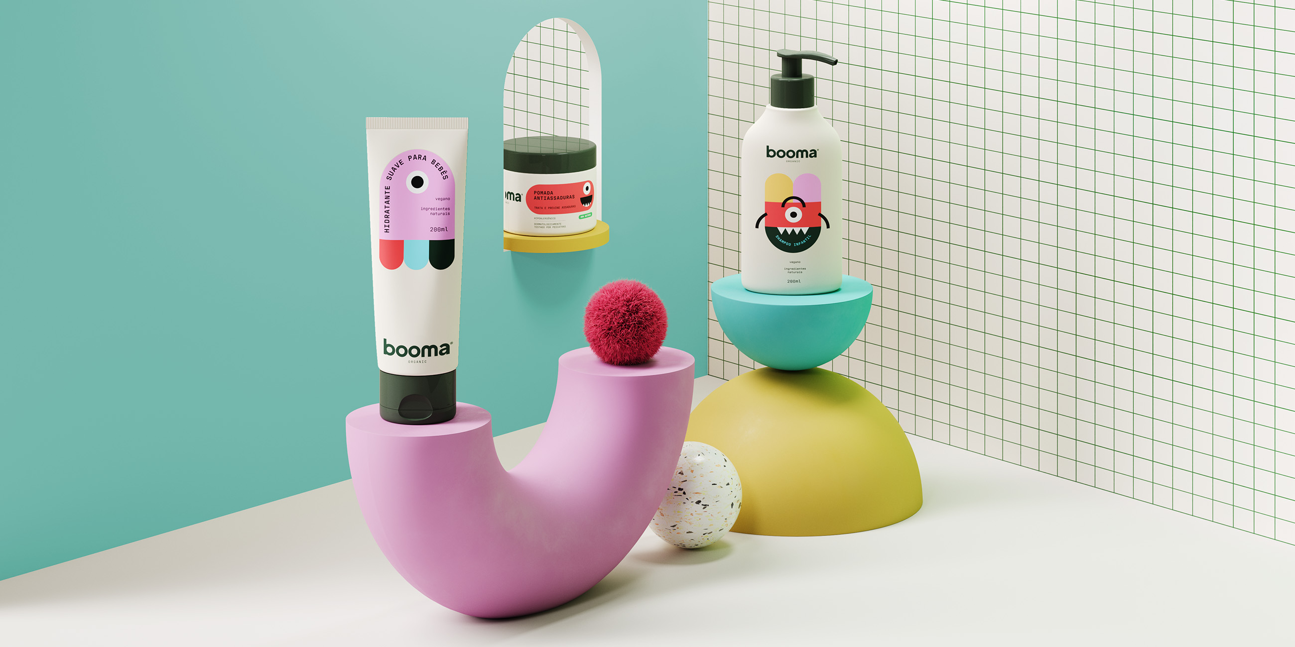
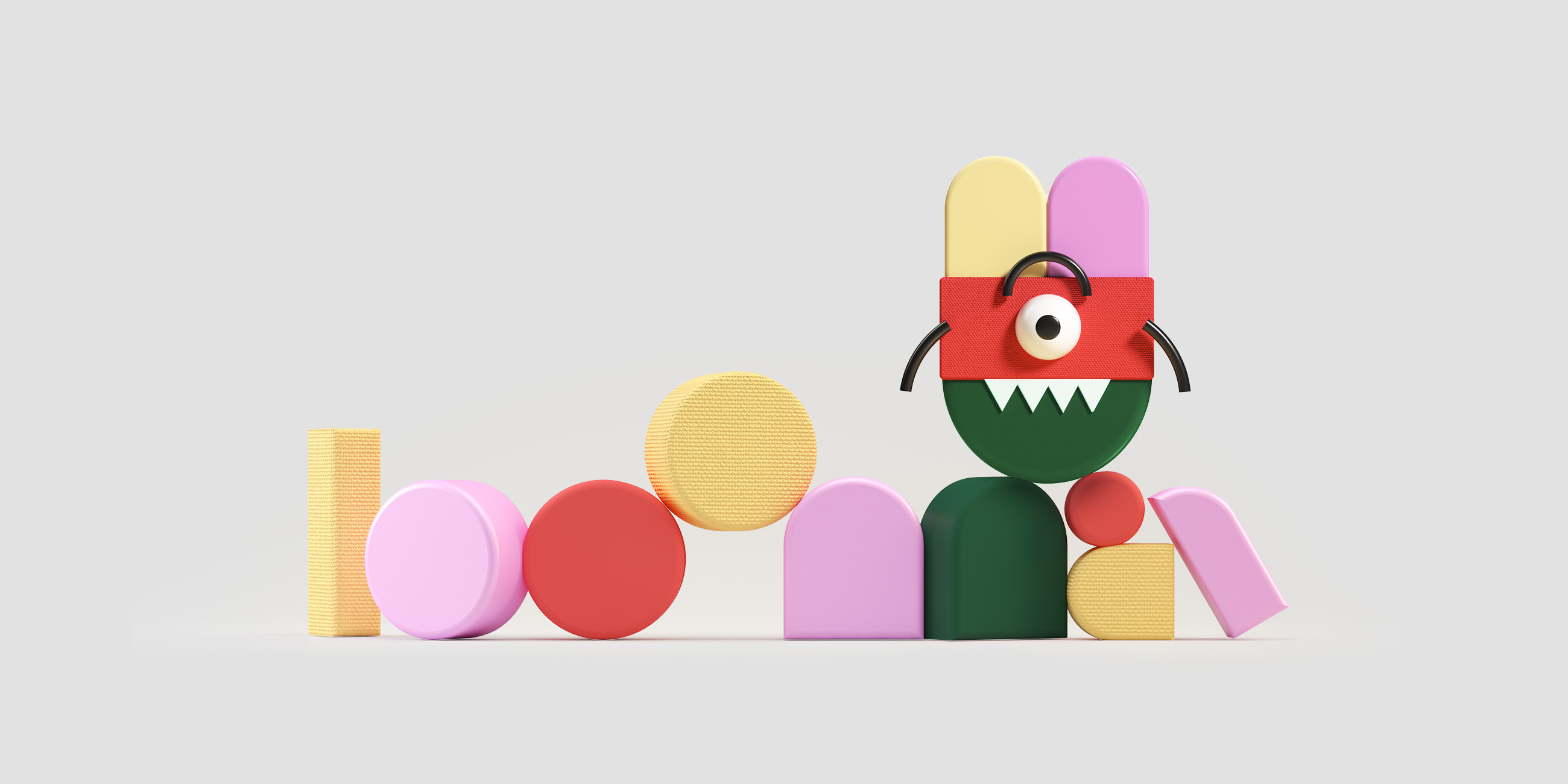
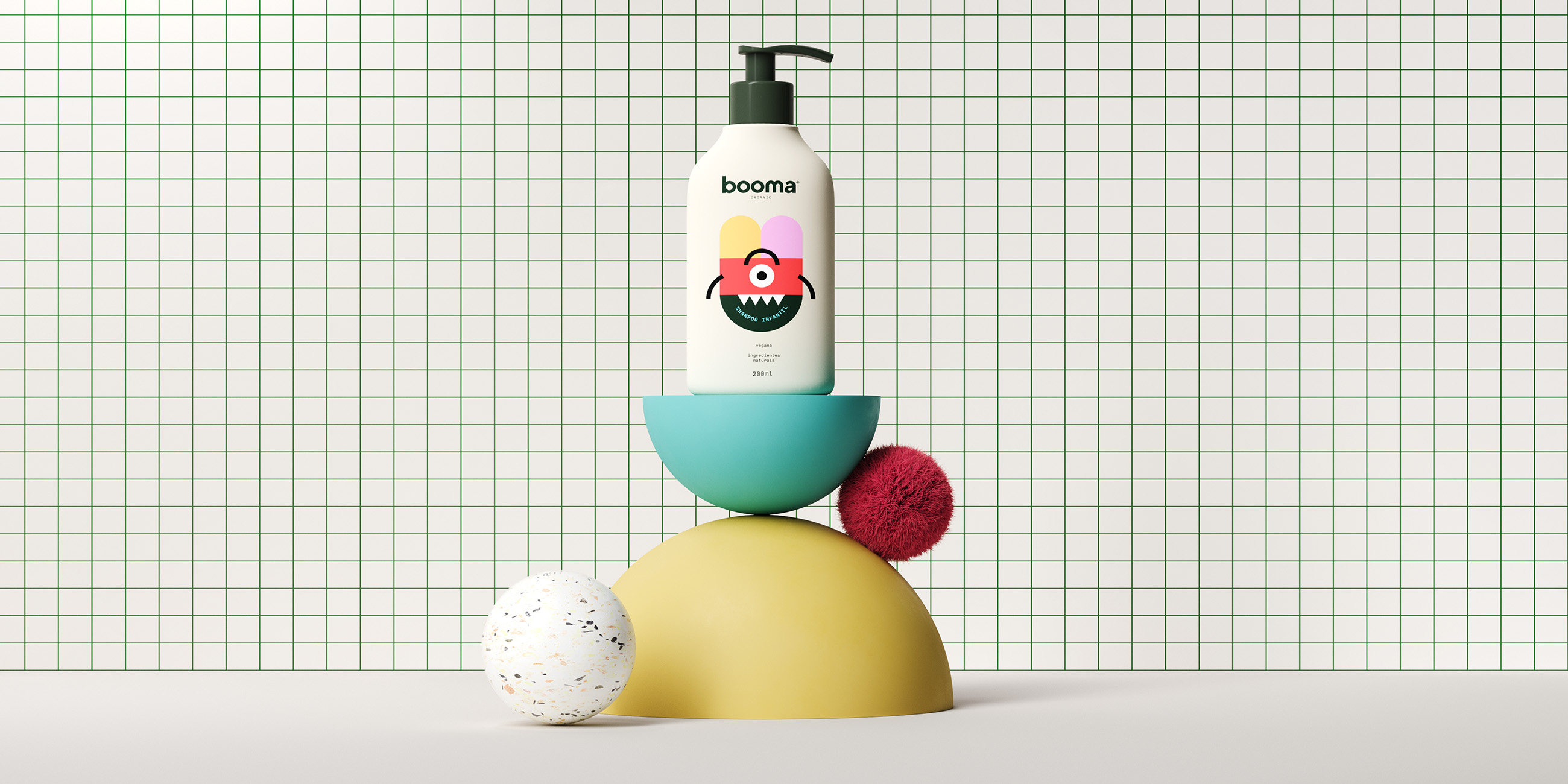
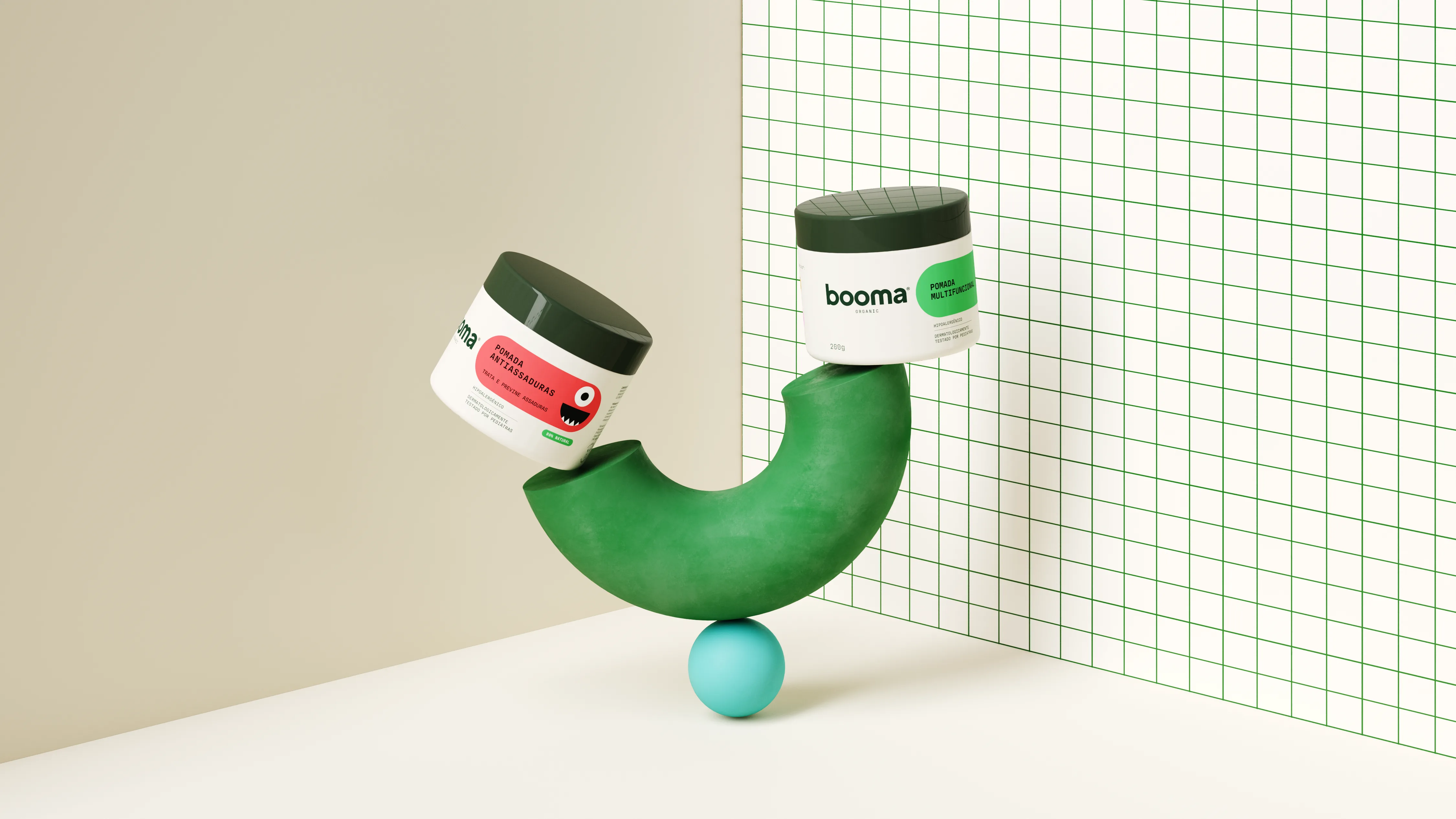
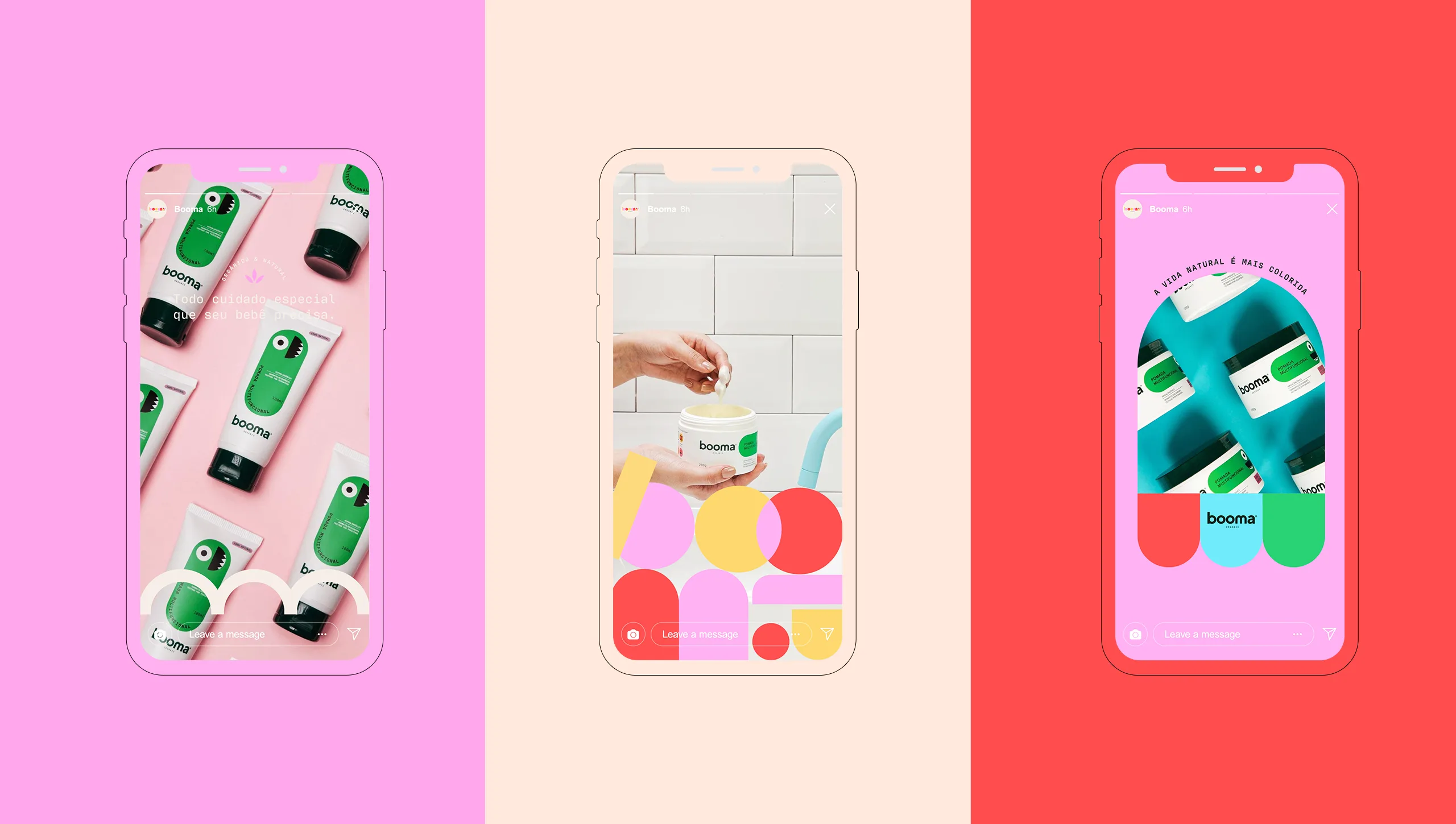
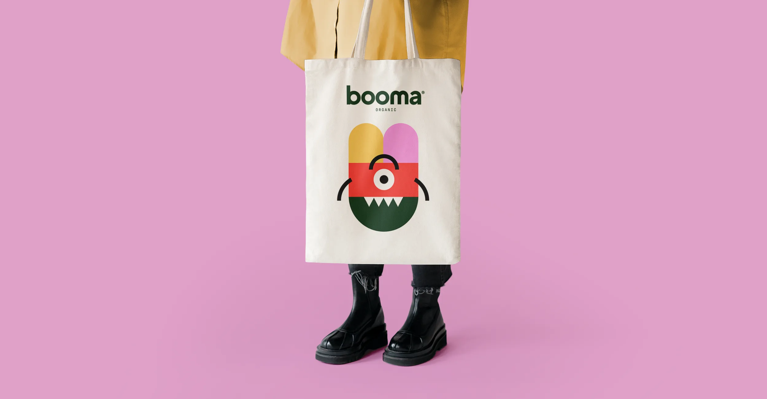
To start the project we inspired ourselves on a universal truth: kids hate bath time. So.. let’s change it a pack at a time! For that reason and from the name Booma, the packing plays with the double meaning of boo: the caring “my boo” and the scaring boo of ghosts and bogeyman. This way we gave life to these beautiful ugly creatures to transform one of the scariest times of childhood into a loving and caring family moment.
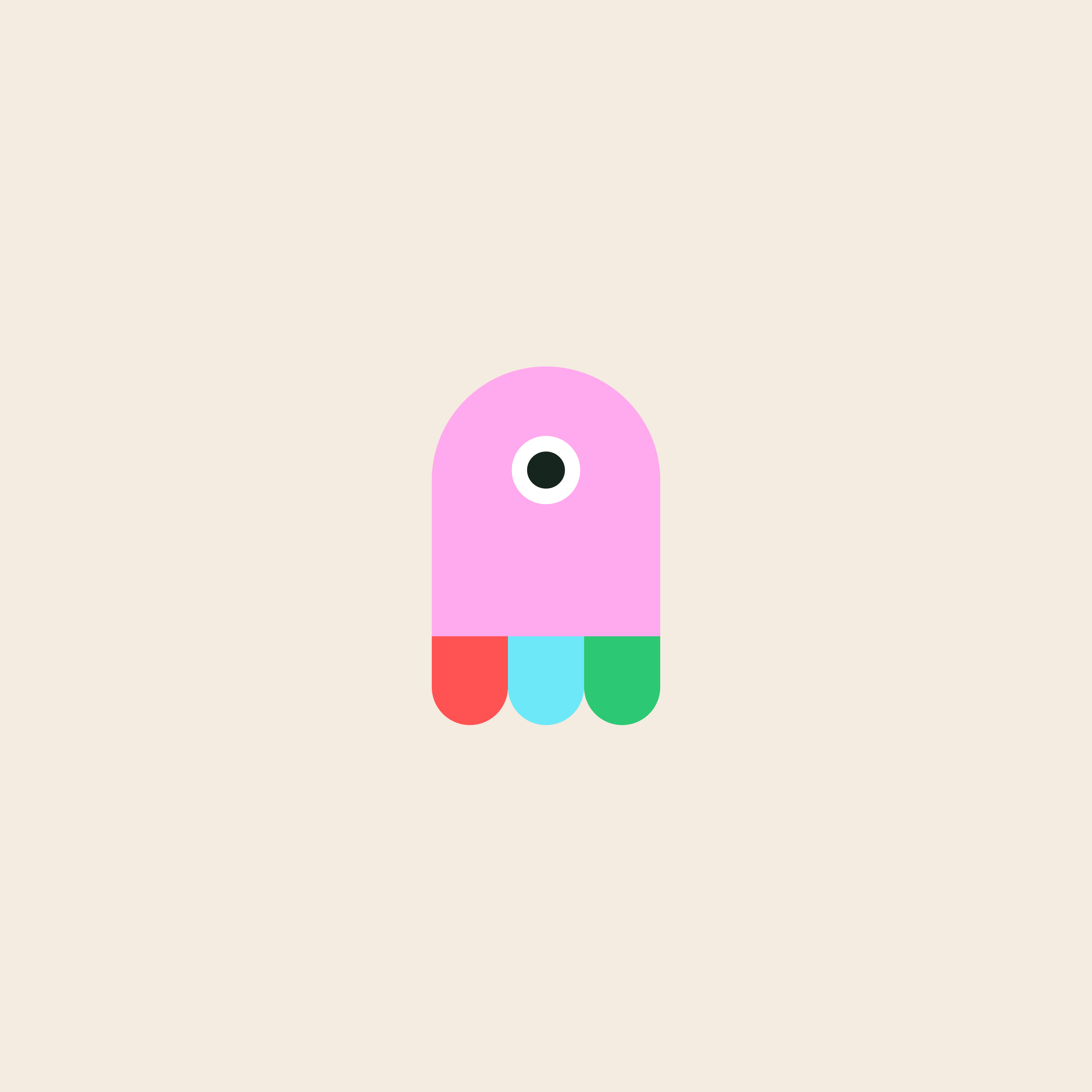
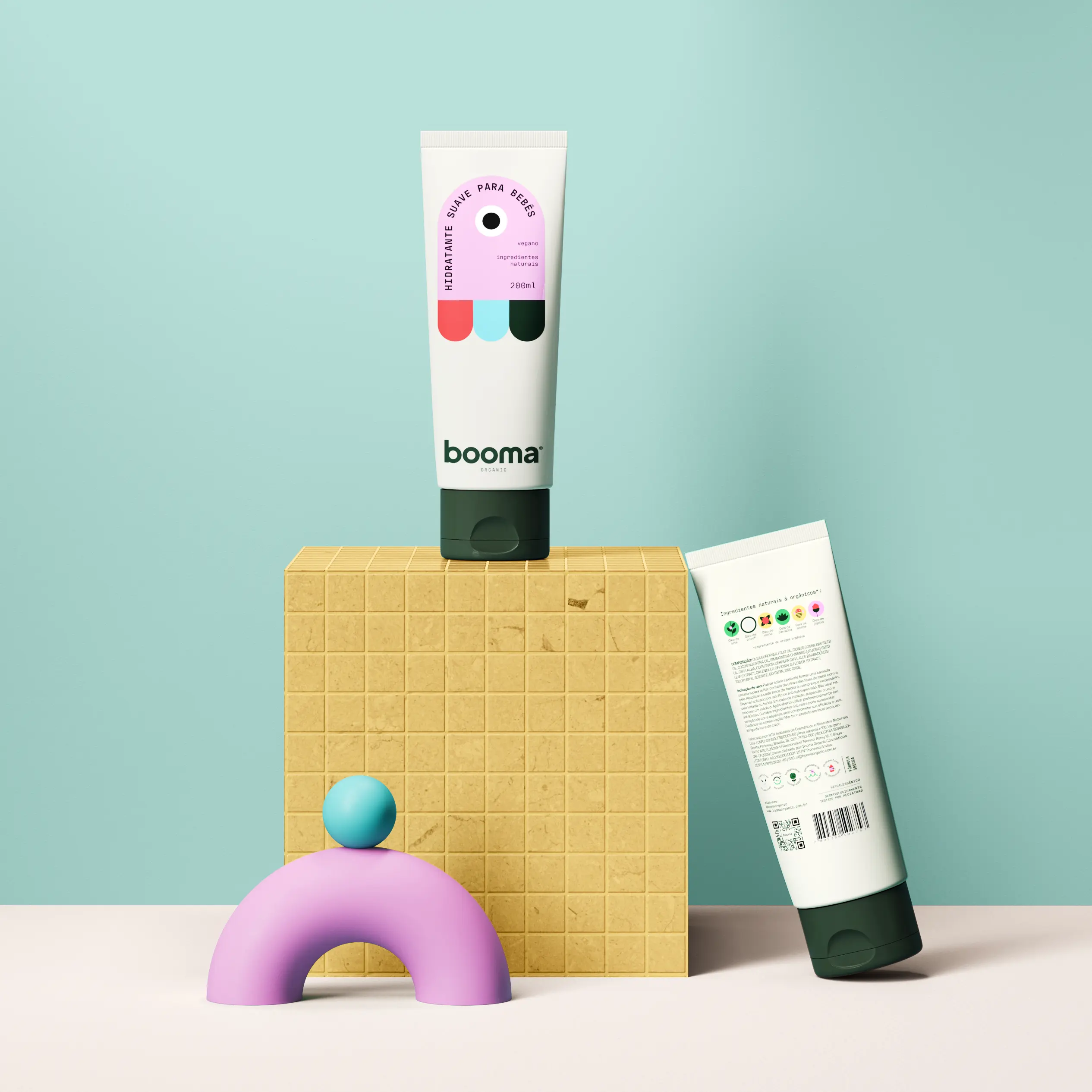
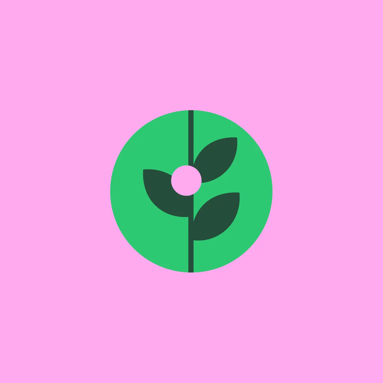
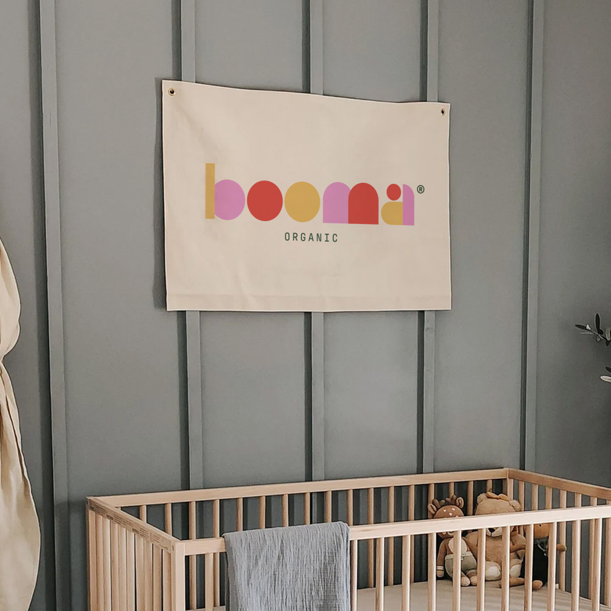
The monsters were created from the geometry of the Booma logo, which was developed based on the famous shape sorter and building toys. However, the version of the logo used on the packaging is the institutional one. To balance the fun with the brand's high quality, the light background associated with monospaced typography brings elegance and minimalism to the packaging.
Bath time is extremely important for the baby's health as it prevents various diseases. For all the care, worry, crying, and tantrums involved, it can be just as stressful for parents as it is for little ones. Booma was born precisely from a concerned mother who was looking for the best for her daughter: more natural products that could offer quality and effectiveness without harming her baby's health.
The love involved in care makes the bath become much more than a hygiene routine. According to experts, it is the opportunity to strengthen ties with the child and stimulate autonomy and senses. For all these reasons, Booma comes up with a fun look to turn this sometimes tense and tiring moment into a happy, light, safe and memorable experience for babies and parents alike.
Booma
fun bath time

Need a project?