Al-Zait
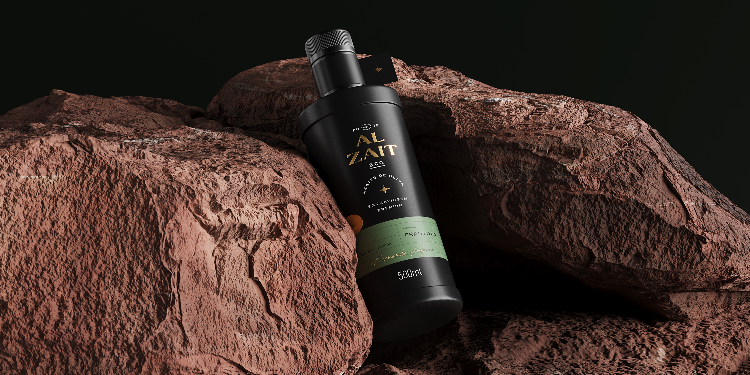
Al-Zait is a brand that values nature as a source of experiences and moments of delight in contemporary life. Inspired by the essence of the olive, they create products ranging from olive oils to perfumes.
Location: Brazil
Role: Branding & Packaging
Date: 2024
Challenge
Develop a visual identity and packaging system that would elevate the brand’s perceived value.
Solution
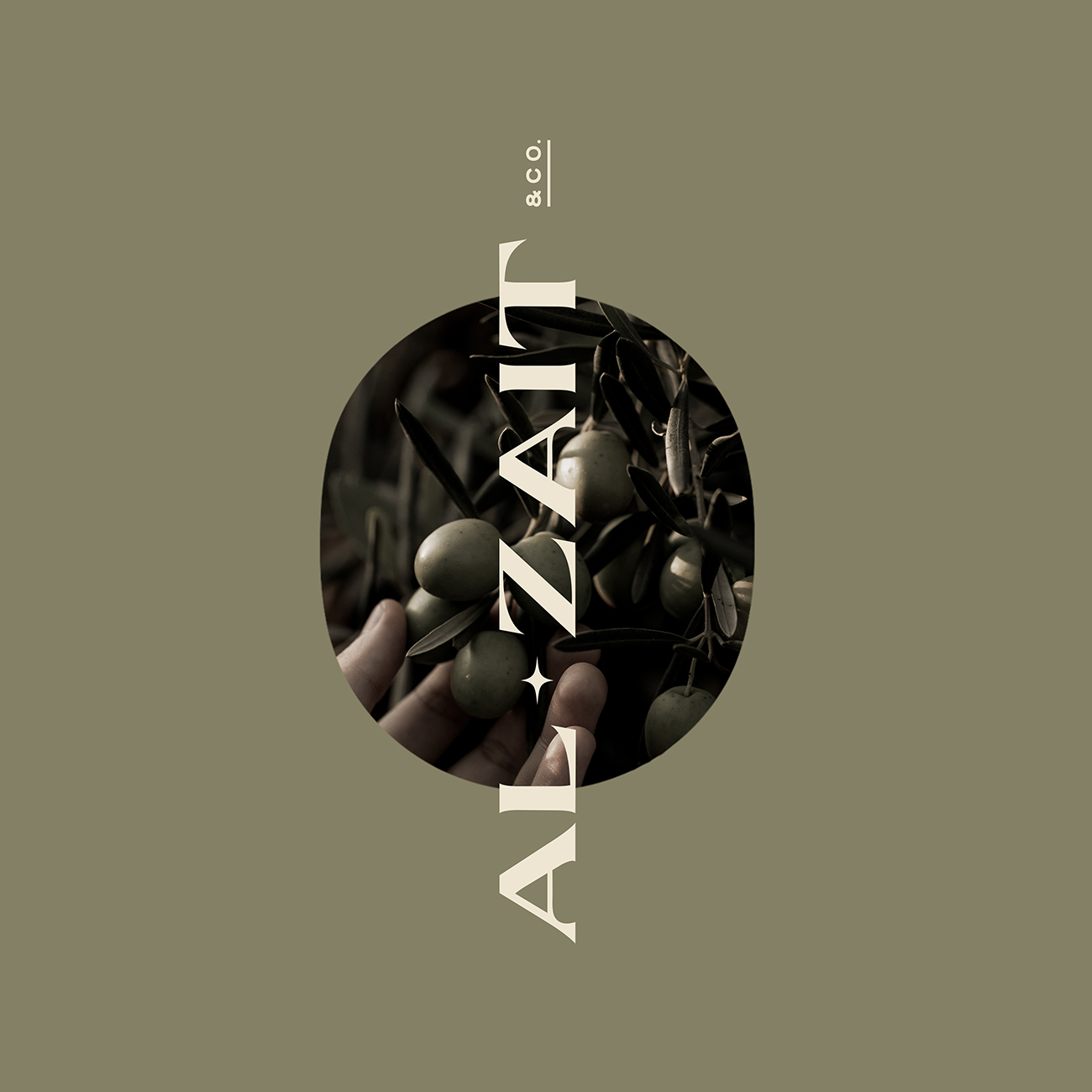
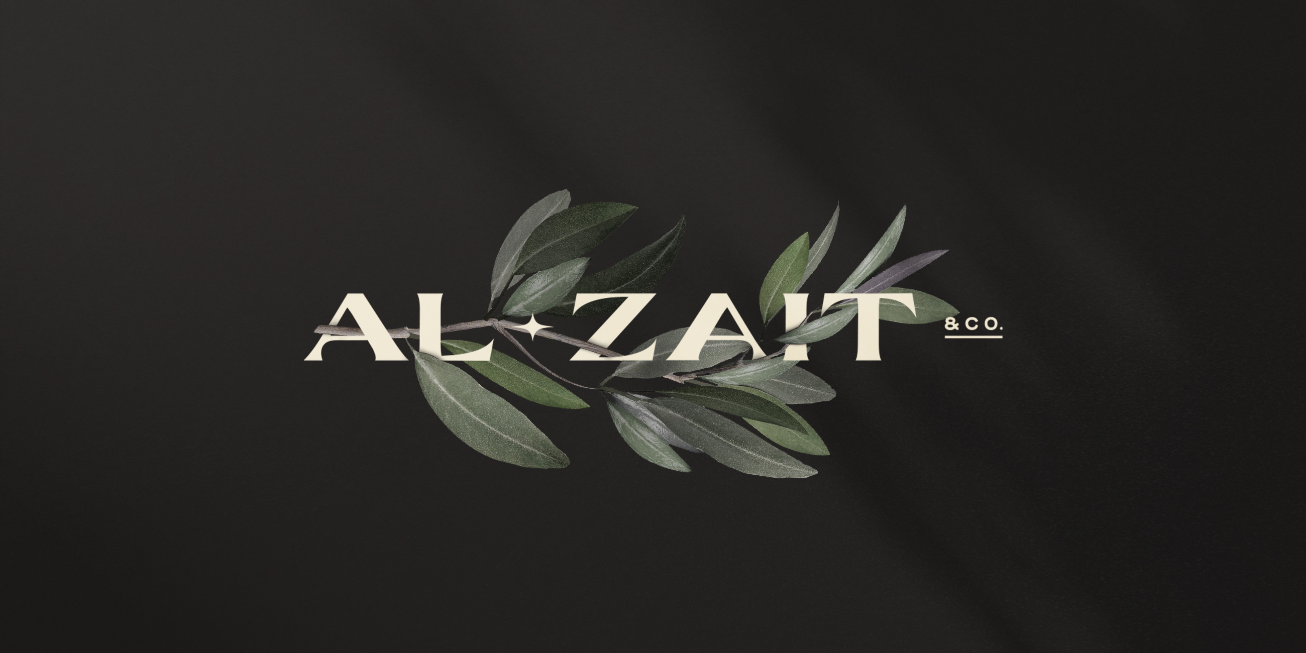
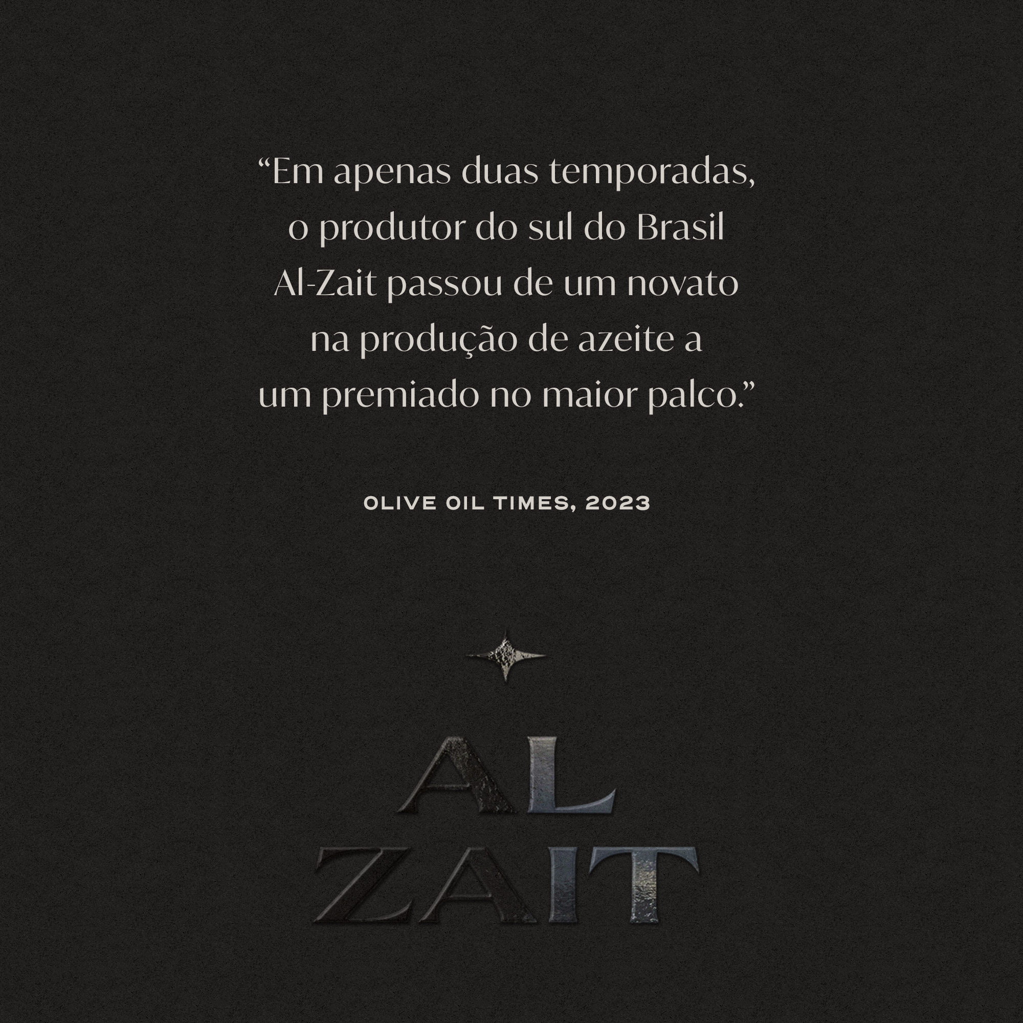
The Al-Zait brand was designed to be timeless, like olive trees. Its angular vertices add personality to the identity, while the contrasting thickness of the typography presents sophistication and elegance. The pronounced curves interact with other identity elements, such as the star and the ellipse.
.
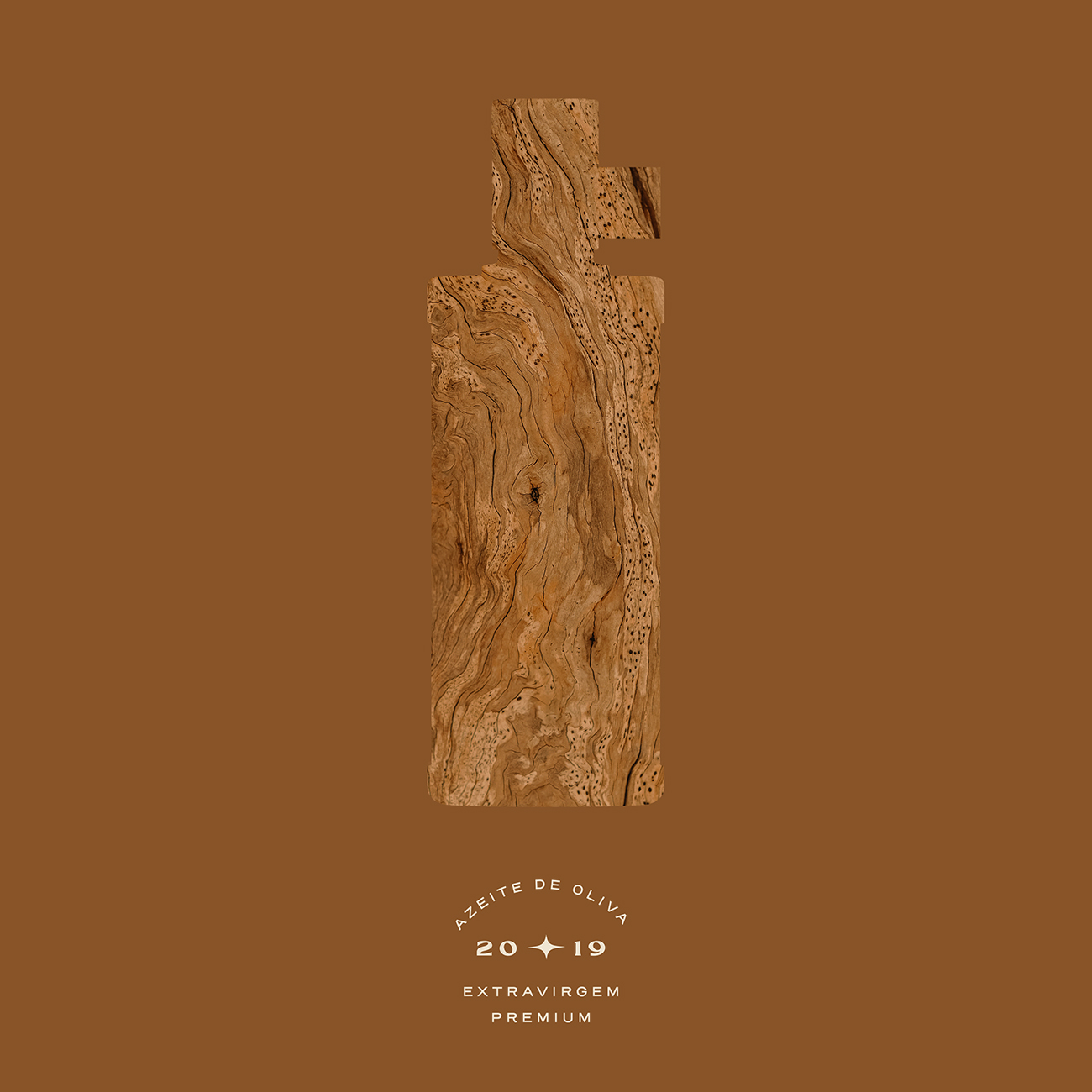
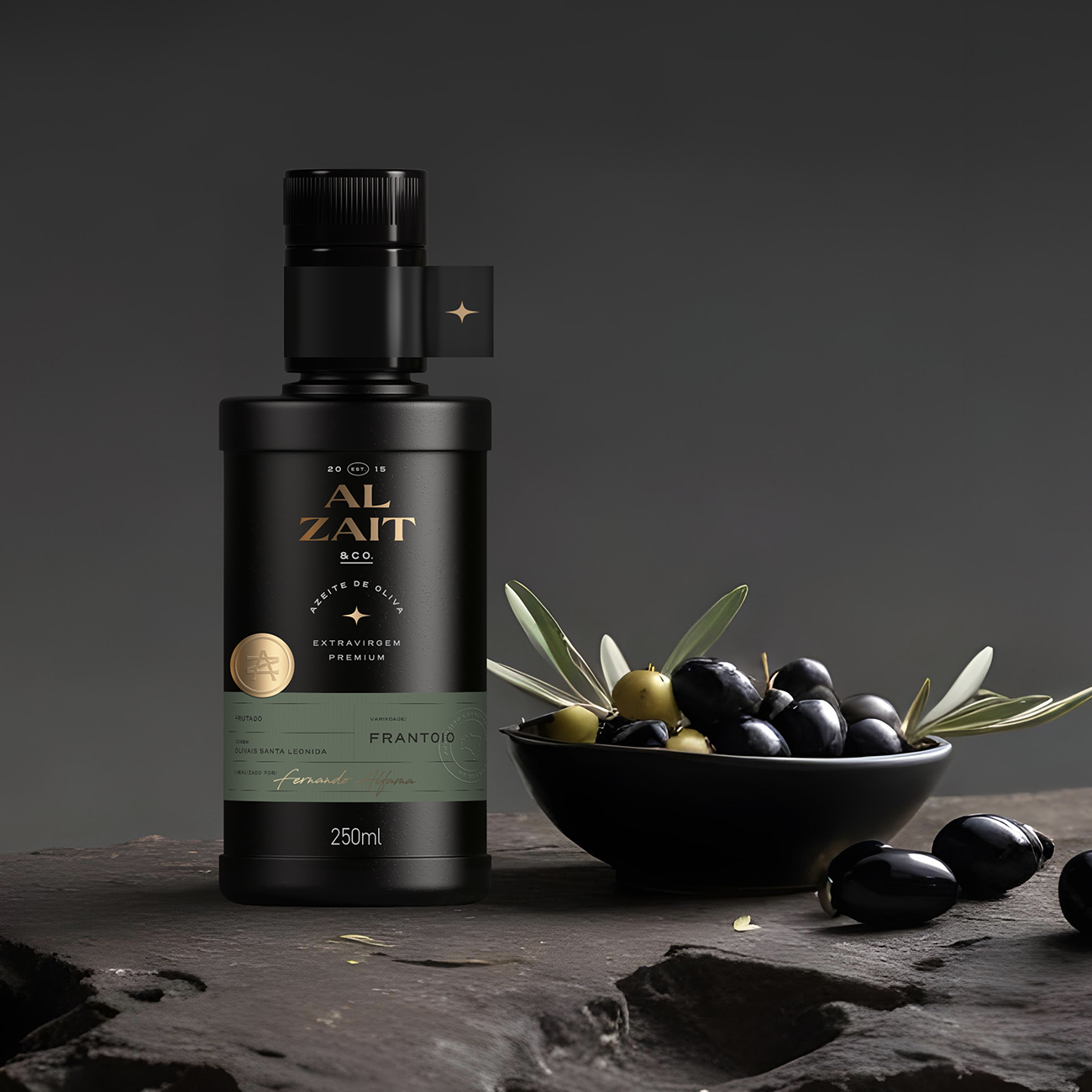
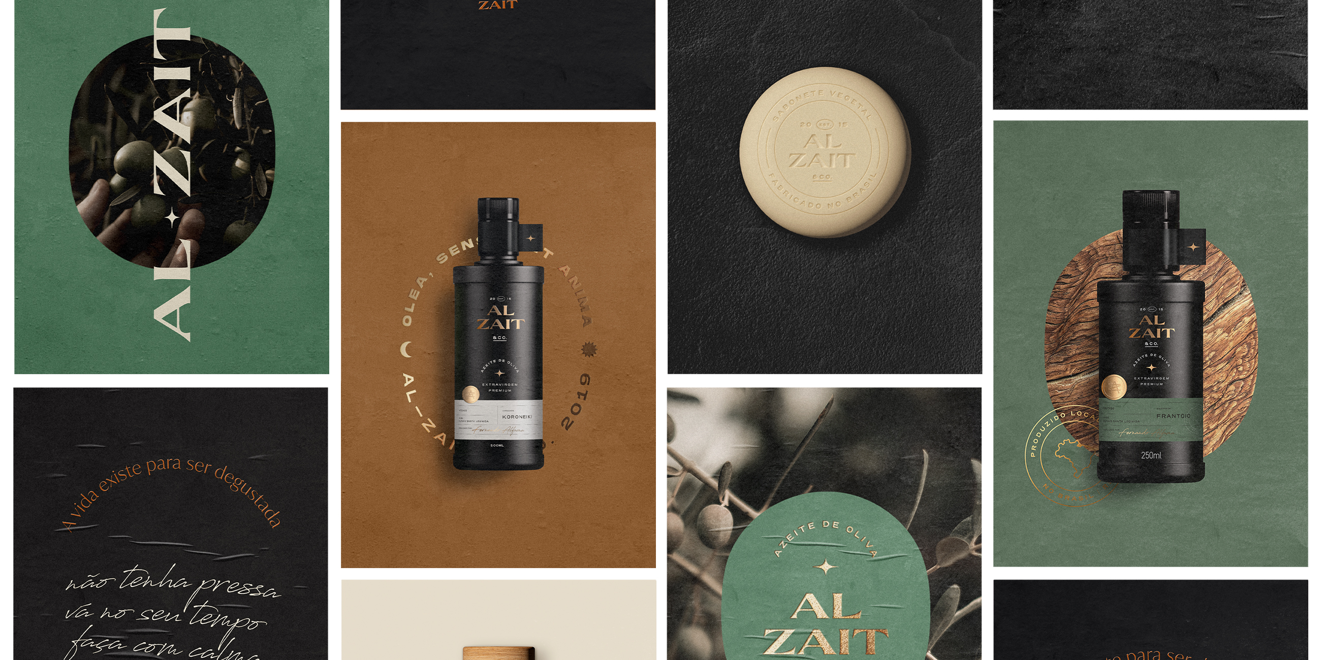
Elegance and strength were the guiding principles for the packaging design. The packaging system harmonizes clear information, sophisticated finishes, and a variety of materials and textures. The matte finish is balanced with embossed metallic seals and textured paper labels.
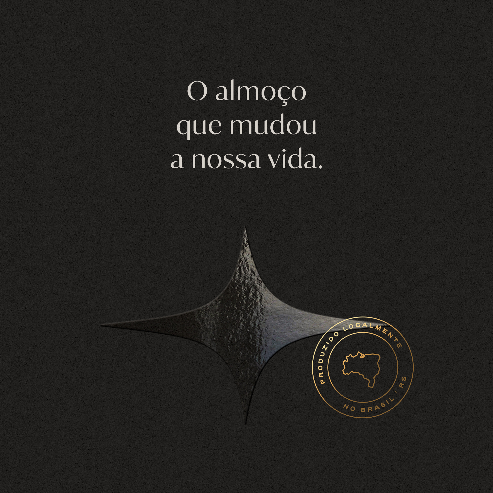


Premiumness
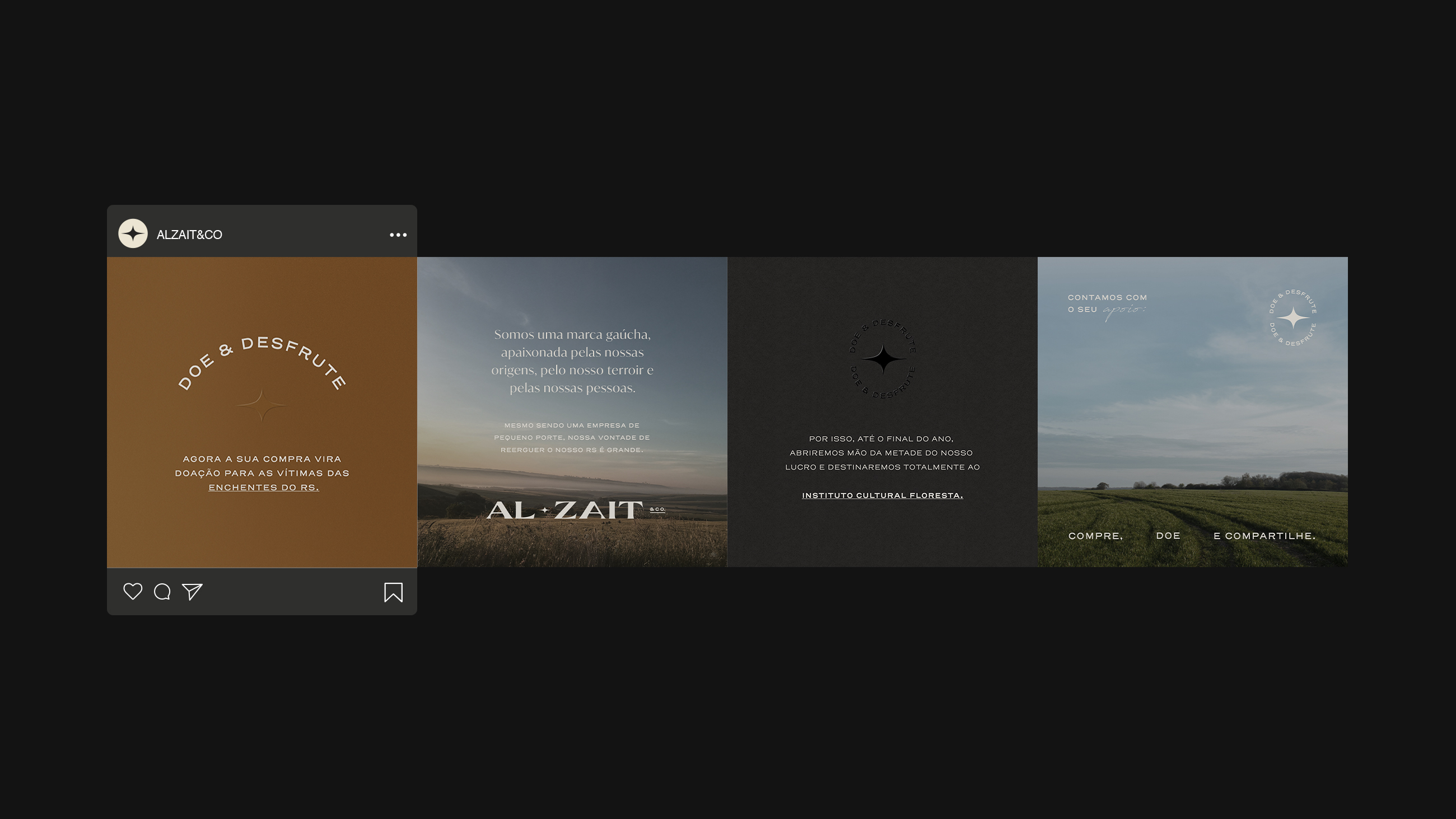
The premium aspect is also reflected in the choice of a neutral and sober color palette. This balance between warm and cool tones creates application possibilities and practicality for a wide product range.
.

Need a project?