Five projects, one question: what can this brand sustain to be recognized before it is read?
A good package is recognized before it is read. On the shelf, in the feed or in someone's hand across the room, reading starts with shape, color and rhythm, and only then reaches the text. That does not happen by chance, or by volume: it happens when a few decisions are made with rigor and sustained to the end.
For us, the work starts there: one form, one color, one voice. Five recent projects show how this idea changes its face for each brand without changing its question.
Recognizing from afar is not shouting louder
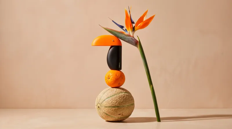
At Cheirinho da Farm, the starting point was a scent, the most invisible of bonds, and the wish to give it weight, form and permanence. The toucan, the brand's historic icon, was stripped of its literalness and reduced to its structural essence: two overlapping arches.
In a market saturated with utilitarian, generic bottles, the diffuser was repositioned as a sculptural, decorative object. That meant eliminating graphic excess and, through prototyping and refining the form, letting the three-dimensional structure itself take the lead in communication. Color has an almost architectural role: it creates a point of tension inside the domestic space and guides recognition from a distance. The proportions of the arches were calibrated for stability, and the refill system keeps the piece in use for much longer.
A rule that lets the line grow
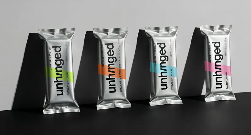
Unhinged was born for people whose days don't follow the clock, and the packaging had to be as clear as the concept: it's too early, it's too late, perfect. The rule is simple. The chrome wrapper is the same across flavors and only the color band changes.
That way each bar is identified at a glance, and the line is born ready for new flavors, formats and even drinks, without losing what makes it recognizable. Black, 2000s grey and chrome form the base. Color comes in as a signal, not as decoration, and typography and stripes do the rest of the work of memory.
Speaking to two people at once
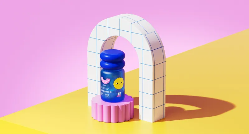
In Brazil's children's gummy market, brands tend to pick a side: functional strength that reassures parents, or fun that wins over kids. Few manage both. Muupi starts with an advantage, the characters and trust inherited from Booma, and with a scene that repeats in homes with children from age two: the daily argument over taking a supplement.
The answer was to give the routine a character, a story and a set time. The package splits the conversation: the front talks to the child through a character, a color and an invitation, and the back talks to parents through function, composition and directions for use. Rounded, sculptural bottles bring the characters into three dimensions and turn each supplement into something to recognize and collect.
Restraint is also a decision
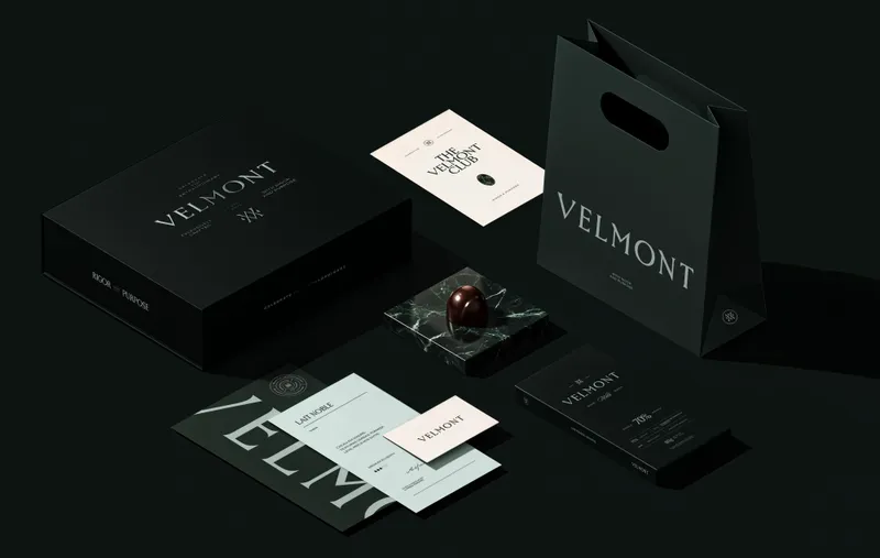
Velmont is a luxury chocolate house that controls the whole process from the roast, in the bean-to-bar model, and needed an identity equal to its own ambition, including supplying fine dining restaurants. Instead of the browns and golds typical of the category, a deep forest green creates immediate differentiation on the shelf. A serif logotype with generous spacing and a monogram fusing V and M build a refined presence.
The central idea starts from a tension: from rigor comes the extraordinary. Sophistication is understood as discipline, not softness. That is why the packaging swapped the folding carton for a tin, and every graphic decision answers the same principle: distinction comes from restraint.
Excess with method
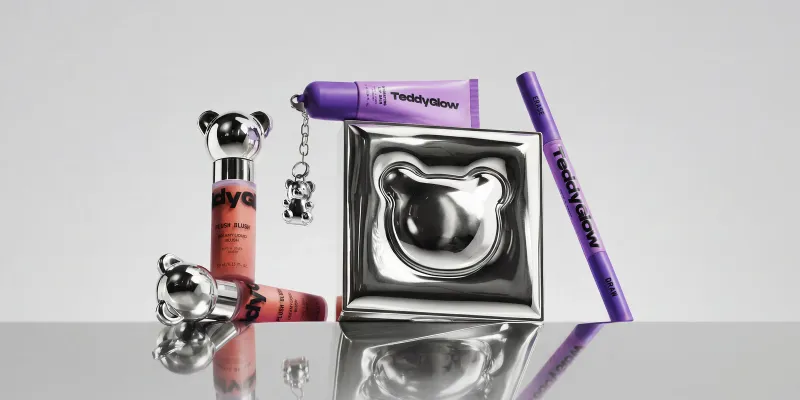
Teddy Glow, the cosmetics extension of Teddy Fresh, lives at the intersection of fashion and beauty. It translates the expressive language of streetwear into a sensorial category, where visual impact has to coexist with product performance. Contrast is the principle: playful yet precise, bold yet controlled, collectible yet functional.
The bear, Teddy Fresh's icon, appears as a graphic silhouette, embossing and pendant, which ensures instant recognition across materials and formats. The palette of lavender, lime green, blood orange and black brings together colors that don't usually coexist, and black grounds the whole with maturity. Sculptural caps, metallic embossing and unexpected formats, such as the metallic eyeshadow palette with an inflated, balloon-like look, turn each package into an object of desire.
What we take from each case
Different brands, the same set of questions. What is the one thing that identifies this package from a distance? What happens when the line doubles in size? Who is each part of the package talking to? And, in the end, what can this brand sustain?
It is what we look for in every project: fewer elements, more clarity, and an identity that keeps working as the line grows.
Packaging you can recognize from across the room — Sweety & Co.