OEJE
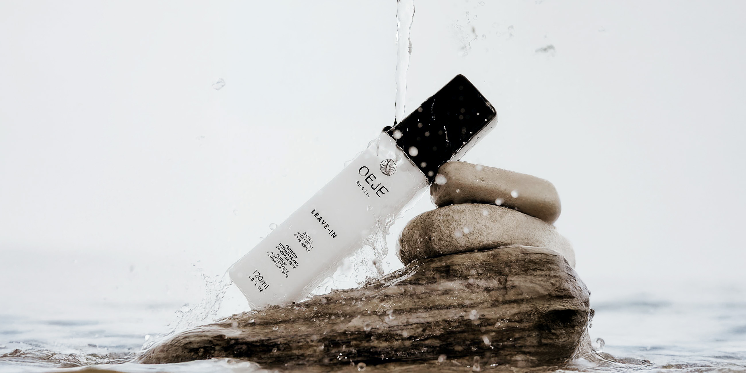
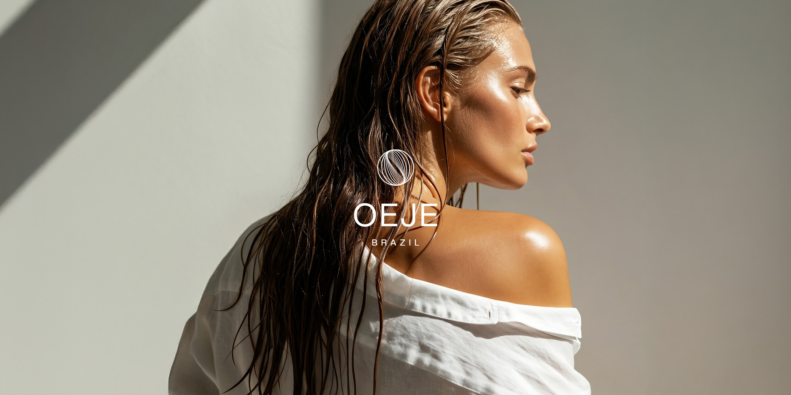
OEJE is a Brazilian haircare brand born with the purpose of reinventing at-home beauty rituals. Its products combine high-performance active ingredients, designed to meet different hair needs, with innovative formulas that bring together efficacy and sensorial pleasure.
Location: Brazil
Role: Branding & Packaging
Date: 2025
Context
The development of OEJE was driven by the ambition to create a Brazilian haircare brand that seamlessly combines innovation, performance, and sophistication. The haircare market is highly competitive and fragmented, with countless options that often fail to clearly communicate the value of their active ingredients or deliver a distinctive aesthetic experience. OEJE was conceived to fill this gap: bringing together cutting-edge technology in effective formulas with a visual language that conveys trust, modernity, and desirability.
Solution
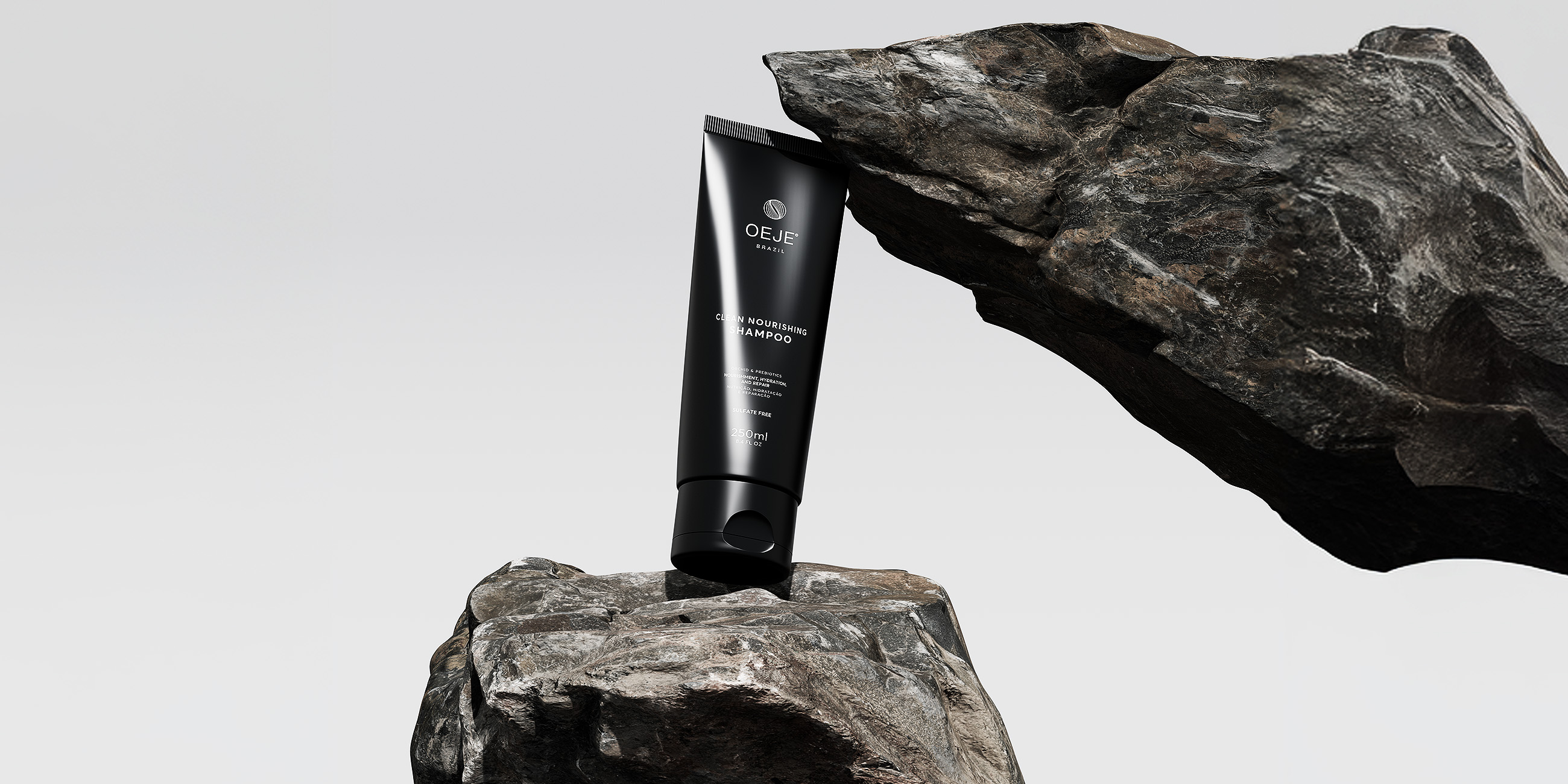
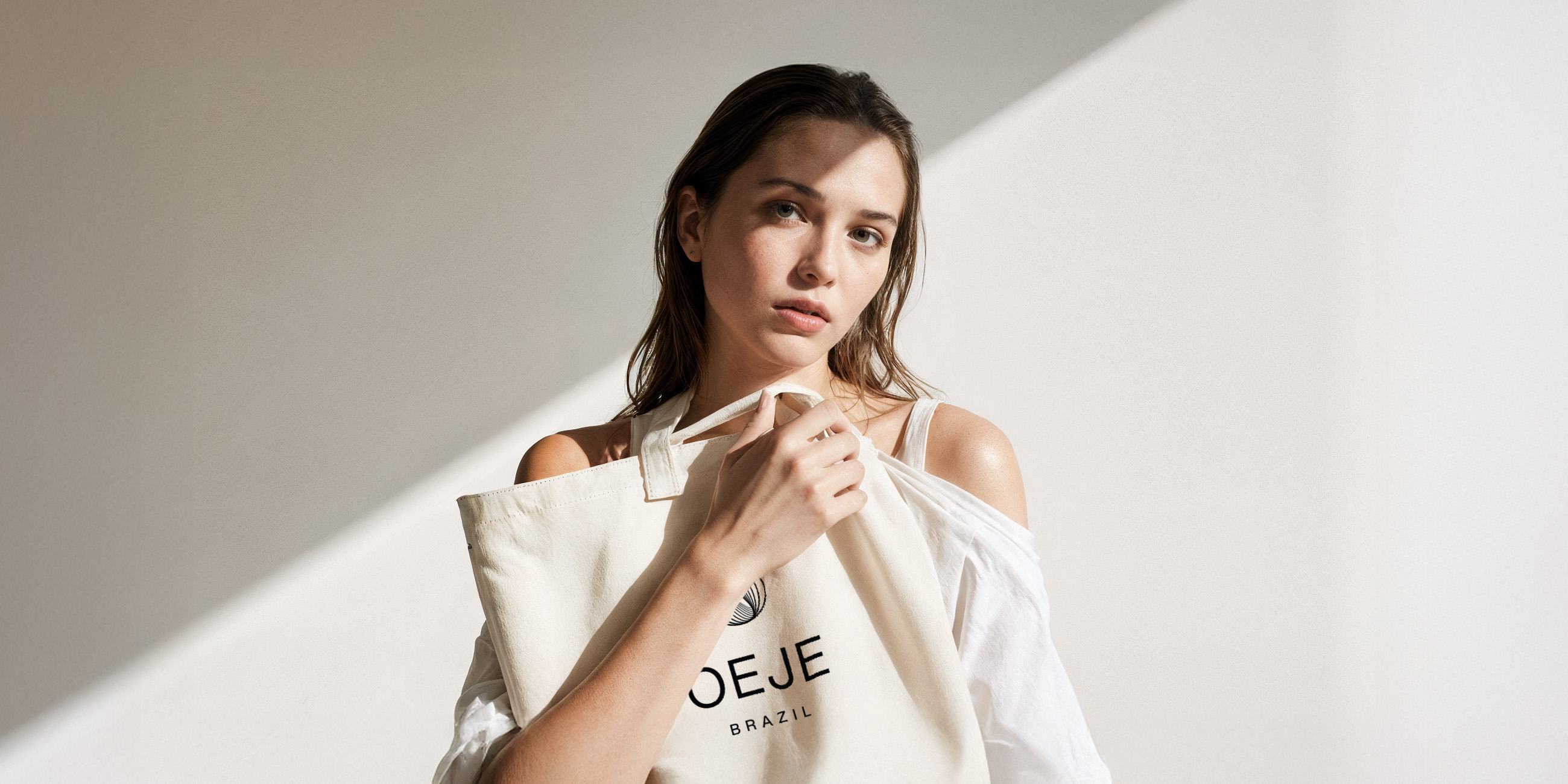
Our studio was involved from the very beginning, shaping the brand’s strategic foundation and defining its positioning and purpose. We translated these values into a clean, sophisticated, and contemporary visual identity that reflects both functionality and aspiration.
.
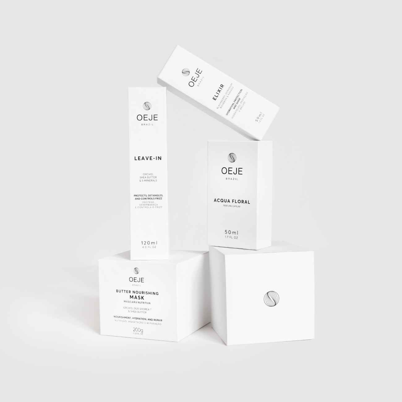
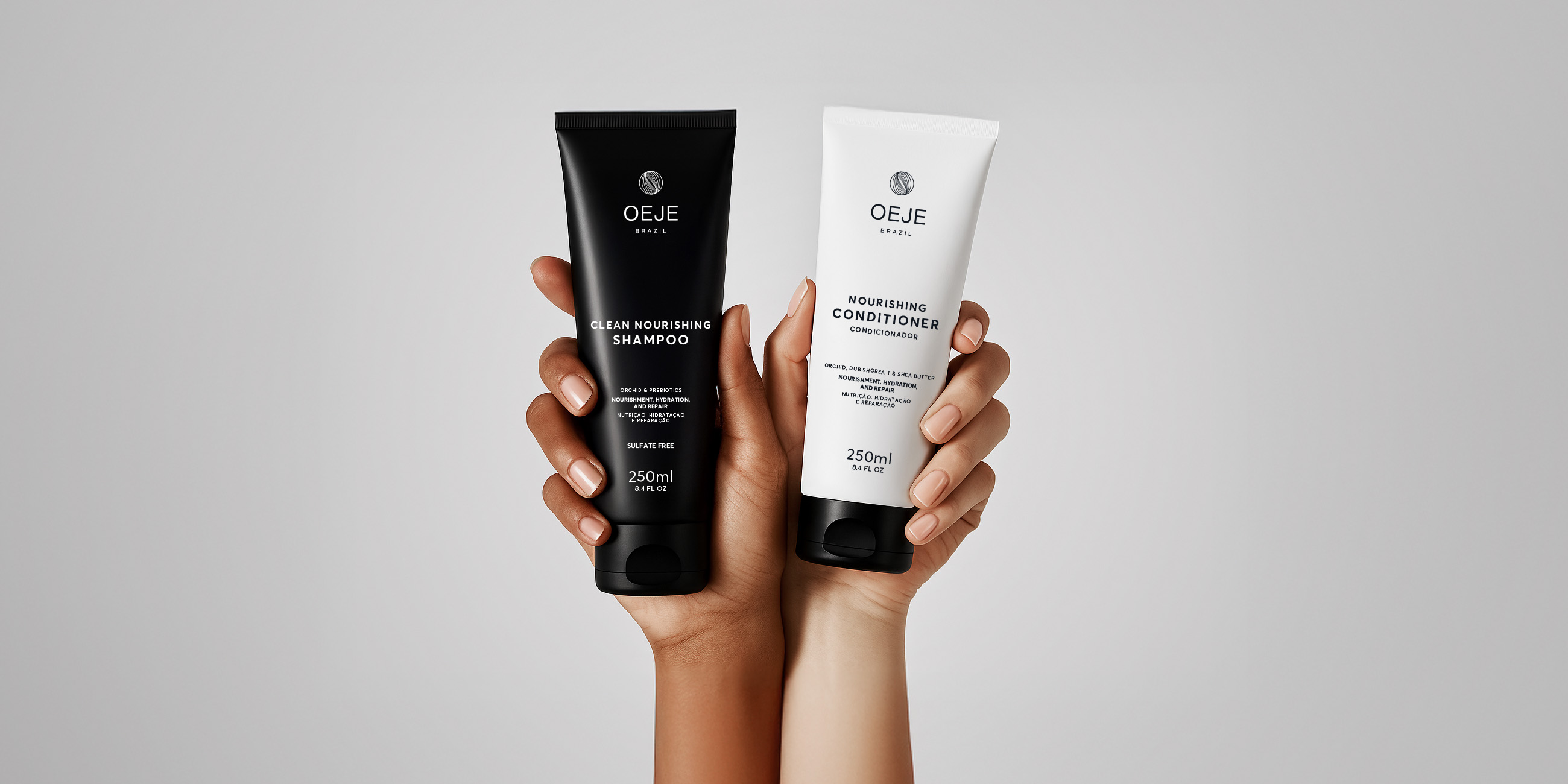
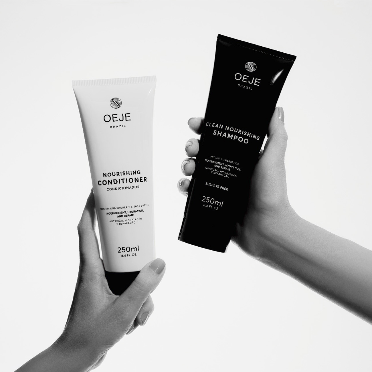
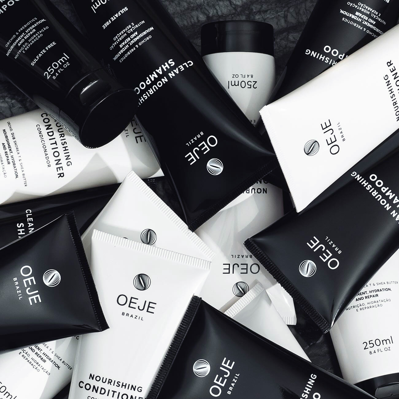
We also led the packaging design process, developing solutions that balance minimalism with strong aesthetic impact, always aligned with international beauty and self-care trends. The result is a product line that not only delivers high performance but also enhances the emotional and aspirational experience OEJE aims to provide in every detail.
Concept
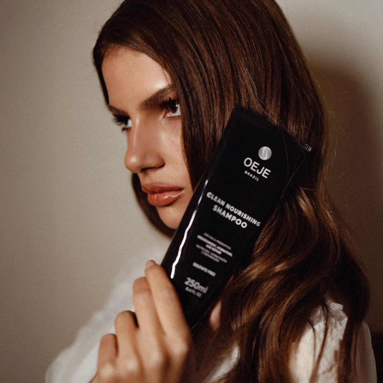
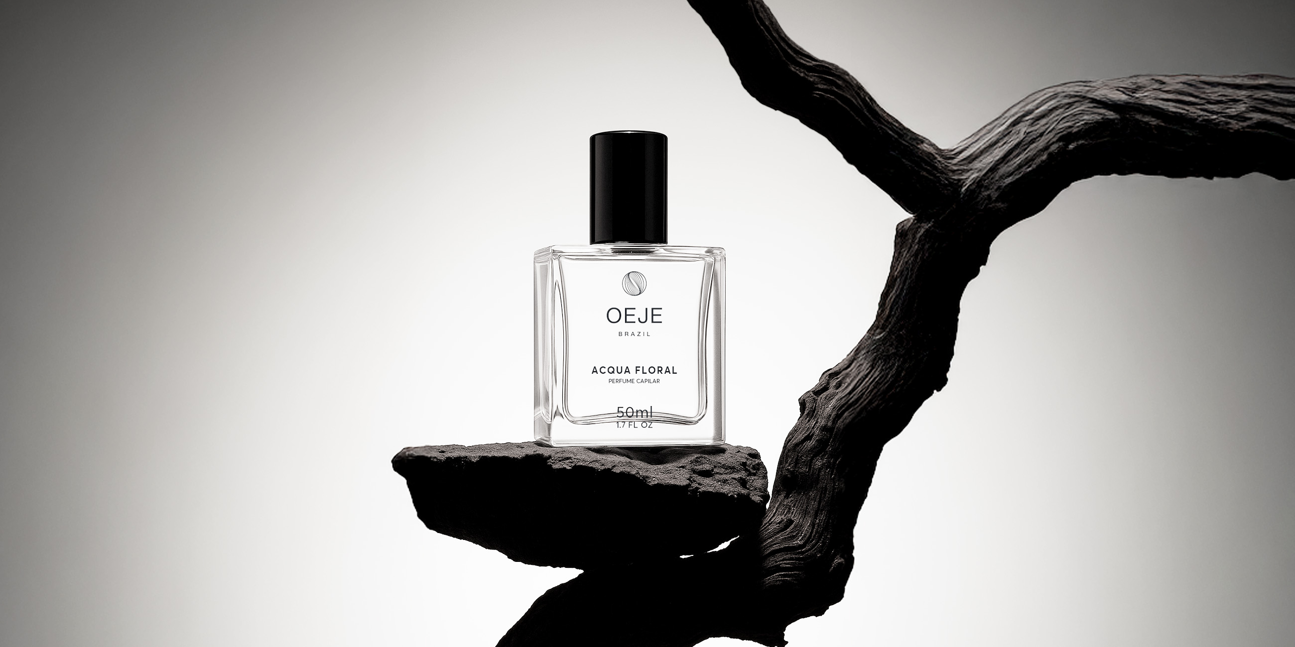
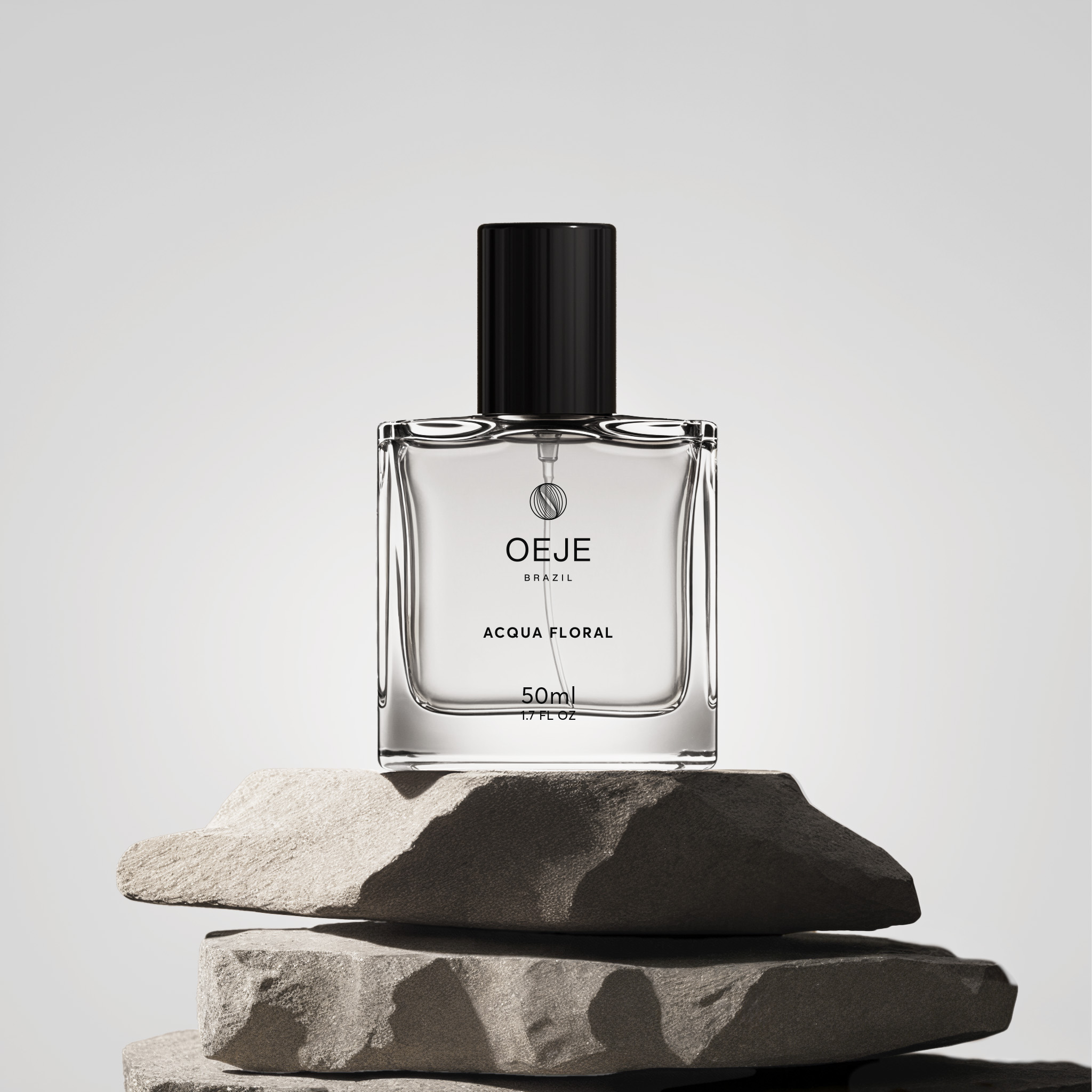
The choice of a black and white palette was a deliberate solution to emphasize OEJE’s sophisticated and timeless positioning. In a market often dominated by colorful, overly busy packaging, the restraint of monochrome creates a strong point of differentiation. Black conveys elegance, strength, and authority, while white introduces balance, clarity, and a sense of purity — directly reflecting the brand’s promise of clean and high-performance haircare. Together, they create a visual identity that is both minimal and striking, capable of standing out on the shelf while remaining versatile enough to adapt across different product categories. This aesthetic decision reinforces OEJE’s ambition to present itself as a contemporary brand that values simplicity as a form of sophistication.

Need a project?