Yourskin
The YourSkin brand is an innovative skincare line that stands out by offering a simplified routine of scientifically-backed products, combining beauty and technology in a close and accessible manner to its audience.
Location: Brazil
Role: Branding, Naming, Social Media Strategy, Packaging
Date: 2023
Challenge
The challenge faced by yourskin involved not only creating an effective product line but also developing a cohesive visual identity and packaging that accurately conveyed the brand's message in a precise and appealing manner.
Synthesis of Science and Delicacy:
One of the main challenges was finding the right balance between conveying the scientific foundation of the products and the brand's delicate and approachable ethos. We needed to ensure that the visual aesthetic reflected both the reliability of science and the smoothness of the skincare experience.
Minimalist Aesthetic:
Opting for a minimalist aesthetic was a strategic choice to convey the simplicity and modernity of the brand. However, finding the ideal point of minimalism that still communicated the sophistication and efficacy of the products was a challenge in itself.
Effective Visual Communication:
The packaging not only needed to be visually appealing but also clearly communicate the value proposition of yourskin and the benefits of its products. This involved using graphic and textual elements strategically to inform and inspire consumers.
Market Differentiation:
The skincare market is highly competitive, so it was crucial that yourskin's visual identity stood out and conveyed a unique and captivating proposition. This required a deep understanding of the target audience and a creative approach to stand out among competing brands.
Solution
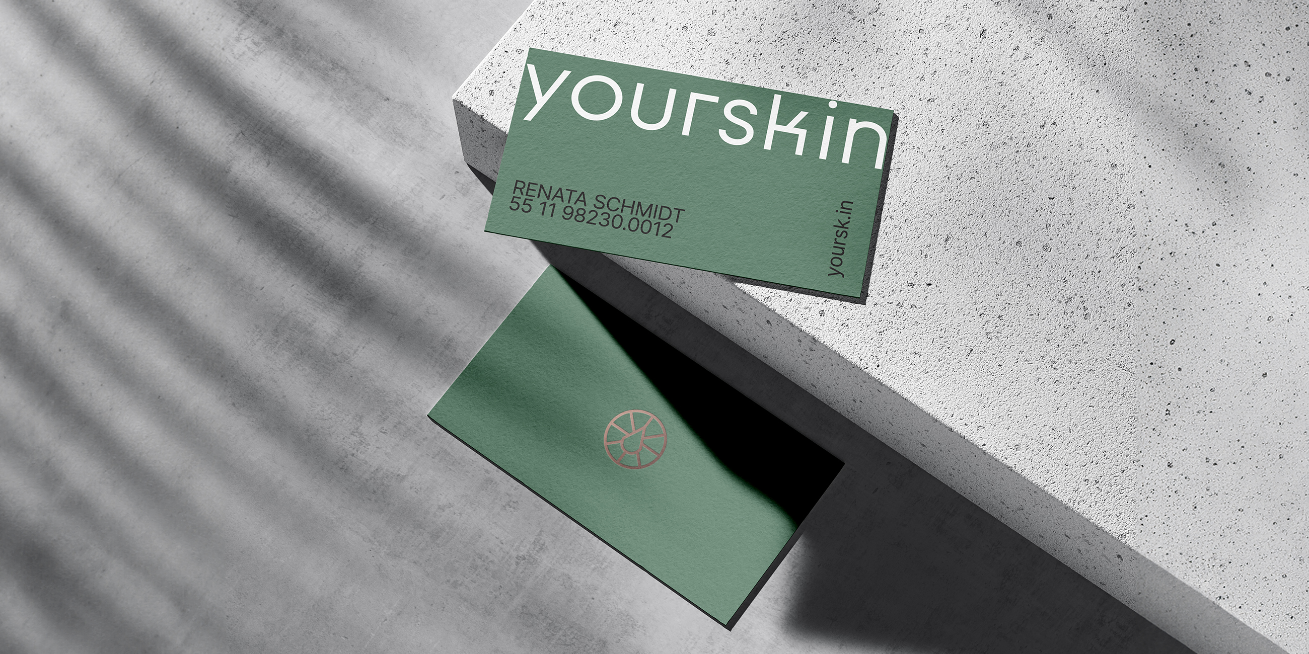
For the brand's icon, we could consider incorporating a minimalist representation of a molecule, such as a stylized molecular structure or a simplified version of a skincare ingredient molecule relevant to your products. This icon not only symbolizes the scientific foundation of yourskin's formulations but also adds a subtle touch of sophistication and modernity to the brand identity. By keeping the icon clean and minimalist, it becomes versatile and easily recognizable across various brand assets, including packaging, digital media, and promotional materials.
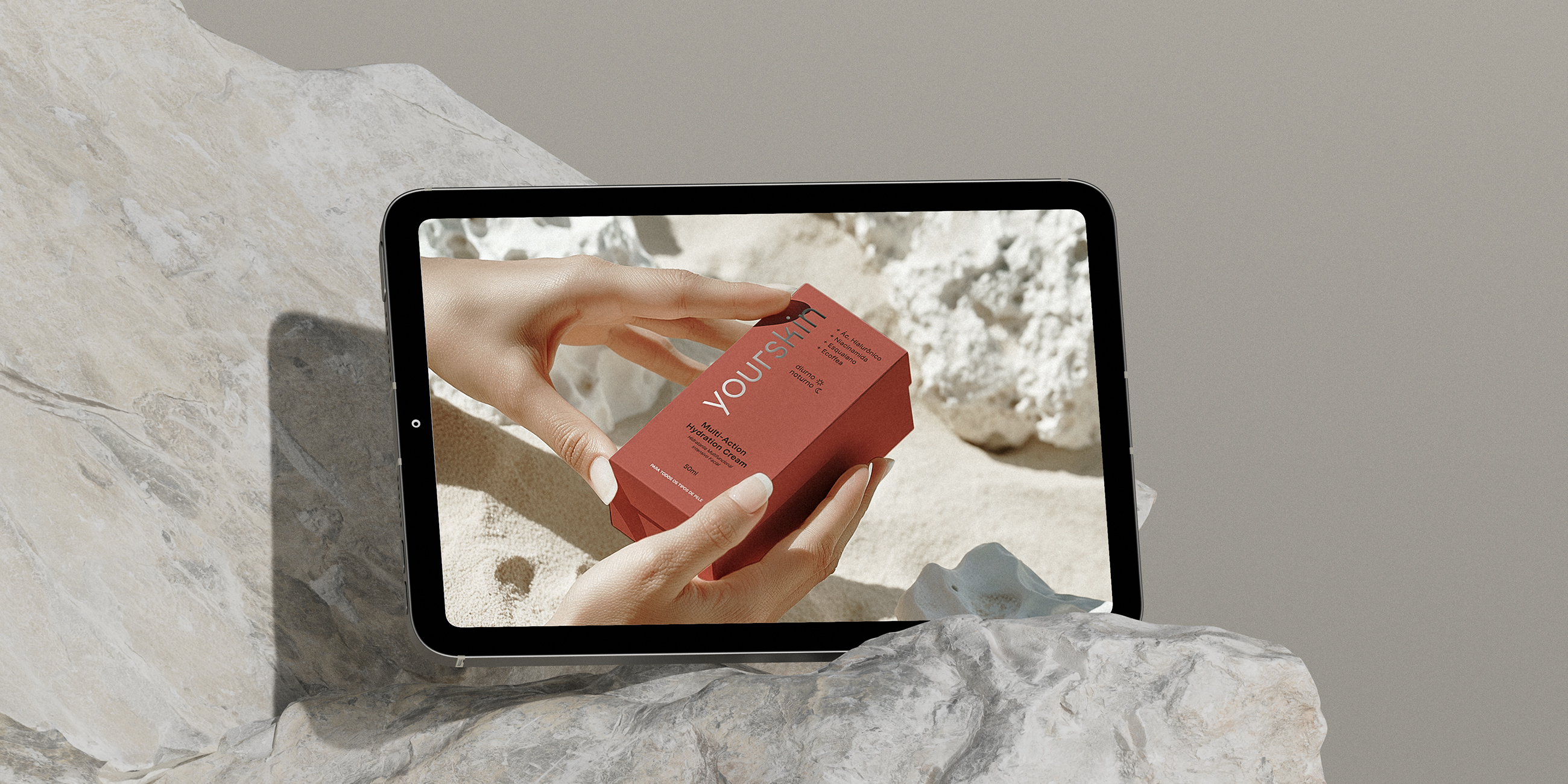
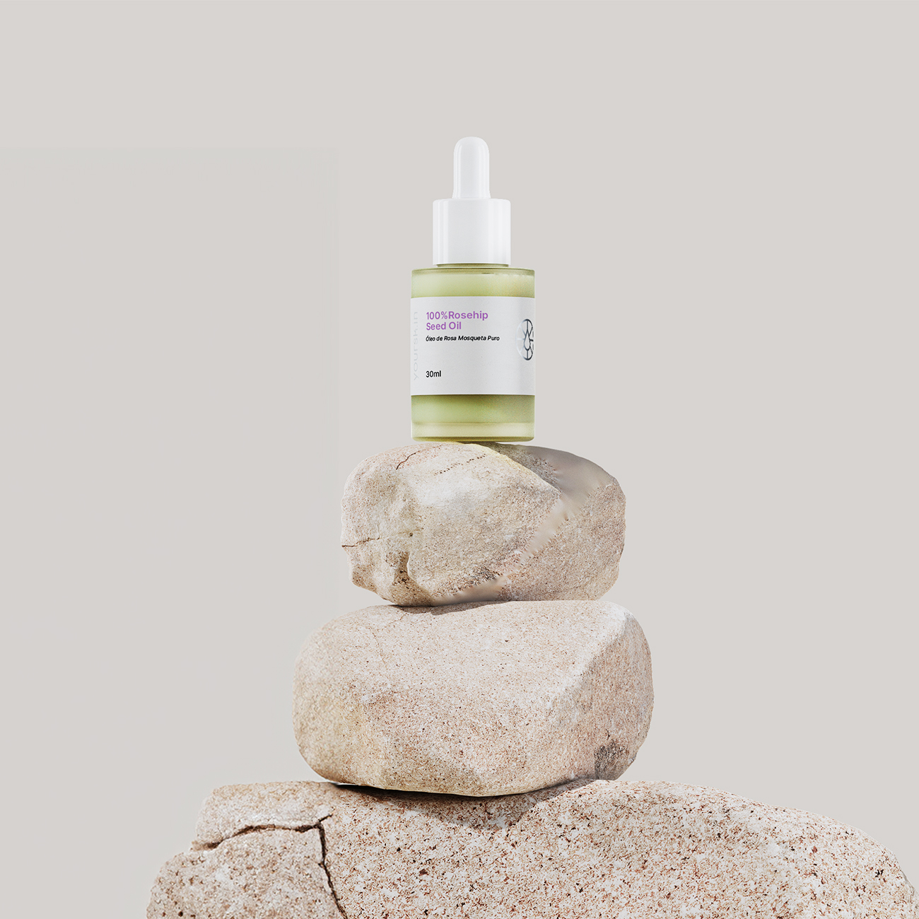
Additionally, the use of metallic finishes or accents on the icon can further enhance its visual appeal and reinforce the brand's premium positioning.
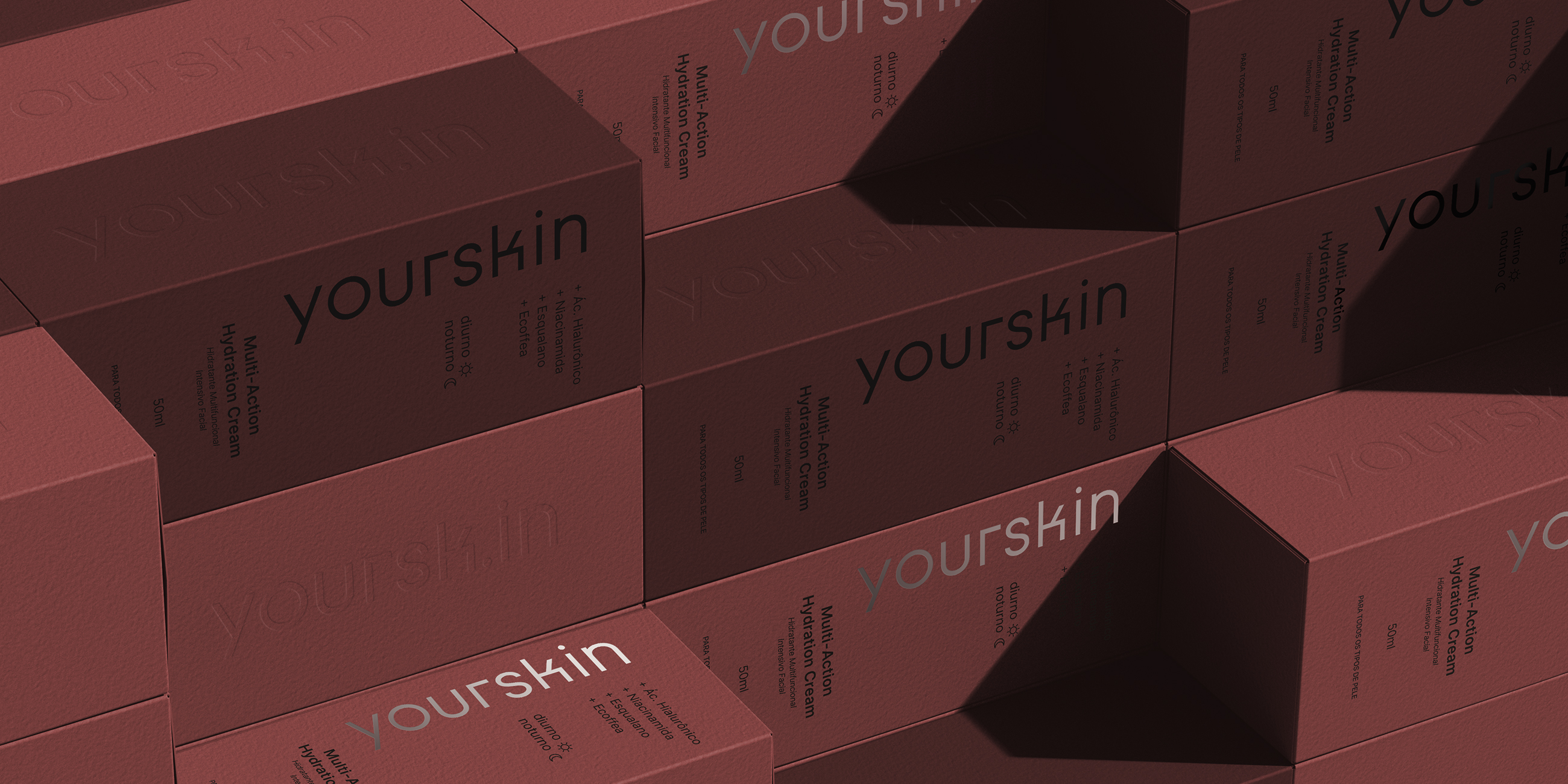
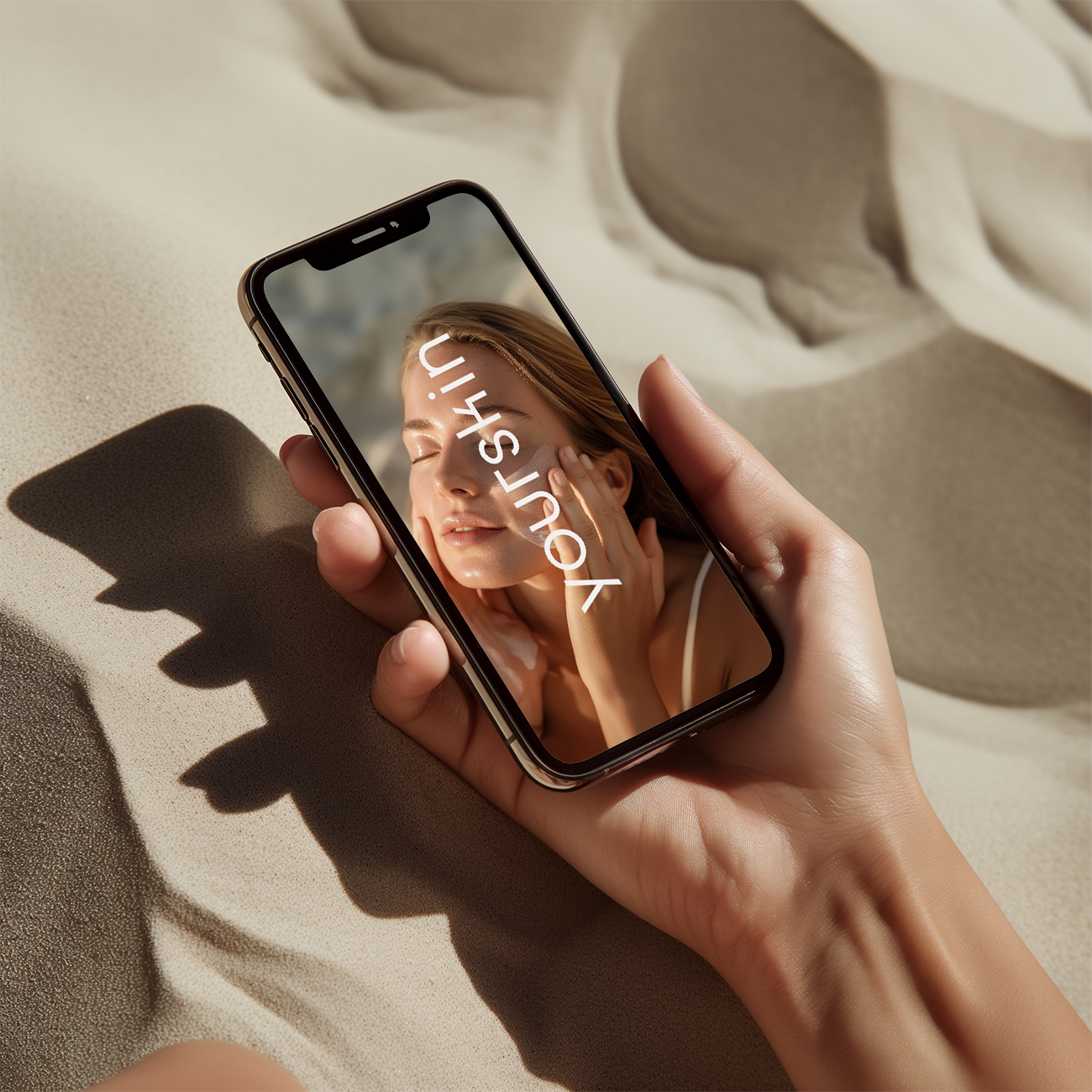
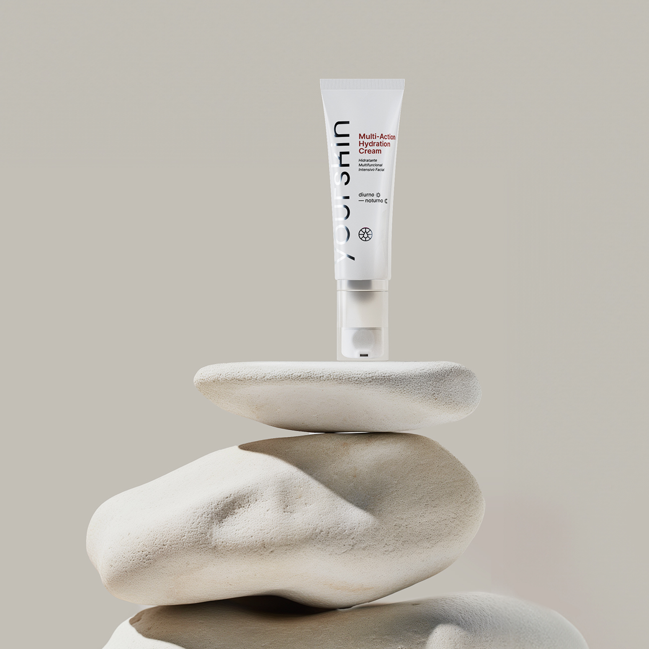
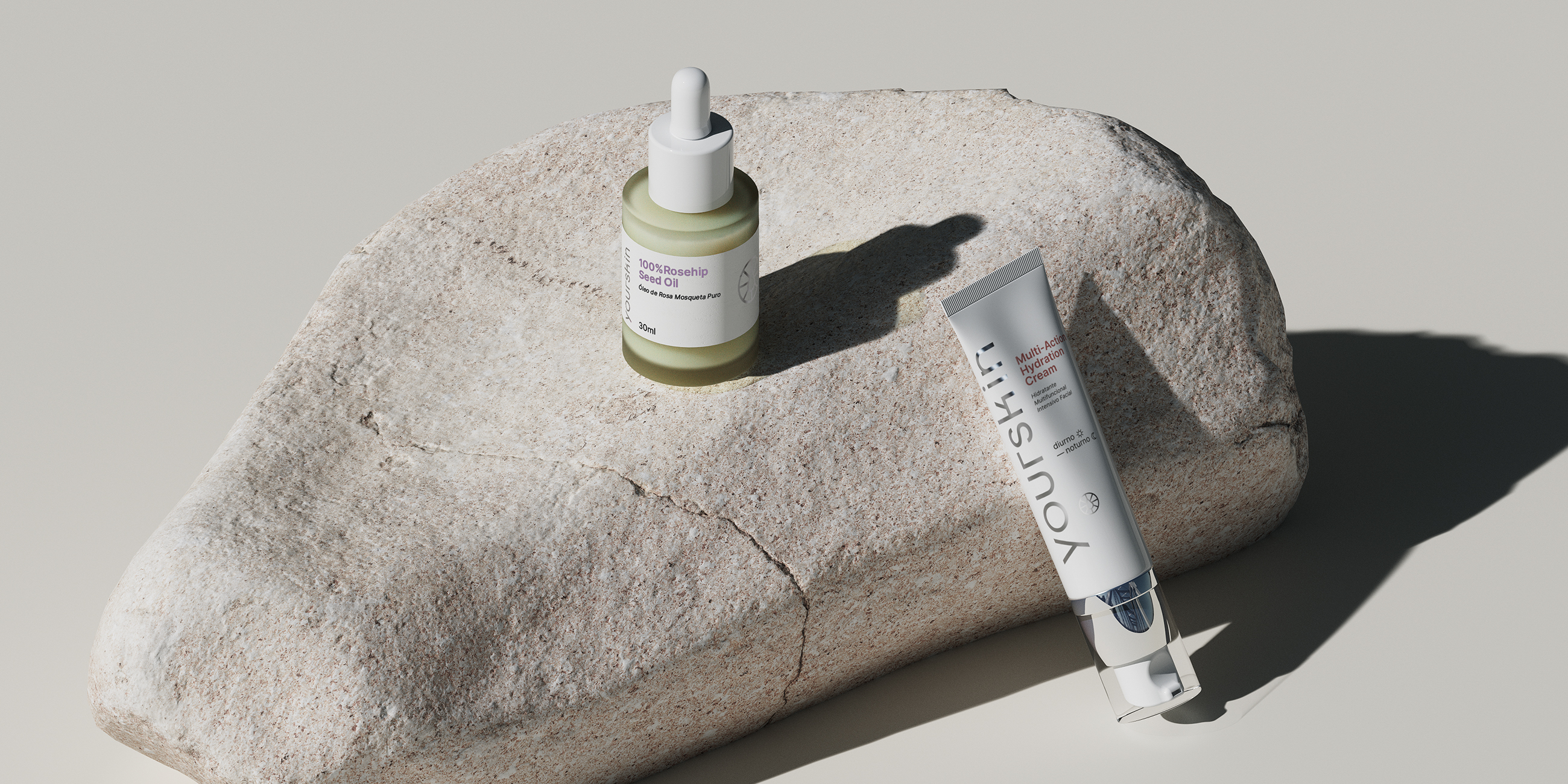
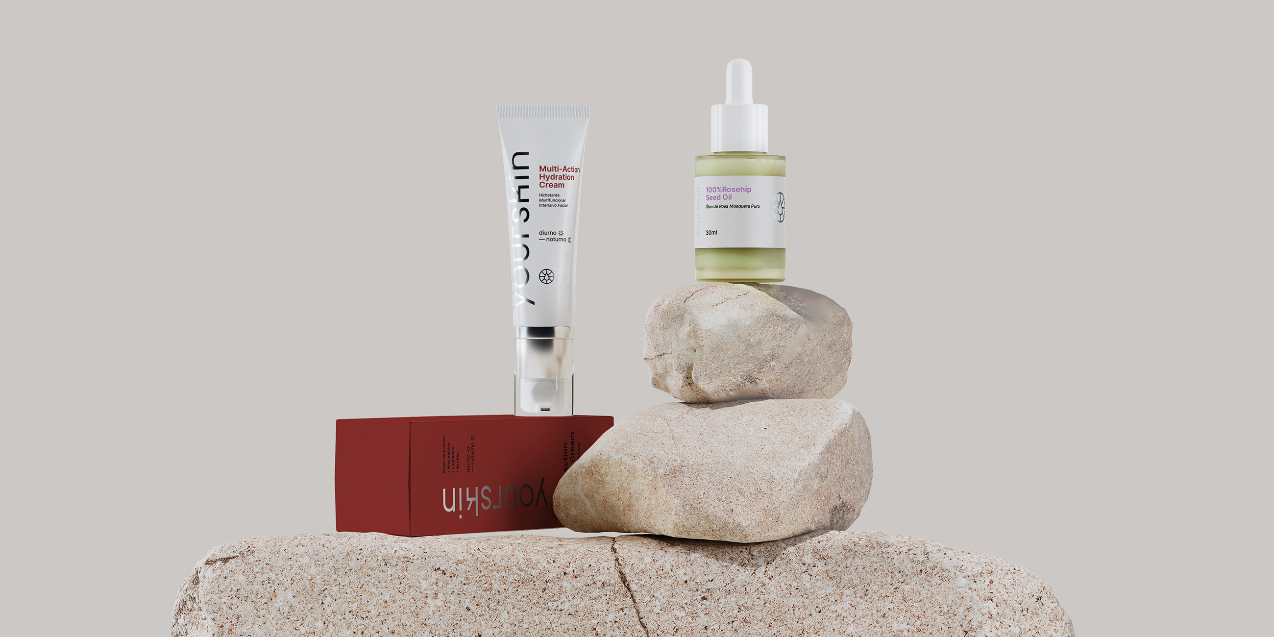
Every detail of the yourskin packaging has been carefully considered to convey the quality and efficacy of the products, while also reflecting the brand's uncomplicated and accessible approach. We are committed to offering not only exceptional skincare products but also an aesthetic experience that delights and inspires our customers.

Need a project?