Nuwa
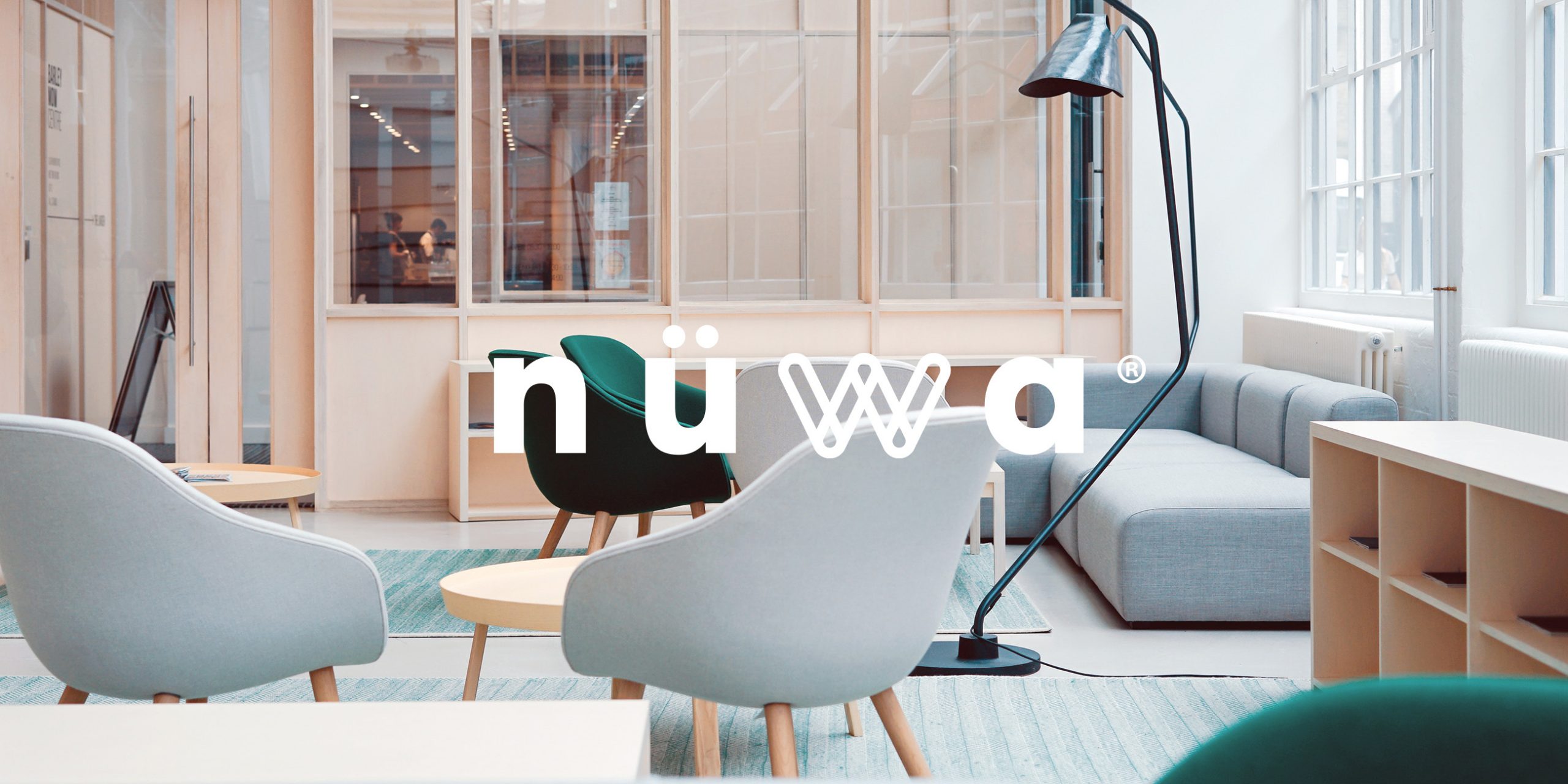
Nuwa is a work base and space for experiences focused on expanding women’s professional confidence, aiming at the development and formation of a feminine network of entrepreneurship and professional relations that will be extended to different capital cities.
Location: Brazil
Role: Branding
Date: 2018
Challenge
Create a modern graphic concept that speaks to today’s world and still translates a strong and feminine (not girly) mood was the goal of this project. Nuwa makes a revolution and leaves a mark, so we needed something memorable to being at the same conceptual level of the project.

Solution
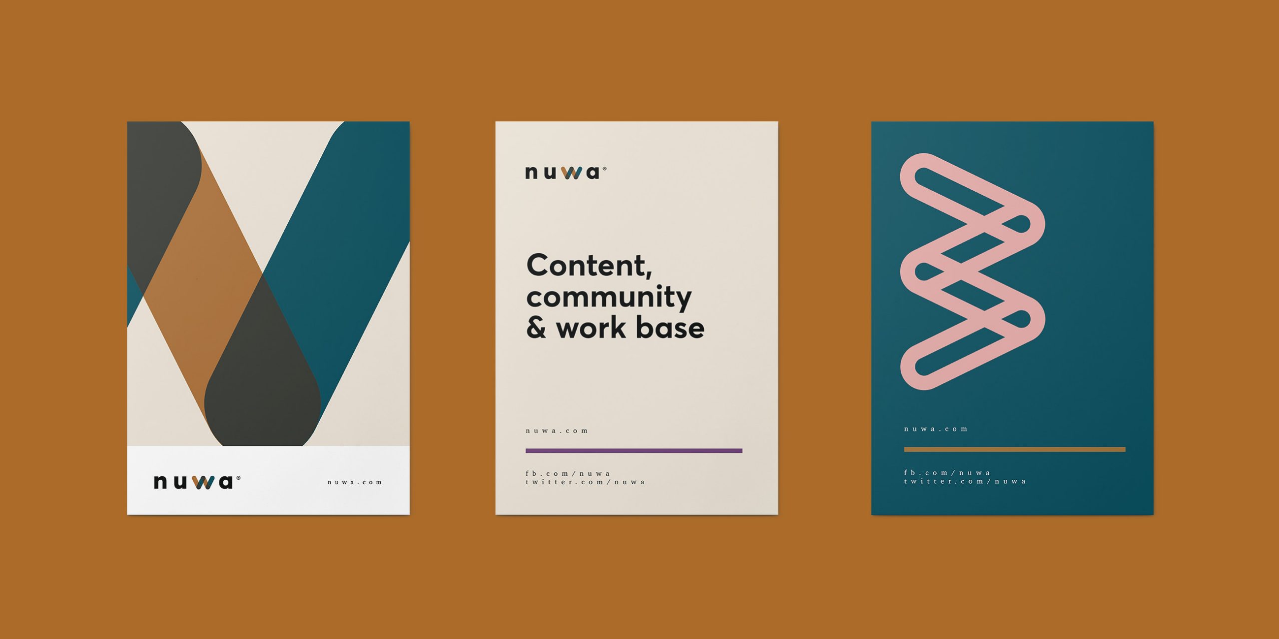
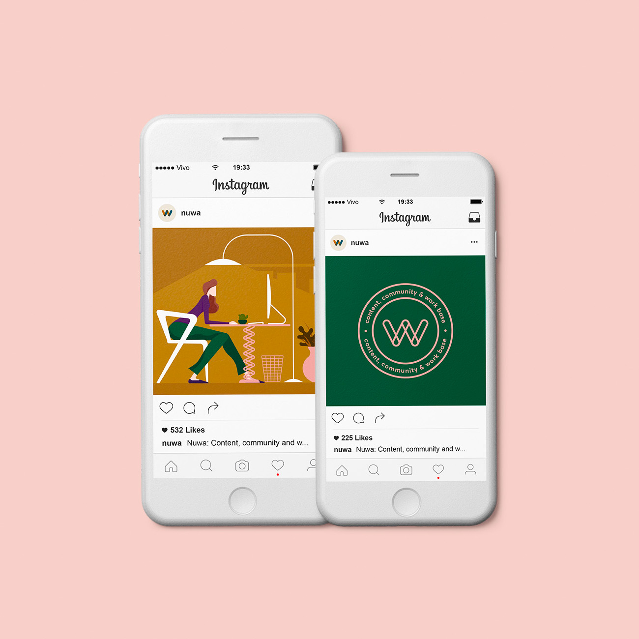
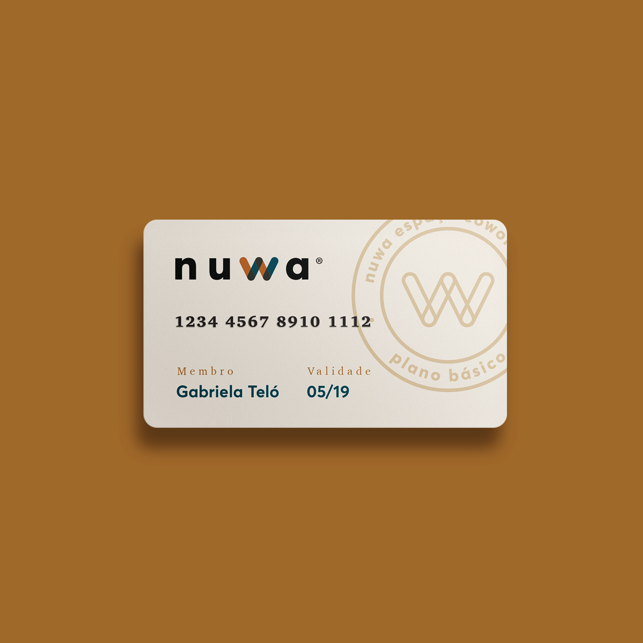
We created a symbol that is supported by a strong and proprietary lettering. The W, which comes from Woman and, when turned, becomes a M of mulher (woman in Portuguese), helps to base the conceptual meaning of the mark. Following this symbol, we worked on an unique and strong color palette, along with illustrations of women in the day-to-day work market.
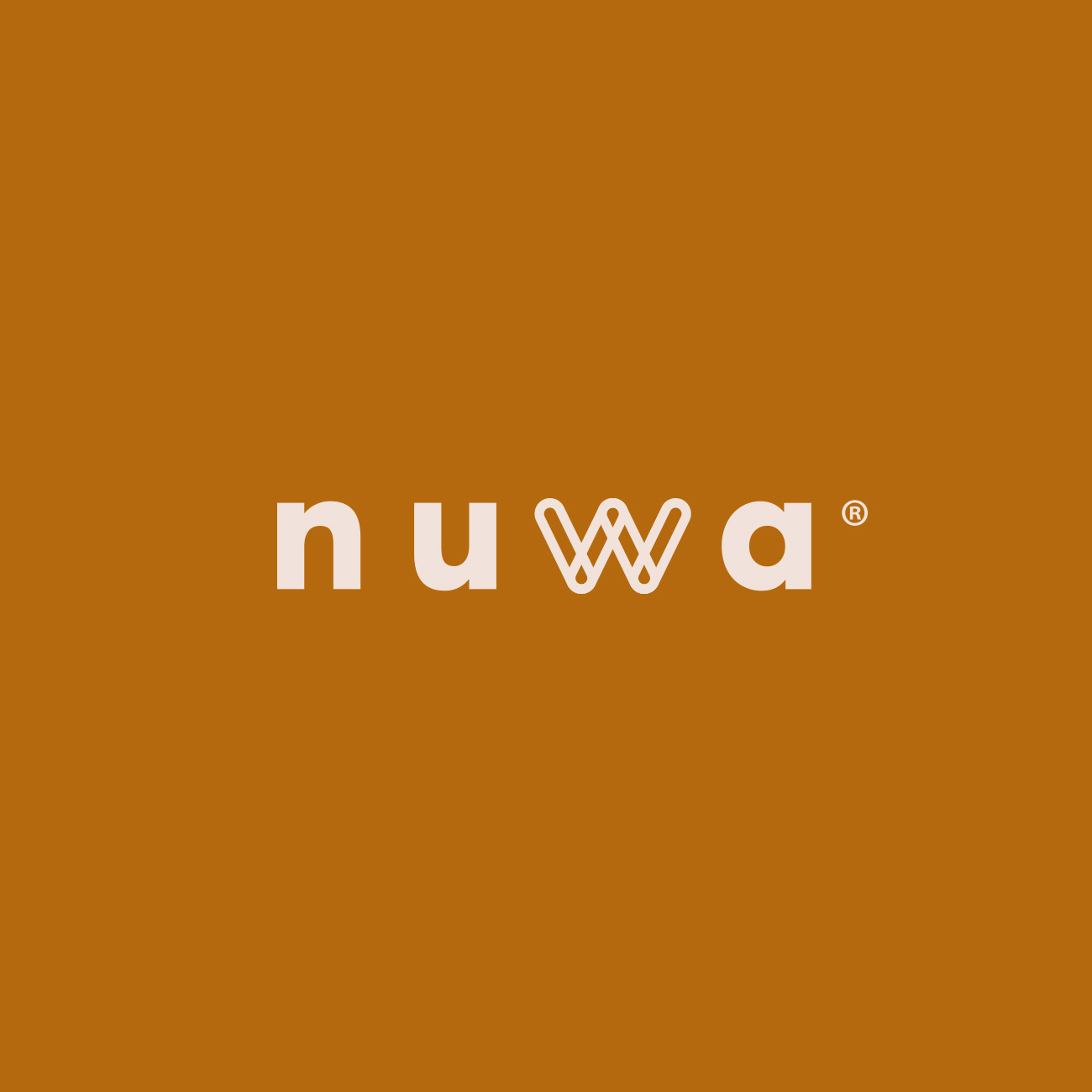
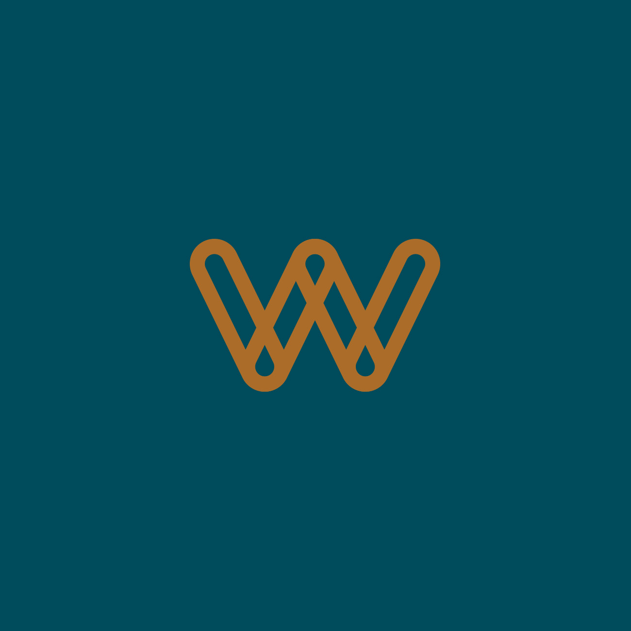
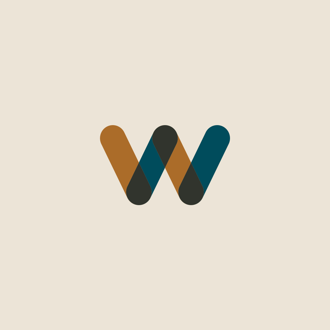
The palette, which brings earthy and nude tones, reinforces the visceral feeling in contrast to the blue, a sophisticated and timeless color.


Need a project?