Gocase
Gocase is a global company that specializes in phone cases and other customized accessories. The brand embodies attitude, exclusivity and self expression through partnerships with illustrators and digital influencers that put their ideas into unique and personalized products.
Location: Brazil
Role: Branding & Packaging
Date: 2019
Challenge
Gocase is a brand with a young and cool personality. The challenge was to keep those aspects, giving it a more solid and mature attitude. In order to achieve that, we had to drift away from the old core values – focused solely on mobile cases – and rethink the brand according to its new positioning, targeting a broad range of creative products, along with communicating to an even more extensive public.
Solution
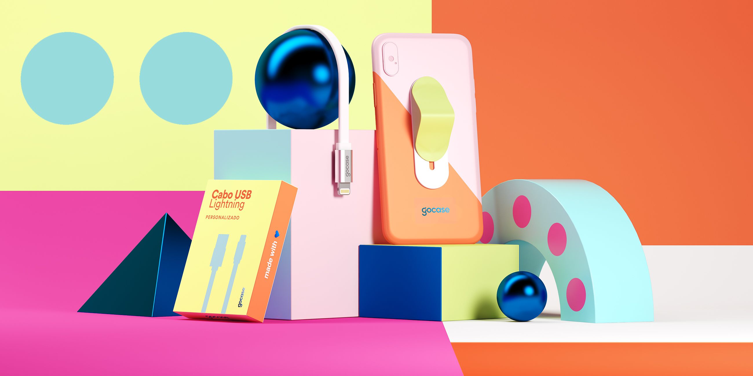
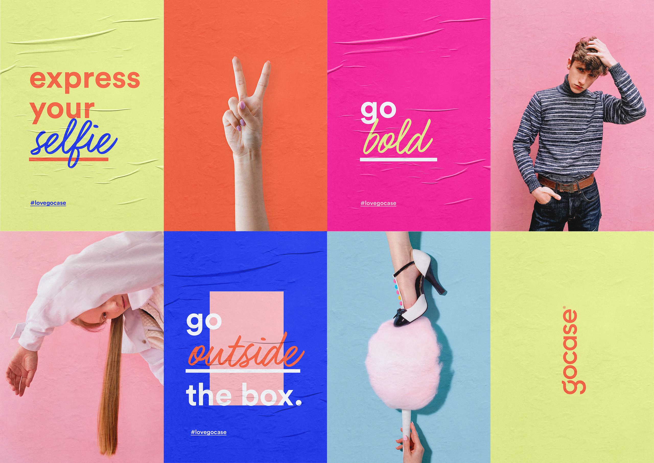
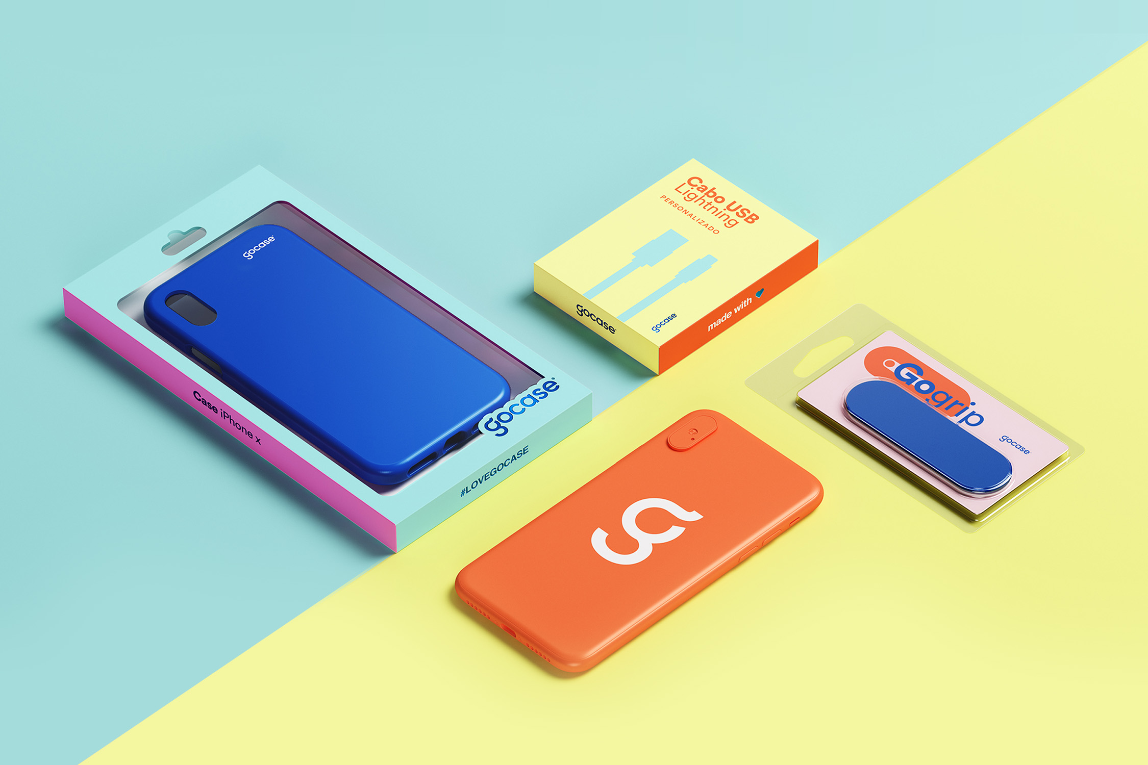
We’ve developed a versatile identity that has a playful and cool aspect with a simple and bold look. Different graphic elements are used to communicate the brand’s personality in a system that speaks with many audiences and adapts to different product categories, always maintaining a great visual impact. With a youthful color palette aligned with the online universe, the old Gocase pink matures and coexists with a diverse and modern color spectrum.
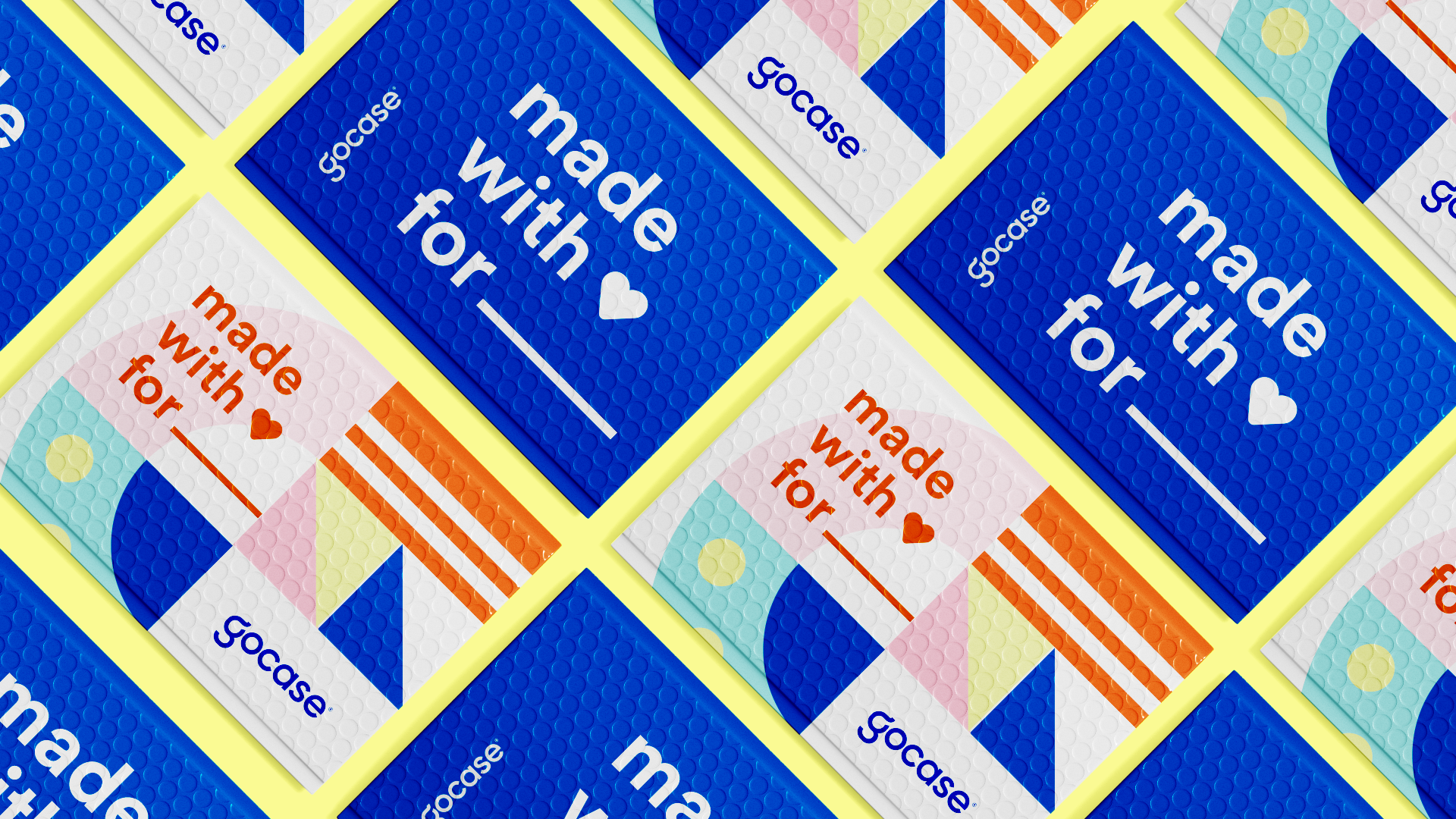

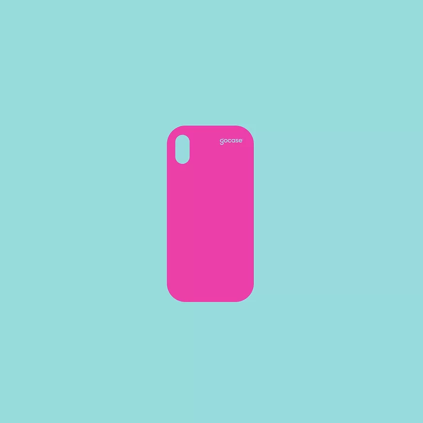
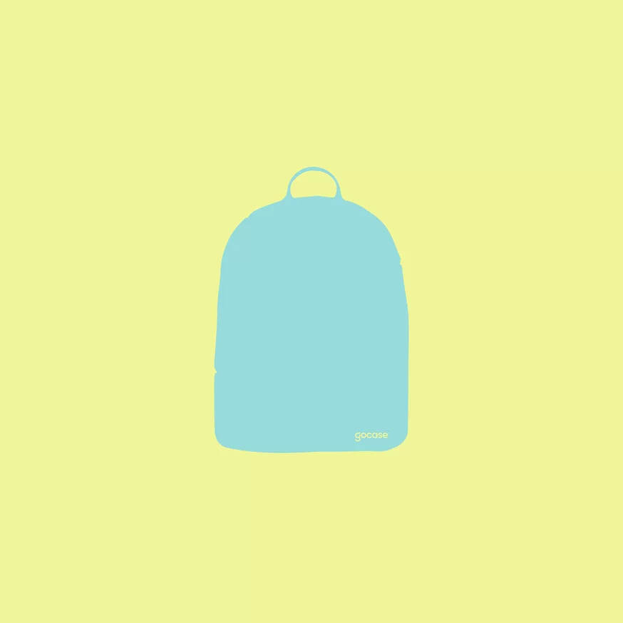
With clean and modern lines, the silhouettes of the products work as a means of illustrating packaging and categorizing a specific range of products. Furthermore, we present an extremely versatile pattern, with fun and geometric graphic elements that can be combined in diverse ways, such as in banners and marketing collateral.


Need a project?