MOSS
Moss is one of the pioneers in the Brazilian carbon credit market, and we had the privilege of being involved since its inception in shaping its visual identity.
Location: Brazil
Role: Branding
Date: 2021
Challenge
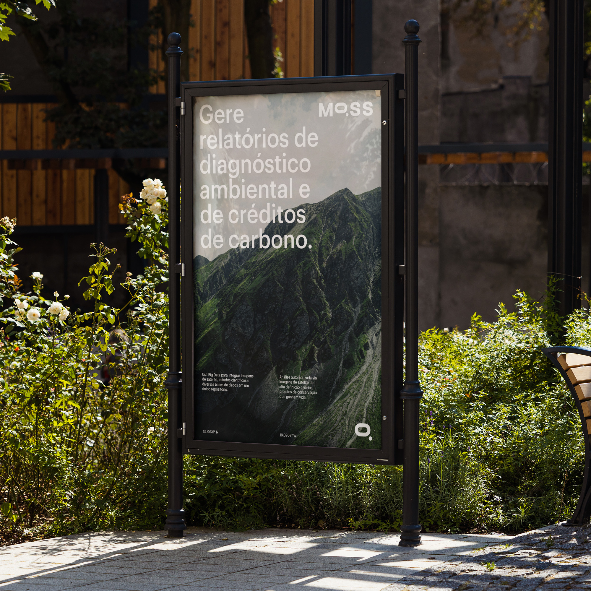
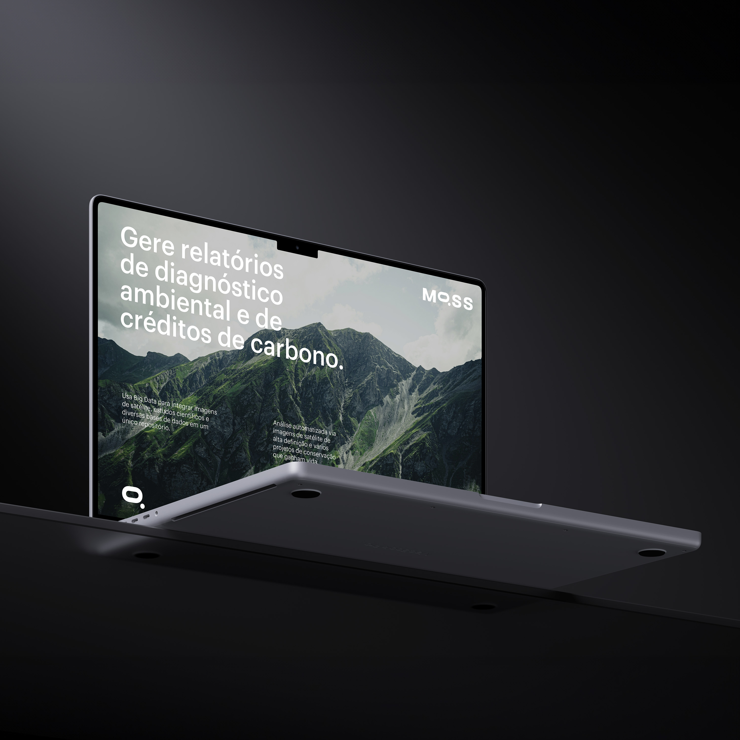
To convey the reliability of an investment company while capturing the innovative freshness of a startup determined to change the world.
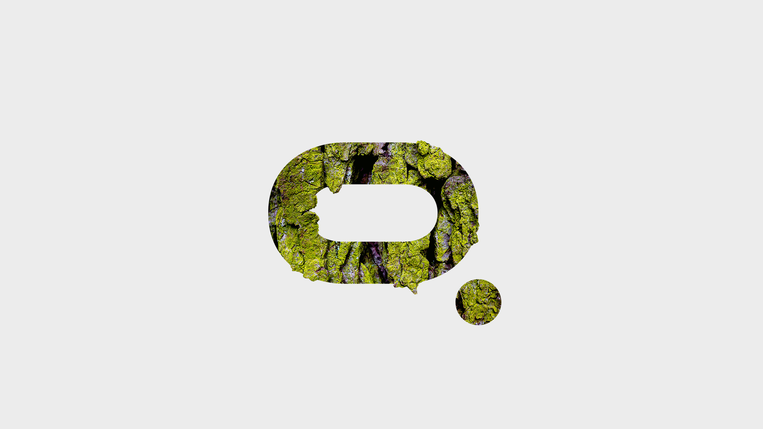
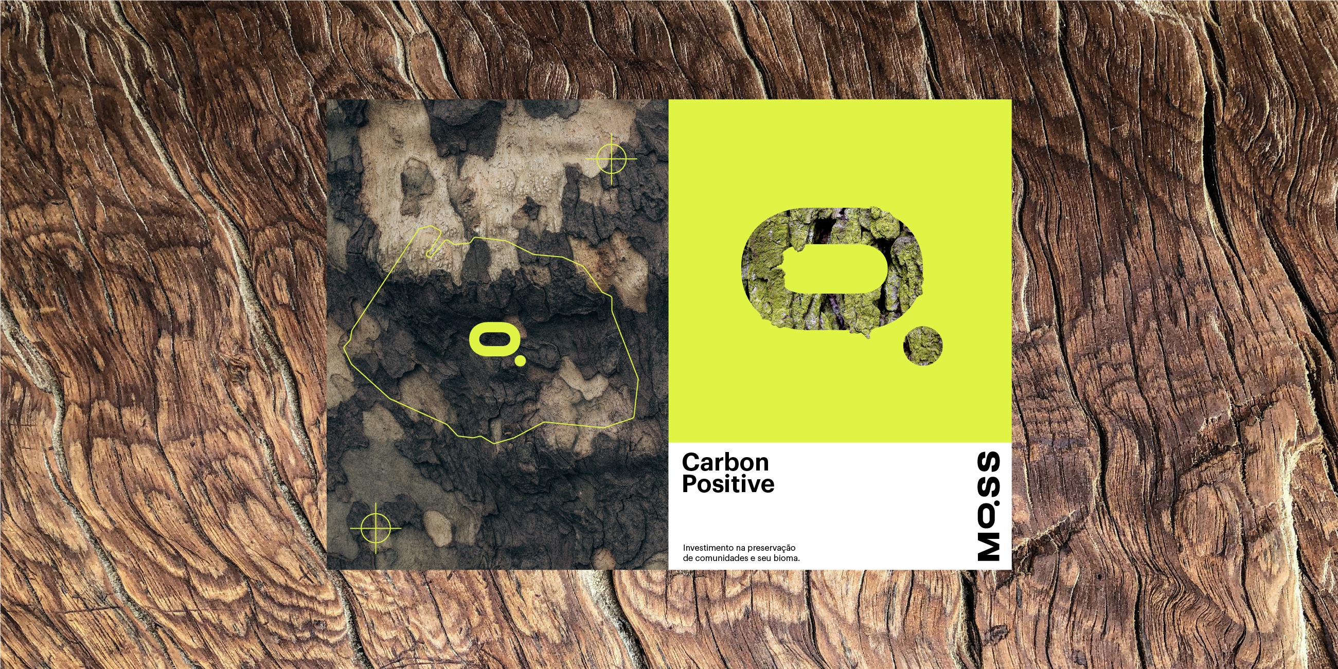
Symbol
The brand symbol is closely linked to the company's social mission, inspired by studies of the oxygen molecule and its chemical symbol. But it doesn't stop there; we integrated the symbol into the logo for even greater visual distinction.
Boldness
An authentic logo designed to convey confidence and strength with its bold weight and minimalist font.
Palette
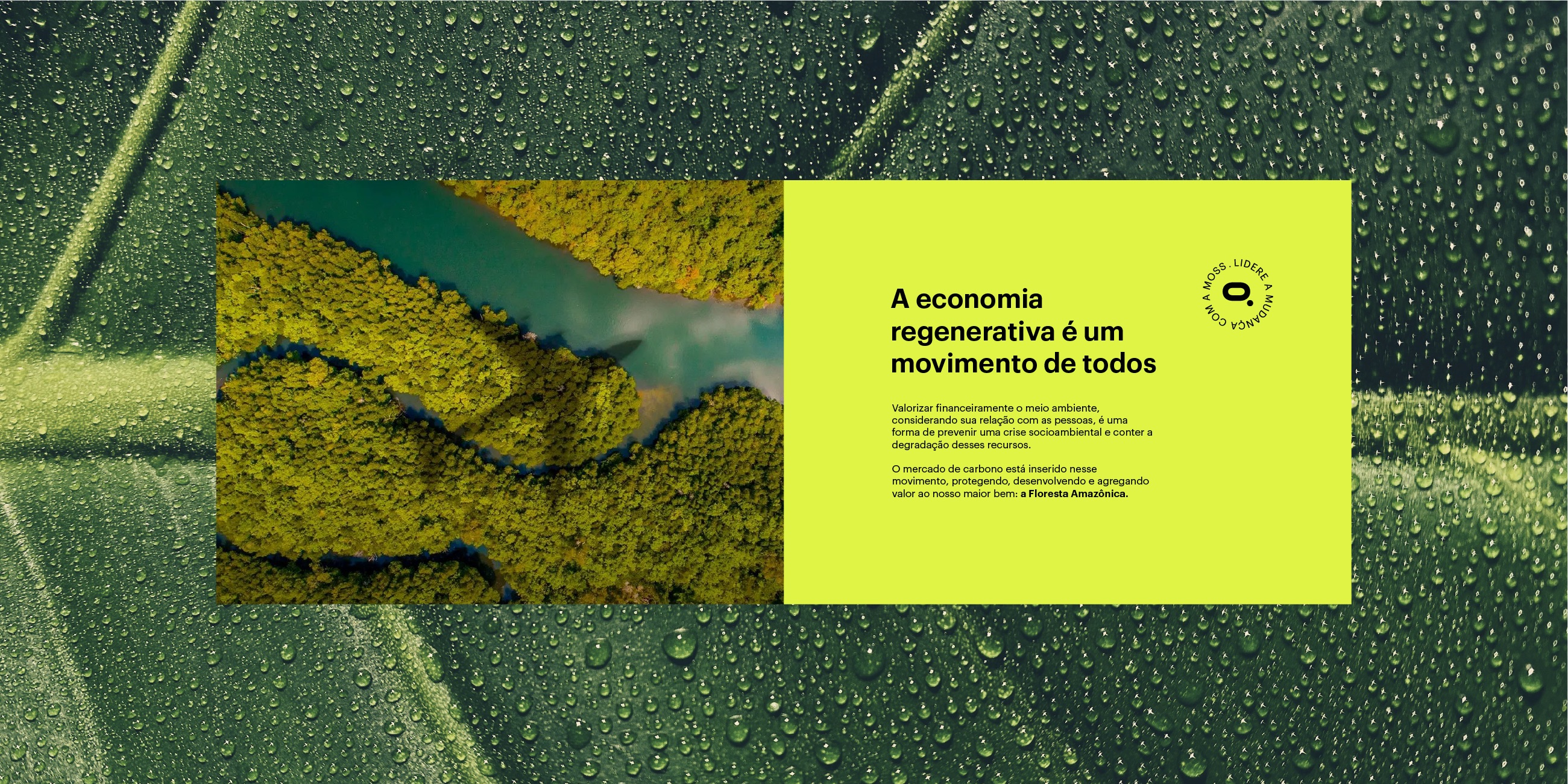
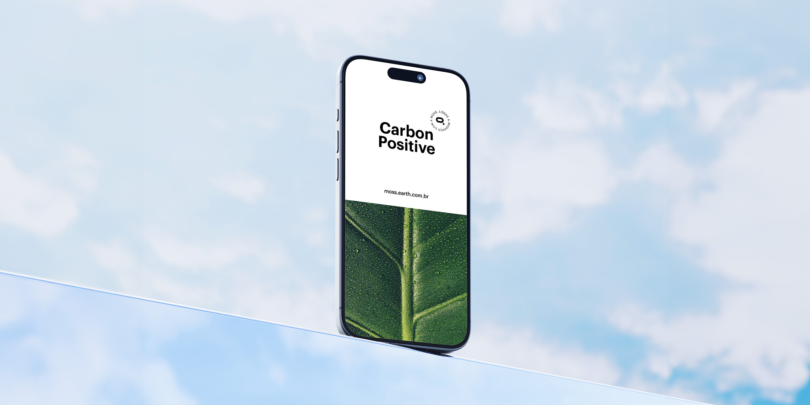
Moss also brings a breath of fresh air to its palette. The sobriety of black and white tones is essential for conveying the brand's reliability while offering a sense of lightness and freshness.
.
We chose neon lime green as a secondary color, a light, and fun option that resonates with an audience thirsty for innovation. Additionally, it alludes to moss, the meaning behind the brand's name.
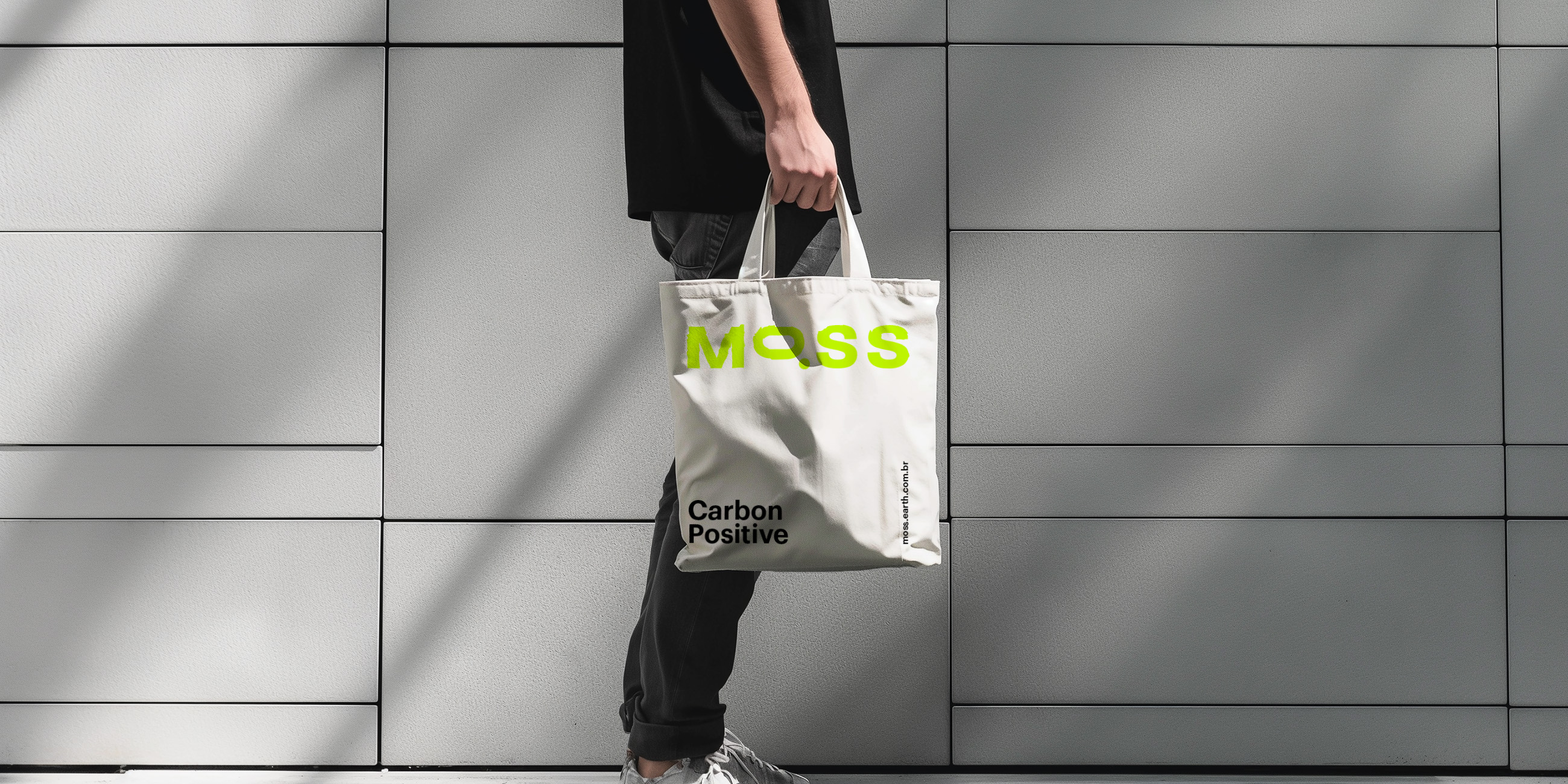

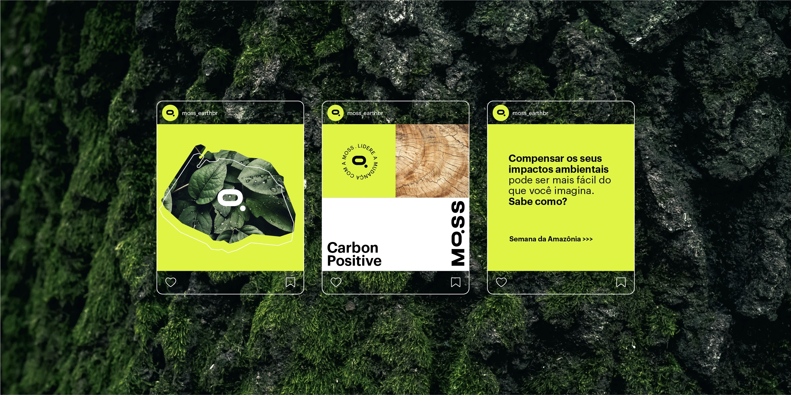
The Moss brand stands out for its mutant ability to adapt to the various materialities that make up its identity, revealing its versatility and innovation in all aspects of its positioning and visual expression.