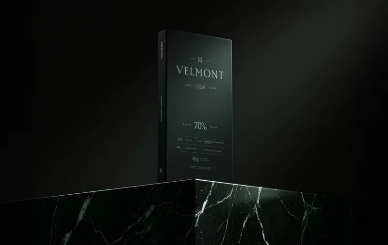
Sweety & Co. presents Velmont, a branding, visual identity and packaging project for a luxury chocolate house that controls the entire process from the roast, in the bean-to-bar model.
Contrast as a starting point
Velmont positions itself above the country's leading chocolatiers and treats each product as a deliberate piece for an occasion rather than a generic bar, presented in packaging of the highest quality, such as a tin in place of folding carton. The identity translates this positioning through contrast: a deep forest green replaces the browns and golds typical of the category and creates immediate differentiation on the shelf. On this base, a serif logotype with generous spacing and a monogram that fuses the letters V and M build a refined presence.
Rigor: where the extraordinary comes from
The central concept starts from a tension: from rigor comes the extraordinary. Sophistication is understood as discipline, not softness, and the brand is organized around three pillars: deep, rigorous and distinct. Forest green conveys depth and solidity; light blue brings lightness as a counterpoint; brown warms the communication; off-white offers a neutral base. The serif typeface, with subtle terminals and a classic structure, conveys control, while the rhythm between the letters communicates precision. The sensory pillars of texture, aroma and flavor give visual form to the tasting experience the brand proposes.
Desire: from impulse to the brand's universe
The project answers a gap in the market: even among the country's reference bean-to-bar chocolatiers, no brand had translated the standard of a luxury product into visual language. Velmont works on two fronts, direct consumption and supply to fine dining restaurants, including Michelin-starred houses. With a restrained palette, noble materials and low-light photography, chocolate moves from the territory of impulse to that of desire. The brand sells not only the product but access to a universe, extended in The Velmont Club.
Solution: functional hierarchy and packaging that lasts
The design answers the category's technical bottleneck: leaving behind the cliché of rustic kraft paper without falling into generic ostentation. The grid organizes vintage, batch and tasting notes with technical clarity, delivering industrial efficiency across the line, portfolio consistency at the point of sale, and packaging whose life goes beyond consumption, becoming a collectible object.