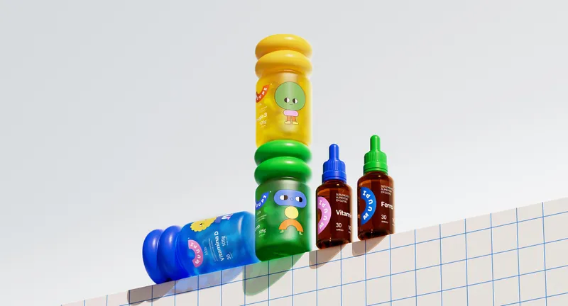
Muupi won Best of Show in the Concept category at The Dieline Awards, an international packaging design award. The project also won Gold and Best Category Work in Packaging at the LAD Awards 2026.
A brand that joins the game
In Brazil's children's gummy market, brands tend to pick a side: the functional strength that reassures parents or the fun that wins over kids. Muupi starts from the idea that health joins the game: instead of asking for a pause, it gives the routine a character, a story and a set time, so care becomes something a child asks for. Each launch adds a new friend to the gang.
Two frequencies
The brand's voice speaks to the child and the parent at once: the same sentence entertains one and informs the other. Part jester, part caregiver, it explains what each product does in the family's own language and leaves out label jargon, forced cheerfulness, fear and guilt. The vocabulary belongs to the brand, from “the gang” to #HoraDoMuupi.
Built like a toy piece
The visual identity is built like a toy: simple geometry becomes characters, patterns and type, and any new product clicks into place and makes the universe bigger. The smile-shaped logo holds it all together, from packaging to campaign. On the pack, the front talks to the child through a character, a color and an invitation, and the back talks to parents through function, composition and directions for use.