Jasmyne
Jasmyne received a new packaging system that brings its connection with Gen Z to life through a more contemporary, functional and recognizable product line.
Location: Brazil
Role: Repackaging, Branding & Product Design
Date: 2026

Context
Jasmyne already had a strong connection with Gen Z, but its packaging no longer reflected the brand’s personality or the value of its formulas. In a saturated category, the opportunity was to give that reputation a visual territory of its own. The redesign of the core line was conceived to build that territory without touching what makes the brand accessible.
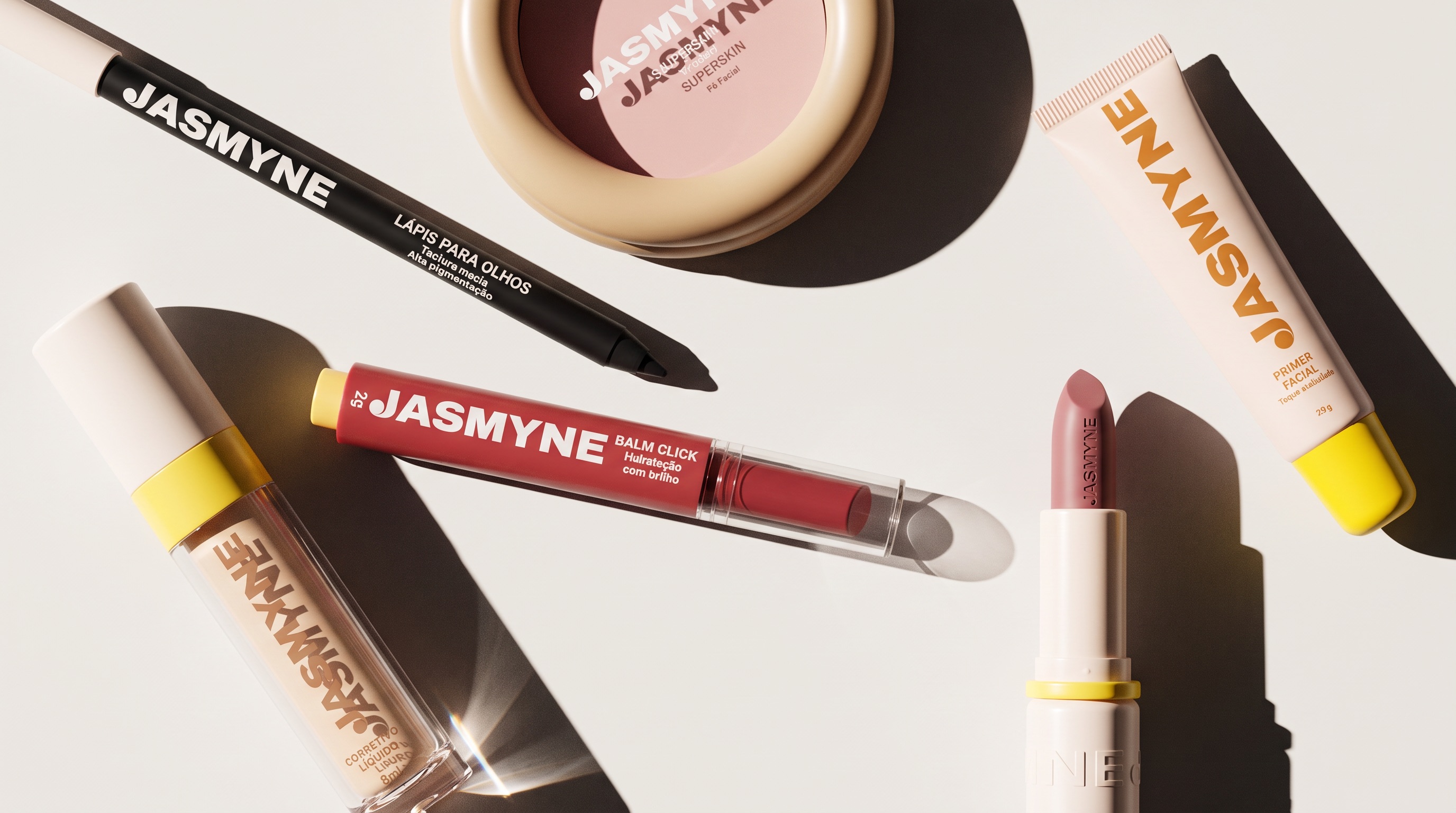
Rather than repeating category conventions such as childish graphics and metallic finishes, the project embraced a cleaner, more contemporary visual language. Jasmyne took the new route, trading ornament for functional beauty: a neutral base in fendi, off white and nude tones, while the sunlit yellow inspired by the jasmine flower adds energy and becomes a distinctive visual signature.
Insight
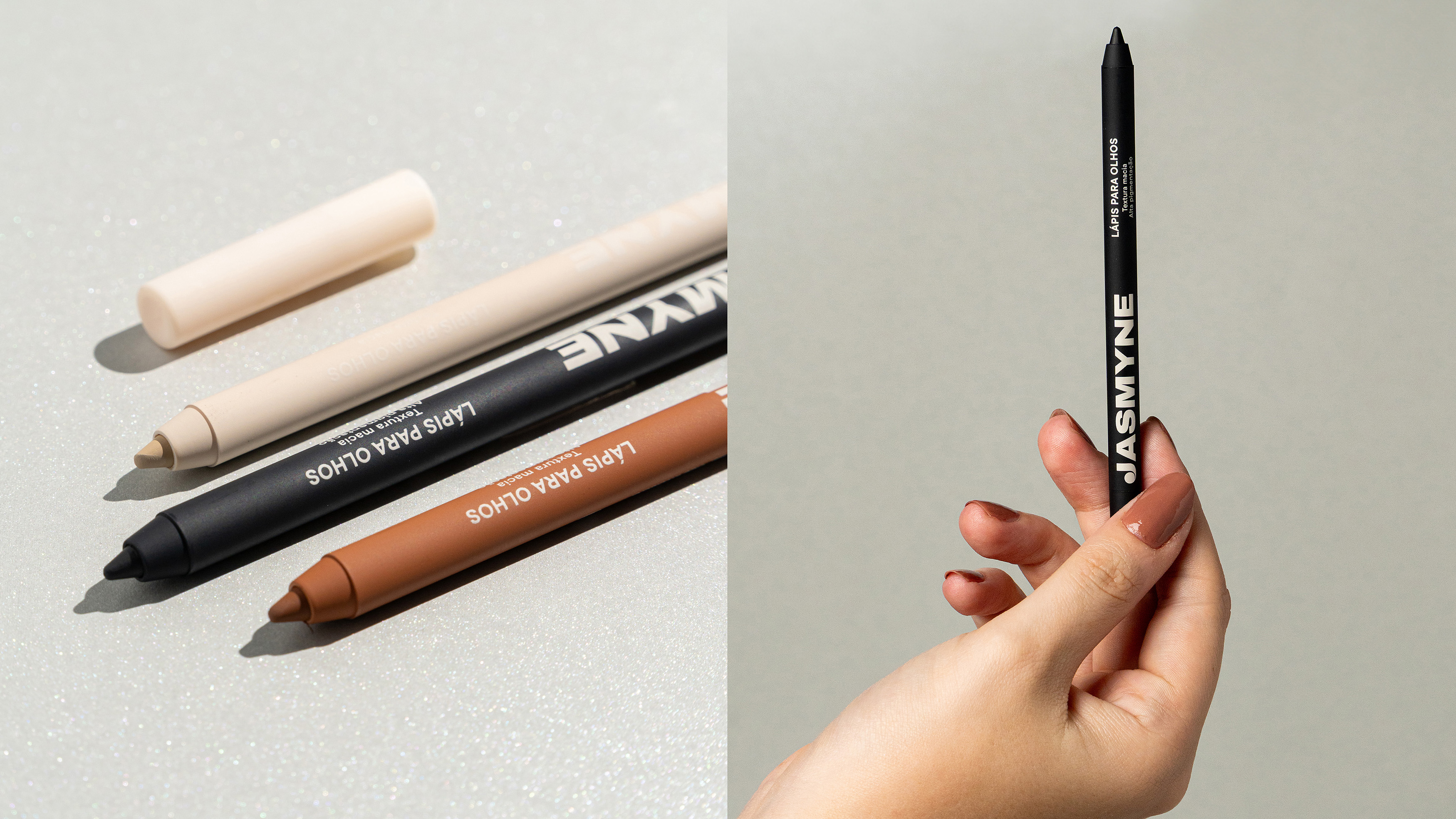
Dupe culture and digital access have changed what C, D and E class consumers expect from an affordable product. In this context, packaging plays an important role in shaping perceived value: it needs to express personality while making product selection easier. For Jasmyne, the opportunity was to bring its core line closer to the expectations of a generation that values aesthetics, without losing the accessibility at the heart of the brand.
Industrial Design
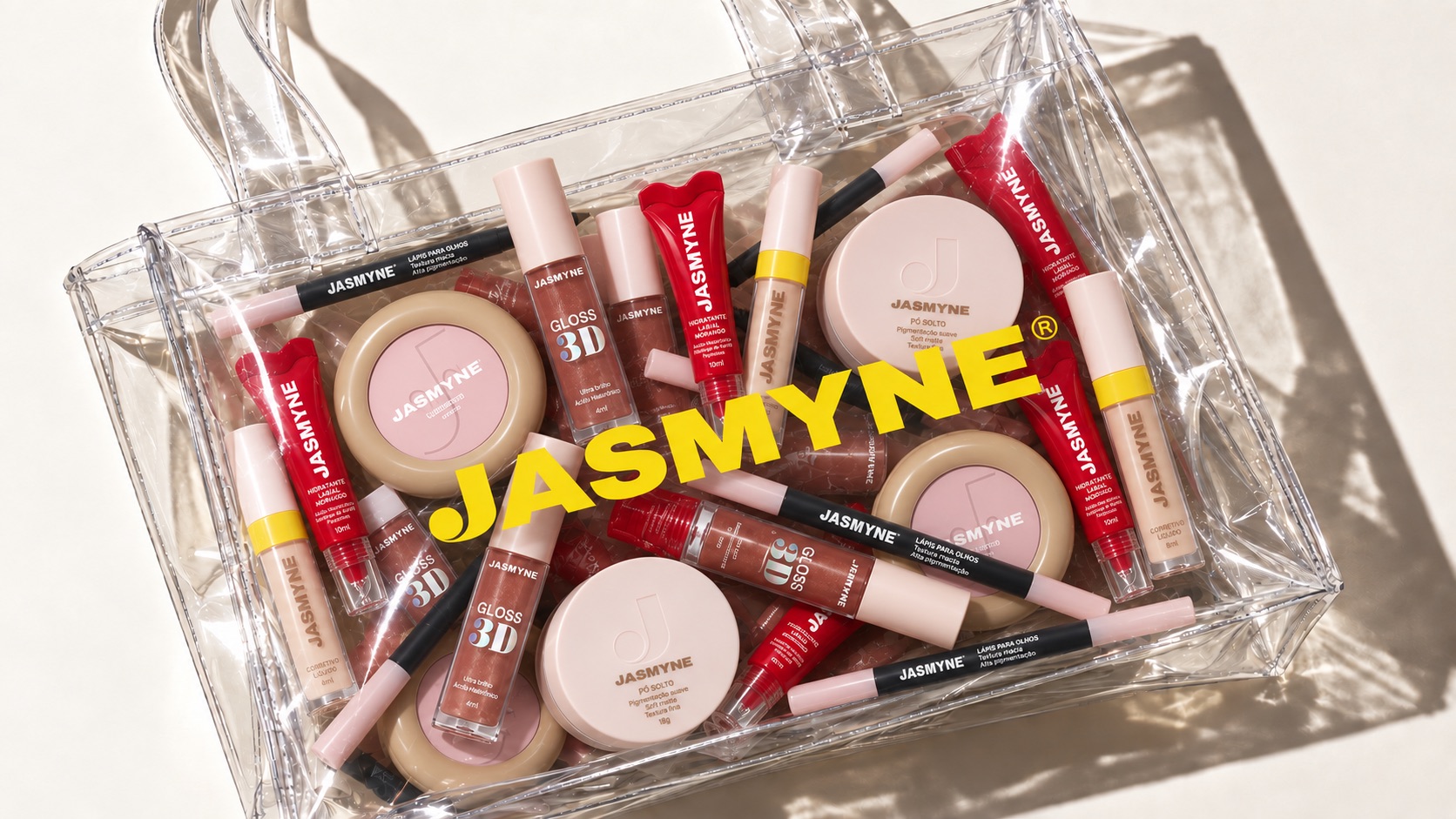
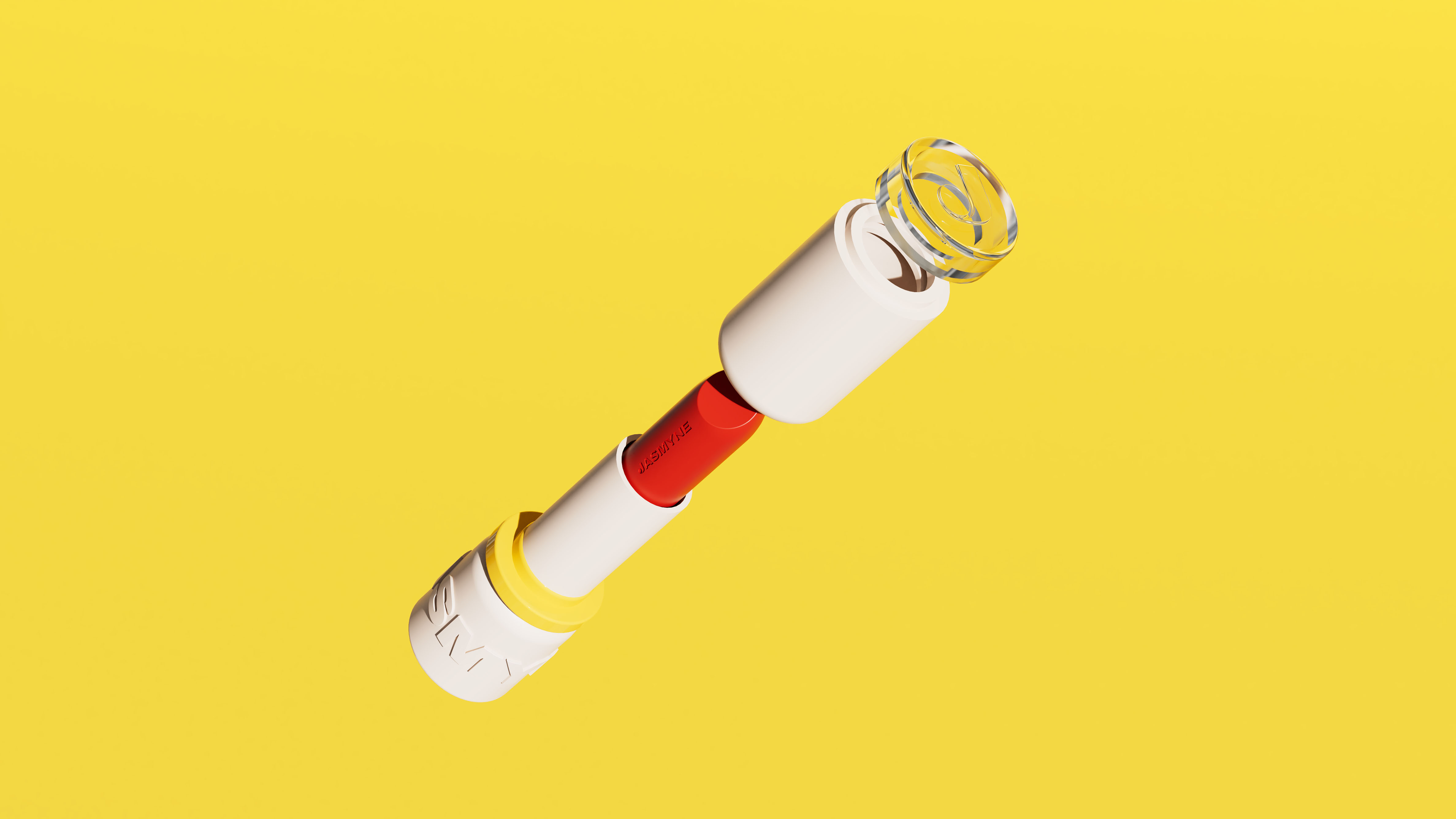
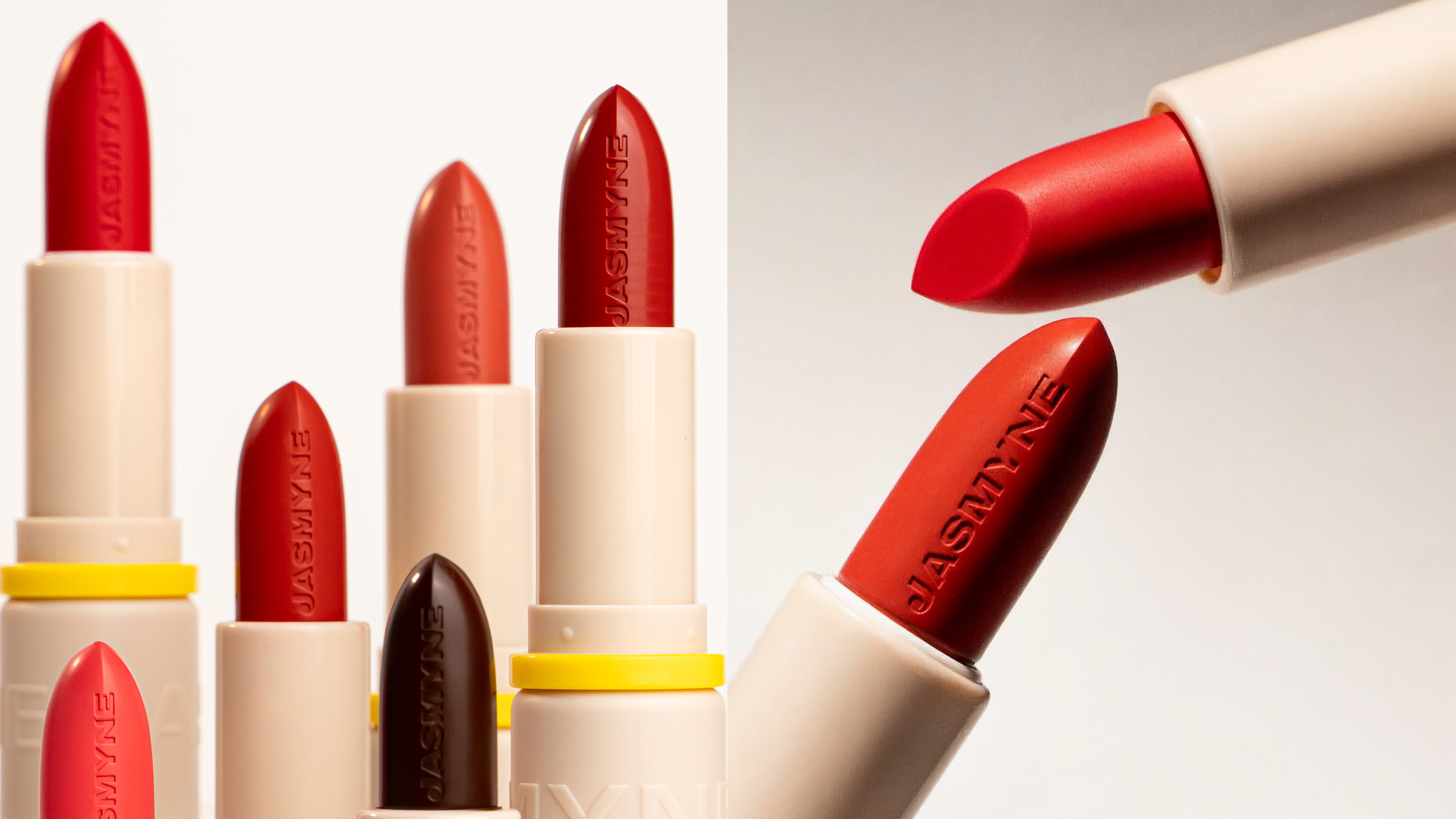
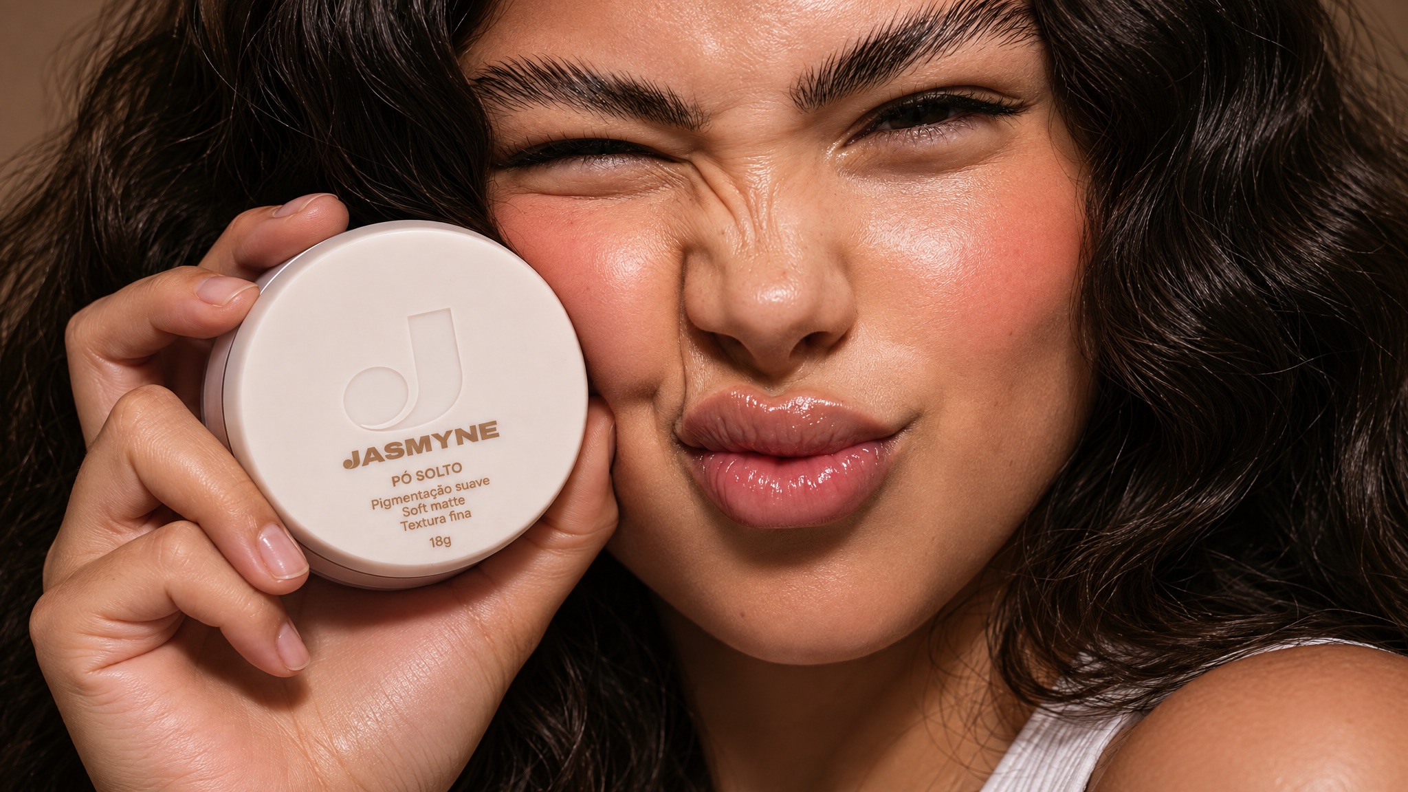
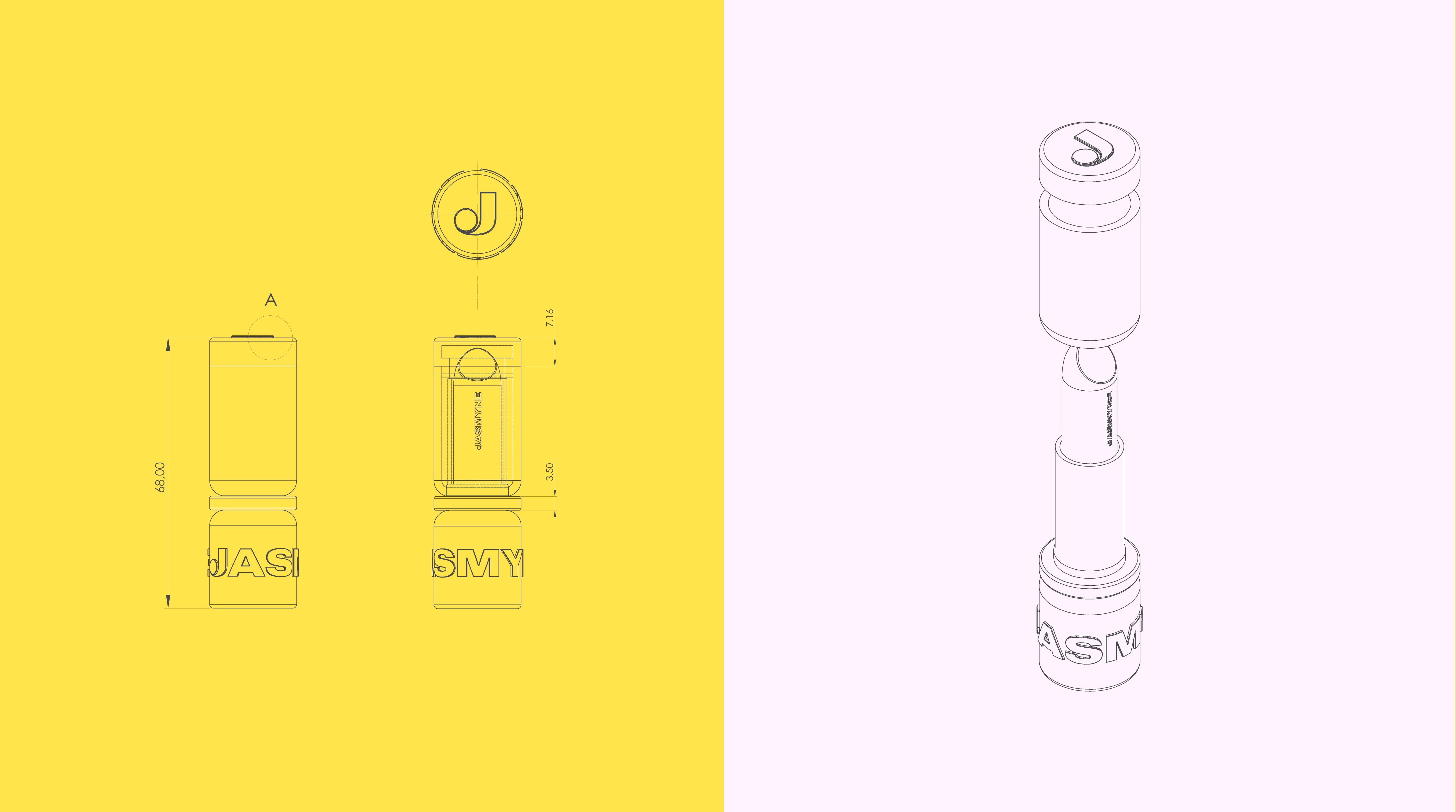
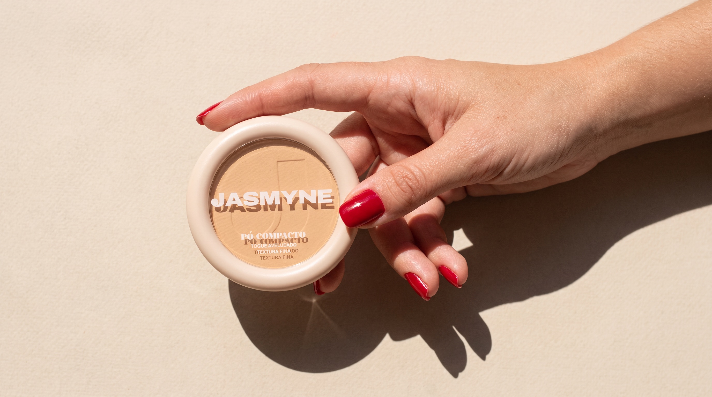
Three proprietary packaging formats bring the collection together as a cohesive family: cylindrical silhouettes for liquid formulas, compact cases for powders and ergonomic tubes. Robust, compact shapes reinforce product presence, while the soft-matte finish elevates the tactile experience. The embossed J monogram creates a distinctive tactile signature, seamlessly integrated into caps and containers. Meanwhile, the jasmine-inspired yellow appears in structural rings and subtle details, connecting the different formats to the overall color palette.
Design System
The neutral palette works as a constant and the yellow as the only variable signature, which allows the range to grow without losing coherence. The three structural matrices standardize the information hierarchy across formats, while the visors and the embossed monogram guarantee recognition at any volume. The system was designed as a flexible base: it sustains the core line and absorbs new shades and launches without renegotiating the identity each time.
Brand Concept
Jasmyne positions accessible beauty as a matter of design, not of price. By elevating the status of a popular brand without betraying its affordability, the project treats design as a tool of democratization: the same aesthetic quality the audience already recognizes in prestige brands, delivered at the price point they actually buy.
Shelf Experience
The line was structured for self-service retail, where the pack is the only salesperson. The translucent caps and visors let the consumer identify the exact shade without breaking protective seals, which simplifies the decision at the shelf and reduces product damage at the point of sale. The proprietary silhouettes build shelf presence and immediate recognition, and the tactile monogram sustains perceived value from the first contact through daily use.

Need a project?