Possible
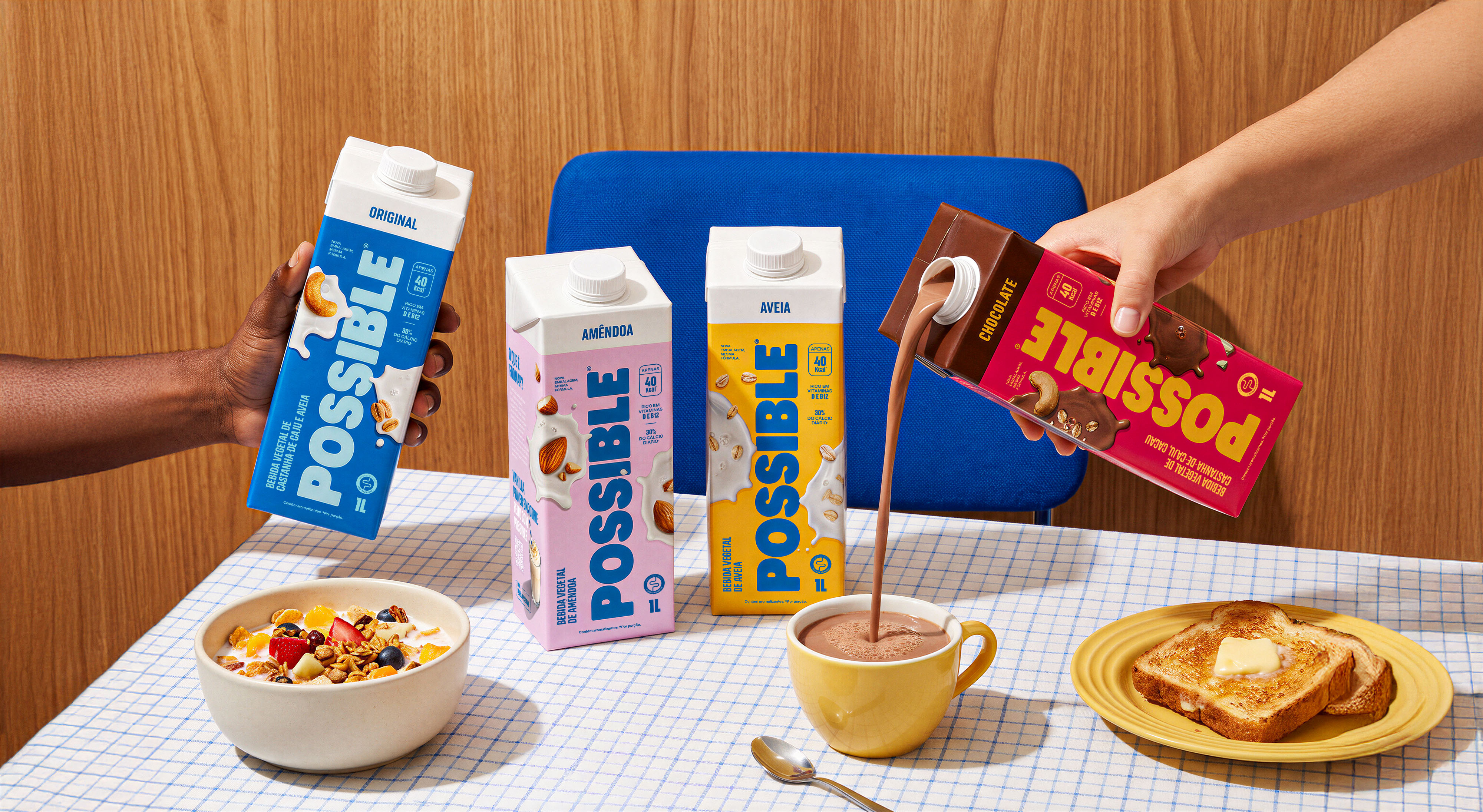
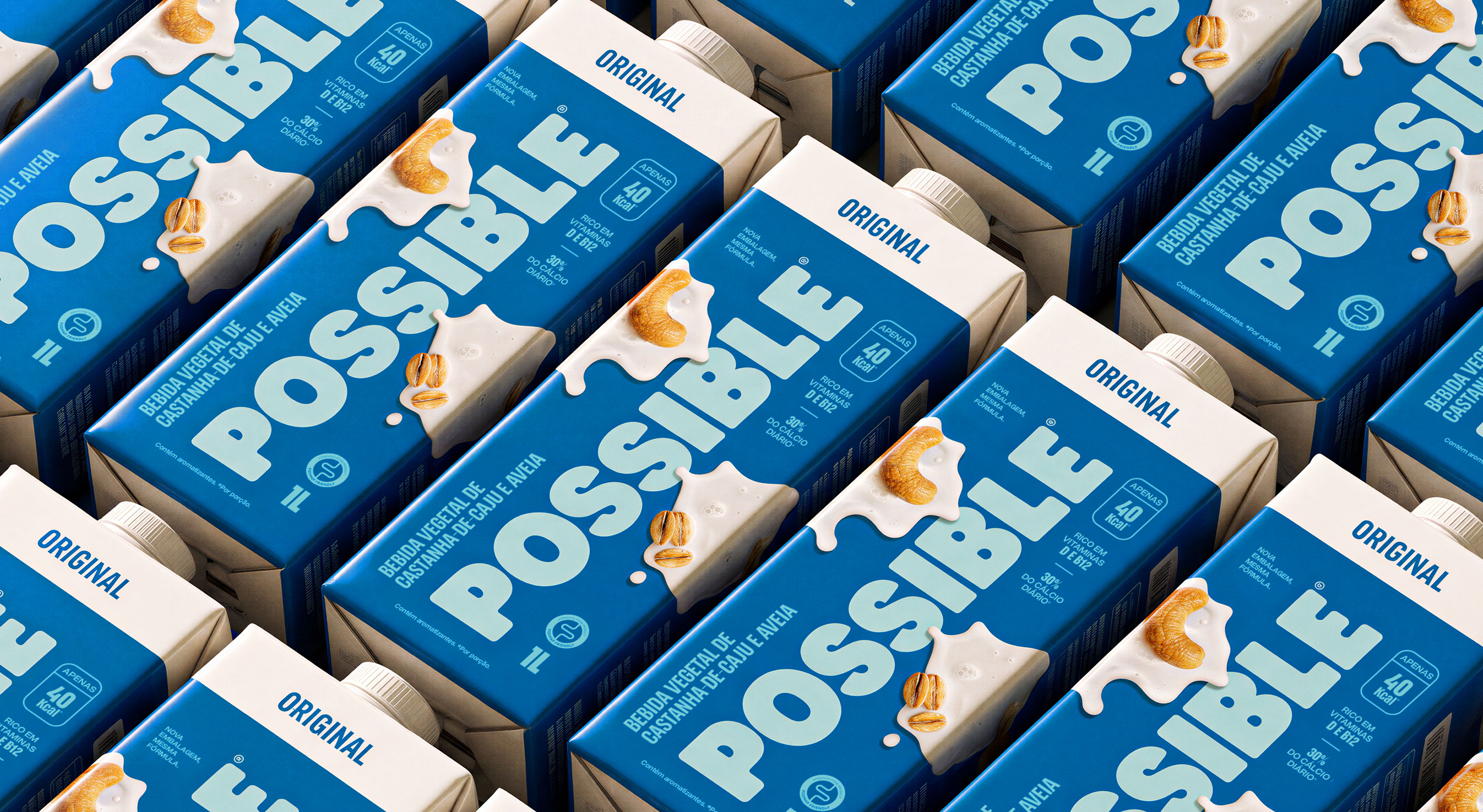
Possible marks its shelf repositioning with packaging that balances its cool essence with the sensory and flavor codes of the plant-based milk market.
Location: Brazil
Role: Repackaging
Date: 2026
Context
For a manifesto to be heard, it first has to speak the language of its time. Possible had built a plant-based milk brand on coolness and an element of surprise, but its previous packaging created friction with shoppers: by holding itself apart from the sensorial world of plant milks, it failed to signal the creaminess and nutrition the category is read for. The brief was to redesign the brand's shelf presence so it would connect with the codes of flavor and health without losing its essence.
Approach
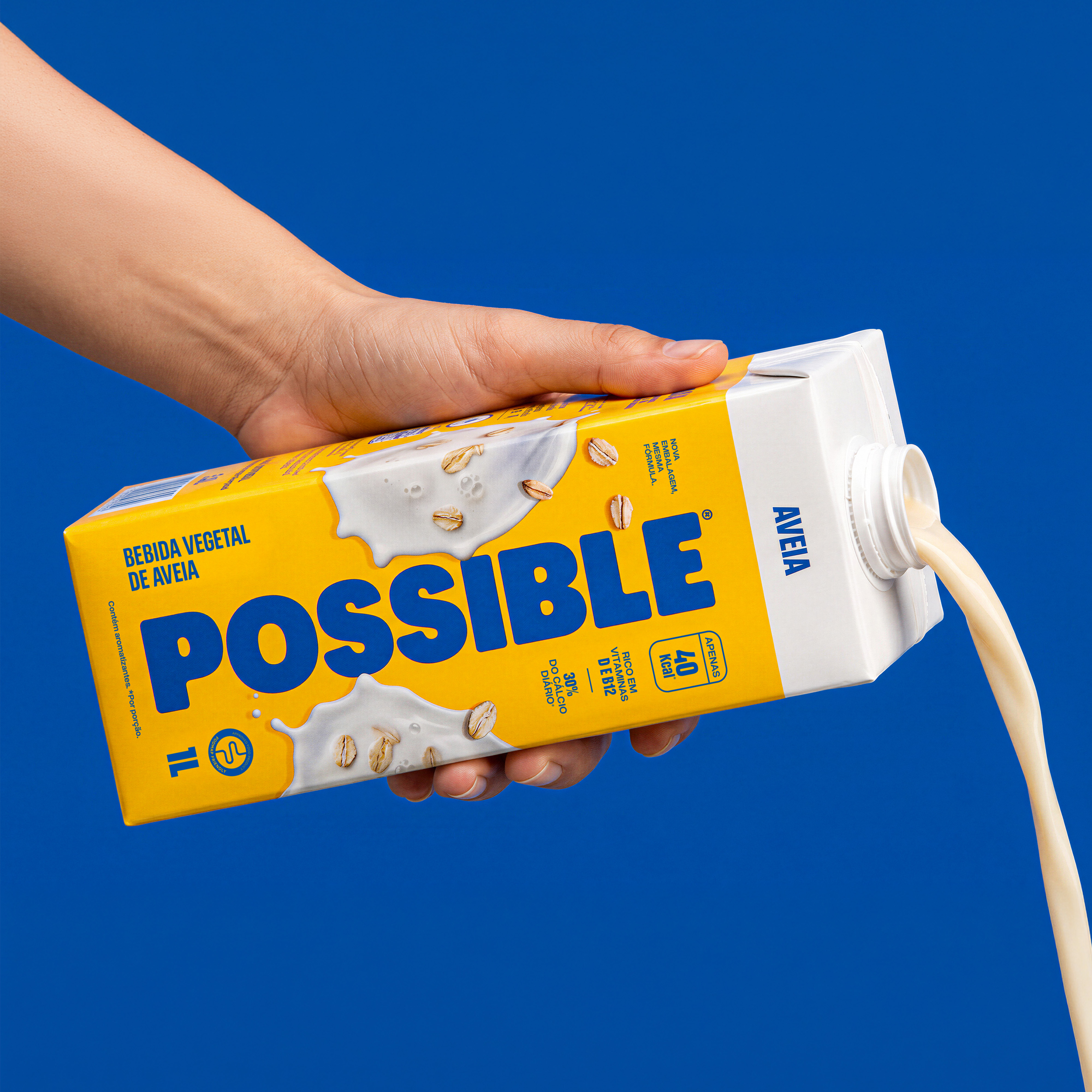
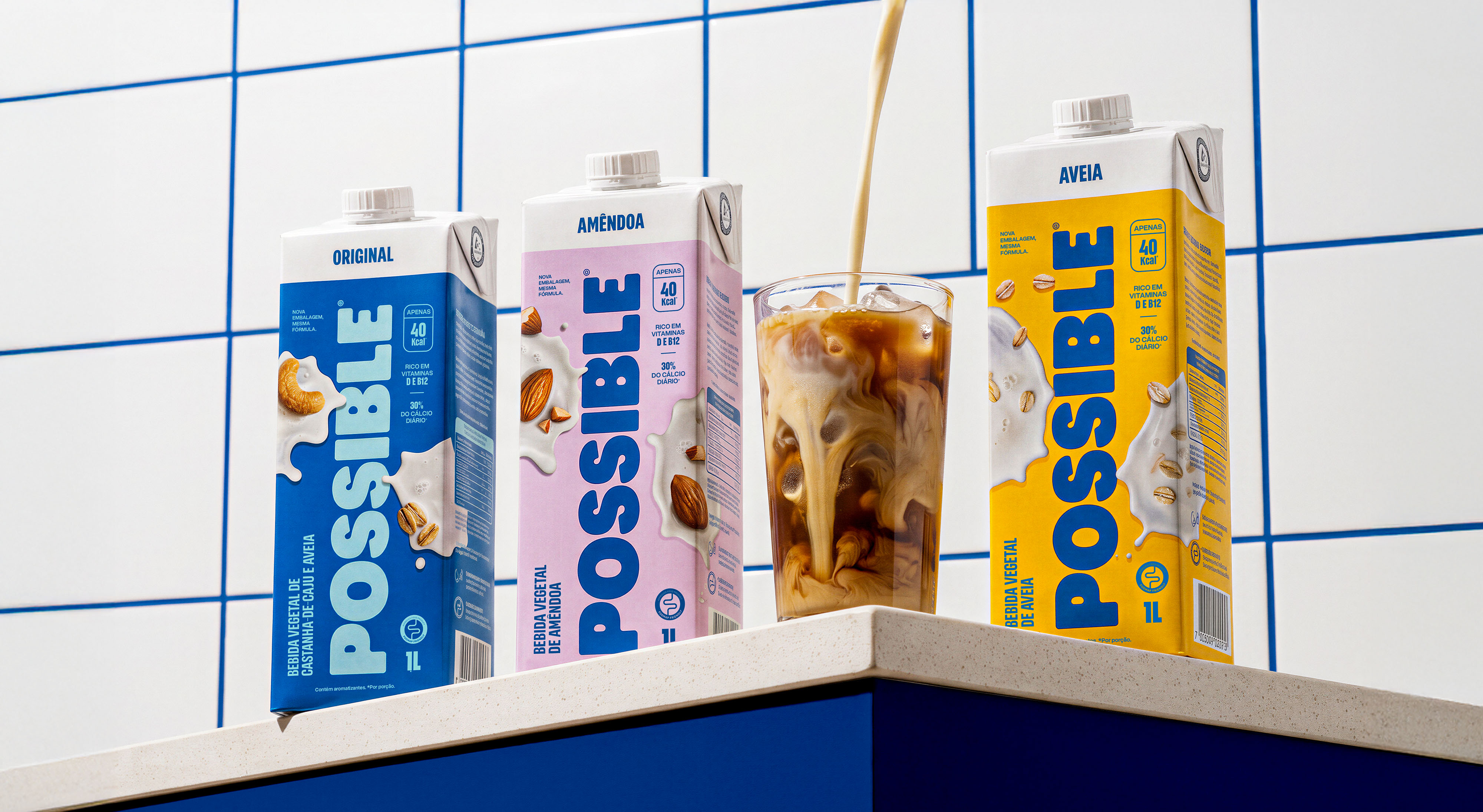
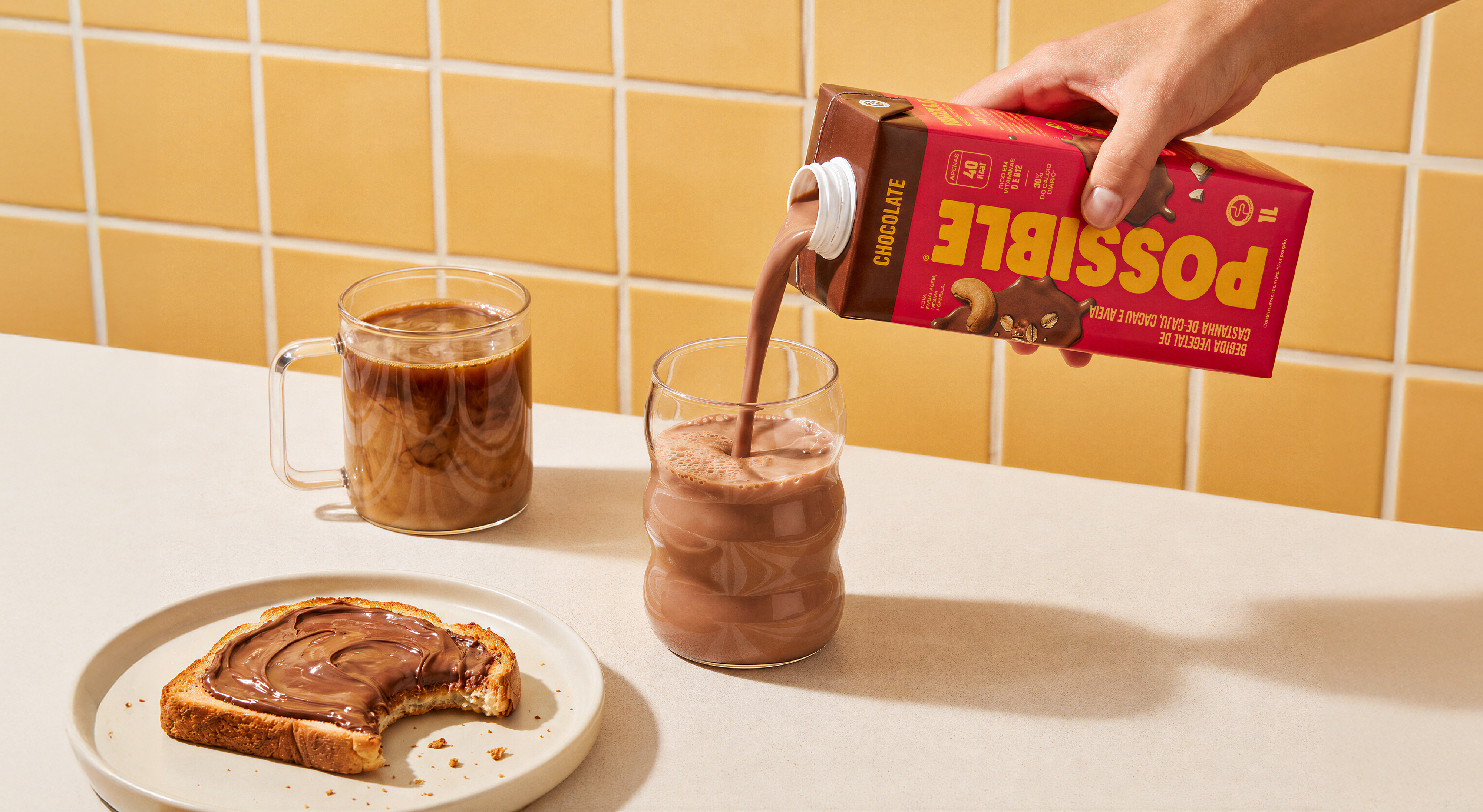
The visual strategy balances two forces at once, giving the logotype greater presence and legibility while letting flavor take the stage through images of the ingredients and their textures, the creamy splash that reads as appetite. The result communicates benefit and taste without the product overpowering the brand: each one completes the other.
Insight
The redesign was born from a practical diagnosis based on real public criticism of the 2024 packaging. The concept stems from a precise question: how to adopt the visual codes of flavor and texture from the category without losing Possible's essence, which is made of coolness and an element of surprise? The answer, and the main insight of the project, was to treat flavor and brand not as competitors, but as a single, unified system.
Visual Identity
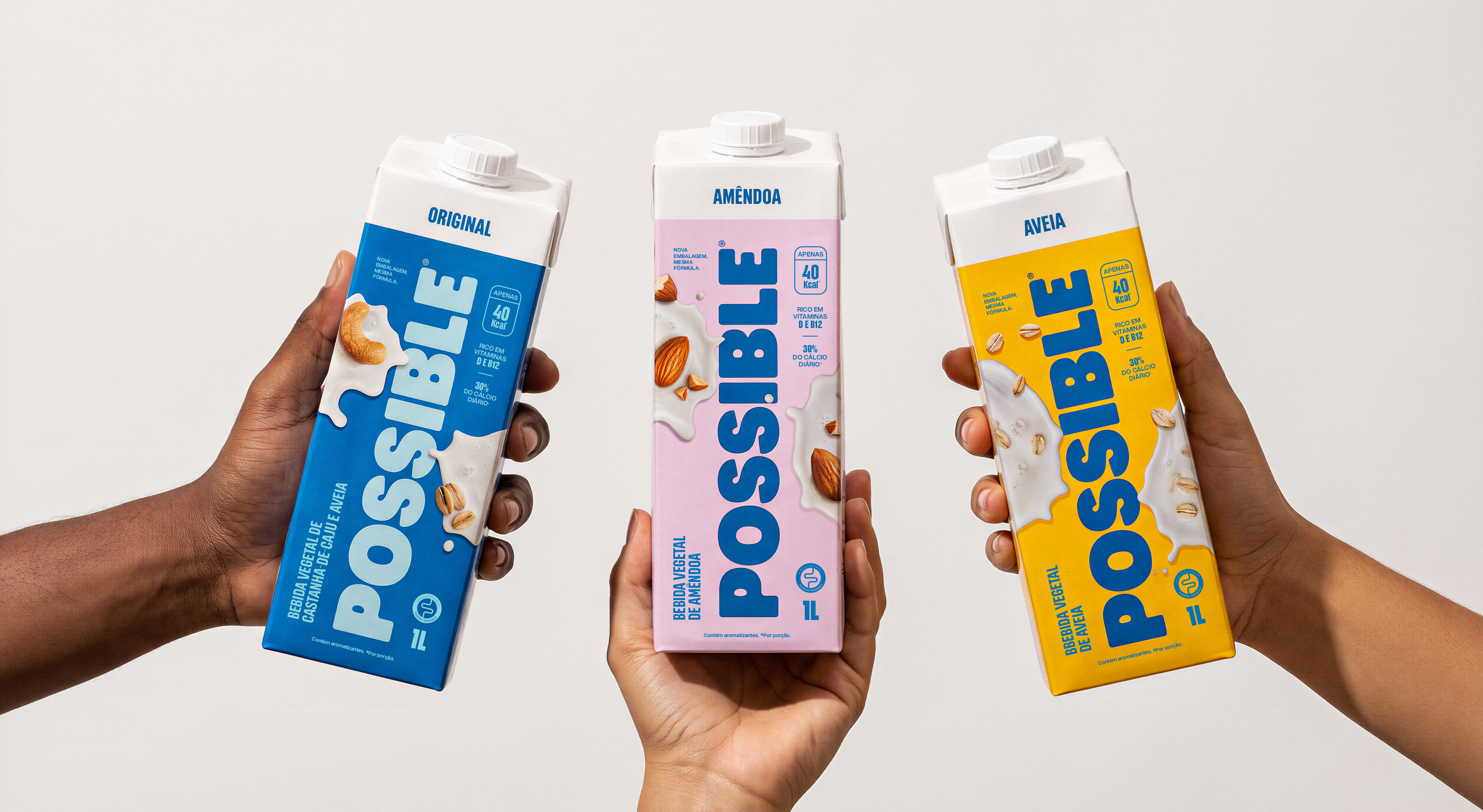
The graphic decisions materialize this balance, as the old typography gave way to a more expressive and legible font. Flavor enters the scene through photographs of the ingredients and their textures, introducing a creamy splash that conveys appetite and anchors the product within the category. Additionally, the original color palette was recalibrated to lighter, more vibrant hues, bringing freshness and reinforcing the health discourse.

Design System
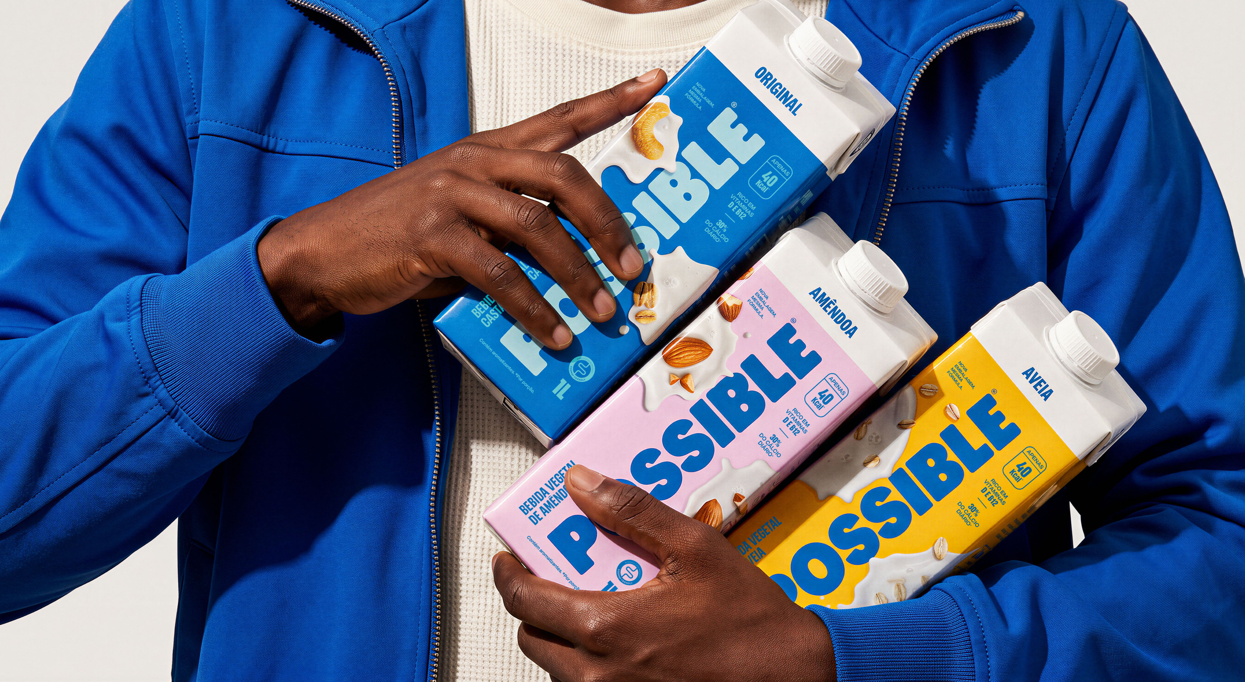
The system is built on a signature color for each flavor, set against a recalibrated palette that keeps Possible's original colors but renders them lighter, brighter and vibrant. The visual hierarchy was restructured for quick recognition, ensuring that benefits, such as 40 kcal, fiber, calcium, and Non-GMO, are communicated directly and consistently. The texture photography delivers the appetite appeal and belonging necessary for the moment of purchase.
Brand Concept
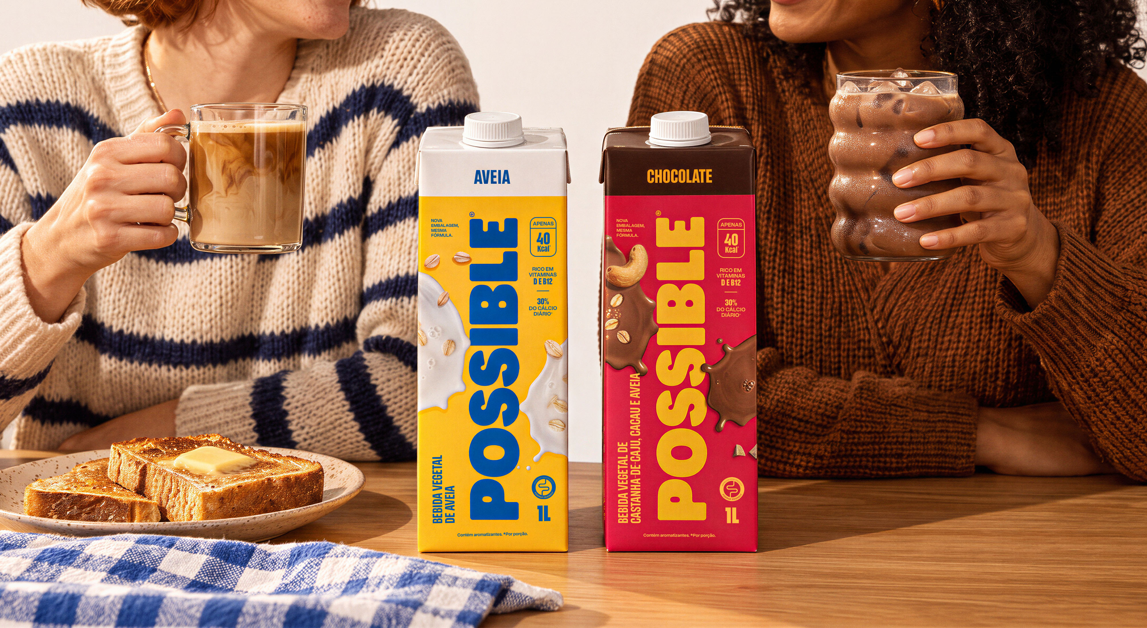
By aligning category codes with the brand's original personality, the design evolved from mere packaging into a competitiveness tool. It is a mature and commercially relevant solution that proves that strategic refinement can reposition a product and resolve business tensions without erasing its soul.
Shelf Experience
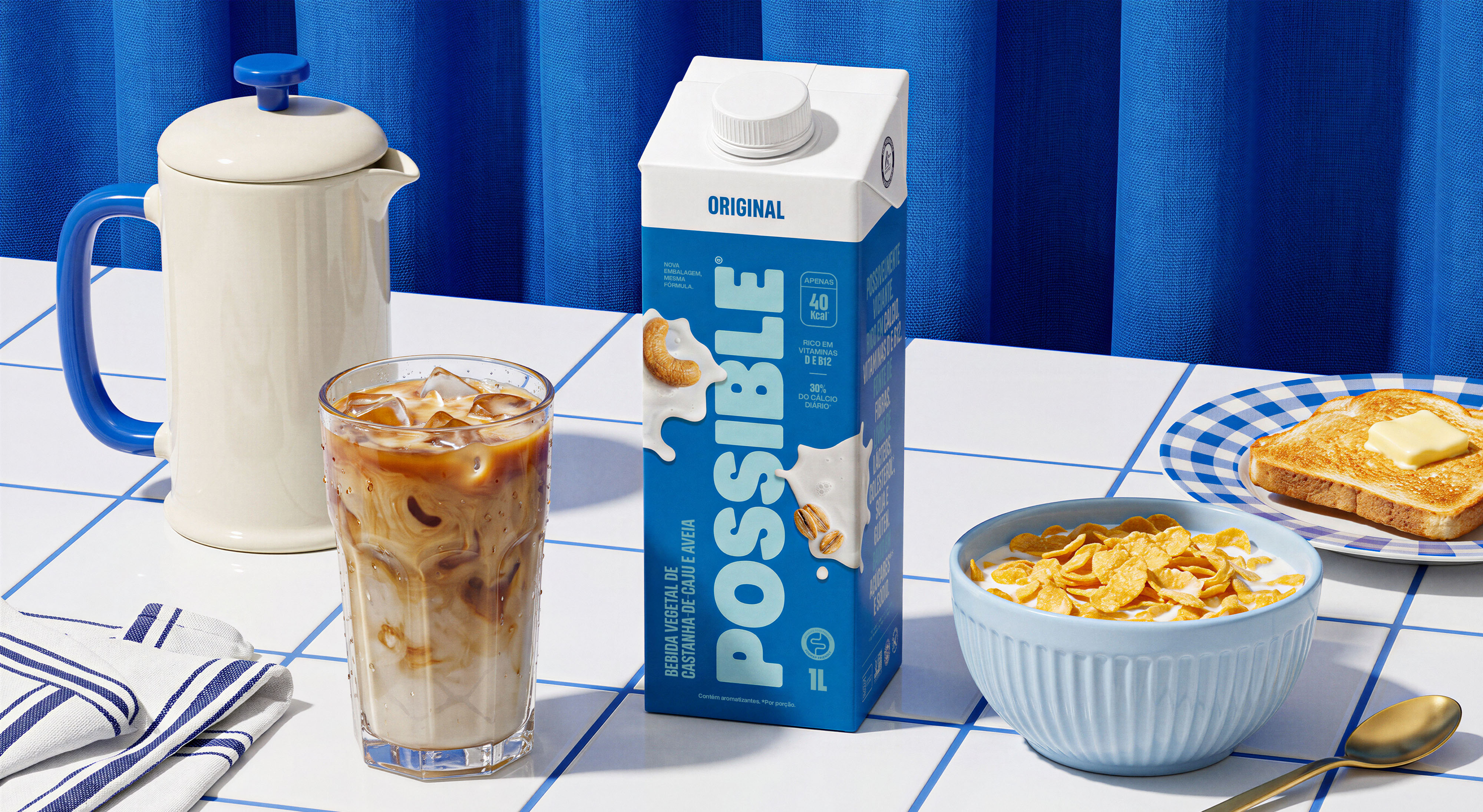
The new packaging solves the reception and readability issues of the previous design, inserting Possible directly into its audience's purchase drivers (flavor, creaminess, and healthiness). The new look better communicates the benefits, increases clarity in the consumer's purchasing decision, and restores the brand's presence and perceived value on the shelf.

Need a project?